Last Updated February 9, 2024
Brief Overview
Cascading Style Sheets (CSS) allow you to customize the look and feel of a balloon including the layout, colors, and fonts.
The CSS feature in WalkMe allows for full customization of Walk-Thrus and Walk-Thru steps. Before entering the rules in the Customize CSS window, you can check if the CSS rule works by inserting it in the Custom CSS tab in the Flow Tracker.
🎓 Digital Adoption Institute
Use Cases
CSS use cases include the following:
- Insert an image or logo in a balloon
- Customize a Welcome ShoutOut for your site
- Change the width of or remove arrows from a balloon
- Change the text of a Next button
How It Works
CSS is a style sheet language used for describing the formatting of a document written in a markup language. When writing CSS, you will need to refer to the different components, or elements of balloons found in WalkMe apps. When typing into the Custom CSS window, WalkMe displays auto-complete options for selectors, properties, and values.
CSS can be added locally via the Rich Text Editor, or globally from the Customize menu accessed in the Admin Bar. Before entering the rules in the Customize CSS window, test it in the Custom CSS tab in the Flow Tracker.
Get Stylin' with CSS Webinar
Configuring Balloon Components
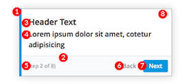
Each Balloon includes a number of components (elements) that can be customized with CSS. For example, you can target the title section of a balloon by using this class: .walkme-custom-balloon-title (see below for a full list of classes).
Global vs. Local Rules For Balloons
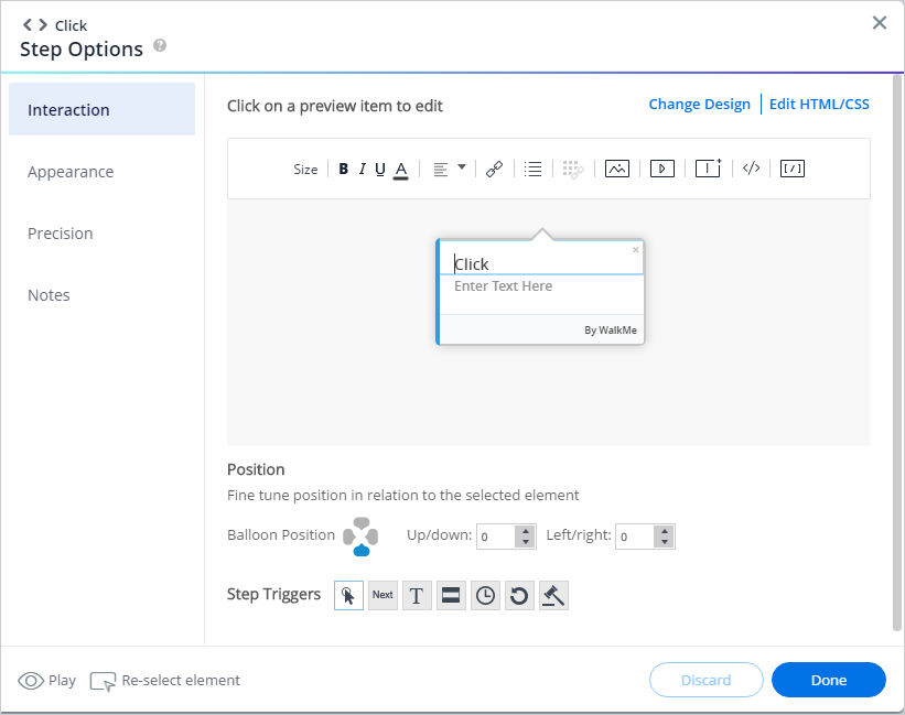
CSS can be applied globally or locally. Local CSS overrides all other design and can be applied from the Rich Text Editor in the Interaction tab.
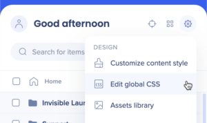
Global CSS can be accessed from the settings dropdown in the Editor.
Using the local CSS editor (Rich Text Editor) makes it easy to customize a single ShoutOut.
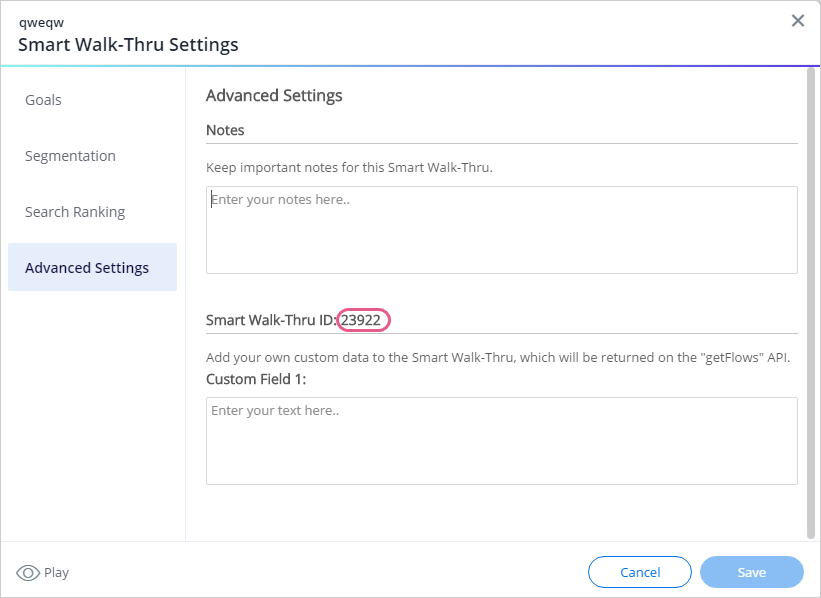
If you are customizing a single ShoutOut on the global level, you must enter the ShoutOut's ID* before the class that identifies the balloon section.
Local level example: .walkme-custom-balloon-title
Global level example: #walkme-balloon-XXXXXXX.walkme-custom-balloon-title)
Tip
For Walk-Thrus, the ID can be found in the Walk-Thru Settings Menu under Advanced Settings:
Using !Important
By default, the WalkMe theme design overrides any other design changes to a balloon or Walk-Thru. In order for CSS to be applied, the CSS rule must contain !important to ensure that it overrides the default styling.
Example:
#walkme-balloon-1760356.walkme-custom-balloon-title {
color: #000 !important;
}
Configurable Components
|
div |
Examples of Editable Attributes |
| 1 |
.walkme-custom-side-border |
This element is the left side balloon border:
|
| 2 |
.walkme-custom-balloon-separator |
This element is the separator on the bottom third of the balloon:
|
| 3 |
.walkme-custom-balloon-title |
This element is the balloon header:
- text-align
- font-color
- font-size
- font-family
- padding
- margin
|
| 4 |
.walkme-custom-balloon-content |
This element is the balloon text:
- text-align
- font-color
- font-size
- font-family
- padding
- margin
|
| 5 |
.walkme-custom-balloon-subtext |
This element is step number:
- text-align
- font-color
- font-size
- font-family
- display
|
| 6 |
.walkme-custom-balloon-back-button |
This element is the back button:
- color
- font-size
- font-family
- width
- height
- background
- border-radius
|
| 7 |
.walkme-custom-balloon-next-button |
This element is the next button:
- color
- font-size
- font-family
- width
- height
- background
- border-radius
|
Most Common CSS Customizations
.walkme-custom-balloon-close-button {
display:none !important;
}
Remove the side borders of a balloon
.walkme-custom-side-border{
display: none !important;
}
Change the balloon side border color
.walkme-custom-side-border{
background-color: red !important;
}
Change balloon background color
#walkme-balloon-XXXXXXX .walkme-custom-balloon-content-wrapper{
background-color: green !important;
}
Alter the width of a balloon
#walkme-balloon-xxxxxxx {
width: 300px !important;
min-width: 0 !important;
padding: 10px !important;
}
Alter the width of a ShoutOut balloon
.wm-shoutout-XXXX.wm-outer-div {
width: XXXpx !important;
}
Remove an arrow from a balloon
.walkme-custom-balloon-arrow.walkme-custom-flow-balloon-xxxxxxx{
display: none !important;
}
Remove step numbers from a balloon
.walkme-custom-balloon-subtext {
display: none !important;
}
Alter the text of the next button
Note
Text & Multi-Language settings are no longer in Insights, and can instead be accessed from the Translations page in the WalkMe Console at console.walkme.com. Learn more.
div#walkme-balloon-xxxxxxx
button.walkme-custom-balloon-button.walkme-custom-balloon-normal-button.walkme-custom-balloon-next-button.walkme-action-next.walkme-click-and-hover span.walkme-custom-balloon-button-text{
font-size: 0 !important;
}
div#walkme-balloon-xxxxxxx button.walkme-custom-balloon-button.walkme-custom-balloon-normal-button.walkme-custom-balloon-next-button.walkme-action-next.walkme-click-and-hover span.walkme-custom-balloon-button-text:before {
content: 'new text' !important;
visibility: visible !important;
font-size: 12px !important;
}
Alter the text for the back button
button.walkme-custom-balloon-button.walkme-custom-balloon-weak-button.walkme-custom-balloon-back-button.walkme-action-back.walkme-click-and-hover span.walkme-custom-balloon-button-text
Alter the text for the done button
button.walkme-custom-balloon-button.walkme-custom-balloon-normal-button.walkme-custom-balloon-done-button.walkme-action-done.walkme-click-and-hover span.walkme-custom-balloon-button-text
Change the global WalkMe font
#walkme-menu *,
#walkme-player *,
.walkme-custom-balloon-outer-div *,
.wm-shoutout *,
.walkme-survey-balloon *,
.walkme-tooltip-outer-div *,
.walkme-custom-launcher-outer-div,
.walkme-icon-image-div.walkme-launcher-image-div * {
font-family: "Roboto",Tahoma,Arial,Verdana,sans-serif !important; /* Add desired Font-Family rule here*/
}
Note
The font-family rule must be coded on every page that WalkMe is implemented on. If the font rule isn't coded on a particular page, WalkMe will not be able to pull and render the font correctly.
Change the font of a Launcher
.walkme-icon-image-div.walkme-launcher-image-div {
font-family: /
*your font here*/ !important;
}
Change the font of a balloon
.walkme-custom-balloon-title,
.walkme-custom-balloon-content,
.walkme-custom-balloon-button-text {
font-family: /
*your font here*/ !important;
}
#walkme-menu.walkme-penguin,
#walkme-main .walkme-title {
font-family: /*your font here*/ !important;
}.walkme-menu.walkme-penguin .walkme-icon {
font-family: /*your font here*/ !important;
}
Change the font of a SmartTip
.walkme-tooltip-content-wrapper .walkme-tooltip-content {
font-family: /*your font here*/ !important;
}
.walkme-tooltip-smarttip-XXXXX{
Display: none !important;
}div.walkme-custom-tooltip-arrow-top.walkme-custom-tooltip-item-YYYYY{
Display: none !important;
}
Apply Z-Index ahanges to all the Walk-Thru balloons
div.walkme-custom-walkthru-xxxxx.walkme-custom-simple-step {
z-index:0 !important;}
div.walkme-custom-walkthru-xxxxx.walkme-custom-balloon-arrow {
z-index:0 !important;}
Open / expand categories
Note
Ireland is not supported.
div.walkme-menu.walkme-penguin.walkme-override .walkme-category .walkme-activatable, div.walkme-menu.walkme-penguin .walkme-override .walkme-category .walkme-activatable {
display: block !important;
}
div.walkme-menu.walkme-penguin.walkme-override .walkme-category.walkme-opened .walkme-activatable, div.walkme-menu.walkme-penguin .walkme-override .walkme-category.walkme-opened .walkme-activatable, div.walkme-menu.walkme-penguin.walkme-override .walkme-category .walkme-activatable.walkme-invisible,
div.walkme-menu.walkme-penguin .walkme-override .walkme-category .walkme-activatable.walkme-invisible {
display: none !important;
}
div.walkme-menu.walkme-penguin.walkme-override .walkme-deployable.walkme-category.walkme-override .walkme-activatable, div.walkme-menu.walkme-penguin.walkme-override .walkme-activatable.walkme-category.walkme-override .walkme-activatable, div.walkme-menu.walkme-penguin .walkme-override .walkme-deployable.walkme-category.walkme-override .walkme-activatable,
div.walkme-menu.walkme-penguin .walkme-override .walkme-activatable.walkme-category.walkme-override .walkme-activatable {
border-bottom: none !important;
}
div.walkme-menu.walkme-penguin.walkme-override .walkme-deployable.walkme-category.walkme-override .walkme-activatable .walkme-deployable-icon,
div.walkme-menu.walkme-penguin.walkme-override .walkme-activatable.walkme-category.walkme-override .walkme-activatable .walkme-deployable-icon,
div.walkme-menu.walkme-penguin .walkme-override .walkme-deployable.walkme-category.walkme-override .walkme-activatable .walkme-deployable-icon,
div.walkme-menu.walkme-penguin .walkme-override .walkme-activatable.walkme-category.walkme-override .walkme-activatable .walkme-deployable-icon {
height: 20px !important;
padding-top: 4px !important;
margin-left: 12px !important;
width: 26px !important;
}
div.walkme-menu.walkme-penguin.walkme-override .walkme-deployable.walkme-category.walkme-override .walkme-activatable .walkme-text, div.walkme-menu.walkme-penguin.walkme-override .walkme-activatable.walkme-category.walkme-override .walkme-activatable .walkme-text, div.walkme-menu.walkme-penguin .walkme-override .walkme-deployable.walkme-category.walkme-override .walkme-activatable .walkme-text, div.walkme-menu.walkme-penguin .walkme-override .walkme-activatable.walkme-category.walkme-override .walkme-activatable .walkme-text {
padding: 0 !important;
}
div.walkme-menu.walkme-penguin .walkme-category > .walkme-deployable-row > .walkme-deployable-icon:before, div.walkme-menu.walkme-penguin * .walkme-category > .walkme-deployable-row > .walkme-deployable-icon:before {
content: "e60a";
}
div.walkme-menu.walkme-penguin .walkme-category.walkme-opened > .walkme-deployable-row > .walkme-deployable-icon:before, div.walkme-menu.walkme-penguin * .walkme-category.walkme-opened > .walkme-deployable-row > .walkme-deployable-icon:before {
content:"e609";
}
Make the default body text size match the header size
.walkme-custom-balloon-title,
.walkme-custom-balloon-content {
      font-size: 12px !important;
}
Note
If you have related CSS already set inside of an individual step, you will need to remove that CSS for the global setting to take effect. Local CSS always overrides global CSS
.walkme-custom-balloon-bottom-div:has(.walkme-custom-balloon-no-buttons-div) {
  display: none !important;
}

.walkme-custom-balloon-inner-div:has(.walkme-custom-balloon-no-buttons-div) {
  padding-bottom: 20px !important;
}
Find & Replace Shortcuts
- Find: Ctrl-F / Cmd-F (press enter to find next, Shift-Enter to find previous)
- Replace: Ctrl-R / Cmd-R
- Jump to line: Ctrl-J / Cmd-J
Watch a quick demo below:
Publish Changes in CSS
In order for changes in CSS to become live, you will need to publish.
Some changes that can be applied to your account aren't reflected in the Publish menu. These include changes that are made to the following items and more:
This is because any change in your account that doesn't relate to a specific WalkMe item will be pushed to your environment as soon as you publish any new or existing content. This means that if you've recently applied changes to one of your global segments, and then published an unrelated Walk-Thru, the changes made to your segment will be published as well.
To publish changes you've made to the CSS, perform a "settings publish" as follows:
- Click Publish in the Admin Bar
- Open the Publish tab
- If all you are doing is publishing changes to CSS, deselect all items
- Click Publish
Note
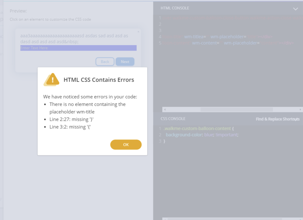
- In case of an error, a validation message will appear in the CSS Console after you click Save
- Error messages are also available for HTML - please request access from your Customer Success Manager or WalkMe contact if you would like this enabled
- When changing text using CSS, keep in mind that this may override any translations added in the Text & Multi-Language page in the Console
- The following terms are not supported and may cause custom CSS to not take effect:
- @import
- expression
- javascript
- -moz-binding
- -o-link
- behavior
CSS Tips and Tricks Video