WalkMe for mobile web enables users to access WalkMe on mobile devices such as Safari or Chrome. WalkMe for mobile web allows you to provide support for your users who are on-the-go with effective guidance anytime and anywhere they need it.
WalkMe for mobile web will be an important component of your implementation if a large portion of your users work remotely from a mobile device. This platform can help you alleviate problems experienced by your salespeople in the field, or employees who frequently travel.
Note: WalkMe for mobile web is not enabled by default. To get access to this feature, please reach out to your Customer Success Manager or WalkMe contact.
How It Works
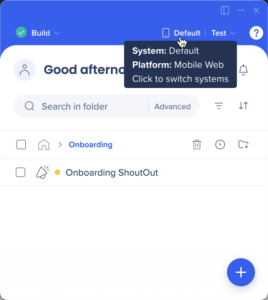
All apps available on web are available on mobile web and can be created very similarly. Each item created in your mobile web system is separate from items created in your web or Workstation systems to ensure the best user experience. You can switch between your systems in the Editor using the systems button, but when building content for mobile web, you should be on the Mobile Web platform.
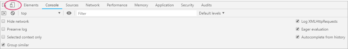
Additionally, it is important to have web browser display set to mobile in dev tools:
This is what the mobile toggle button looks like on Chrome's dev tools.
This way you will be able to record and preview your mobile content, and understand what a mobile user will see.
Before displaying any content, WalkMe checks the device you are on and screen resolution to decide if mobile or desktop experience should load. First WalkMe checks if you are on a mobile device, then it checks screen resolution. When a mobile device is detected only the items created with the Mobile Emulator will be seen by users. When WalkMe detects a desktop browser, it automatically filters out items created for a screen size of less than 600x800 (resolution can be customized).
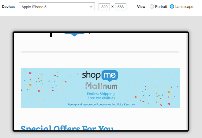
WalkMe for mobile web uses the same snippet as the desktop version. However, since the UI of a mobile environment can vary greatly from a desktop to a mobile version, it is recommended that you build your WalkMe items custom to that environment. Using our mobile emulator, you'll be able to select specific devices and see your environment as it would fit on that screen. This allows you to build with confidence knowing that your WalkMe items are tailored to different screen resolutions.
In order to use WalkMe for Mobile Web, you must be using the standard snippet on your site or Self Hosting. If you are currently using an extension, contact your Account Manager for more information on how to use WalkMe for Mobile Web.
Want access to mobile browsers without the snippet?
The Workstation mobile app uses the WalkMe extension. This way your users can access your WalkMe content via Shuttles to the Workstation's mobile browser without using the snippet.
Differences From Desktop
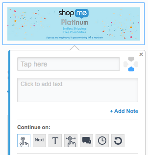
Items such as Walk-Thrus, Launchers, Resources, Task Lists, and Shuttles are all created the same way as the desktop version. This includes the use of Segmentation and Goals within your mobile environment. The design of some of these items will change in your mobile environment to better suit the smaller screen sizes: The WalkMe menu now appears smaller, balloons scale in size based on the screen resolution and shoutouts have unique templates.
Smart Walk-Thrus
There are a few differences between the desktop and the mobile version of the Walk-Thrus App. Because the mobile user cannot use triggers like Click or Hover. In the mobile emulator, these triggers are not available and have been replaced with Tap and Swipe.
Segmentation
Rule Types have been added to help Segment for mobile environments: Use Screen Size to determine the minimum desktop size or the maximum mobile size. Items may also be segmented by Browser Size, which accommodates for responsive sites. All other Rule Types will be available including segmentation for user type based on Variable, jQuery, and Cookie. If a Walk-Thru that works for an iPhone 5 in Portrait mode, may not work for an iPad in landscape mode, you can duplicate the Walk-Thru and change only the steps necessary. Once the alternative Walk-Thru is created, remember to segment both Walk-Thrus so they are only seen by users on the appropriate devices.
Testing and Evaluation
When testing Walk-Thrus and other items for mobile, begin testing in preview mode through the Editor. Thoroughly check all your items, paying special attention to layout issues. In addition, testing items directly on a mobile device is highly recommended. Test on devices that will be most commonly used by your audience. In order to test on the device itself, publish your items to a test environment.
Once published to production, your items for mobile can be reviewed as part of WalkMe Analytics. Mobile Web data is merged with Desktop Web data and can be viewed on the same account in Insights.
Try It Out
Re-create an existing Smart Walk-Thru with the mobile emulator. This can help you understand the differences in your website across the desktop and the mobile version.
Test out this Smart Walk-Thru on as many devices as possible to get as much information on potential problem spots. Next, brainstorm with your team to identify which processes are used the most on mobile. This might be very different from the processes completed on desktop. Consult with your users first to see which actions are most frequent from a mobile device.
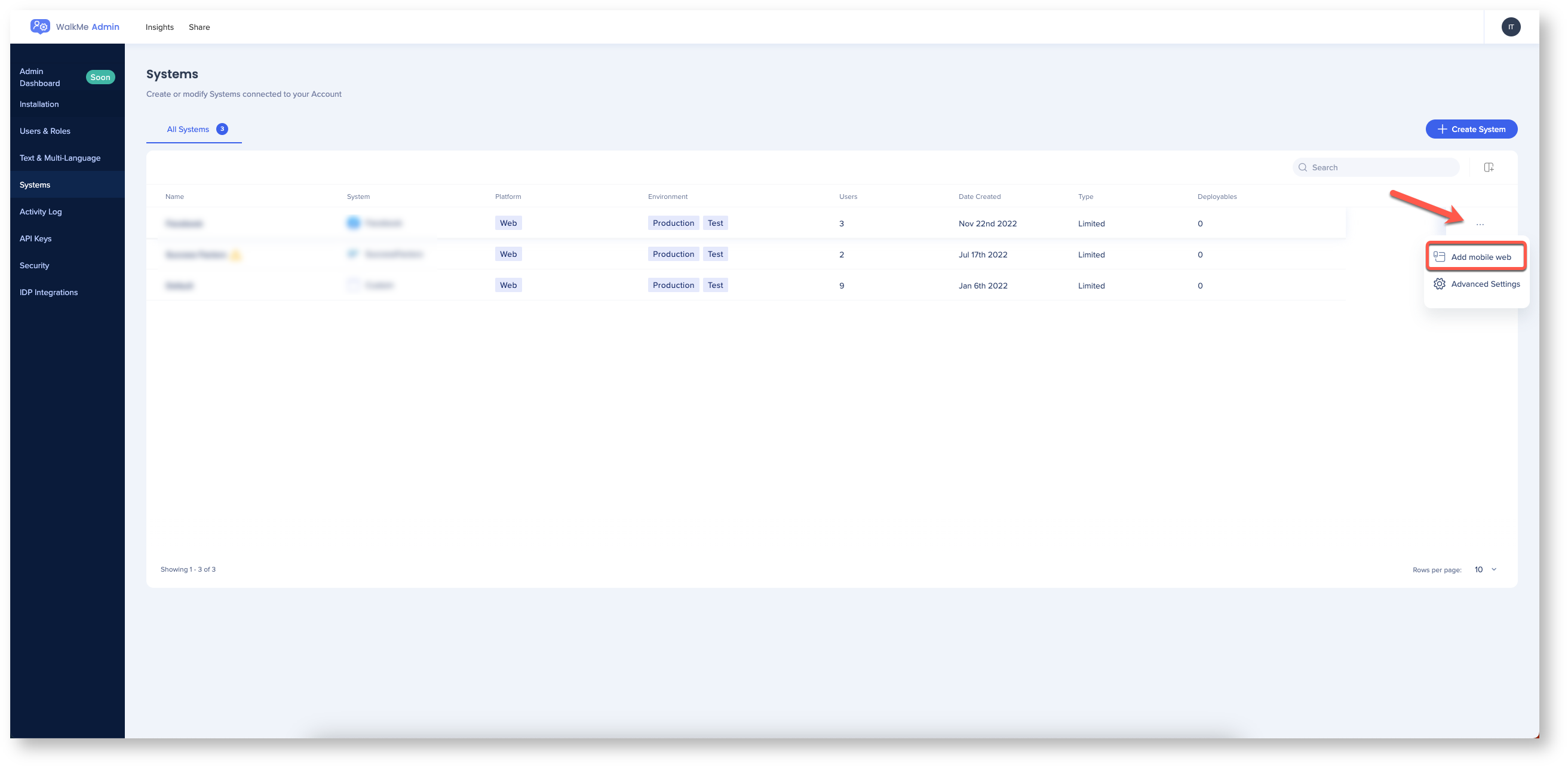
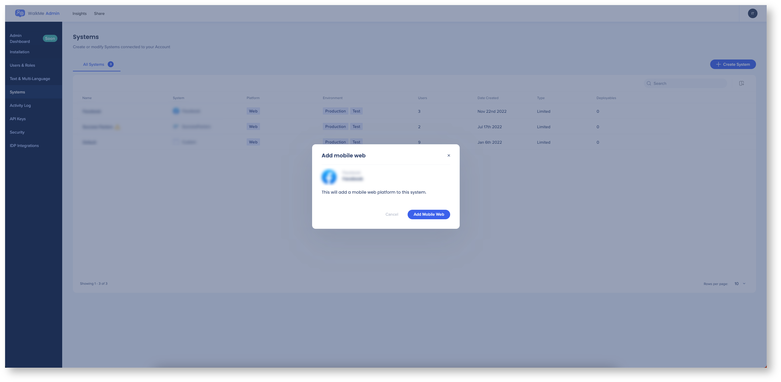
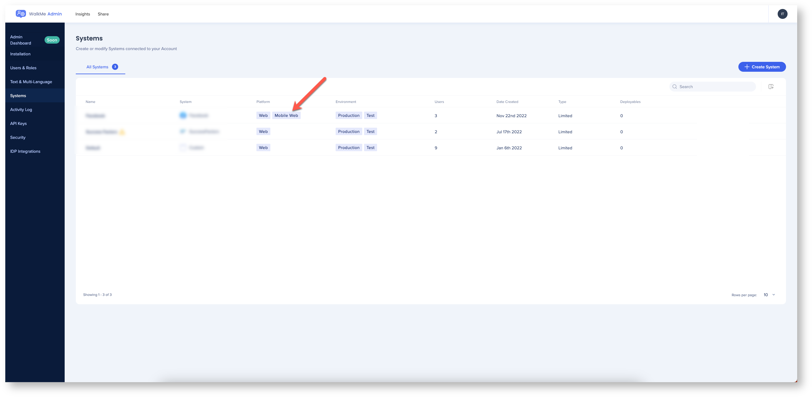
Add a mobile web system
Add a mobile web system to an existing web system in the Admin Center.