概要
以下のハウツー記事では、CSSを使用してActionBotの外観を変更する方法について説明します。
CSSを変更する前に
、独自のロゴとボットのアイコンを追加する予定なら、最初にそれらをアセットライブラリにアップロードすることをお勧めします。
- すべてのファイルをアセットライブラリにアップロードします。
- IDをコピーします
- コピーされたIDをどこかに保存して、後でCSSに追加できるようにします。
動画チュートリアル
アクションボットを利用した自動化のクイックチュートリアルについては、こちらの動画をご覧ください。
CSSを使用したアクションボットを利用した自動化ステイリング
アクションボットを利用した自動化の外観とフィールを変更するには、
- エディタに移動します
- ActionBotを開く(すべてのアイテム→アクションボットを利用した自動化)
- ボットに移動
- ボットの外観とフィールをカスタマイズするをクリック
- [Advanced Customizations(高度カスタマイズ)]をクリックして、CSSエディタを開きます。
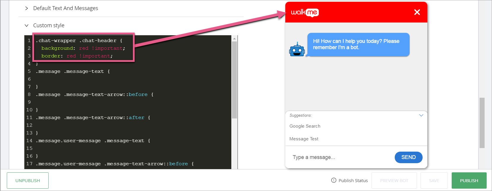
チャットダイアログボックスのヘッダー色を変更する
CSSセレクター:.chat-wrapper .chat-header
CSS例:
.chat-wrapper .chat-header {

background: red !important;
border: red !important;

}
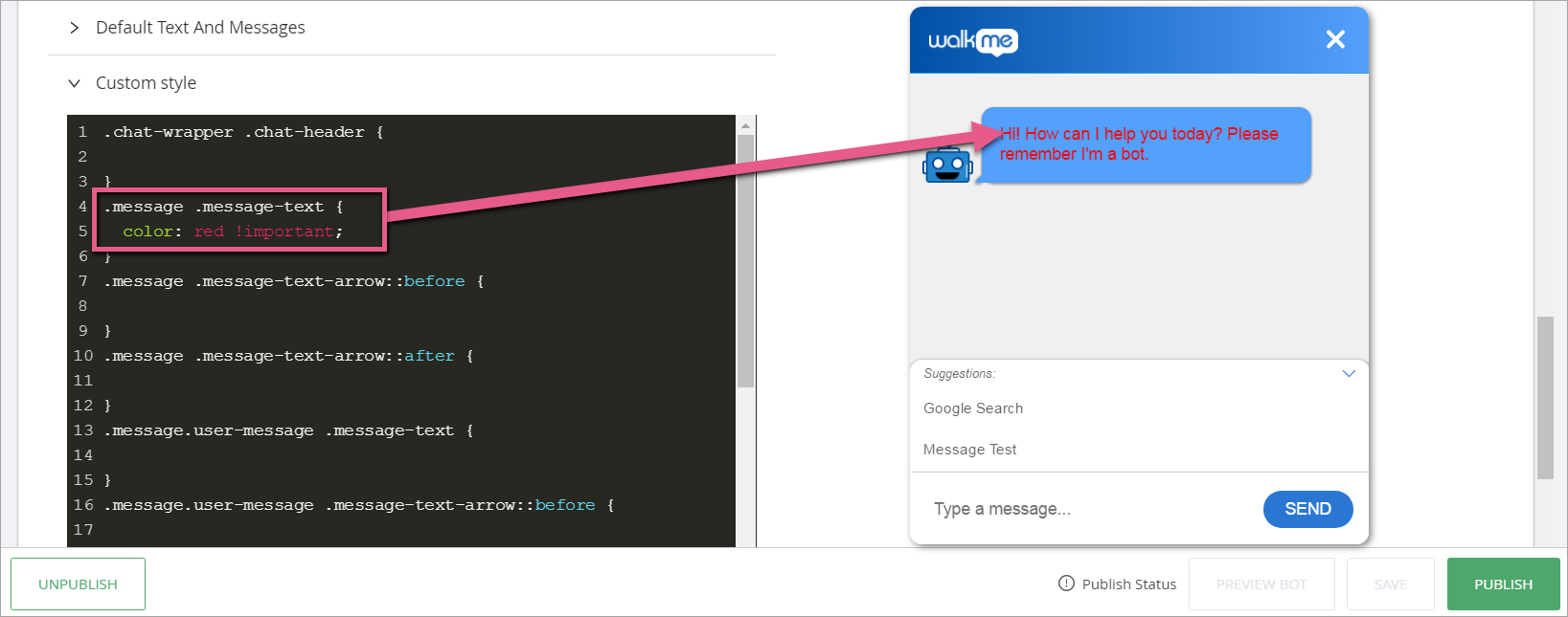
ダイアログメッセージのテキスト色を変更する
CSSセレクター:.message .message-text
CSS例:
.message .message-text {

color: red !important;

}
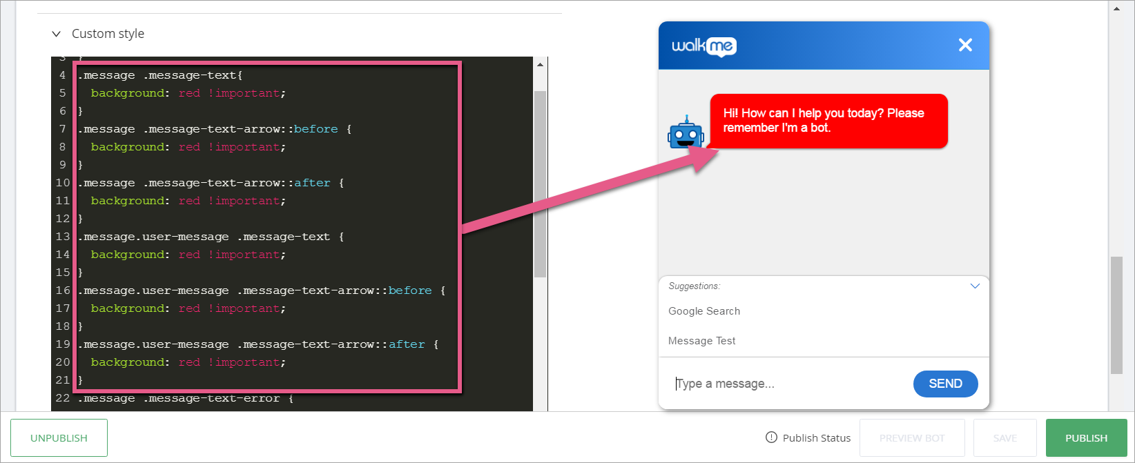
メッセージバブルの背景色を変更する
CSSセレクター:
- .message .message-text
- .message .message-text-arrow::before
- .message .message-text-arrow::after
- .message.user-message .message-text
- .message.user-message .message-text-arrow::before
- .message.user-message .message-text-arrow::after
CSS例:
.message .message-text {

background: red !important;

}

.message .message-text-arrow::before {

background: red !important;

}

.message .message-text-arrow::after {

background: red !important;

}
ユーザーのメッセージを変更するには:
.message.user-message .message-text {

background: red !important;

}

.message.user-message .message-text-arrow::before {

background: red !important;

}

.message.user-message .message-text-arrow::after {

background: red !important;

}
メッセージのシャドウの削除
メッセージボックスの裏に影を削除するには、ステートメントに以下の行を追加します。
- .message .message-text
- message .message-text-arrow::before
- .message .message-text-arrow::after
CSS例:
.message .message-text {

box-shadow: 0 0px 0px 0 rgba(0,0,0,0) !important;

}

.message .message-text-arrow::before {

box-shadow: 0 0px 0px 0 rgba(0,0,0,0) !important;

}

.message .message-text-arrow::after {

box-shadow: 0 0px 0px 0 rgba(0,0,0,0) !important;

}
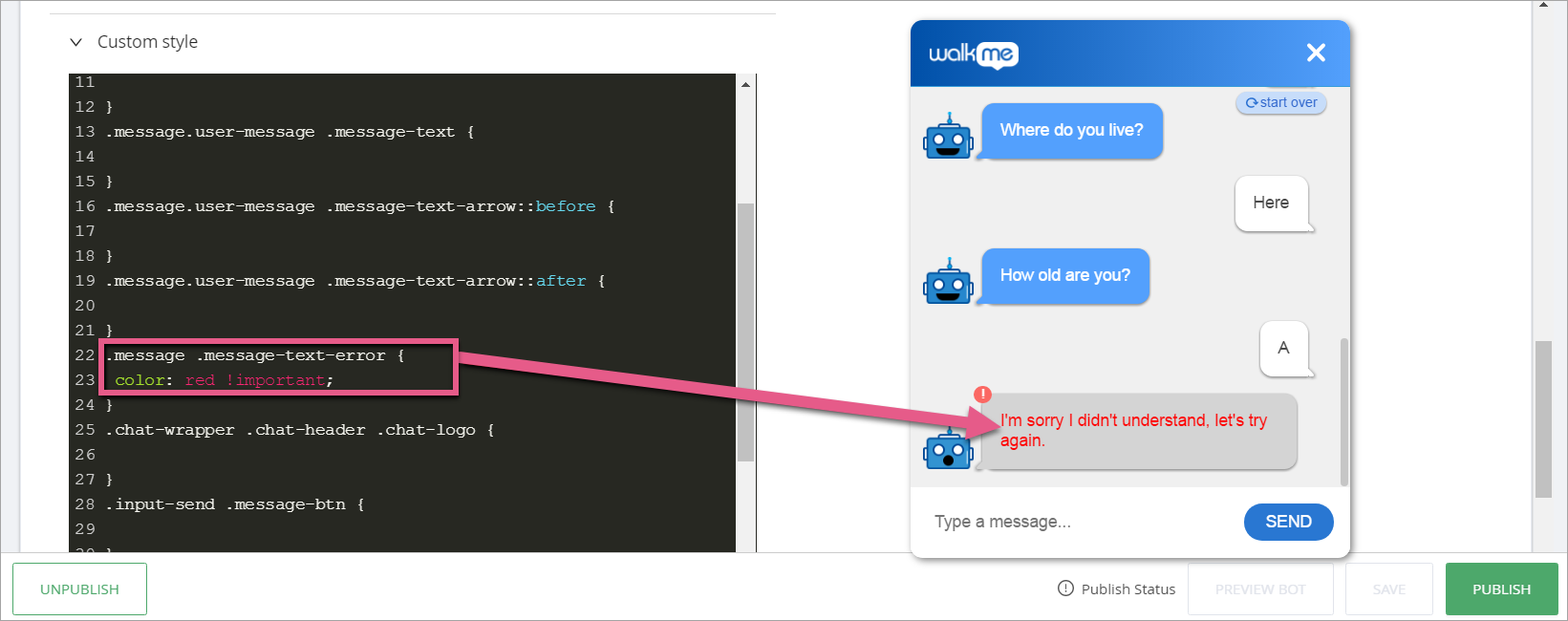
エラーメッセージのテキスト色を変更する
CSSセレクター:.message .message-text-error
CSS例:
.message .message-text-error {

color: red !important;

}
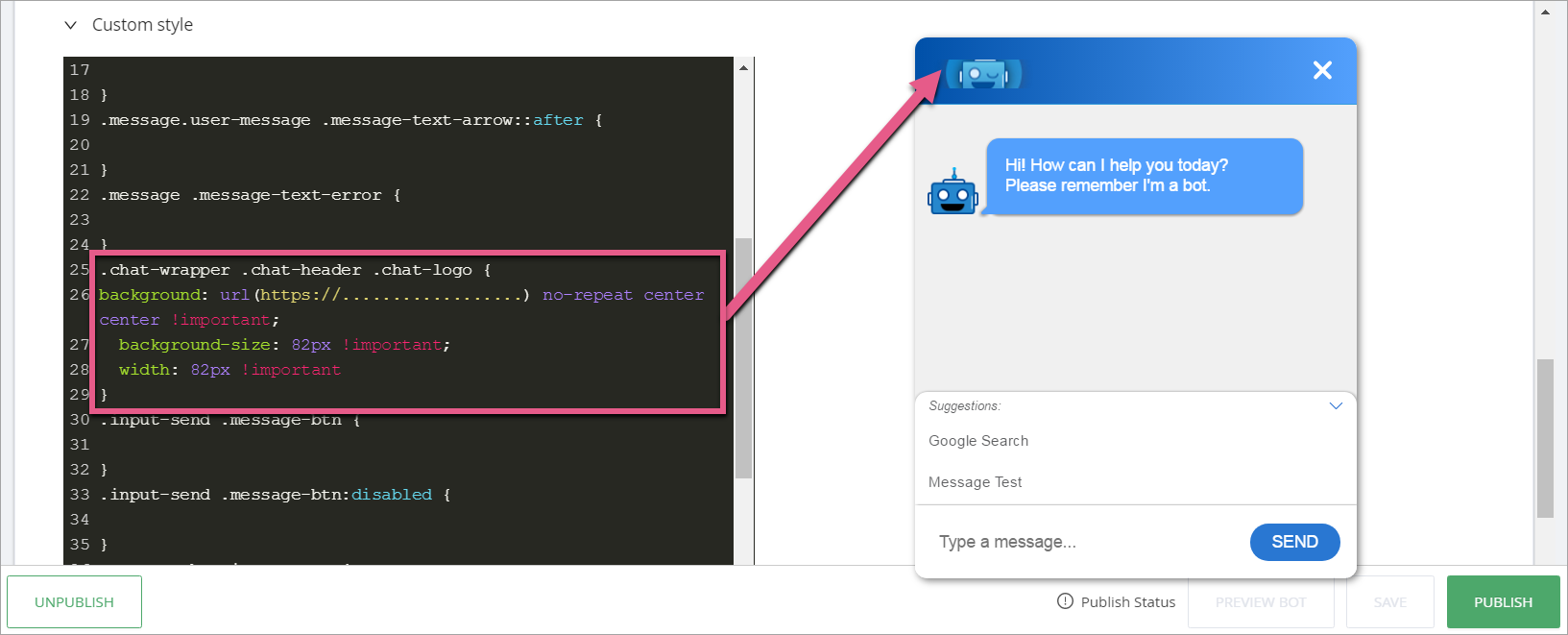
ヘッダーロゴの変更
CSSセレクター:.chat-wrapper .chat-header .chat-logo
CSS例:
.chat-wrapper .chat-header .chat-logo {

background: url(https://.....image...) no-repeat center center !important;
background-size: 82px !important;
width:82px !important

}
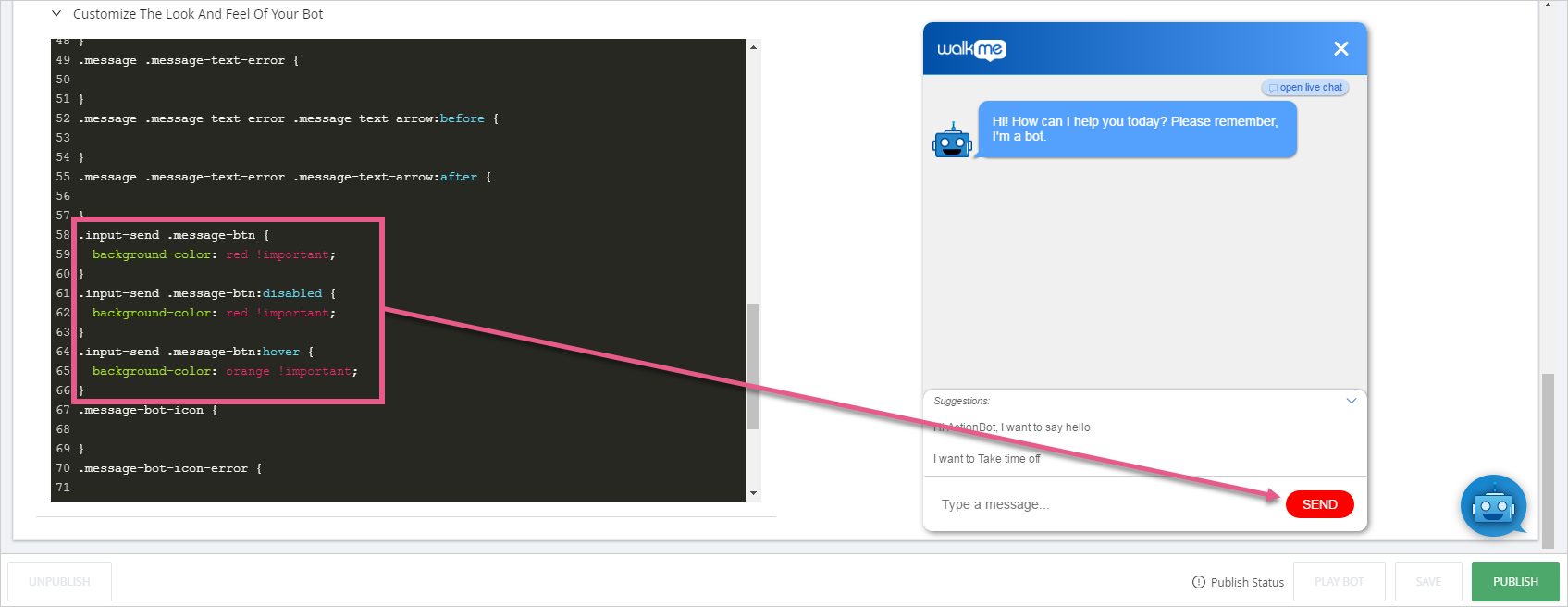
送信ボタンの色を変更する
CSSセレクター:
- .input-send .message-btn
- .input-send .message-btn:disabled
- .input-send .message-btn:hover
CSS例:
.input-send .message-btn {

background-color: red !important;

}

.input-send .message-btn:disabled {

background-color: red !important;

}

.input-send .message-btn:hover {

background-color:orange !important;

}
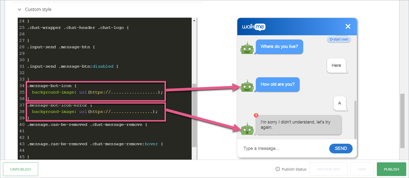
アクションボットを利用した自動化アイコンの変更
CSSセレクター:
- .message-bot-icon
- .message-bot-icon-error
CSS例:
.message-bot-icon {

background-image: url(https://.....image...)!important;

}

.message-bot-icon-error {

background-image: url(https://.....image...)!important;

}
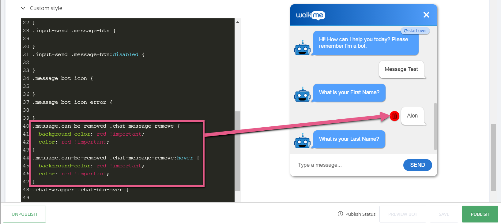
「メッセージの削除」アイコン色を変更する
CSSセレクター:
- .message.can-be-removed .chat-message-remove
- .message.can-be-removed .chat-message-remove:hover
CSS例:
.message.can-be-removed .chat-message-remove {

background-color: red !important;
color: red !important;

}

.message.can-be-removed .chat-message-remove:hover {

background-color: red !important;
color: red !important;

}
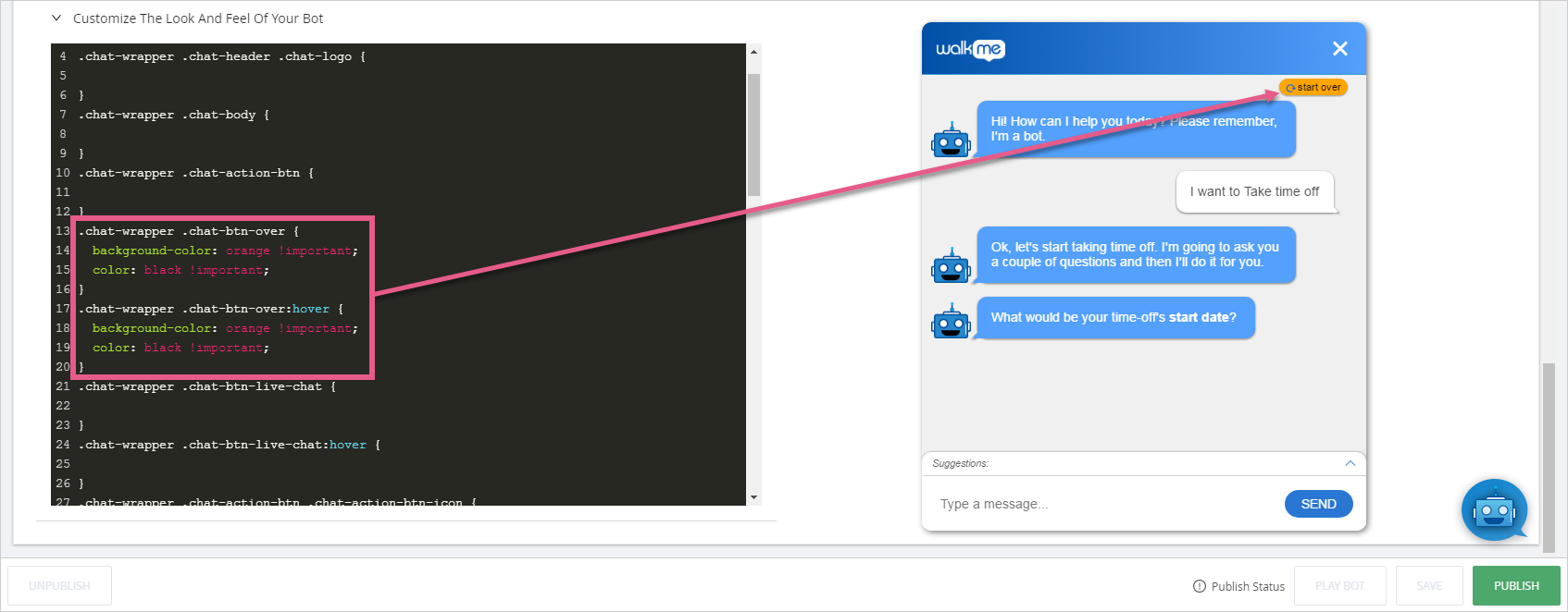
「スタートオーバー」アイコン色を変更する
CSSセレクター:
- .chat-wrapper .chat-btn-over
- .chat-wrapper .chat-btn-over:hover
CSS例:
.chat-wrapper .chat-btn-over {

background-color:orange !important;
color:black !important;

}

.chat-wrapper .chat-btn-over {

background-color:orange !important;
color:black !important;

}
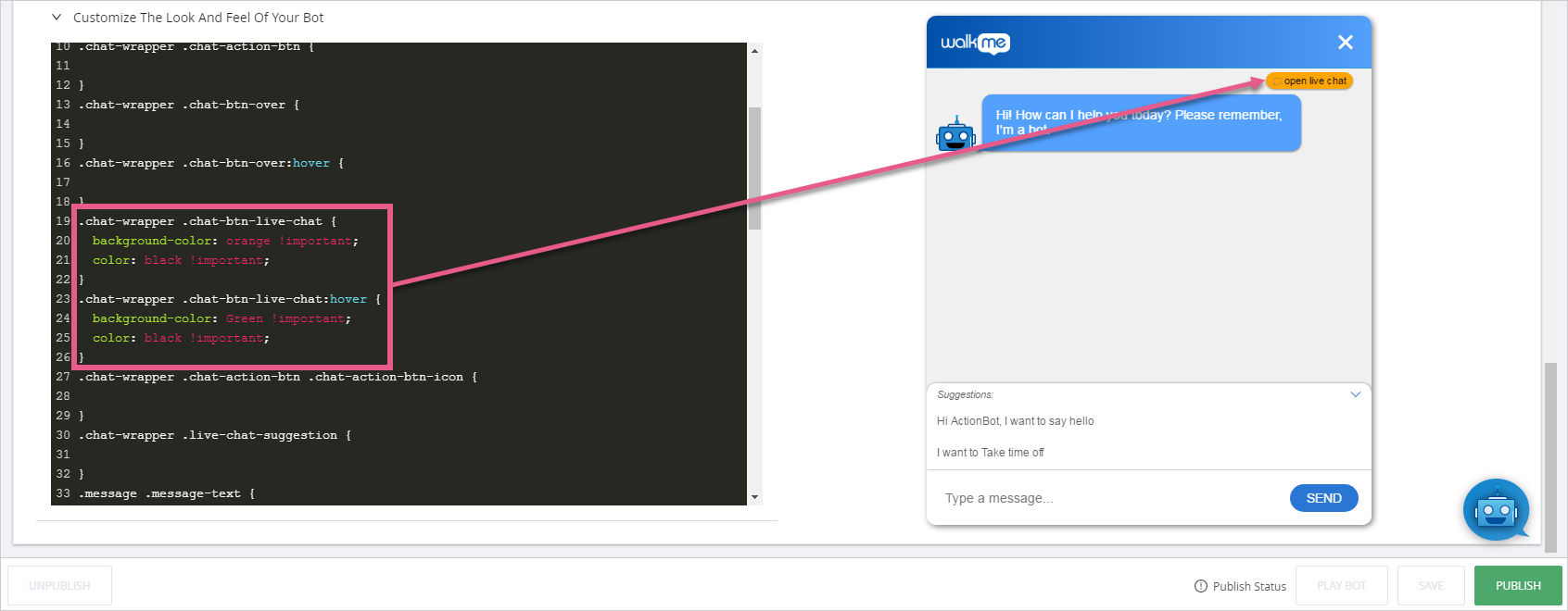
「ライブチャットを開く」アイコン色を変更する
CSSセレクター:
- .chat-wrapper .chat-btn-live-chat
- .chat-wrapper .chat-btn-live-chat:hover
CSS例:
.chat-wrapper .chat-btn-live-chat {

background-color:orange !important;
color:black !important;

}

.chat-wrapper .chat-btn-live-chat:hover {

background-color: green !important;
color:black !important;

}
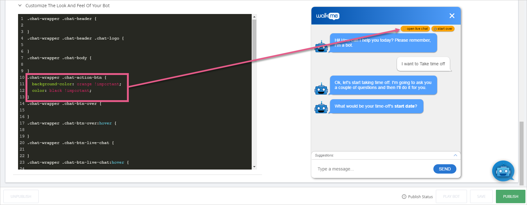
すべての上部アクションボタンの色を変更する
CSSセレクター:.chat-wrapper .chat-action-btn
CSS例:
.chat-wrapper .chat-action-btn {

background-color:orange!important;
color:black !important;

}
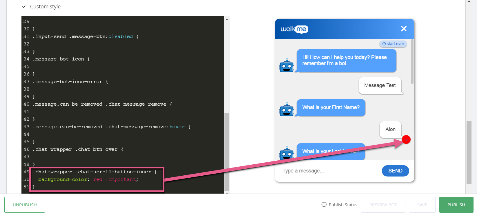
スクロールダウンボタンの色を変更する
CSSセレクター:.chat-wrapper .chat-scroll-button-inner
CSS例:
.chat-wrapper .chat-scroll-button-inner {

background-color: red !important;

}
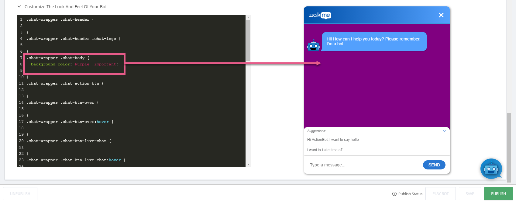
背景色の変更
CSSセレクター:.chat-wrapper .chat-body
CSS例:
.chat-wrapper .chat-body {

background-color:purple !important;

}
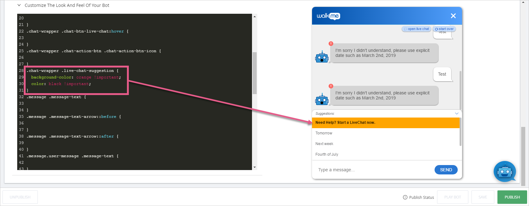
ライブチャットの提案色の変更
CSSセレクター:.chat-wrapper .live-chat-suggestion
CSS例:
.chat-wrapper .live-chat-suggestion {

background-color:orange !important
color:black !important
}
ユーザーメッセージの境界を変更する
CSSセレクター:.message.user-message .message-text
CSS例:
.message.user-message .message-text {

border:2px solid 黒色;
}
提案されたメッセージ境界線の変更
CSSセレクター:.chat-wrapper .suggestion-box-text
CSS例:
.chat-wrapper .suggestion-box-text {

border:2px solid blue;
}
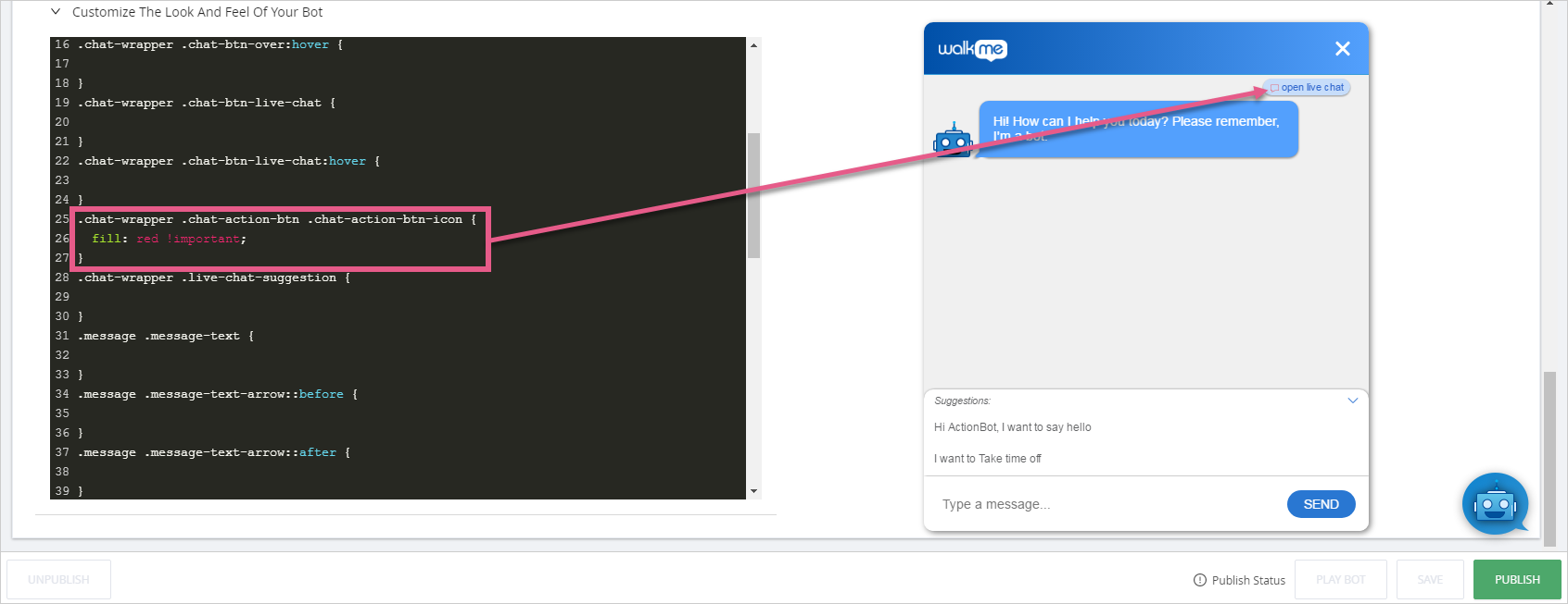
ライブチャットアイコン色の変更
CSSセレクター:.chat-wrapper .chat-action-btn .chat-action-btn-icon
CSS例:
.chat-wrapper .chat-action-btn .chat-action-btn-icon {

fill:red !important;
}
アクションボットを利用した自動化の位置を変更する
これは、エディタのメインCSSで行われます。
アクションボットの幅、高さ、画面位置を変更するのは、アクションボットエディタではなく、エディタのメインCSSで行われます。
コンテナの位置を変更するには、エディタのメインCSSに移動します。
- エディタ
に移動します
- [Customize(カスタマイズ)
 ]をクリックします。
- CSSタブに移動します
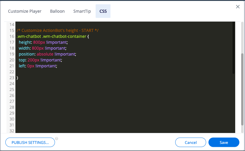
ボットのコンテナに関連するセレクターは以下の通りです:.wm-chatbot .wm-chatbot-container
画面上の位置と高さと幅のCSSを同じセレクター内で組み合わせることができます。 絶対的なポジショニングは、ウェブページの上部、右下部、左側の余白からボットボックスの位置を定義します。
CSS例:
.wm-chatbot .wm-chatbot-container {

height:800px !important;
width: 800px !important;
position: absolute !important;
top: 200px !important;
left: 0px !important;

}


