概要
カスケーディングスタイルシート(CSS)では、フォント、背景、境界線などのエレメントを含む高度なカスタマイズをクラシックシャウトアウトに適用することができます。
CSSを使用してシャウトアウトをカスタマイズできます。
- [Action(アクション)]ボタンと[Close(閉じる)]ボタン
- テキストヘッダーとリボン
- テキスト
- 「X」ボタン
新しいシャウトアウト用ビジュアルエディターをCSSなしで使用する方法の詳細については、「シャウトアウト:スタートガイド」を参照してください。
使用方法
カスケーディングスタイルシート(CSS)は、マークアップ言語で書かれたドキュメントの書式を記述するために使用されるスタイルシート言語です。 CSSを記述する際、クラシックシャウトアウトの各種コンポーネント(エレメントとも呼ばれる)を参照する必要があります。
Custom CSS(カスタムCSS)ウィンドウに入力する際、WalkMeはセレクター、プロパティ、値のオートコンプリートオプションを表示します。
バルーンコンポーネントを設定する
各シャウトアウトには、CSSでカスタマイズできるコンポーネント(エレメント)が多数含まれています。
例えば、次のクラスを使用して、シャウトアウトのタイトルセクションを対象にすることができます。
クラスのリスト全体を表示します。
グローバルCSSとローカルCSSの比較
CSSはグローバルまたはローカルで適用できます。 ローカルCSSコンソールを使用すると、個々のシャウトアウトを簡単にカスタマイズできます。
グローバルレベルで単一のシャウトアウトをカスタマイズする場合は、バルーンセクションを識別するクラスの前にシャウトアウトのIDを入力する必要があります。
ローカルCSSの例:
グローバルCSSの例:
- #wm-shoutout-XXXXX .wm-title
ローカルCSSの編集
ローカルCSSは他のすべてのデザインを上書きします。
- シャウトアウトのオプションメニューを開きます
- インタラクションタブに移動します
- CSSの編集
 をクリックします
- CSSコンソールにカスタムCSSを入力します。

- [Save(保存)]をクリックします。
グローバルCSSの編集
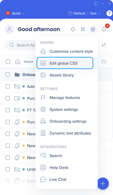
- WalkMeエディタ設定メニューで[Edit global CSS(グローバルCSSを編集)]をクリックします
- CSSエディターにカスタムCSSを入力する
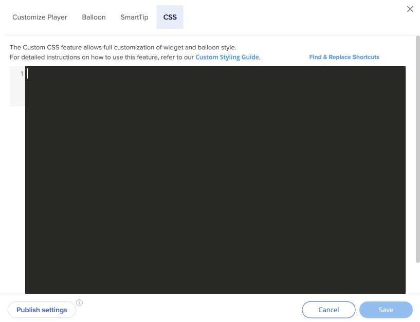
- [Save(保存)]をクリックします。
- 公開設定をクリックします
WalkMe IDの検索
- エディタでアイテムにカーソルを合わせます
- [Options Menu(オプションメニュー)]をクリックします
- [Copy ID(IDをコピー)]をクリックします

!importantの使用
デフォルトでは、WalkMeのテーマデザインは、他のデザインの変更を上書きします。
CSSを適用するには、CSSルールに「!important」を含めてデフォルトのスタイリングを上書きする必要があります。
例:
#wm-shoutout-XXXXX .wm-title {
color: #000 !important;
}
設定可能なコンポーネント
|
div |
編集可能な機能 |
| 1 |
.wm-outer-div |
このエレメントはシャウトアウトリボンです。 次を編集できます:
|
| 2 |
.wm-ribbon |
このエレメントはシャウトアウトリボンです。 次を編集できます:
- 表示
- background-color
- border-color
|
| 3 |
.wm-title |
このエレメントはシャウトアウトヘッダーです。 次を編集できます:
- text-align
- font-color
- font-size
- font-family
- padding
- margin
|
| 4 |
.wm-template-text |
このエレメントはシャウトアウトテキストです。 次を編集できます:
- text-align
- font-color
- font-size
- font-family
- padding
- margin
|
| 5 |
.wm-blue-btn |
このエレメントは「アクション」ボタンです。 次を編集できます:
- font-color
- font-size
- font-family
- 幅
- 高さ
- background
- border-radius border-bottom
- color
|
| 6 |
.wm-close-link |
このエレメントは[Close(閉じる)]ボタンです。 次を編集できます:
- font-color
- font-size
- font-family
- 幅
- 高さ
- background
- border-radius
|
| 7 |
.walkme-x-button |
このエレメントは「X」ボタンです。 次を編集できます:
- font-color
- font-size
- font-family
- margin
|
一般的なCSSのカスタマイズ
シャウトアウトバルーンの幅を変更する
.wm-shoutout-XXXX.wm-outer-div {
width: XXXpx !important;
}
センターシャウトアウトリボン
#wm-shoutout-XXXXX .wm-main-ribbon.wm-template-main-bg,
.wm-ribbon-edge.left.wm-template-main-bg, .wm-ribbon-edge.right.wm-template-main-bg {
background-color: #XXXXXX !important;
}
シャウトアウトリボンの左端
#wm-shoutout-XXXXX .wm-ribbon-triangle.left.top.wm-main-border-right-color, .wm-ribbon-ripple.left.wm-main-border-right-color {
border-color: transparent #XXXXXX transparent transparent !important;
}
#wm-shoutout-XXXXX .wm-main-border-bottom-color {
border-color: transparent transparent #XXXXXX !important;
}
シャウトアウトリボンの右端
#wm-shoutout-XXXXX .wm-ribbon-triangle.right.top.wm-main-border-top-color, .wm-ribbon-ripple.right.wm-main-border-top-color.wm-main-border-left-color {
border-color: #XXXXXX transparent transparent !important;
}
#wm-shoutout-XXXXX .wm-ribbon-triangle.right.bottom.wm-main-border-left-color {
border-color: transparent transparent transparent #XXXXXX !important;
}
台形テンプレート
#wm-shoutout-XXXXX .wm-trapezoid {
border-top: 40px solid #XXXXXX !important;
}
#wm-shoutout-XXXXX .wm-main-border-bottom-color {
border-color: transparent transparent #XXXXXX !important;
}
正方形テンプレート
#wm-shoutout-XXXXX .wm-icon-square {
border-color: #XXXXXX !important;
}