Brief Overview
Cascading Style Sheets (CSS) allows you to apply advanced customization to Classic ShoutOuts including elements such as the font, background, and border.
CSS can be used to customize ShoutOut:
- Action and Close buttons
- Text Header and Ribbon
- Text
- “X” button
To learn more about using the new Visual Editor for ShoutOuts without the need for CSS, read the ShoutOuts: Getting Started Guide.
How It Works
Cascading Style Sheets (CSS) is a style sheet language used for describing the formatting of a document written in a markup language. When writing CSS, you will need to refer to the different components (technically known as elements) of the Classic ShoutOut.
When typing into the Custom CSS window, WalkMe displays autocomplete options for selectors, properties, and values.
Configuring Balloon Components
Each ShoutOut includes a number of components (elements) that can be customized with CSS.
For example, you can target the title section of a ShoutOut by using this class:
See entire list of classes.
Global vs. local CSS
CSS can be applied globally or locally. Using the local CSS Console makes it easy to customize an individual ShoutOut.
If you are customizing a single ShoutOut on the global level, you must enter the ShoutOut ID before the class that identifies the balloon section.
Local CSS example:
Global CSS example:
- #wm-shoutout-XXXXX .wm-title
Edit local CSS
Local CSS overrides all other designs.
- Open the ShoutOut Options menu
- Go to the Interaction tab
- Click Edit CSS

- Enter the custom CSS in the CSS Console

- Click Save
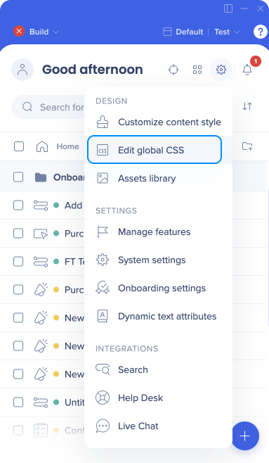
Edit global CSS
- Click Edit global CSS in the WalkMe Editor settings menu
- Enter the custom CSS in the CSS editor
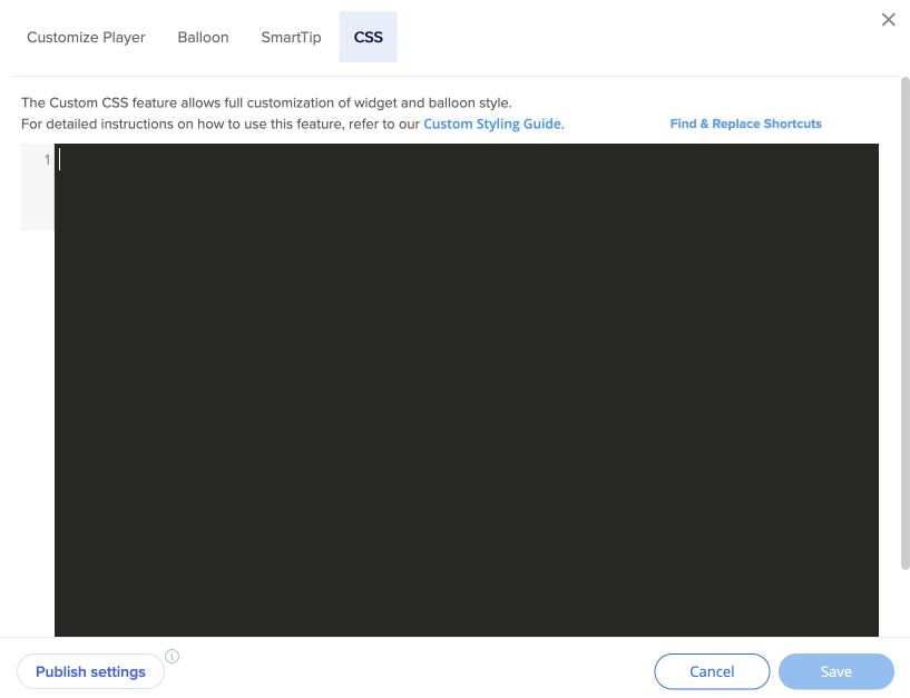
- Click Save
- Click Publish settings
Find WalkMe ID
- Hover over the item in the editor
- Click the Options menu
- Click Copy ID

Using !important
By default, the WalkMe theme design overrides any other design changes.
In order for CSS to be applied, the CSS rule must contain “!important” to ensure that it overrides the default styling.
For example:
#wm-shoutout-XXXXX .wm-title {
color: #000 !important;
}
Configurable Components
|
DIV |
Editable Features |
| 1 |
.wm-outer-div |
This element is the ShoutOut ribbon. You'll be able to edit:
|
| 2 |
.wm-ribbon |
This element is the ShoutOut ribbon. You'll be able to edit:
- display
- background-color
- border-color
|
| 3 |
.wm-title |
This element is the ShoutOut Header. You'll be able to edit:
- text-align
- font-color
- font-size
- font-family
- padding
- margin
|
| 4 |
.wm-template-text |
This element is the ShoutOut Text. You'll be able to edit:
- text-align
- font-color
- font-size
- font-family
- padding
- margin
|
| 5 |
.wm-blue-btn |
This element is the Action button. You'll be able to edit:
- font-color
- font-size
- font-family
- width
- height
- background
- border-radius border-bottom
- color
|
| 6 |
.wm-close-link |
This element is the Close button. You'll be able to edit:
- font-color
- font-size
- font-family
- width
- height
- background
- border-radius
|
| 7 |
.walkme-x-button |
This element is the "X" button. You'll be able to edit:
- font-color
- font-size
- font-family
- margin
|
Common CSS Customizations
Alter the width of a ShoutOut balloon
.wm-shoutout-XXXX.wm-outer-div {
width: XXXpx !important;
}
Center ShoutOut Ribbon
#wm-shoutout-XXXXX .wm-main-ribbon.wm-template-main-bg,
.wm-ribbon-edge.left.wm-template-main-bg, .wm-ribbon-edge.right.wm-template-main-bg {
background-color: #XXXXXX !important;
}
Left End of ShoutOut Ribbon
#wm-shoutout-XXXXX .wm-ribbon-triangle.left.top.wm-main-border-right-color, .wm-ribbon-ripple.left.wm-main-border-right-color {
border-color: transparent #XXXXXX transparent transparent !important;
}
#wm-shoutout-XXXXX .wm-main-border-bottom-color {
border-color: transparent transparent #XXXXXX !important;
}
Right End of ShoutOut Ribbon
#wm-shoutout-XXXXX .wm-ribbon-triangle.right.top.wm-main-border-top-color, .wm-ribbon-ripple.right.wm-main-border-top-color.wm-main-border-left-color {
border-color: #XXXXXX transparent transparent !important;
}
#wm-shoutout-XXXXX .wm-ribbon-triangle.right.bottom.wm-main-border-left-color {
border-color: transparent transparent transparent #XXXXXX !important;
}
Trapezoid Template
#wm-shoutout-XXXXX .wm-trapezoid {
border-top: 40px solid #XXXXXX !important;
}
#wm-shoutout-XXXXX .wm-main-border-bottom-color {
border-color: transparent transparent #XXXXXX !important;
}
Square Template
#wm-shoutout-XXXXX .wm-icon-square {
border-color: #XXXXXX !important;
}