Brief Overview
Cascading Style Sheets (CSS) allows you to apply advanced customization to surveys, including elements such as the font, background, and border.
CSS can be used to customize WalkMe Surveys and NPS Surveys:
- Action and close buttons
- Text for title
- Text
- “X” button
Surveys
How It Works
Cascading Style Sheets (CSS) is a style sheet language used for describing the formatting of a document written in a markup language. When writing CSS, you will need to refer to the different components (technically known as elements) of the survey. When typing into the Custom CSS window, WalkMe displays autocomplete options for selectors, properties, and values.
CSS
Configuring balloon components
Each survey includes a number of components, or elements, that can be customized with CSS.
For example, you can target the title section of a survey by using this class:
See the entire list of classes.
Global rules
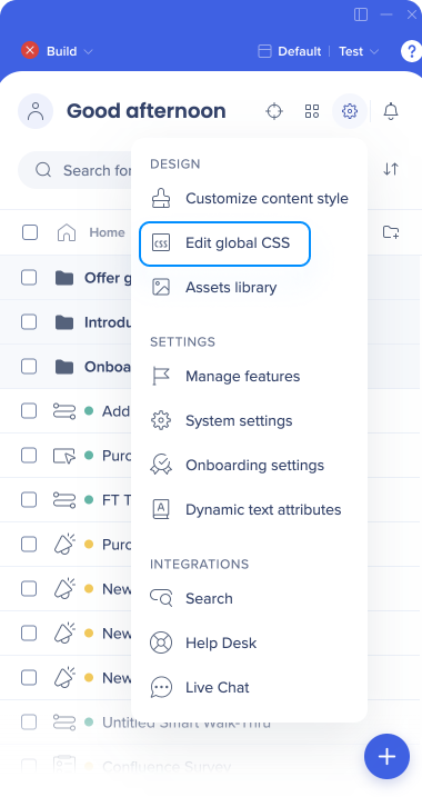
Global CSS can be accessed from the editor.
- Open the Settings menu in the editor
- Click Edit global CSS
Survey ID
- Hover over the survey in the editor
- Click the Options menu
- Click Copy ID

Tip
Replace the XXXXX in the CSS on this page with the Survey ID or desired change(color, font, etc.)
Using !important
By default, the WalkMe theme design overrides any other design changes to a balloon or app.
In order for CSS to be applied, the CSS rule must contain “!important” to ensure that it overrides the default styling.
For example:
#walkme-survey-balloon-37897 .walkme-survey-title {
color: #000 !important;
}
Configurable Survey Components
| DIV |
Editable Features |
| #walkme-survey-balloon-XXXXX |
The main survey components, including:
- Display
- Background
- Positioning on the screen
- Z-index
- Width
- Height
|
| .walkme-survey-title |
Survey title, including the following:
- Text alignment
- Font color
- Font size
- Font family
- Padding
- Margin
|
| .walkme-survey-question-title |
Survey question(s), including:
- Text alignment
- Font color
- Font size
- Font family
- Padding
- Margin
|
| #walkme-survey-answer-text-XXXXXX |
Survey answers, including:
- Text alignment
- Font color
- Font size
- Font family
- Padding
- Margin
|
| #walkme-survey-answer-radiobutton-XXXXX |
Survey answer radio buttons, including:
- Positioning
- Width
- Height
- Background
- Border radius
- Border bottom
- Color
|
| .walkme-click-and-hover.walkme-custom-balloon-close-button.walkme-action-close.walkme-inspect-ignore |
Survey "Close" button, including:
- Font color
- Font size
- Font family
- Width
- Height
- Background
- Border radius
|
| .walkme-custom-balloon-content-wrapper |
General survey content and text, including:
- Font color
- Font size
- Font family
- Background color
|
Configurable NPS Survey Components
| DIV |
Editable Features |
| .walkme-survey-question-nps-answers |
All NPS survey answers (typically from 0-10), including:
- Display
- Background
- Positioning
|
| .walkme-survey-nps-answer selected .walkme-survey-answer-label-nps-radiobutton |
The selected NPS answer, including:
- Background color
- Border color
|
- .walkme-survey-low-score-div span
- walkme-survey-high-score-div span
|
High and low score labels, including:
- Text alignment
- Font color
- Font size
- Font family
- Padding
- Margin
|
| .walkme-custom-side-border |
Survey side border, including:
|
Common Survey CSS Customizations
Change the font size of survey title
#walkme-survey-id-XXXXXX .walkme-survey-title {
font-size: XXpx !important;
}
#walkme-survey-balloon-XXXXX .walkme-custom-side-border{
background-color: #XXXXXX !important;
}
#walkme-survey-balloon-XXXXX .walkme-custom-balloon-submit-button{
background-color: #XXXXXX !important;
}
Change or fix the margin of NPS choices (1-10)
#walkme-survey-question-nps-answers-XXXX .walkme-survey-nps-answer {
margin: XXpx !important;
}
Change the font style of survey questions
#walkme-survey-balloon-XXXXX .walkme-custom-balloon-content {
font-family: (font here) !important;
}
Change the color of NPS survey answers
.walkme-survey-question-nps-answers.selected .walkme-survey-nps-answer.selected label {
background: XXX !important;
border-color: XXX !important;
}
Change the color of NPS survey answers when hovering
.walkme-survey-answer-label-nps-radiobutton.walkme-survey-answer-label-nps-radiobutton-unchecked:hover {
background: XXX !important;
border-color: XXX !important;
}
Change the width of survey question
#walkme-survey-balloon-XXXXXX {
width: 650px !important;
height: auto !important;
}
Change the width of NPS survey question
#walkme-survey-balloon-XXXXXX .walkme-custom-balloon-mid-div {
width: 650px !important;
position: fixed !important;
top: 50% !important;
left: 50% !important;
transform: translate(-50%,-50%) !important;
}
Change the color of the asterisk next to mandatory questions
.walkme-survey-balloon .walkme-survey-question-mandatory {
color: #ff0000 !important;
}
Changing survey button text
You can change the text of survey buttons in the Multi Language page in the Console.
- Go to Console → Multi Language → Translations → WalkMe General → General WalkMe Text → Submit Button Text
