Brief Overview
The Settings page is where you manage the global configuration for your WalkMe Learning Arc environment. It's organized into tabs, each controlling a different area of your setup — from the look and feel of your learning portal to how notifications, simulations, and integrations behave.
The Settings page is divided into the following tabs:
- General
- Portal Branding
- Simulations
- User Notifications
- Export Settings
Access
Access Learning Arc in the console:
- Open the WalkMe Console
- Go to the Content category
- Select Learning Arc
- Select the Settings page
WalkMe Learning Arc free trial
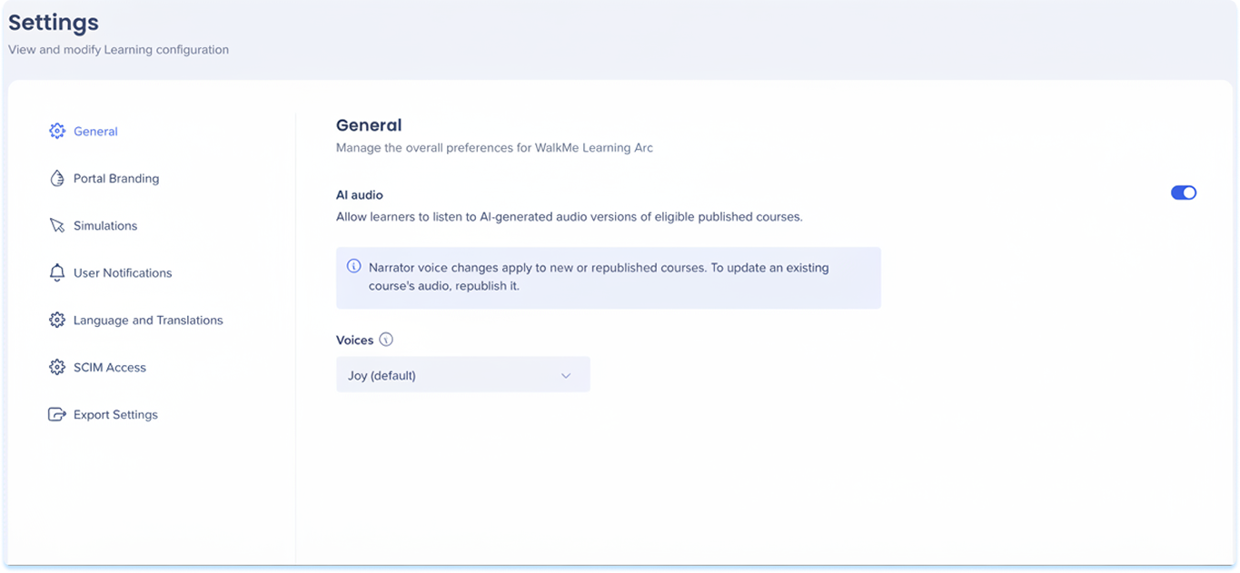
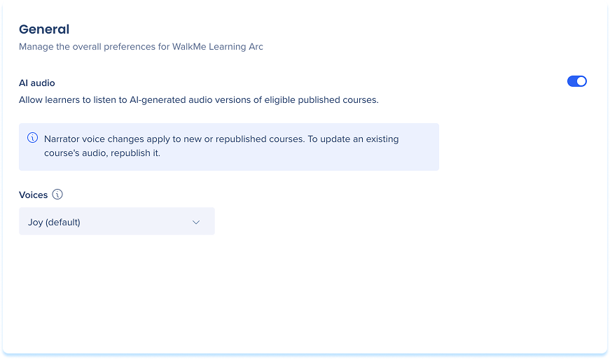
General Tab
Manage organization-wide preferences.
General Settings
Portal Branding Tab
Customize the look and feel of your learning portal, including colors, typography, and your company logo.
Portal Branding
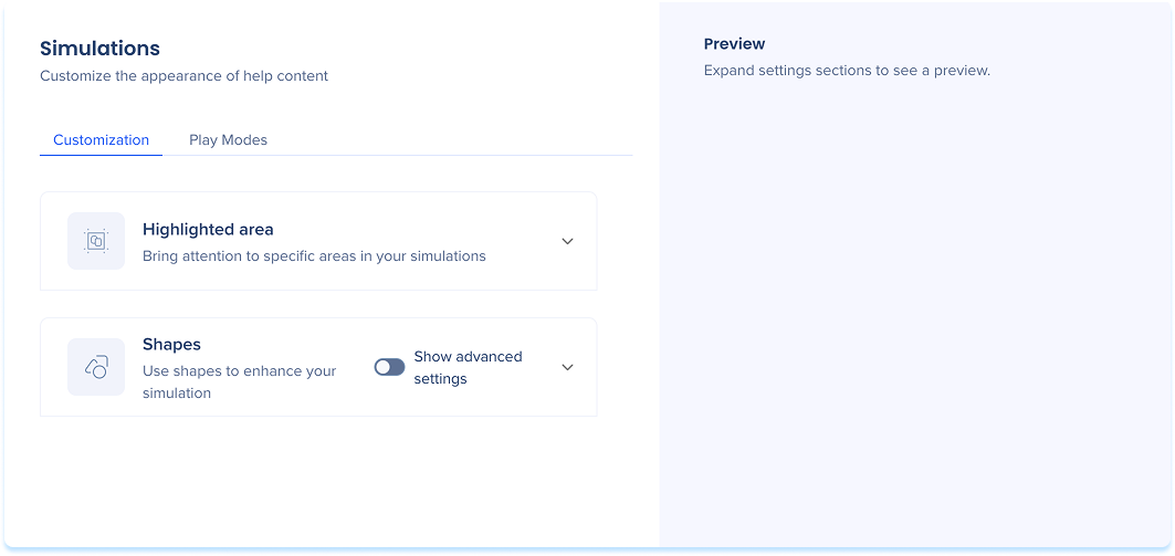
Simulations Tab
Set the default visual style and playback behavior for simulations across your organization.
Simulations Settings
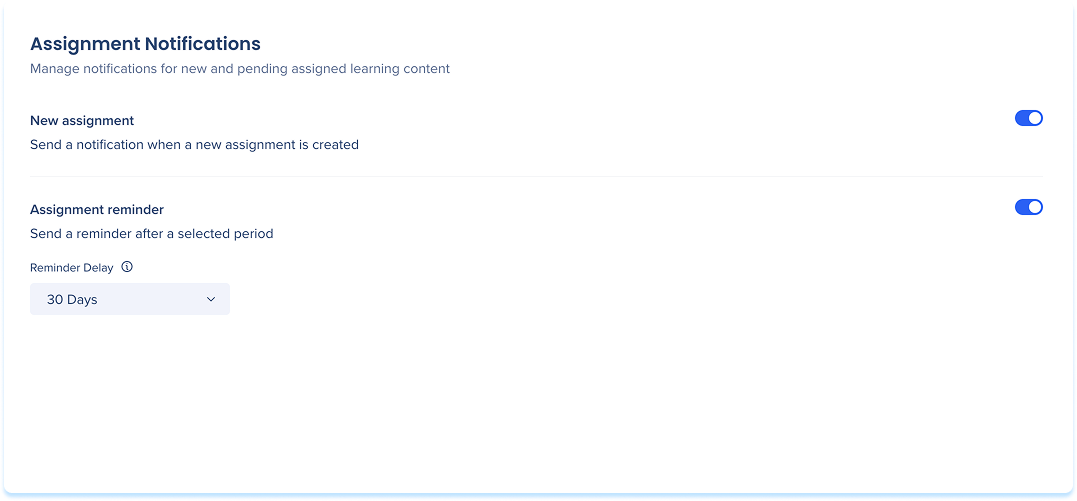
User Notifications Tab
Manage system-triggered email notifications sent to learners for assignments, course completions, and certifications.
User Notifications
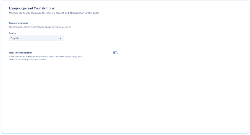
Language and Translations Tab
Language and Translations lets you manage the source language for your learning content and control whether learners can translate content in real time using AI.
Language and Translations
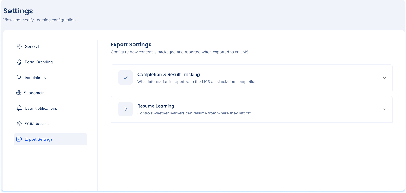
Export Settings Tab
Configure how simulation and learning content is packaged and reported when exported to an LMS.
Export Settings