Brief Overview
Card setup is where you decide what appears on a highlight card and how it looks. Each card is built from fields that pull live data from your connected data source, so the card updates automatically for every user and every record it appears on.
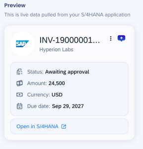
Card setup has three tabs: Card header, Card body, and Card links. A live preview on the right shows how the card will look as you build it.
Don't have a data source connected yet?
You'll need to connect to a data source first to edit card entities. Learn how
Access
Open Card setup from the Smart Highlights app:
-
Open the WalkMe Console
-
Select the Content category
-
Select the Smart Highlights page
-
Hover over an entity, select the Options icon
-
Select Edit

How It Works
Card setup uses live data from your connected data source, so you can see exactly how each card will look as you build it. You build the card across three tabs — Card header, Card body, and Card links — and a preview on the right updates in real time using real data from your source.
Because the preview shows live data, you'll need an active session with your data source. If you aren't logged in yet, a login screen appears first.
Loggin in
The first time you open card setup, you may see a Customize your card screen asking you to log in.
This appears because card setup shows live data from your connected data source, and loading that data needs an active session. Your data source is already connected, logging in just gives the console a session to pull your data for the preview.
Select Log in and complete the sign-in for your data source. Once you're logged in, the card setup tabs load and you can start building.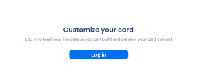
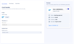
The card header is the top of the card — its image, title, and subtitle.

Image
Upload an image to show at the top of the card, such as a the data source application's logo. The image appears in a circle next to the title.
Title field
The title field is set for you and can't be edited. It defines the entity type — for example, an invoice entity uses the invoice ID as its title — so changing it would change what the card detects.
The title shows this field's live value from your data source, so it updates for every record the card appears on.
Subtitle field
Choose which field fills the subtitle. It shows that field's live value from your data source, so the subtitle reflects the latest record.
Card body
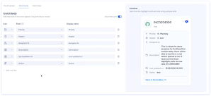
The card body holds the fields shown below the header.
Add fields, set how each one appears, and drag and drop to reorder them. For each field, set three things:
-
Icon: Select an icon to show next to the field
-
Field: Select the data shown on the card, drawn from your data source
-
Display name: Enter the label shown on the card
You can add up to 6 fields.
Note
Field options come from your connected data source. The fields available depend on the entity and the source it's connected to.
Card links
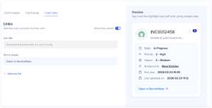
Card links are buttons users can open from the card, such as Open in S/4HANA.
For each link, set:
Select Add link to add additional links.
Preview
The preview on the right shows the card as users will see it, using live data from your connected data source.
Technical Notes
-
Up to 6 fields can be added to the card body
-
The title field is set by the entity and can't be edited
-
Building requires an active session with your data source; live data and preview won't load until you log in