SmartTips provide on-screen guidance that can be used to give users additional information about specific items on your page. SmartTips are especially useful when addressing processes or forms on your site where users often make mistakes.
SmartTips come in two types: SmartTip and AI SmartTip. AI SmartTip is now the default type in the capture popover and is available for all eligible customers. Unlike standard SmartTips, AI SmartTips evaluate user input in real time and generate suggestions based on a validation rule you define, making them well-suited for text fields.
Follow this guide to create SmartTip sets and SmartTips. For AI SmartTips, learn how to set up here.
🎓 Digital Adoption Institute
How It Works
Create a SmartTips Set
- From the Editor, click the + icon
- Select SmartTips Set
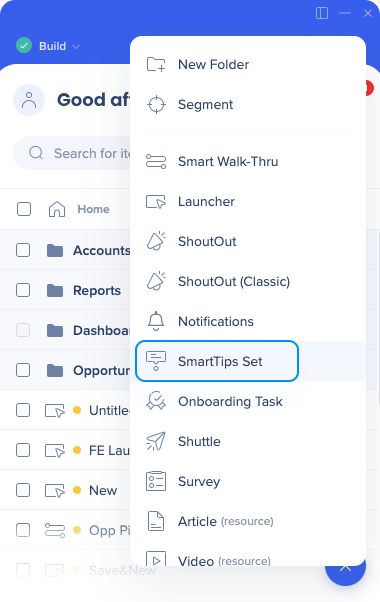
- Name the SmartTips set
This will not be visible to your users, so choose a name that will be meaningful for you
- Choose where to display the SmartTip Set. You have two options:
-
Display Set only on a specific page | Recommended
-
Why use this method:
-
Optimize performance by checking for a specific rule for the Set to display
-
Most SmartTips Sets display only on one specific page
-
Display Set on multiple pages
-
Why use this method: Your SmartTips appear on every page (in the header, footer, navigation pane, etc.)
-
If you select Display Set only on a specific page, click "Create rule to identify page"
-
Define the conditions to determine when this SmartTips Set appears
-
This is commonly based on the URL of the page, though your platform may require different rules. Follow the Rule Engine guide for more information
-
Click Done
- Apply segments if needed in the Segmentation tab to make the SmartTip set appear to your target audience only
-
Use the Notes tab to communicate with colleagues and document important info about your item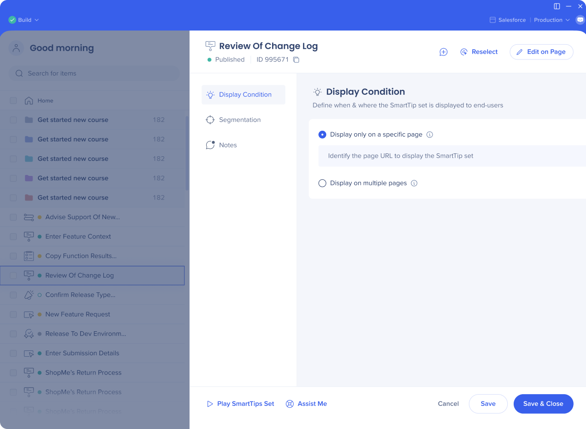
Create SmartTips
Now that you have created a SmartTips Set, you will create an individual SmartTip.
- Click the + plus icon in the SmartTips set to add a new SmartTip
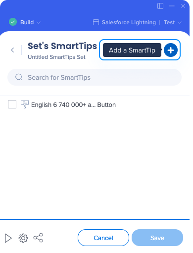
- Select the element that you want to attach the SmartTip to
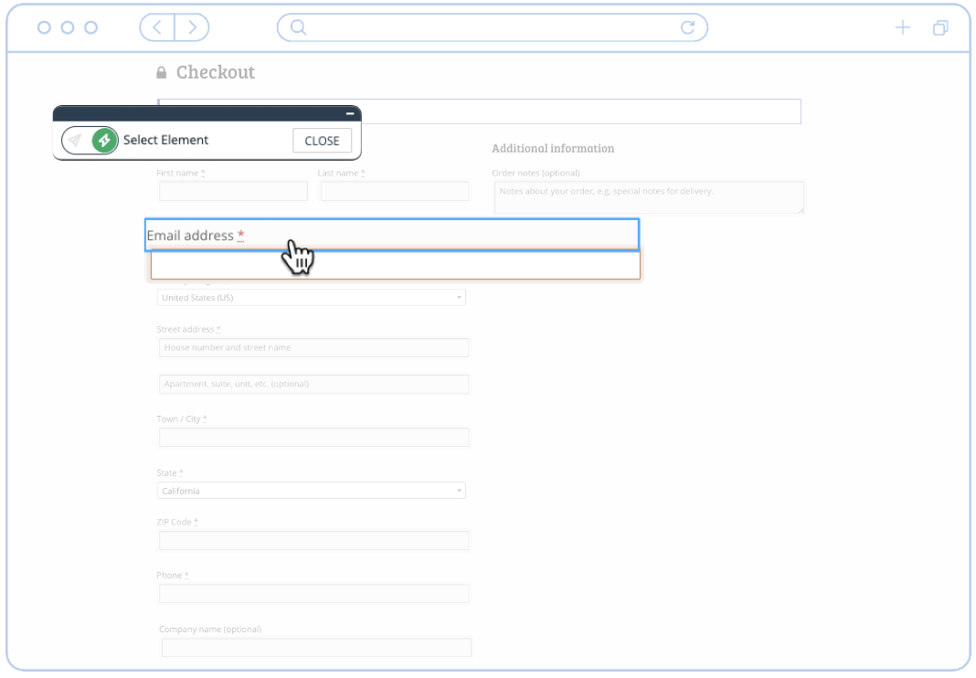
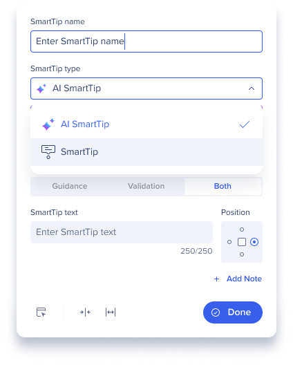
- Use the mini-editor popup to define the SmartTip's initial settings:
-
Edit the SmartTip name
-
WalkMe may auto-fill the title if you selected a text element
-
This is the display name and is not visible to end-users
-
Select SmartTip as the SmartTip type
-
AI SmartTip is the default selection when capturing input fields. If you want to use the AI SmartTip, go the the AI SmartTip article
-
Select the type of SmartTip: Guidance, Validation, or Both
- Guidance SmartTips give users additional information about specific elements on a page
- This is the most commonly used SmartTip type.
- Validation SmartTips can be used in text fields to ensure that users fill out their forms correctly
-
Click Done
Note
-
For new sessions, when you capture an input field, the capture popover defaults to an AI SmartTip with the Both tab selected
-
Within the same session, the last-used SmartTip type and tab are pre-selected
-
Guidance and Validation tabs are still available, but clicking them will switch the AI SmartTip into a regular SmartTip type
Customize SmartTips
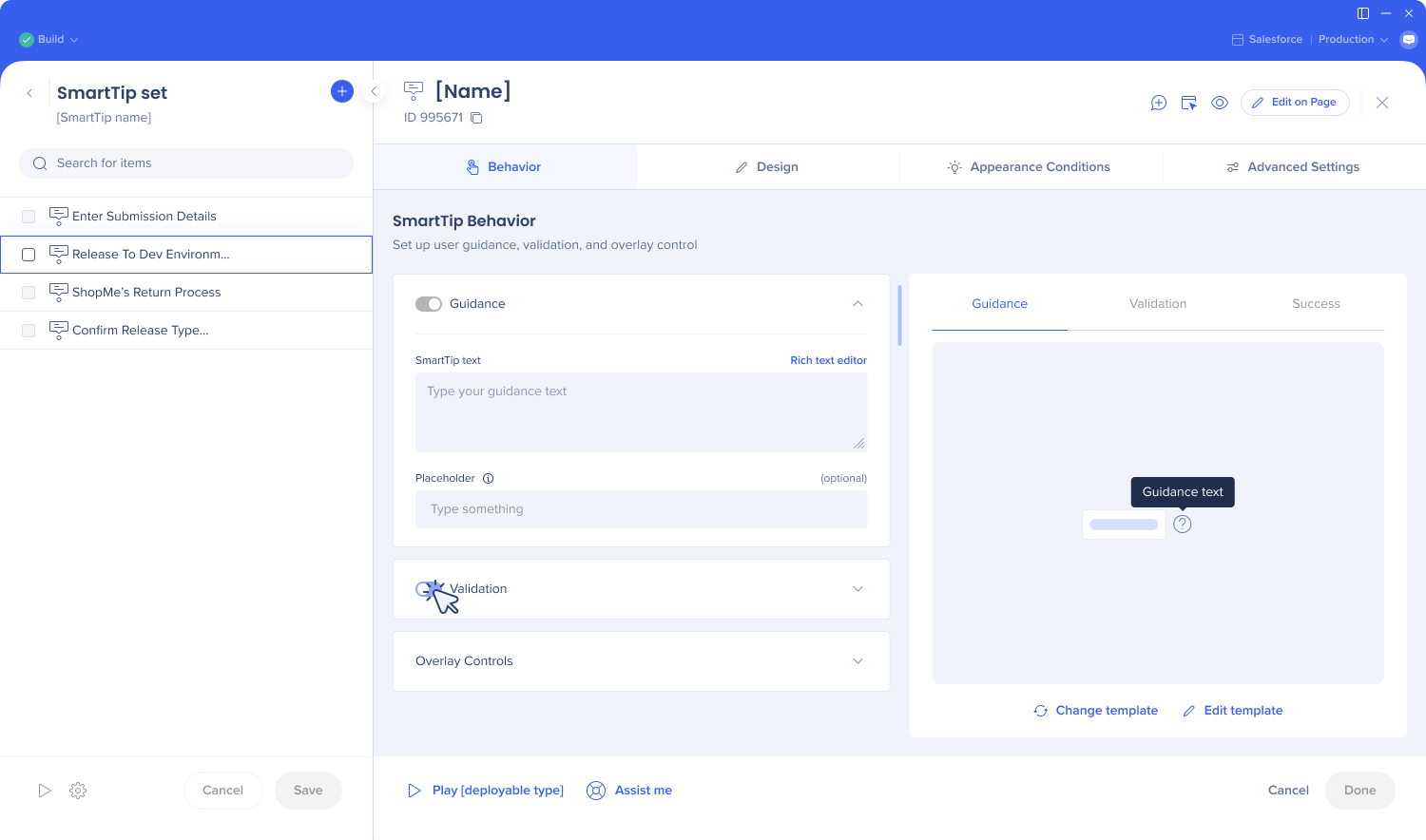
Open the SmartTips Set you want to edit, then click a SmartTip's title to open its settings.
Behavior tab
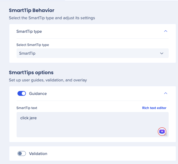
Use the Select SmartTip type dropdown to choose whether the item is a standard SmartTip or an AI SmartTip.
Under SmartTips options, use the toggles to enable the pieces you need:
- Guidance – turn this on to show an informational message. Enter the message in the SmartTip text field, or click Rich text editor for formatting options and to insert images from the Assets Library (TIFF, SVG, PNG, JPG, JPEG, and GIF are supported).
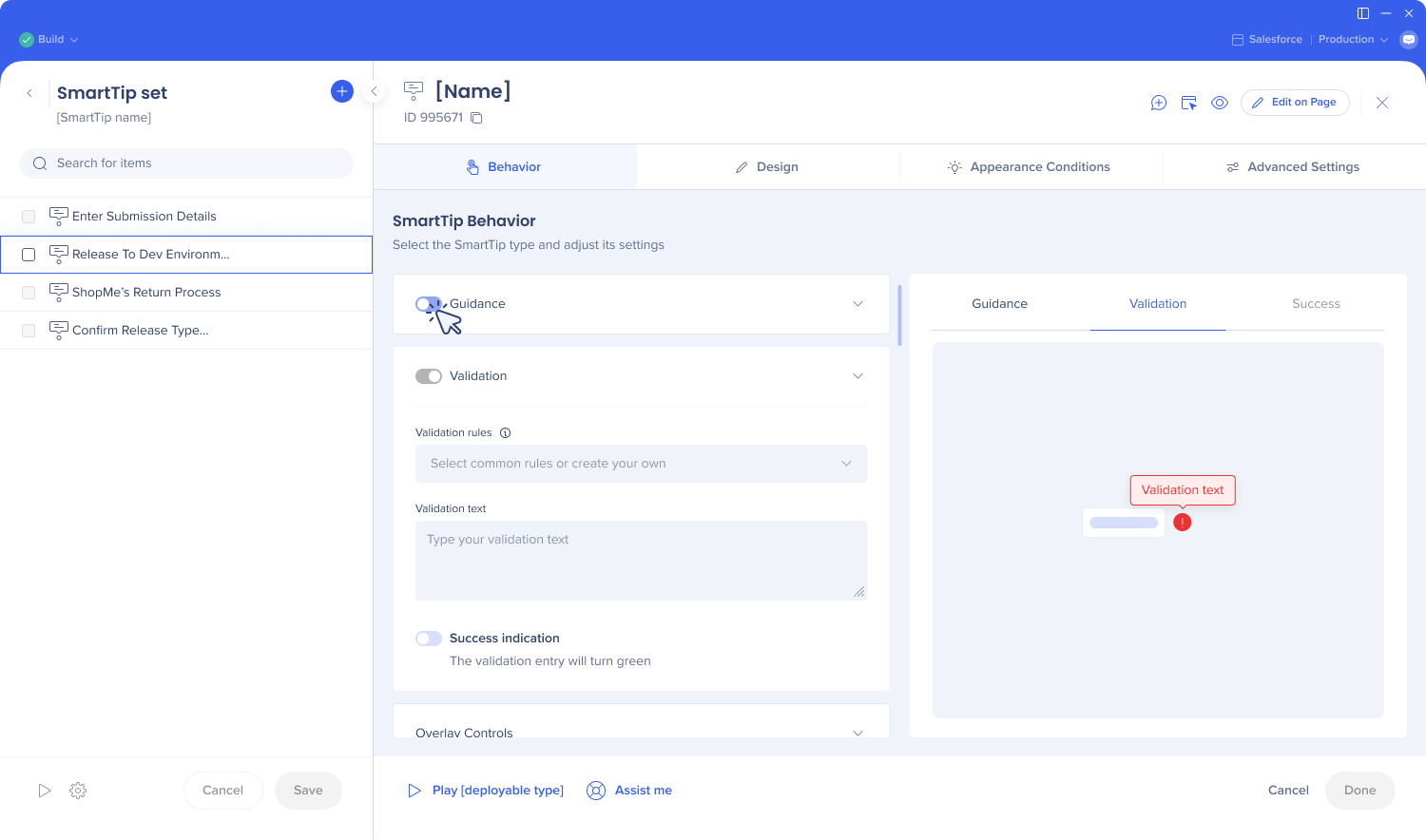
- Validation – turn this on to check user input against a rule and display an error (and optionally a success message) on a text field. See the Validation SmartTips guide for setup details.
Under Overlay Controls, adjust how and where the SmartTip appears:
- Icon position – use the 3x3 grid to choose where the icon sits relative to the captured element
- Tooltip position relative to the icon – choose Auto to let WalkMe position the tooltip automatically, or Manual to set its placement yourself
- Offset position – fine-tune placement with From left and From top values, entered in pixels
- Lock to element – anchors the SmartTip to its element during scrolling and helps prevent layering issues
- Arrange layers (z-index) – adjusts visibility when the SmartTip is hidden behind or overlapping other page elements; use Edit on Page to fine-tune
Design tab
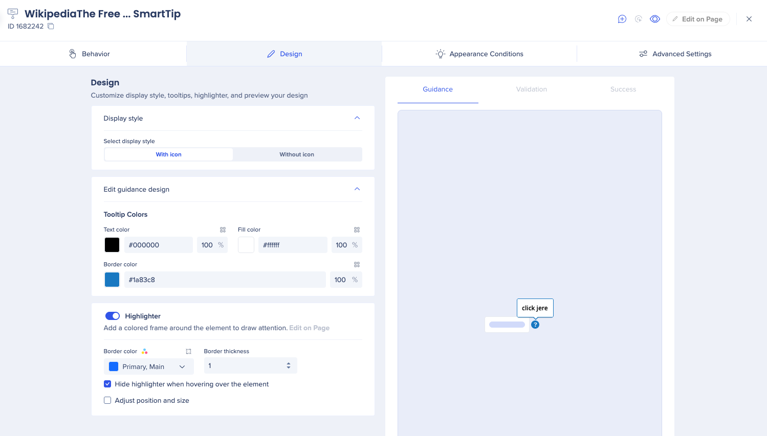
Under Display style, choose whether the SmartTip appears With icon or Without icon.
Under Edit guidance design:
- Tooltip Colors – set the Text color, Fill color, and Border color for the tooltip, each with its own opacity percentage.
- Highlighter – toggle on to add a colored frame around the element to draw attention to it (click Edit on Page to adjust it directly). Set the Border color and Border thickness, and optionally check Hide highlighter when hovering over the element or Adjust position and size for finer control.
Guidance SmartTips
Guidance SmartTips present users with additional information on the content and the format of the data that should be entered in the input field.
Guidance SmartTips can be displayed in an icon and the messages appear when you hover over the icon or click on the element or in placeholder text, which is always visible until the user types in the field with the placeholder.
How to display the SmartTip?
- With icon. Select icon position: When this option is selected, the guidance icon will appear next to the element and the message displays when the user hovers over it
- Without icon: When this option is selected, the message will appear when the user hovers over the element
- Placeholder text only: When this option is selected, no icon will display, only the placeholder text
Placeholder text
Placeholder text, located inside a text field, is an additional hint, description, or example of the information required for a particular field. It disappears when a user starts typing in the field.
You can have both a placeholder and a message on hover.
The placeholder text option is only available for Guidance SmartTips. It's not available if Validation or Both is selected.
The captured element must be an input field for placeholder text to be supported. Placeholder text can also be used if the element is defined with jQuery.
Note
SmartTip placeholder text will replace any existing placeholders.
Validation SmartTips
Validation SmartTips allow you to check your users' input on a text field to ensure that the information given meets the requirements of the field. The Validation SmartTip will highlight the field in red and display an error if the information given is invalid. Validation SmartTips must be placed on a text field.
- To create a validation SmartTip, you can add a SmartTip to an existing SmartTips Set or you can create a new SmartTips Set.
Note: You can add Validation to an existing Guidance SmartTip by clicking the Add Validation button in the Interaction tab of the SmartTip options.
- In the appropriate SmartTips Set, click the orange plus sign.
- Click the Validation radio button to make this SmartTip a Validation SmartTip:
- Choose when to display the validation message, then click Done. This will open the SmartTip Options page in the Editor.
- Choose from the available options for validation rules (if none of these are applicable, you can Define valid entries using the Rule Engine):
- Mandatory field
- Numeric field validation
- Date format validation
- Time format validation
- US Phone number format validation
- Email address format validation
- Web address format validation
- Enter the Error message that you want to display when the text entered is invalid.
- Optionally, you can check the box for Success indication, which will highlight the text field green once the text entered is valid. You can also include a success message to be displayed once the information entered is correct.
Technical Note
Disable AI SmartTips
If you prefer not to use AI SmartTips, you can select SmartTip from the SmartTip type dropdown at any time during capture. To disable the feature entirely, contact your CSM or WalkMe Support.
SAP users
SAP users will have to enabled AI on their account and sign the WalkMe AI terms and conditions.