Welcome to the
WalkMe Help Center
Please log in to continue

Please log in to continue

Using Cascading Style Sheets (CSS) allows you to customize Smart Walk-Thru elements, including the layout, colors, and fonts.
When writing CSS, references to various components or elements of the Smart Walk-Thru are essential. This article provides an overview of the CSS options available for personalizing these advanced elements.
To customize Smart Walk-Thrus using the default options, view the Smart Walk-Thru: Getting Started Guide.
Each Smart Walk-Thru includes a number of components (elements) that can be customized with CSS. Smart Walk-Thrus can be customized both locally and globally.
If you are customizing a single Smart Walk-Thru on the global level, you must enter the Smart Walk-Thru ID before the class that identifies the balloon.
Local level example:
Global level example:
The Smart Walk-Thru ID can be found in the WalkMe Editor:


See below for a full list of classes.
By default, the WalkMe theme design overrides any other design changes.
In order for CSS to be applied, the CSS rule must contain “!important” to ensure that it overrides the default styling.
Example:
#walkme-balloon-1760356.walkme-custom-balloon-title {
color: #000 !important;
}


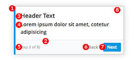
| DIV | Editable Features | |
|---|---|---|
| 1 | .walkme-custom-side-border | Left side balloon border:
|
| 2 | .walkme-custom-balloon-separator | Balloon separator (bottom third):
|
| 3 | .walkme-custom-balloon-title | Balloon header:
|
| 4 | .walkme-custom-balloon-content | Balloon text:
|
| 5 | .walkme-custom-balloon-subtext | Step number:
|
| 6 | .walkme-custom-balloon-back-button | Back button:
|
| 7 | .walkme-custom-balloon-next-button | Next button:
|
.walkme-custom-balloon-close-button {
display:none !important;
}
.walkme-custom-side-border {
display: none !important;
}
.walkme-custom-side-border {
background-color: red !important;
}
#walkme-balloon-XXXXXXX .walkme-custom-balloon-content-wrapper {
background-color: green !important;
}
#walkme-balloon-xxxxxxx {
width: 300px !important;
min-width: 0 !important;
padding: 10px !important;
}
.walkme-custom-balloon-arrow.walkme-custom-flow-balloon-xxxxxxx{
display: none !important;
}
.walkme-custom-balloon-subtext {
display: none !important;
}
.div.walkme-custom-walkthru-xxxxx.walkme-custom-simple-step {
z-index:0 !important;
}
.div.walkme-custom-walkthru-xxxxx.walkme-custom-balloon-arrow {
z-index:0 !important;
}
.walkme-custom-balloon-title, .walkme-custom-balloon-content {
font-size: 12px !important;
}
.walkme-custom-balloon-bottom-div:has(.walkme-custom-balloon-no-buttons-div) {
display: none !important;
}
.walkme-custom-balloon-inner-div:has(.walkme-custom-balloon-no-buttons-div) {
padding-bottom: 20px !important;
}