Brief Overview
Desktop Menu will soon support the following Accessibility Guidelines -
WCAG Version 2.1 level A and AA
Desktop menu currently supports all of the WCAG 2.1 AA standards. An official confirmation will follow soon after the WalkMe accessibility audit by an external company.
What is Accessibility
Accessibility is the design of products, devices, services, or environments for people who experience disabilities. Web accessibility is an inclusive practice of removing barriers that prevent people with disabilities from accessing websites and interacting with them.
While accessibility compliance is ultimately determined by the end user experience, there are four main principles that all guidelines and standards encompass:
- Perceivable: Users must be able to perceive the information being presented
- Operable: Users must be able to operate the interface
- Understandable: Users must be able to understand the information and the operation of the interface
- Robust: Users must be able to access the content as technologies advance
There are many standards of accessibility that define the guidelines to provide service to people with disabilities.
Keyboard Shortcuts
| Interaction |
Windows |
macOS |
| Pop or minimize the desktop menu |
Ctrl + Shift + E |
⇧ ⌘ E |
| Search |
Ctrl + F |
⌘ F |
| Scroll up and down on the screen |
Page up and Page down |
Page up and Page down |
| Take action or "click" on selected element |
Enter |
Return |
| Copy URL |
Ctrl + C |
⌘ C |
| Widgets \ Inner tabs when focus on a widget |
Tab and Shift+Tab |
Tab and ⇧ Tab |
| Move to widget's records |
Enter |
Return |
| Move between elements / widgets / records (depends on the focus) |
Arrows up and down |
Arrows up and down |
| Focus one step backwords (records -> cards -> home) |
Esc |
Esc |
| Move between navbar tabs |
Ctrl + 1-6 |
⌘ 1-6 |
| Start your next meeting |
Shift + Enter |
⇧ ⌘ |
Higher Contrast
The new contrast ratio as following the WCAG2.1 - Web Content Accessibility Guidelines is of 4.5.
Aria-Label
Aria-label provides a label for objects that can be read by assistive technology. The aria-label attribute provides the text label for an object, such as a button. When a screen reader encounters the object, the aria-label text is read so that the user will know what it is.
All of the desktop menu forms support “legend” & “label” html tags and “aria-label” & “role” attributes where relevant.
Focus Indicator
If a user will clicks on the Tab key, it allows to navigate through interactive elements in the product - search, widgets, records. When an item is tabbed to, it has keyboard "focus" and can be activated or manipulated with the keyboard. There's a visual indicator of the element that currently has keyboard focus. The focus indicator is a border or highlight (called an outline) around the focused element.
Items that should not receive keyboard focus are those which will already accessible to keyboard users. That means that the following elements are excluded of the focus lifecycle - left navbar menu, feedback button. The exception here is the search bar - which has a dedicated shortcut (Ctrl+F) but will still be in the focus lifecycle.
- Widgets on empty state (that no actions can be done) - skipped of the focus lifecycle.
- Scroll down to locate element in the middle of the screen - when reaching a half-displayed element.
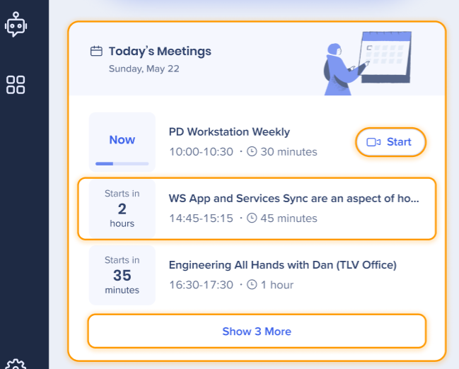
Start your next meeting
Shift + Enter would open the next meeting's conference call (same functionality as clicking on the Start button).
This works according to the following logic -
- If two or more meetings start at the same time
- Prefer the meeting that has a conference all (Zoom, Microsoft Teams, etc.) over the ones that do not have
- If both have conference calls → prefer the meeting that was accepted by the user over those who were not accepted (rejected meeting won't even be in the widget)
- If both have conference calls and were accepted → the meeting that appears on top of the widget is preferred
- If a meeting starts back2back (one meeting straight after the other), and the time is 1 minute prior to the next meeting (or less) -
Shift + Enter directs to the upcoming meeting. For example, a meeting starts at 3:00 PM and user clicks Shift + Enter on 2:59 PM - it will take user to the meeting that starts at 3:00 PM
Search Flow
There's a separate flow for the search that does not have the focus indicator flow.
Trigger for the flow is conducting a search. After the search, using arrows up and down would browse between the search results using the hover affect (without the focus indicator). Clicking Enter will access the result.


