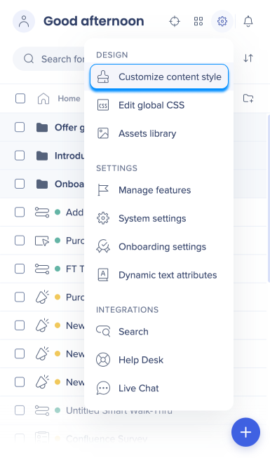
Brief Overview
Theming brings your design settings from the Console into the WalkMe Editor and WalkMe Apps. You can view and adjust how the theme applies to each item, detach individual elements when needed, and design WalkMe Apps like Surveys and the Action Bar directly from the Theming app.
Theming: Getting Started Guide
How It Works
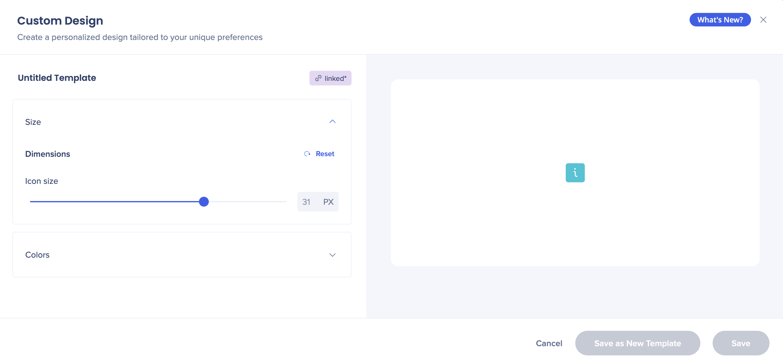
Theming in the WalkMe Editor
Note
Theming is only supported in the Pro menu.
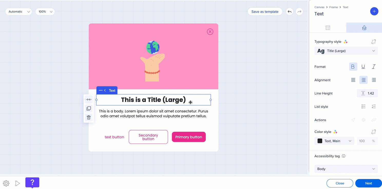
Theming is applied to all of your editor content. Go to Customize content style to see how it affects your balloons and SmartTips.
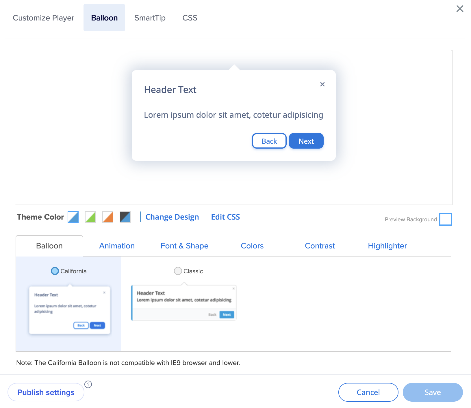
Balloons
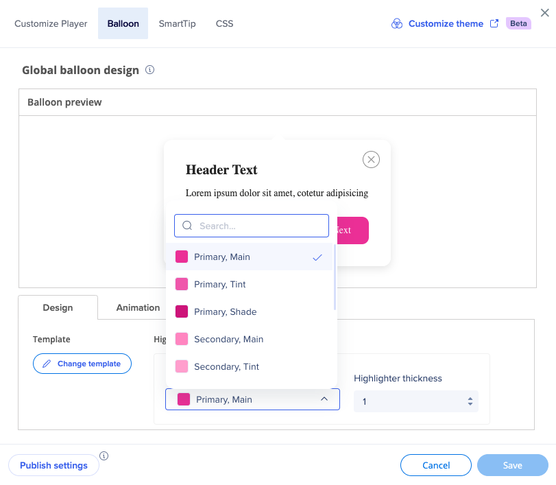
In the Balloon tab, you can see the active theme applied to your balloons.
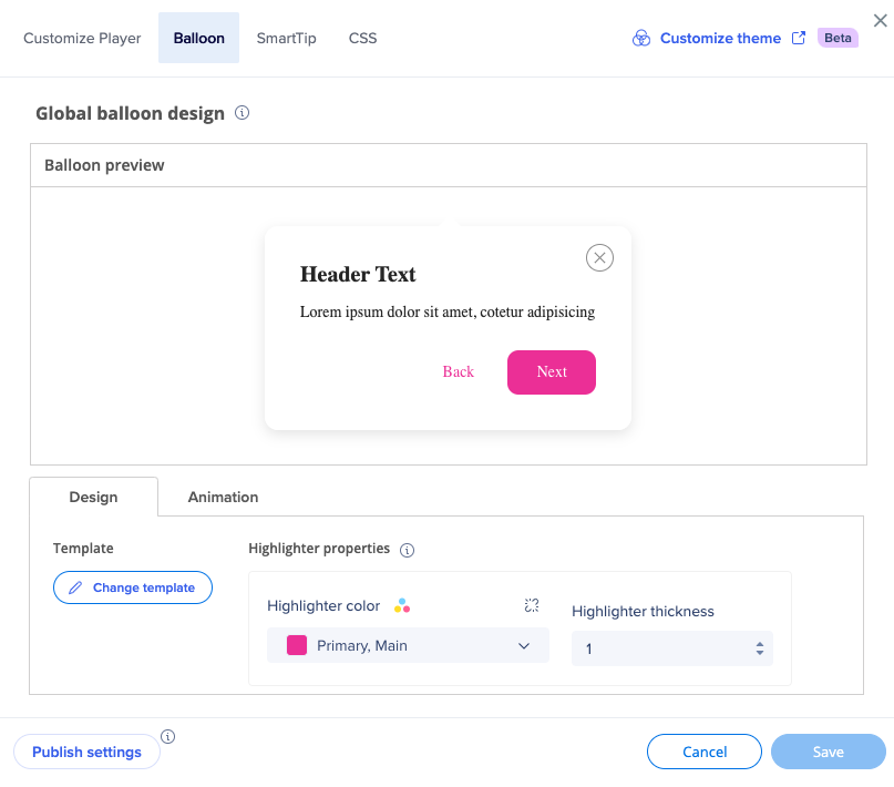
You can change the highlighter color to be any of the theme colors.
You can also detach from the theme if you want your content not be affected by the theme.
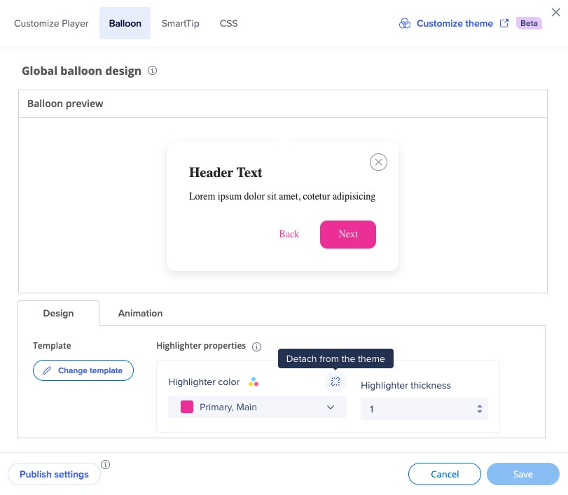
For example, if you detach the highlighter color from the theme, it'll stay to be this color (in this case - pink Primary, Main) even if you change the theme in console.
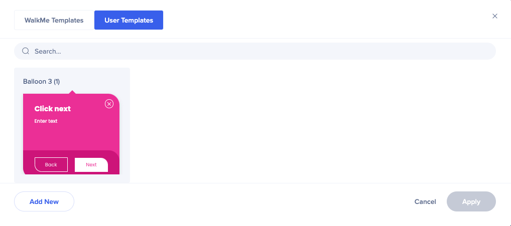
Click Change template to see all the templates available.
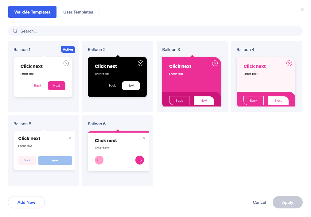
To better understand how different text and color types from the theme are connected to different templates, see the Mapping: Theme-Template Relationship section below.
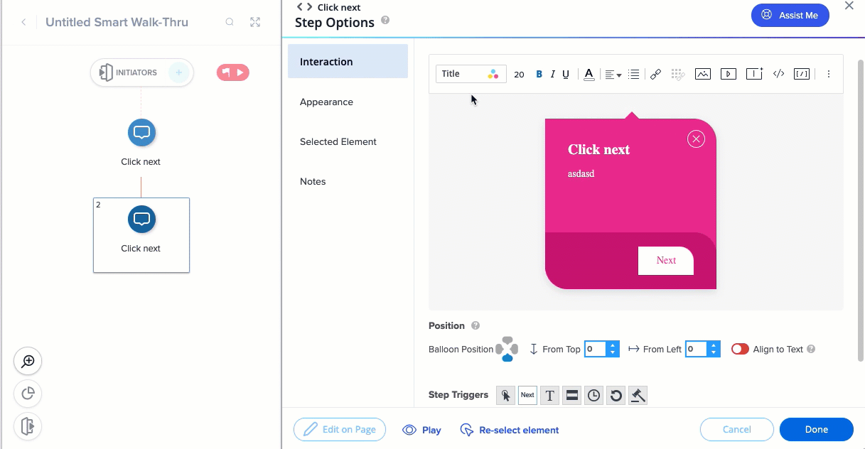
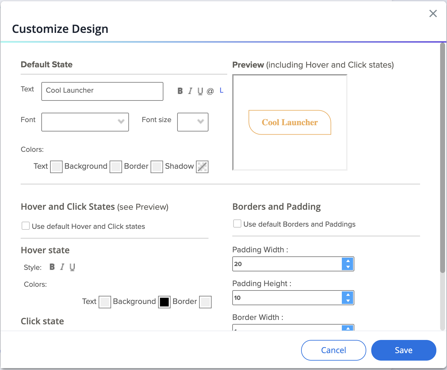
If you want to make changes to a specific template of the theme, click on the Edit icon.
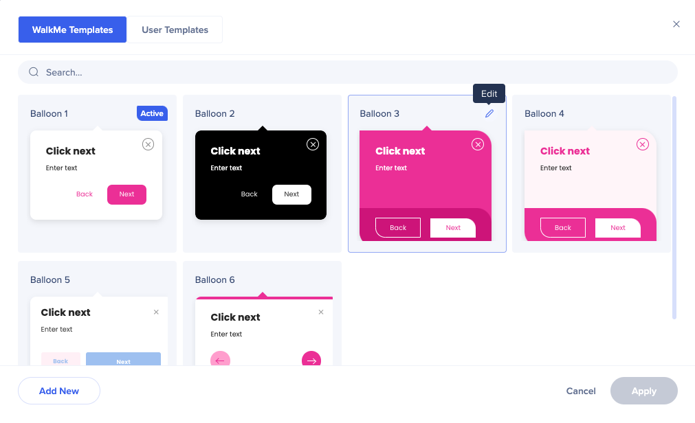
The CSS console will open. Here you can adjust any of the balloon's properties.
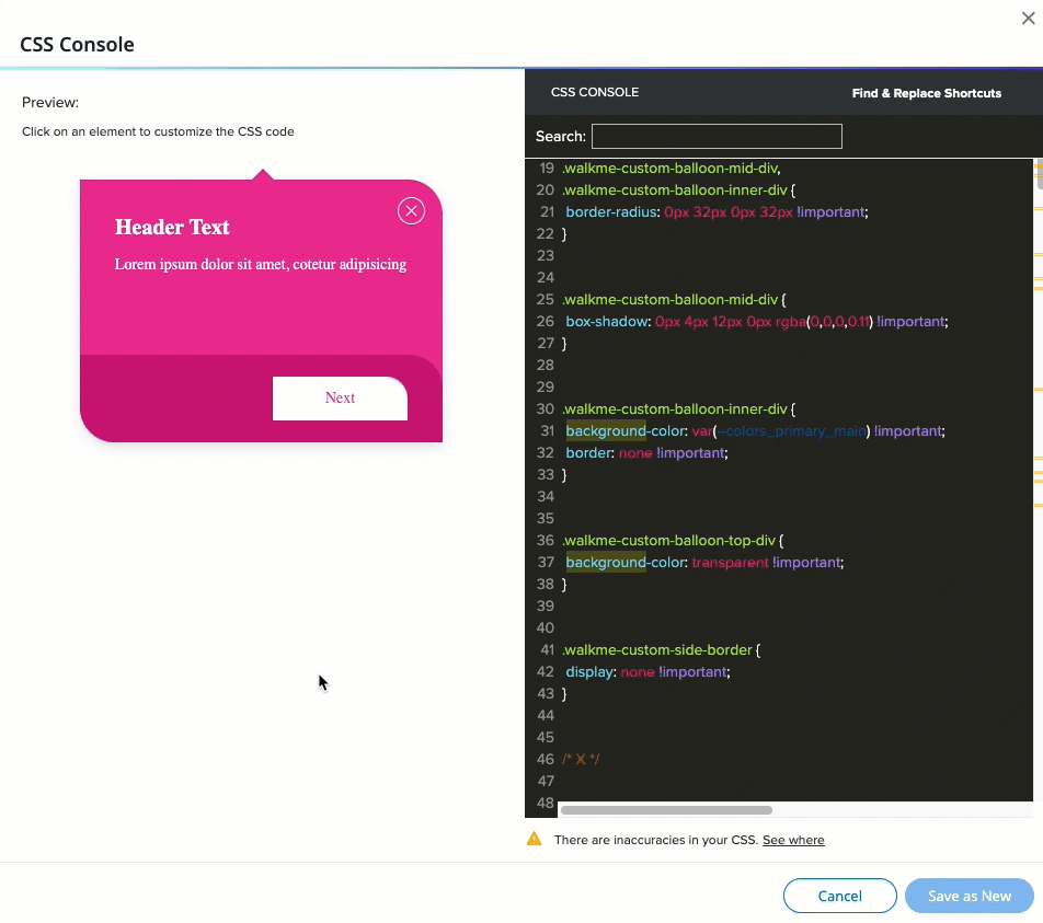
You can replace the primary color with the secondary, or change it completely - for example, to black or white.
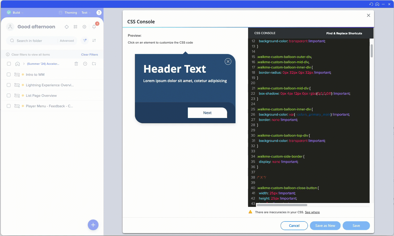
You can find the CSS variables coming from the theme in the CSS in Theming article.
Note
The CSS inserted in the global CSS, balloon template, or local balloon, will override the theme.
You can save the edited template as new, and it'll appear in the User Templates tab.
New!
All the steps that are connected to this template will change.
In the Smart Walk-Thru step screen, you can select the color of the text parts from the theme colors. The typography style cannot be changed from here, since it's inherited from the theme.
You can also change a different template.
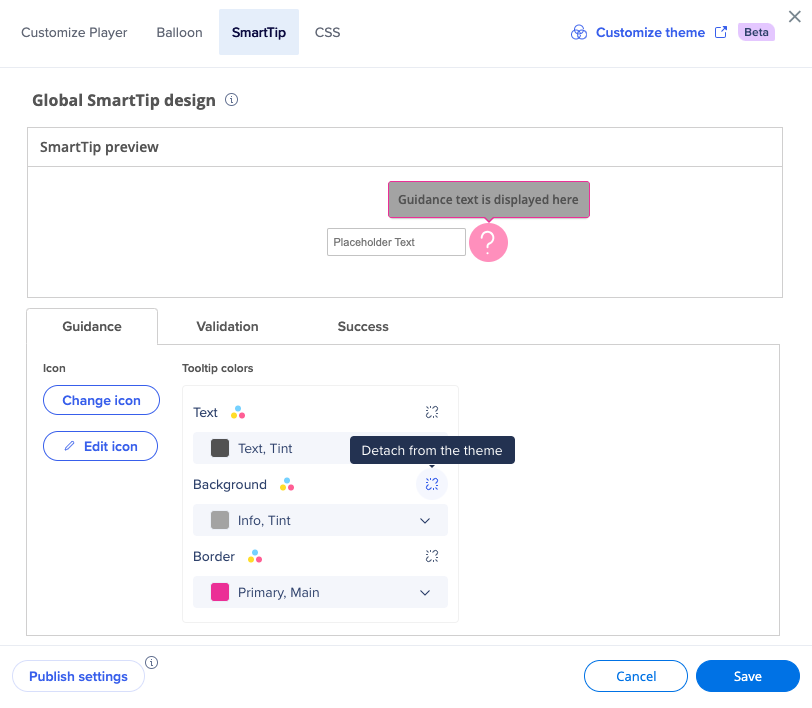
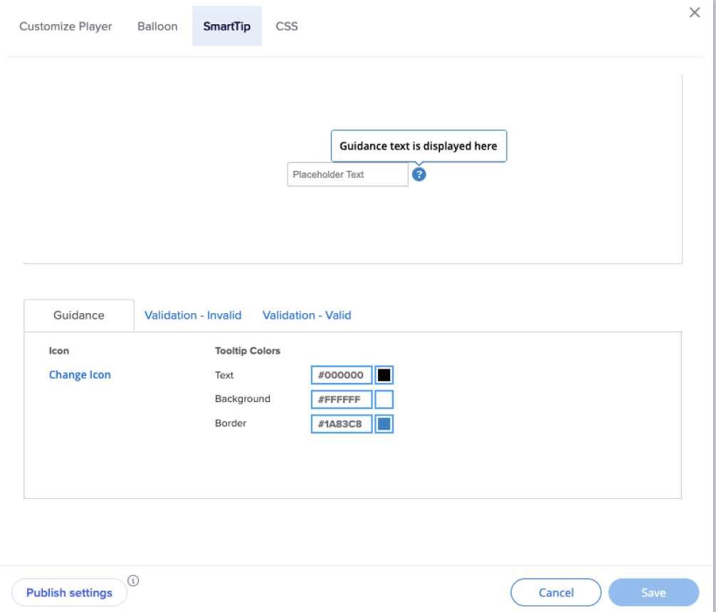
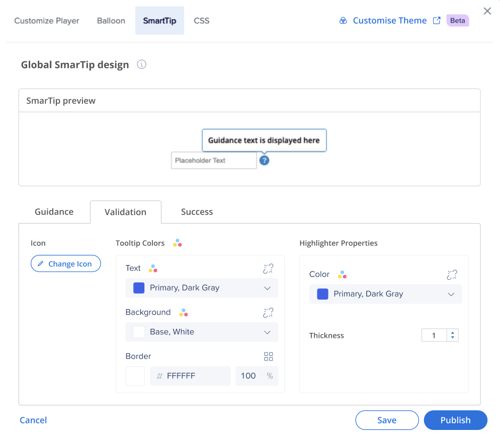
SmartTips
In the SmartTip tab, you can see the active theme applied to your SmartTips.
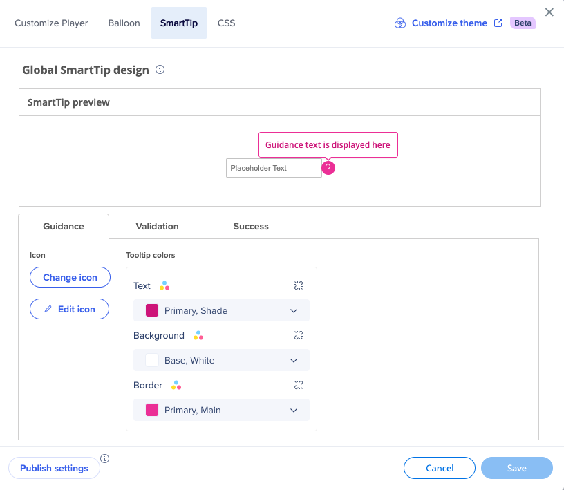
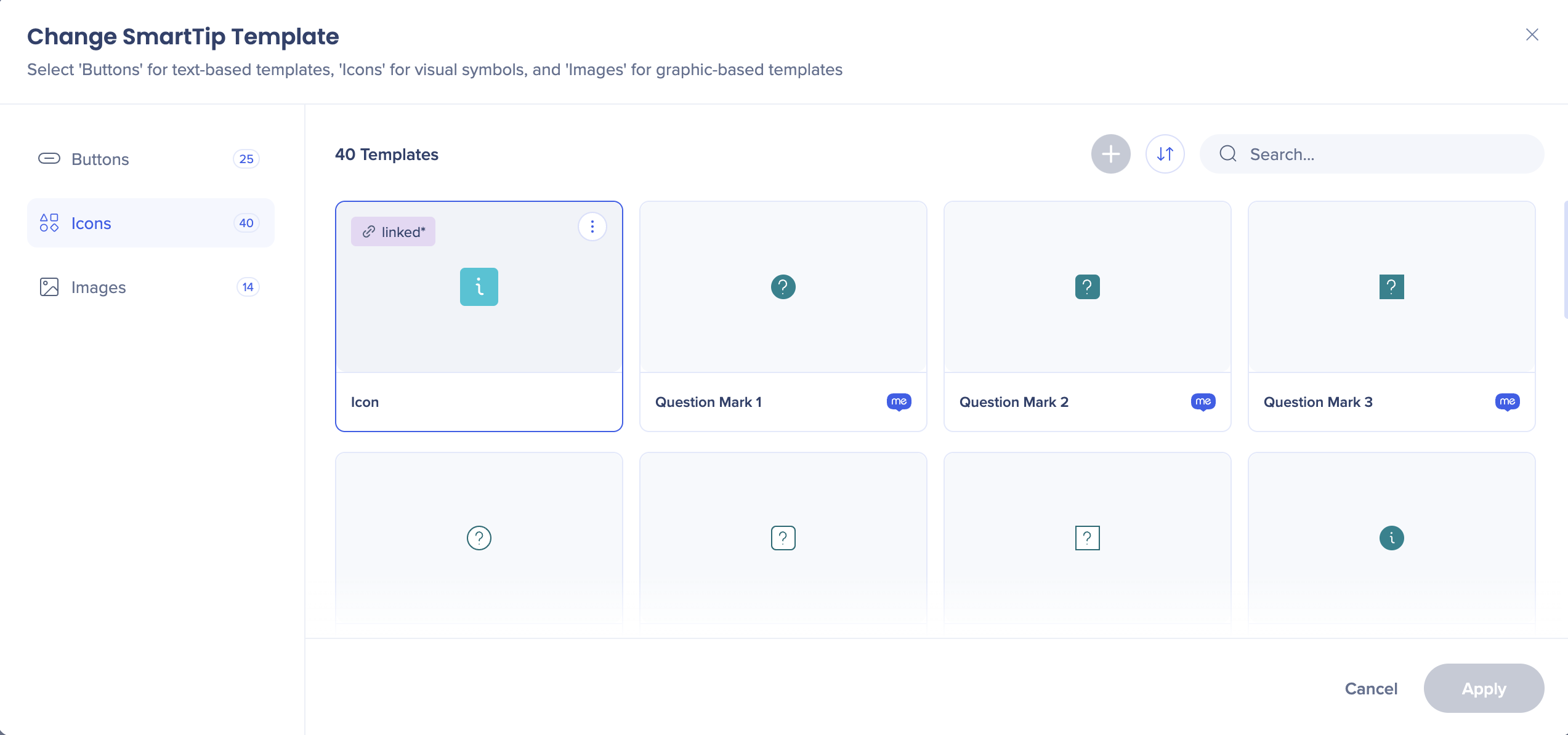
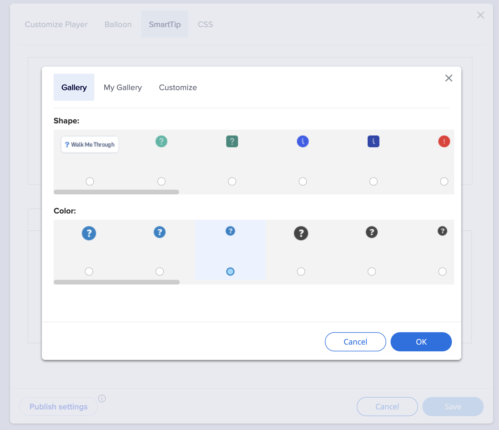
Click Change icon to select the icon you want your SmartTip to have.
Click Edit icon of you want to change the color and the size of the icon. You can select any color from the theme.
You can also change the color of the tip itself.
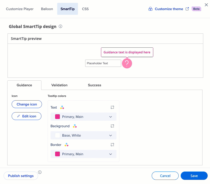
You can also detach any of the values from the theme if you want this design element not be affected by the theme.
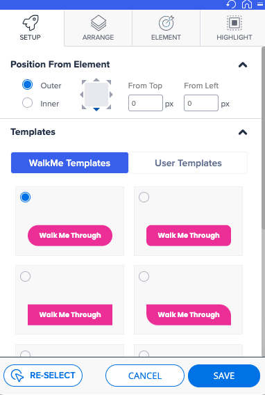
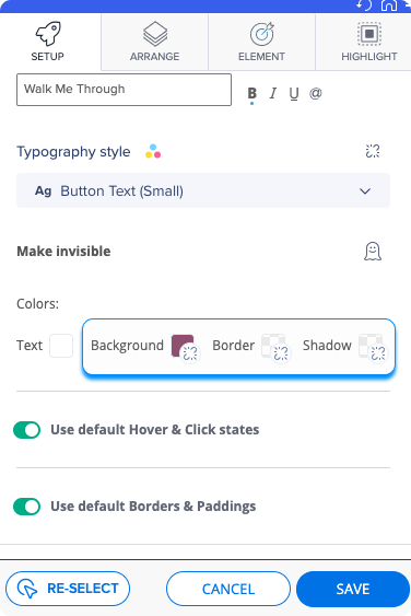
Launchers
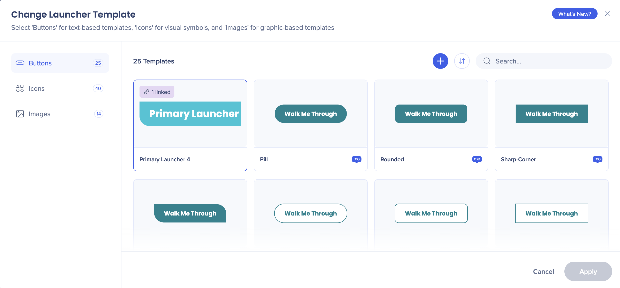
When you create a launcher, you can choose between all the templates available in this theme.
In the Design dropdown you can set the preferred colors from theme.
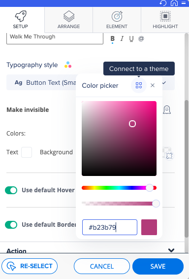
You can also detach from the theme, and set a color unrelated to it.
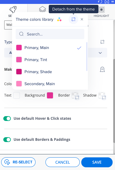
When you detach the color from the theme, you'll see a dedicated icon illustrating it.
You can always connect back to the theme.
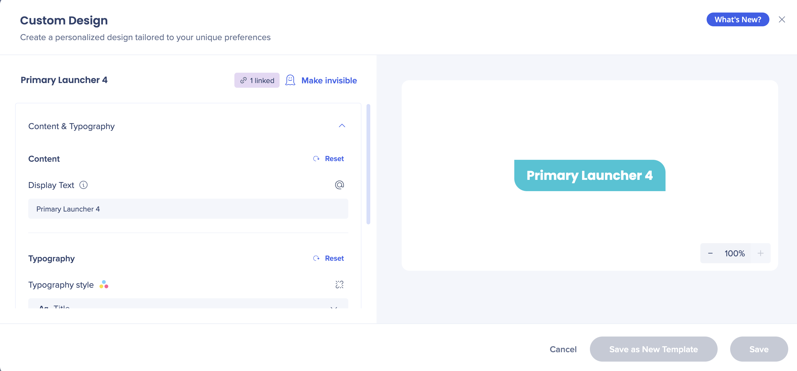
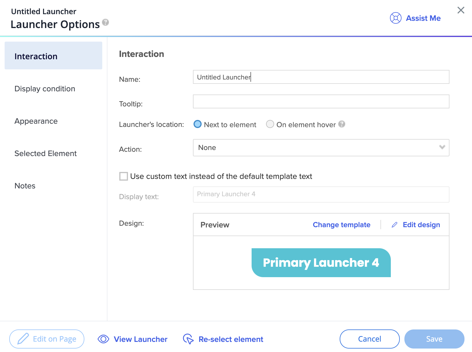
After you created the launcher, you can change the template in the Launcher Options screen.
Did you know?
You can change the text of a local launcher in the launcher's Interaction tab. To do so, check the box saying “Use custom text instead of the default template text“. Now you can edit the display text below.

Click Edit design to change the typography style or select different colors from the theme.
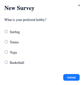
Surveys
- Surveys are connected to themes by default
- Only one template is available for surveys
Changes in the Editor
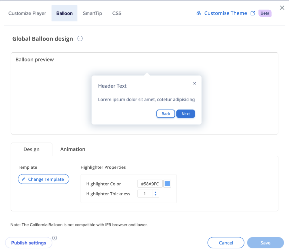
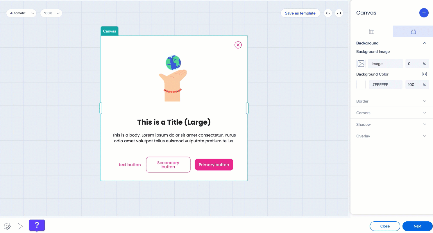
Global Balloon
Before
- You can select colors in the editor, edit the CSS of the template and see the CSS, save CSS design as template
After
- Color and typography editing is done in theme
- New theme-connected templates will be provided to user
- You can edit the global balloon template CSS
SmartTip tooltip
Before
- You can select colors for text, background, border
After
- The colors come from the theme and you are able to change the mapping and to disconnect from the theme
SmartTip icon
Before
- Icons are images - the color cannot be changed (user can only select a different image)
- Colors cannot be changed with CSS
After
- Icons are HTML
- Icons are linked to the theme and impacted when colors of the theme are changed
- You can change the mapping and the size of the icon
Local Balloon
Before
- You cannot change font family
After
- You can see the applied typography of the title and the body
- Design is attached to the theme
Local Launcher
Before
- You can't change the text of the launcher
- You can only created a new template with different text
After
- You can change the text of the local launcher by checking the "Use custom text" box
- The gallery was refreshed and now offers new theme connected templates
Theming in Visual Designer
New Templates
When you create a new ShoutOut, you'll see the new templates, all of them presented in the theme that you now have set as active.

When you hove over the Theming icon next to the color, you can see which theme is currently used.
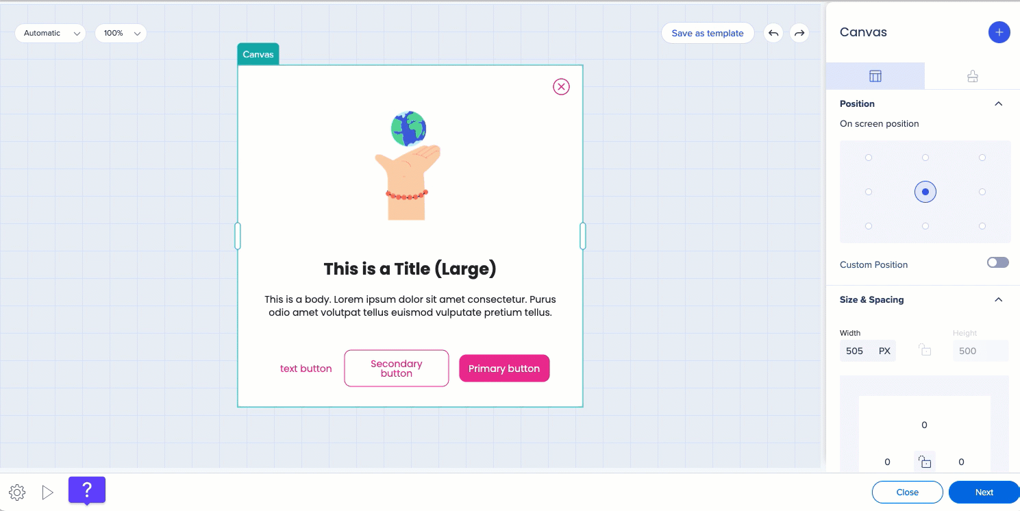
You can choose between the theme colors and typography styles, or detach from the theme and set a color or font properties of your own.
You can decide which properties of the button you want to be connected to or detached from the theme. For example, you can detach font and choose a font of your own, and keep the text color and fill color connected to the theme.
Theming for Action Bar
To design your Action Bar from the Theming app:
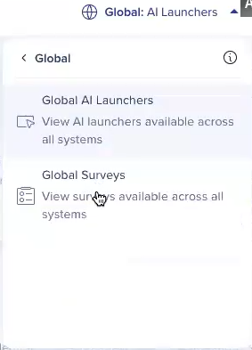
- Open Theming
- In the systems dropdown, select Global systems → Global AI Launchers

- You'll see a default theme and the preview of the Action Bar on the right side of the screen
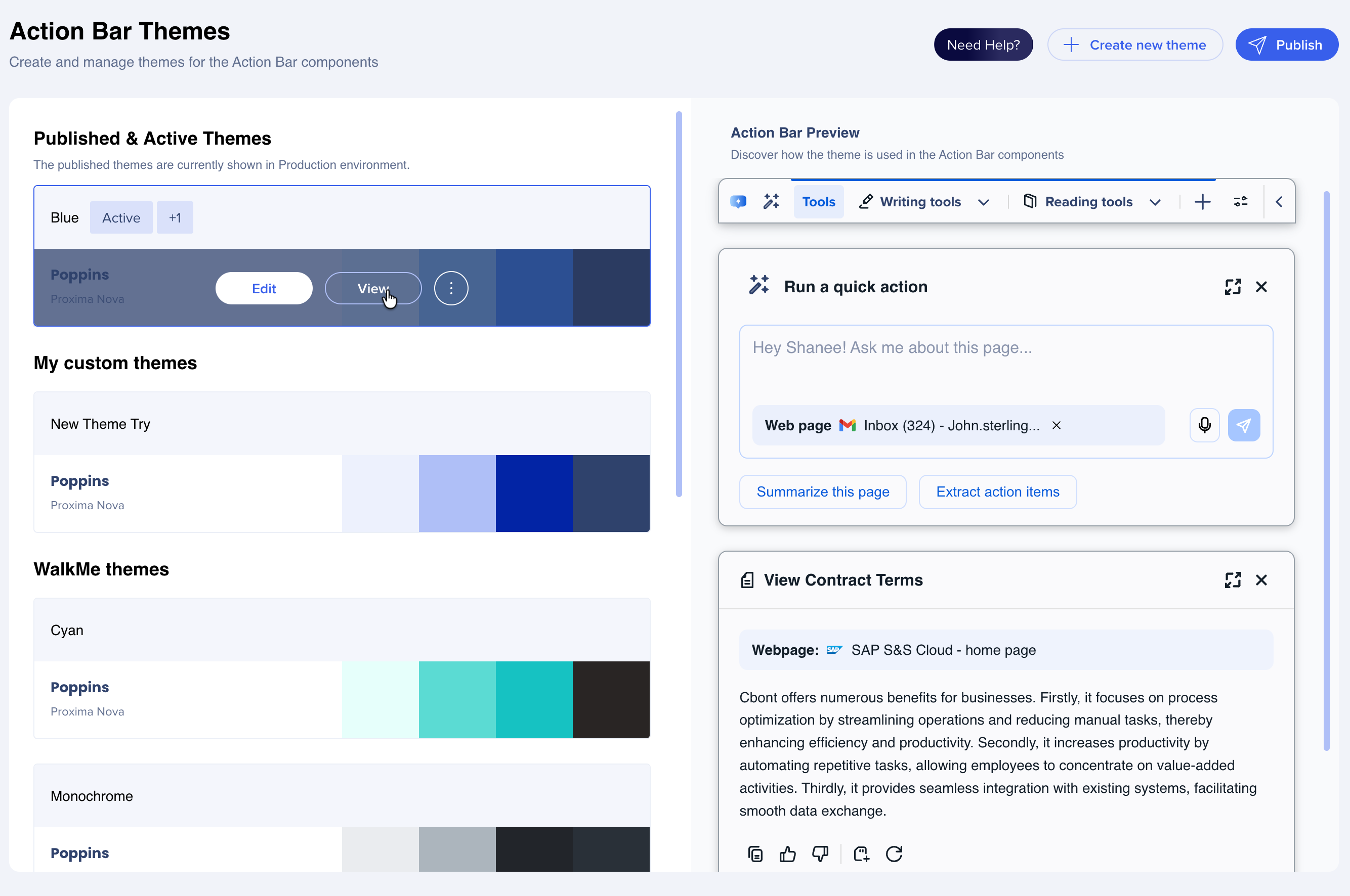
You can use any of the WalkMe or customized themes for your Action Bar.
You can design your Action Bar icon and other elements using the gradient color feature.
Theming for Surveys
Popup surveys will inherit your system theme. Full-page surveys can be designed individually from the Theming app.
To design your full-page survey:
-
You'll see a default theme and the preview of the full-page survey on the right side of the screen
-
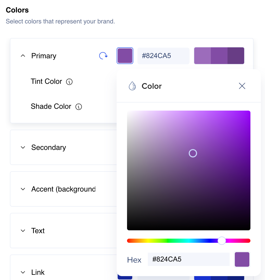
You can set colors, typography, and buttons style


