Brief Overview
Theming lets you define and manage the visual style of your WalkMe content from one place to keep your designs consistent and on-brand.
This guide explains how to enable Theming, create or edit a theme in the console, and publish it so builders can start designing with it.
Access
To access, go to the Theming app in the Tools category in the WalkMe Console.
How It Works
Main Screen
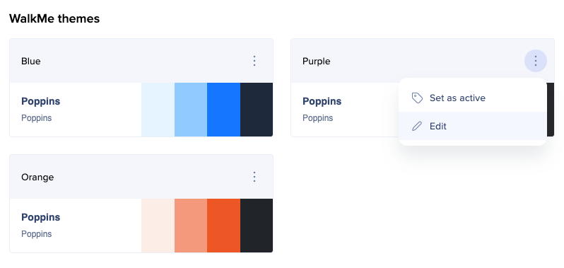
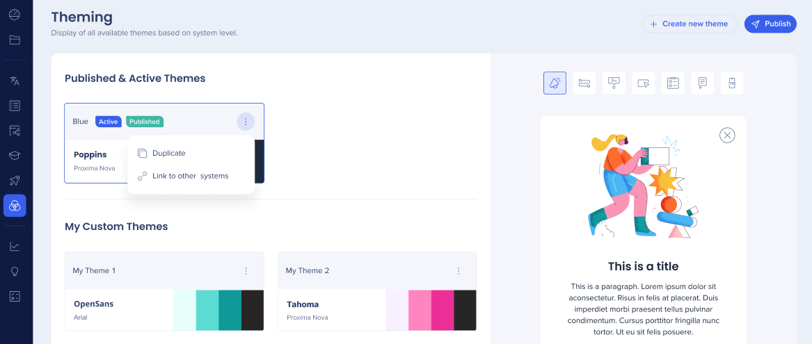
When you access Theming for the first time, on the main screen you'll see all the themes offered by WalkMe.
On the right side of the screen, you can see the preview of what this theme looks like. You can navigate between different item types and see how each of them looks in this theme.
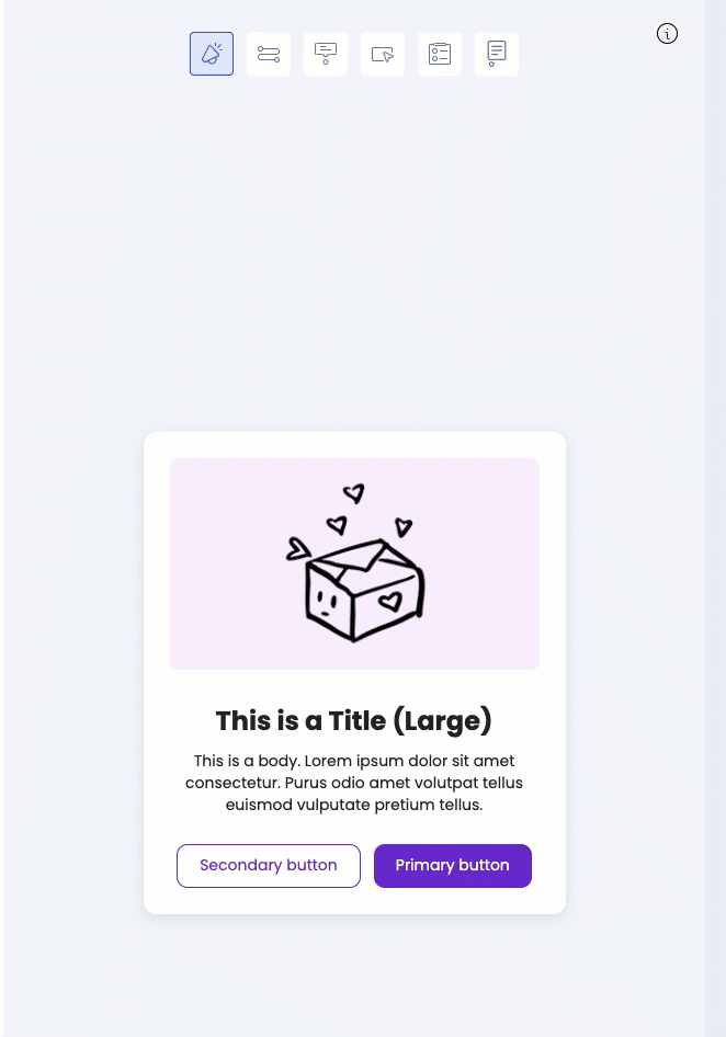
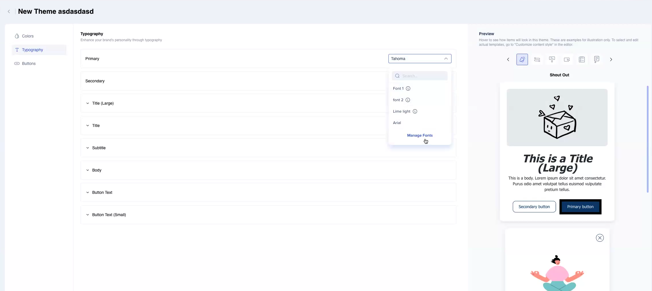
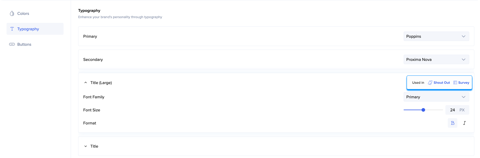
Hover over different elements of the preview to see what they inherit from the theme. For example, the frame which contains the image in this ShoutOut inherits the color (Background, Main), and the text title inherits the Title (Large) typography and the color Text, Main.
Note
- The preview only demonstrates what the theme consists of and looks like. It doesn't show your real editor content.
- In the editor you can see a variety of different templates, each one inherits from the theme in a different way.
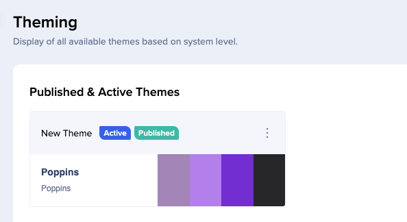
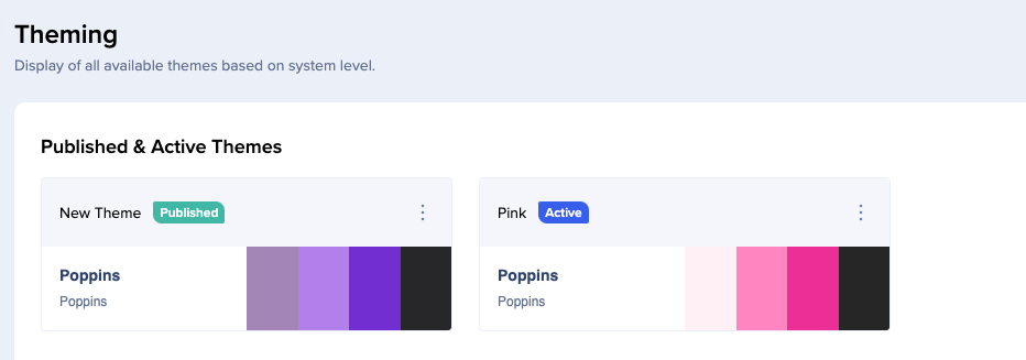
Active and Published Themes
Label Active means that this theme is currently the one applied to your editor content.
Label Published means that this theme is currently the one displayed to your users in the published environment.
Note that there might be a case when active theme and published theme are not the same.
If you set a theme as active, you'll be able to see it in the editor. However, to make it theme visible to your users, you need to publish it first.
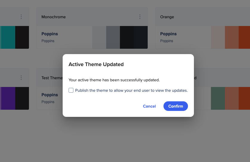
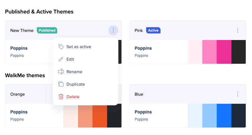
To set a theme as active:
- Click on the Options menu
- Select Set as active
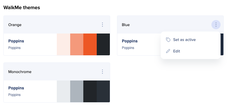
- If you don't want to publish the theme yet, click Confirm
- To also publish the theme, check the box and then click Confirm
Editing Themes
You can edit WalkMe themes and save the result as a new theme.
To edit a theme, click on the Options menu and select Edit, or double click on the theme.
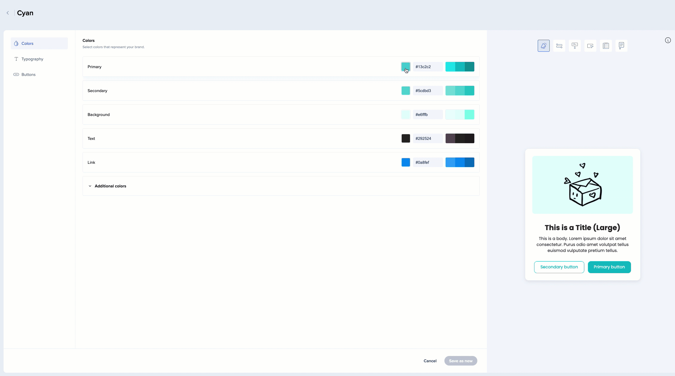
Here you can change the colors, typography, and button properties of the theme.
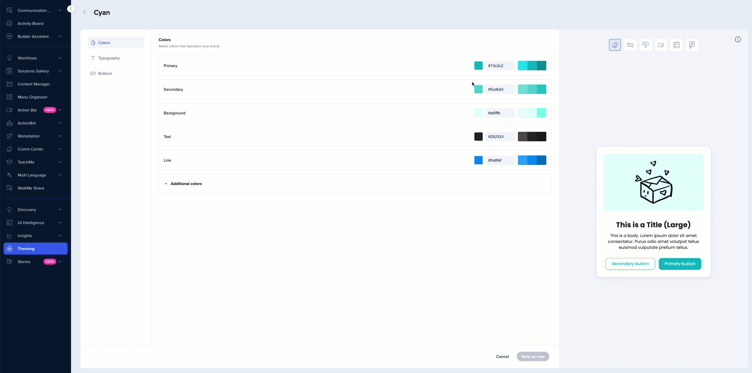
Colors
- In the Colors tab, you can change the color of different design elements
- You can see what exactly is changing in the preview on the right
- When making changes, you will see animation on the item navigation bar showing in which item you can see this change
Typography
- In the Typography tab, you can change the font type and size for all the text elements
- You can change primary and secondary font
- You can select which of the two you want each of the titles and text types to inherit - primary or secondary
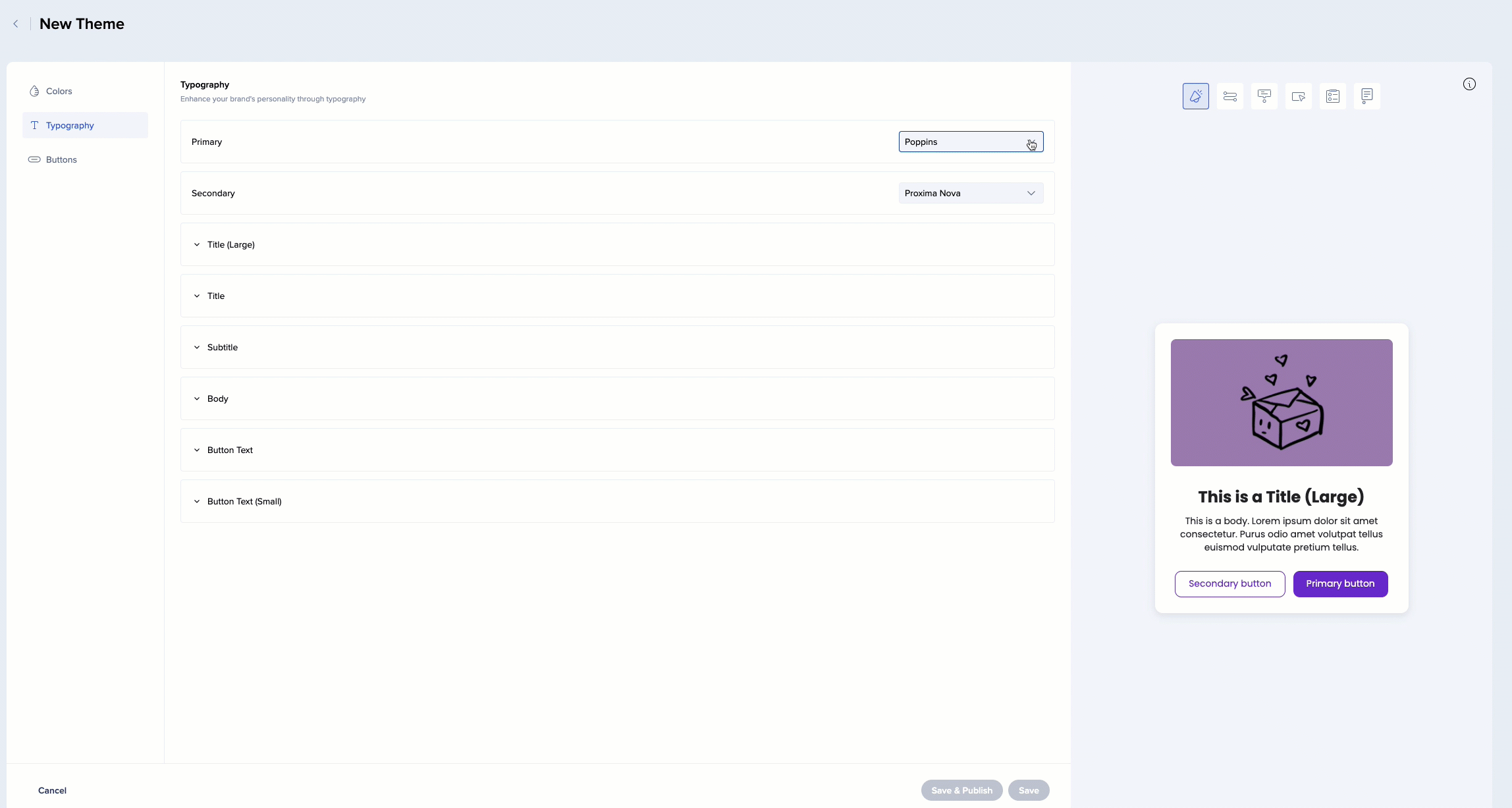
- You can see where each of the text elements is currently used
Did you know?
This is what we generally recommend, however, you can choose to use these text types in other locations. For example, to have your launchers inherit the Title (Large) properties. This can be set in the editor - see more information below.
Fonts
We support the following fonts:
-
Arial, Tahoma, Georgia, Courier, Proxima Nova, Poppins, Open Sans
You can also:
-
Use a website font
-
Upload a custom font
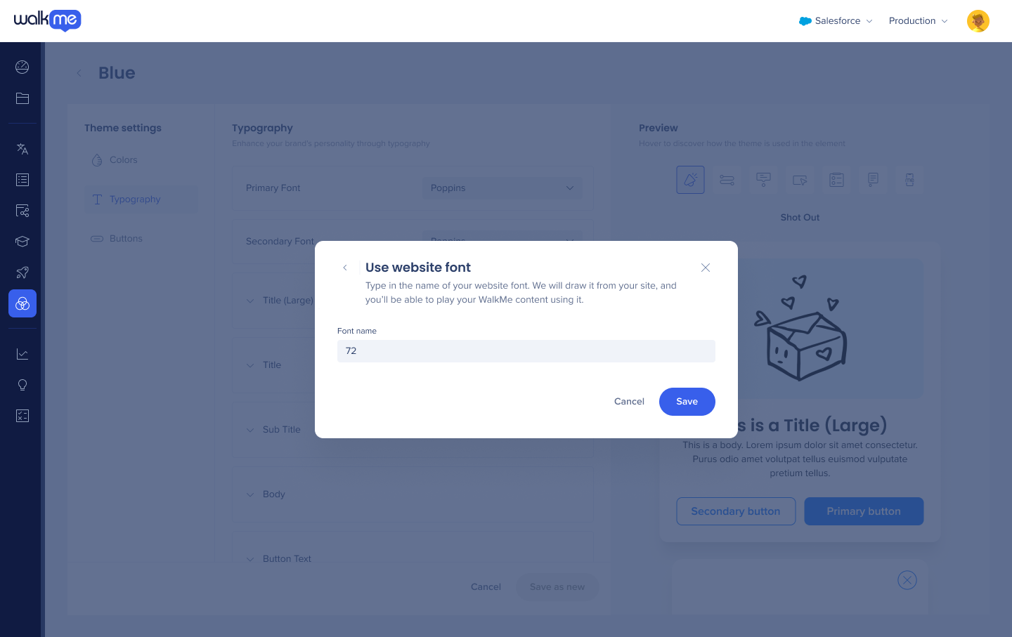
Use website font
Website font is a font that exists in the site where you're playing WalkMe. To use a website font:
-
Click Manage fonts
-
Click Use website font
-
Give this font a name and click Save
-
You'll see it in the list of fonts, marked as “Your website font“

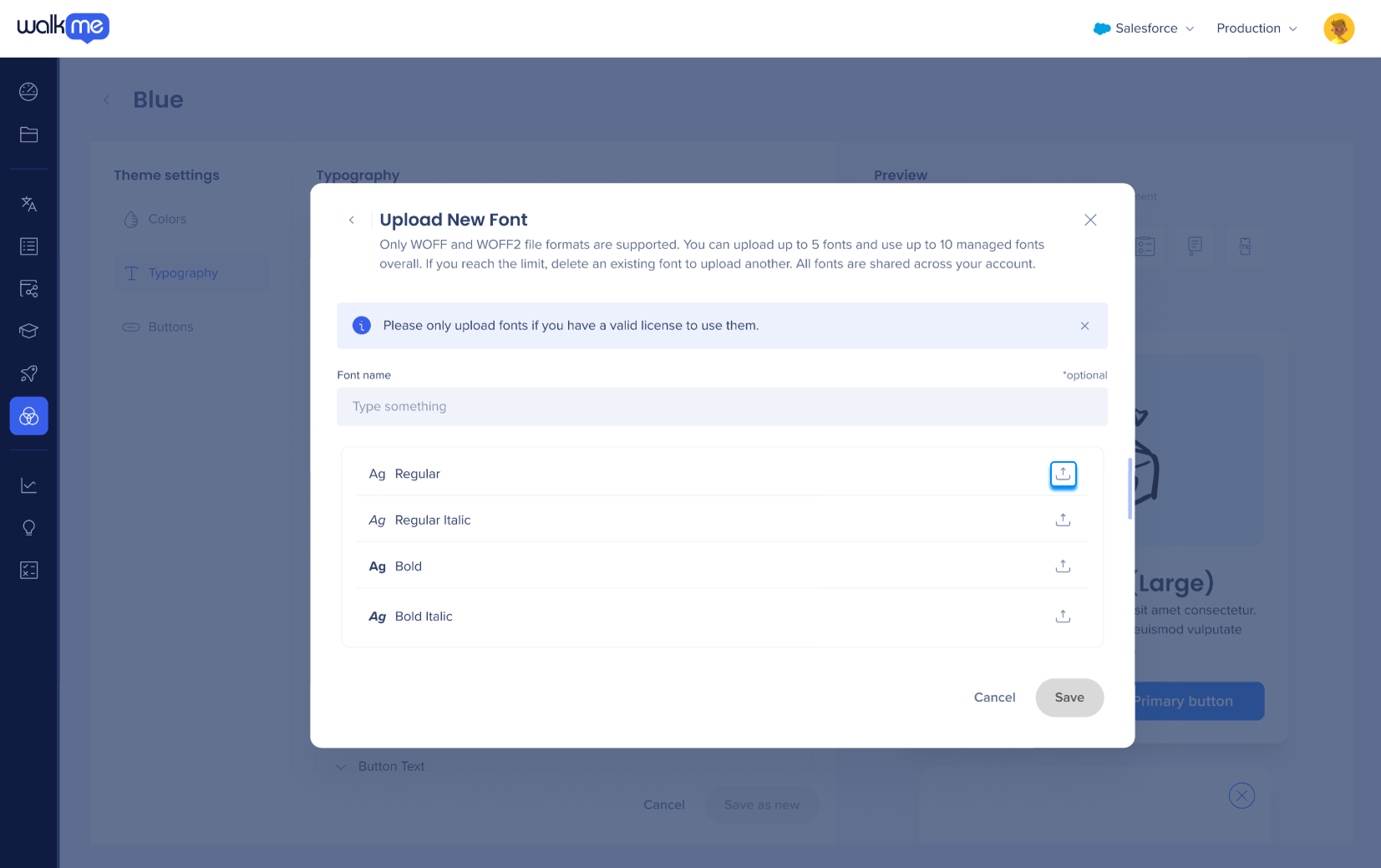
Upload font
To upload a font you'd like to use:
-
Click Manage fonts
-
Give this font a name
-
Click Upload font next to the font variant
Note
-
Only admins can upload fonts
-
Woff, Woff2, TTF, and OTF formats are supported
-
Please only upload fonts that you have a valid license to use
-
You can upload variants of the font (Bold, Italic, etc). If you don't upload a variant, we'll play the regular variant.
-
Fonts exist on the account level, not per theme. You'll be able to use them on all the systems.
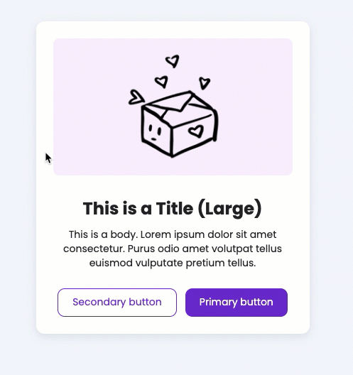
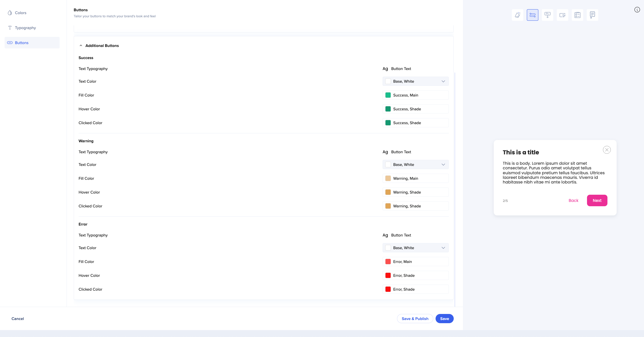
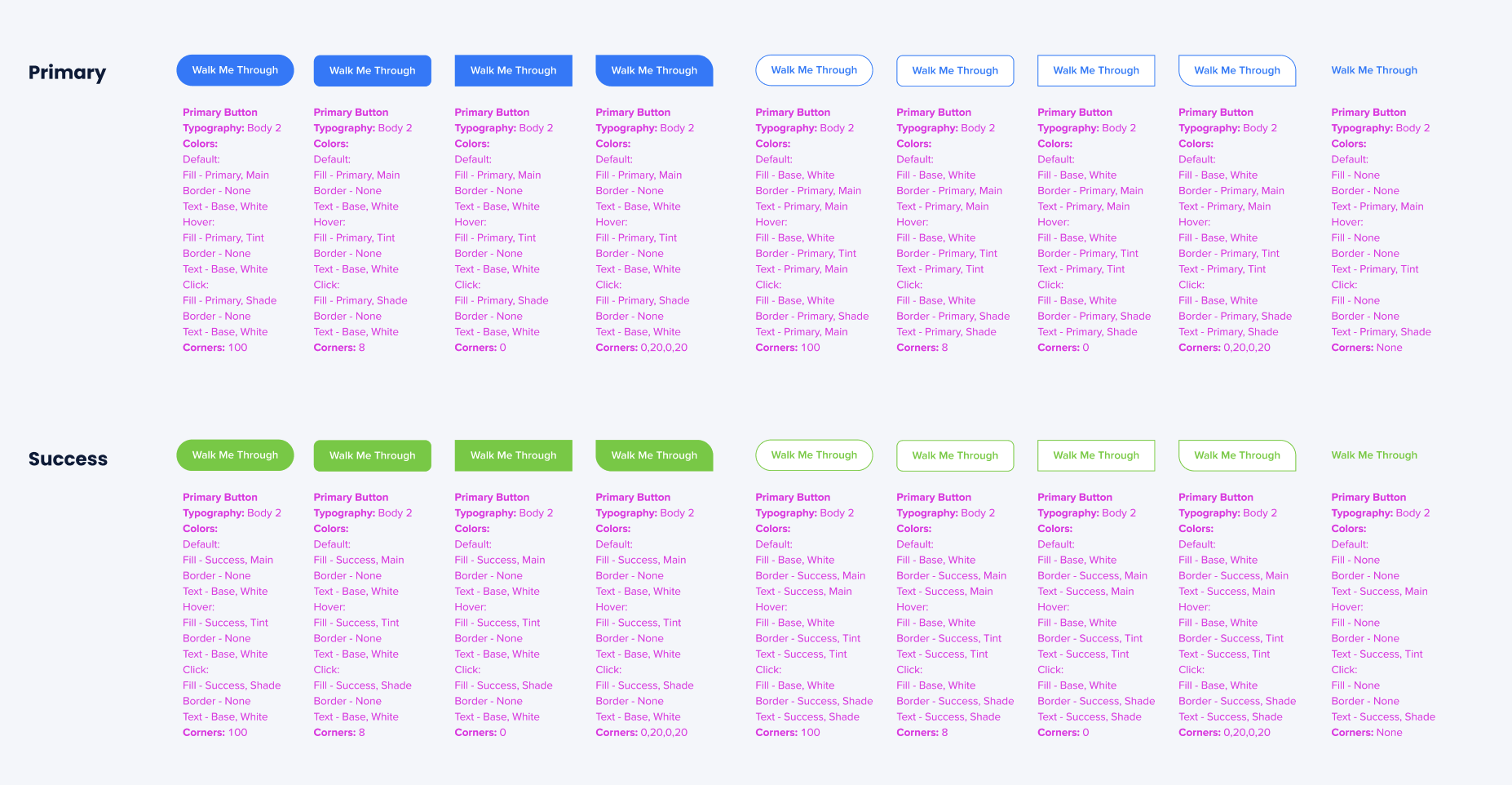
- Change the border width and the corner radius of your buttons
- You can choose to have a colored border and set the thickness on each of the sides
- The fill and text colors are automatically inherited from the theme - you cannot change them from here, but you can change the color which the button inherits in the Color tab, and it'll affect the button here
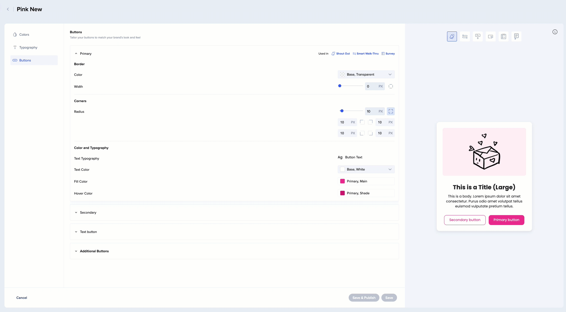
- Secondary text buttons don't have fill color (are transparent) by default (for example, Back button in this ShoutOut)
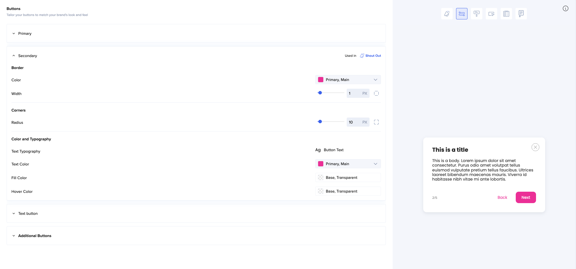
- Additional buttons inherit most of their properties from the theme
- You can only change the color of the text
When you're done editing, you can save the theme as new.
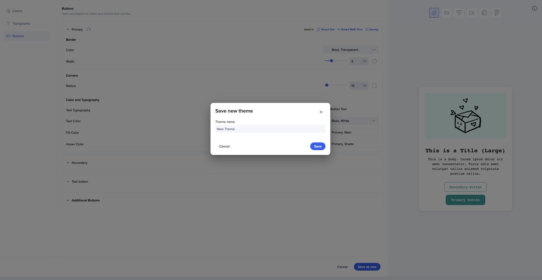
Your themes will appear under My custom themes.
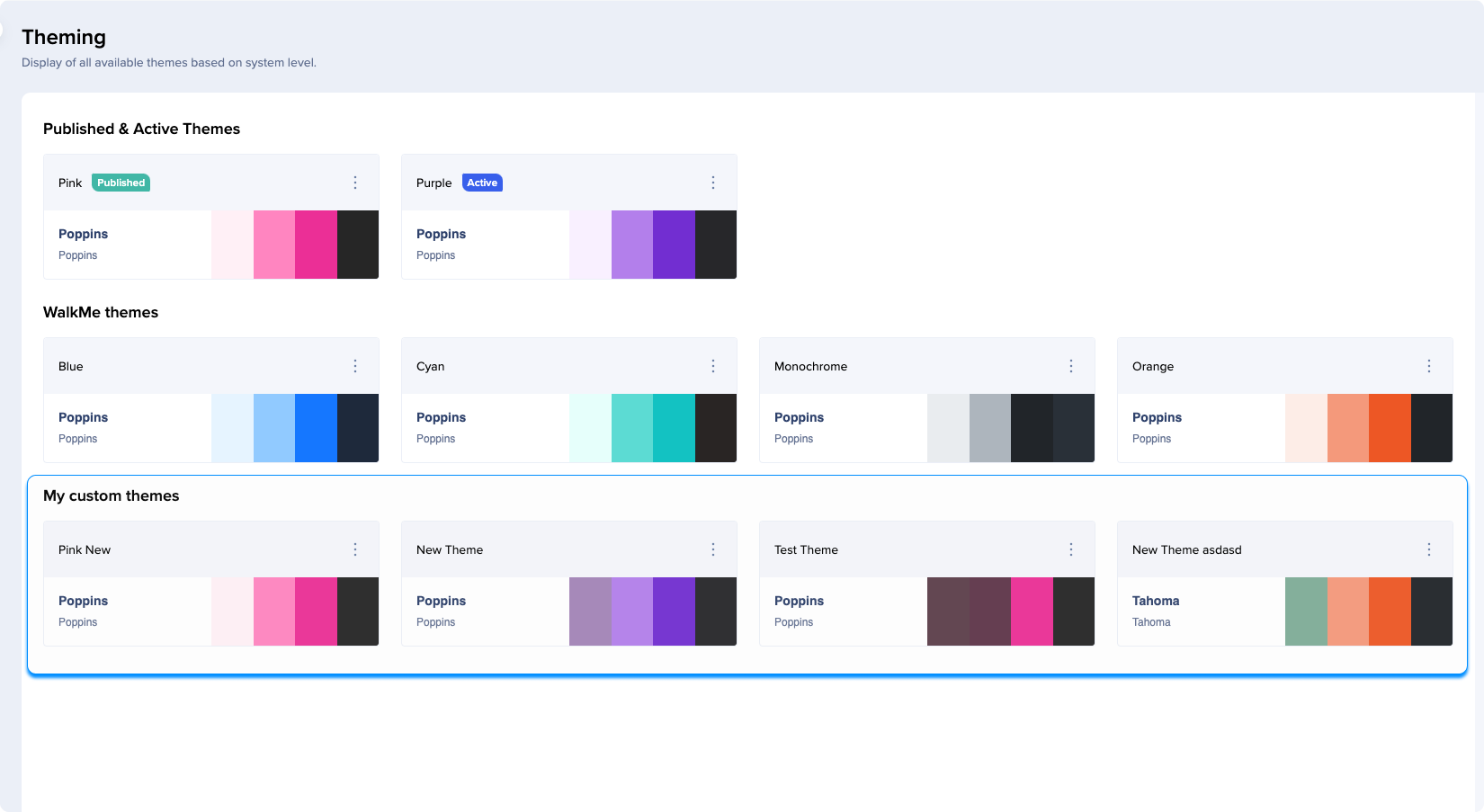
Unlike WalkMe themes, your custom themes can also be renamed, duplicated, and deleted.
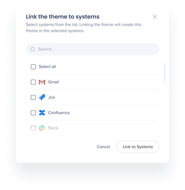
Sharing themes
If you have Edit & Share permission enabled for Theming in the Admin Center, you can link themes to multiple systems you're assigned to. To link your custom theme to other systems:
- Click on the Options menu
- Select Link to other systems (you will only see the systems which have Theming enabled)
Note
-
Only users with an Edit & Share permission will see this option
-
Users with Edit & Share permission can only edit and link the theme of the systems they're assigned to
-
A theme can only be linked to the systems that have Theming enabled
-
If a theme was linked to a system that was deleted and is in the soft delete phase now (still exists but not accessible for 30 days before the permanent deletion), then you can't link or unlink the theme until the system is deleted completely
You'll see a list of systems you're assigned to. You will not see systems you're not assigned to here even if you have the Edit & Share permission.
Select which systems you want to link to this theme. Linking the theme will create this theme in these systems. Unlinking a theme from a system you have access to will create a copy of that theme at that system (state of when it was disconnected).
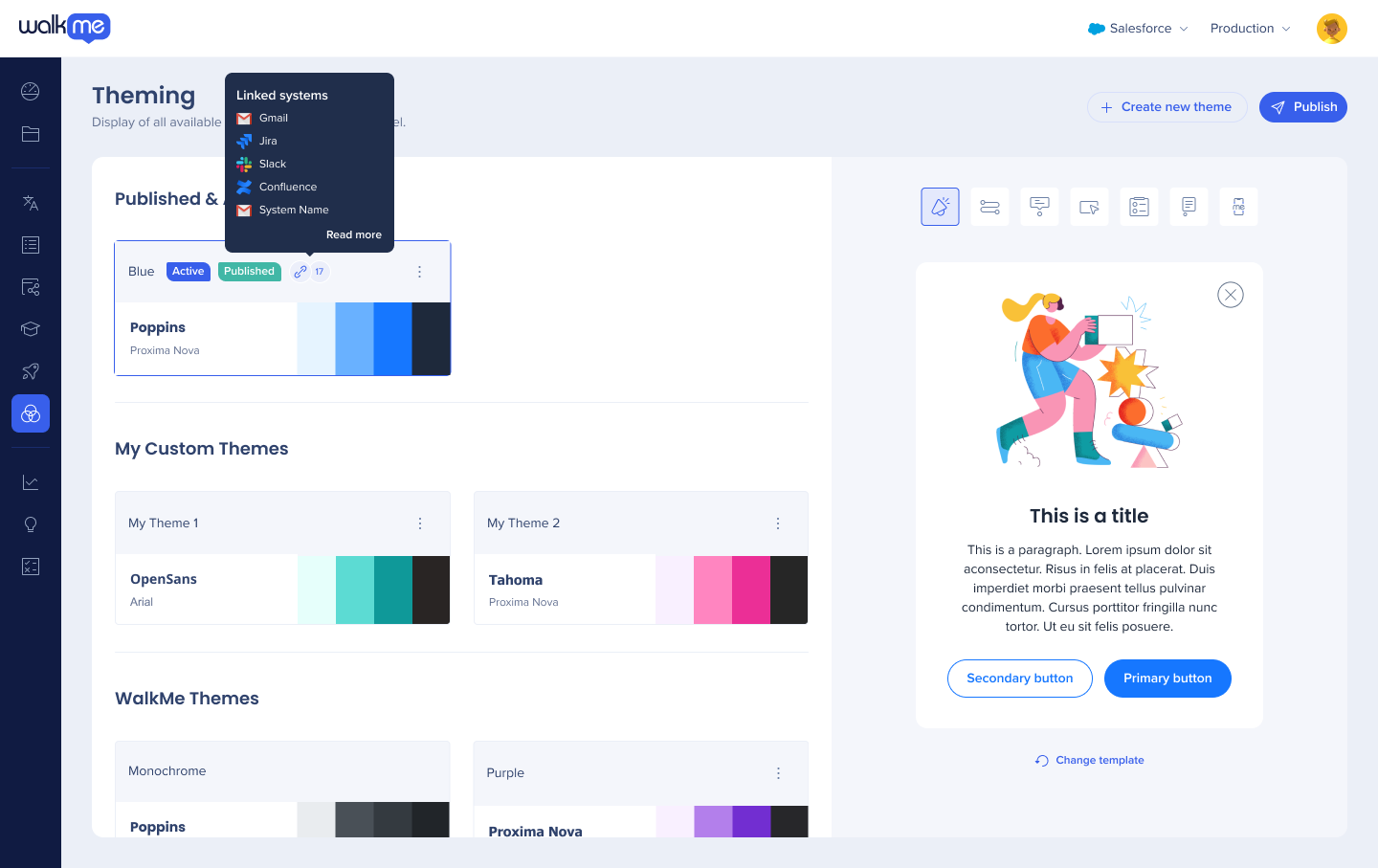
After you link the theme to the selected systems, you'll be able to see an indication next to the theme showing how many systems this theme is linked to. Hover over it to see which systems those are.
Click Read more to see the whole list. Users without the Edit & Share permission will also see this indication.
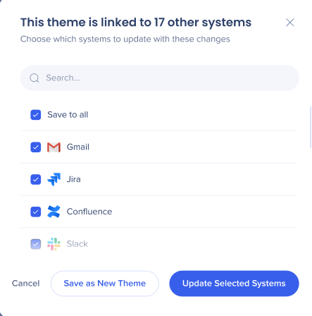
If you're editing the theme that's linked to other systems, you'll be prompted to select which systems you want to changes to be reflected in.
Note
-
If you edit a shared theme that's used by the systems you're not assigned to, those systems will be automatically unlinked, and the changes you make won't apply to them
-
When you edit a theme, you'll see a popup asking for which systems you want the changes to apply
If you duplicate a theme, the systems linked to this theme will not be linked to the duplicate.
If you want to delete a theme that's linked to multiple systems, you'll have to unlink the systems first. This theme will be deleted, but duplicates will be created in all the other linked systems. This is done to ensure that no themes are deleted by mistake from different systems.
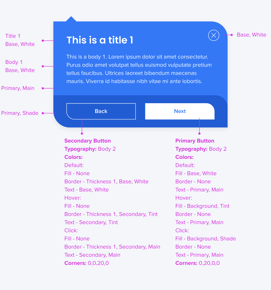
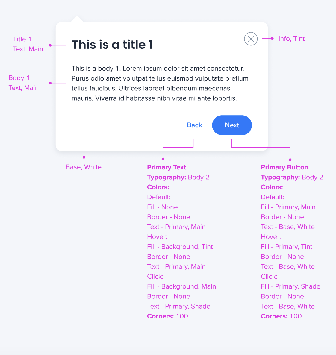
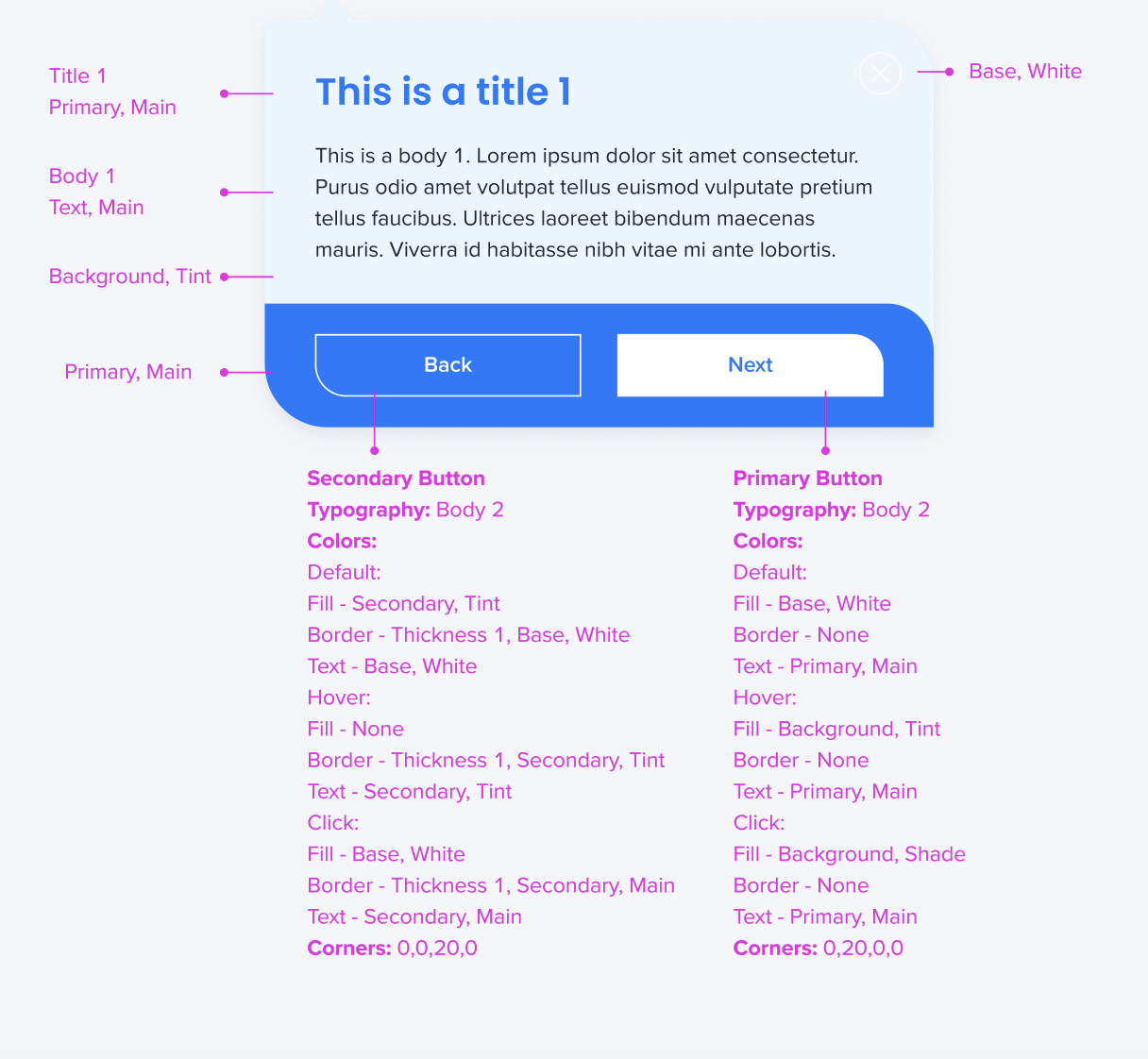
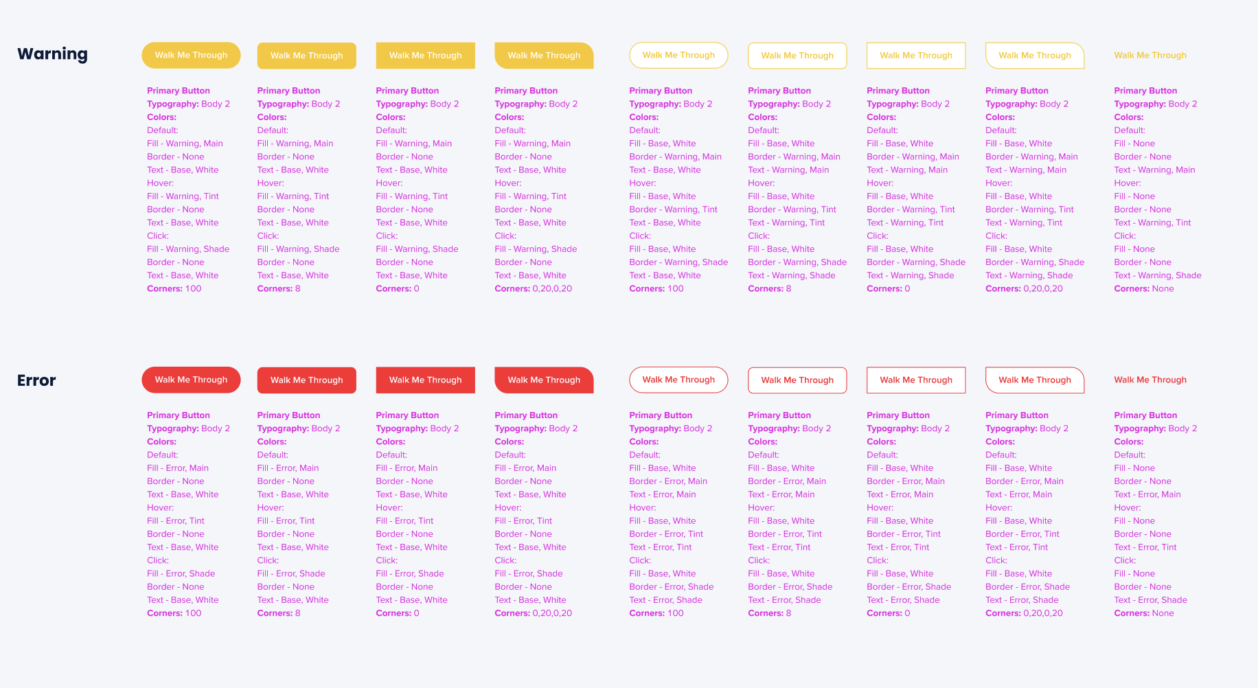
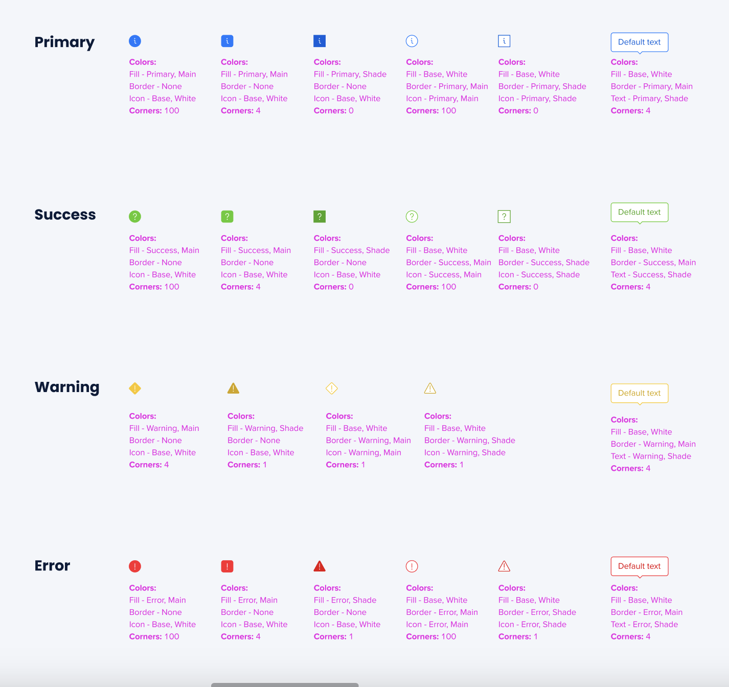
Mapping: Theme-Template Relationship
- All the text and color values (Title 1, Body 1, Primary, Secondary, etc.) work differently in different templates, even inside one theme
- For example, the Smart Walk-Thrus templates attached here are using the same theme
- As you can see, the relationships between the values are different in different templates
- Find the mapping of the colors and text in the images attached
Smart Walk-Thru templates
Launcher templates
SmartTip templates
Technical Notes