The Settings page for the WalkMe Menu for Web lets you view and modify Pro Menu configurations. You can select preferences and customize branding to suit your needs.
Includes:
For Pro and Legacy Menus:
Menu Templates
Pro Menu only:
Position
Menu Structure
Configuration
Branding
Search
How It Works
Explore the settings tabs for configuring the WalkMe Web Menu, including menu templates, positioning, text, branding, help desk integration, task statuses, and search functionality. Each tab provides tools to customize the menu's appearance and behavior, ensuring it aligns with your brand and user needs.
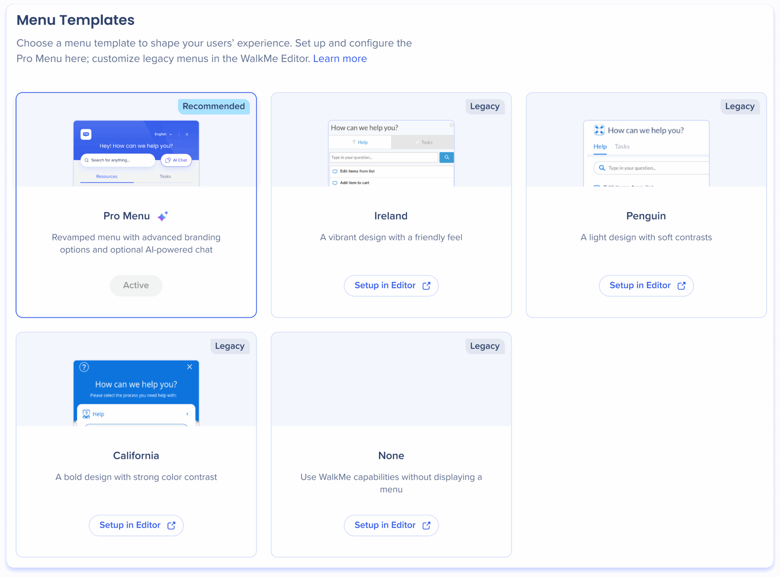
Menu Templates
The Menu Templates tab is where you choose which type of web menu to create.
Each template offers a different design and configuration level.
Pro Menu: The most advanced template. Includes all settings tabs and full configuration access directly in the console
California, Ireland, and Penguin: Legacy menu designs. These remain configurable only through the WalkMe Editor
Note
In the Menu Templates tab, you can view the selected menu. Upgrades are only available to the Pro Menu, and you cannot switch to legacy designs or downgrade from Pro to a legacy menu.
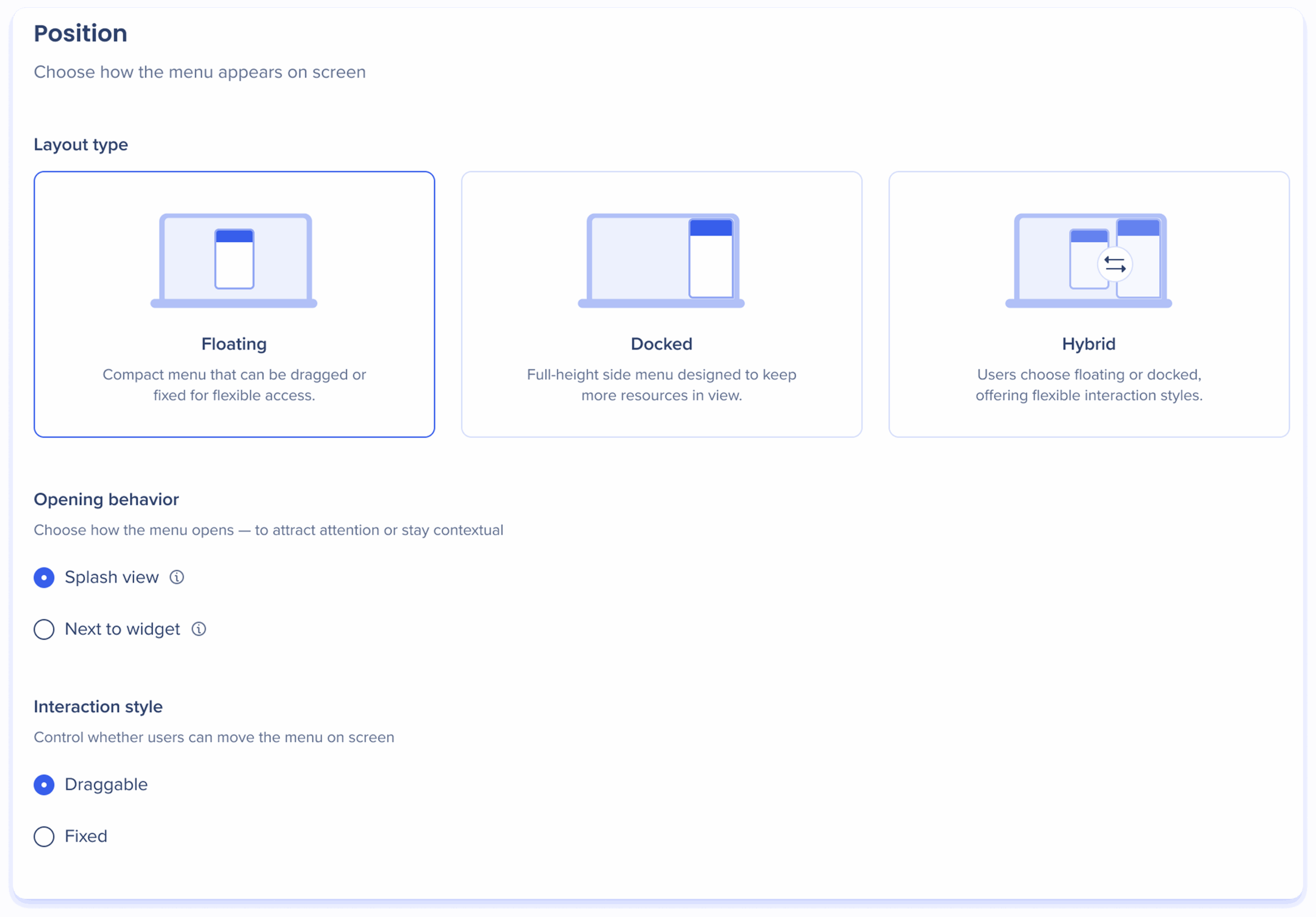
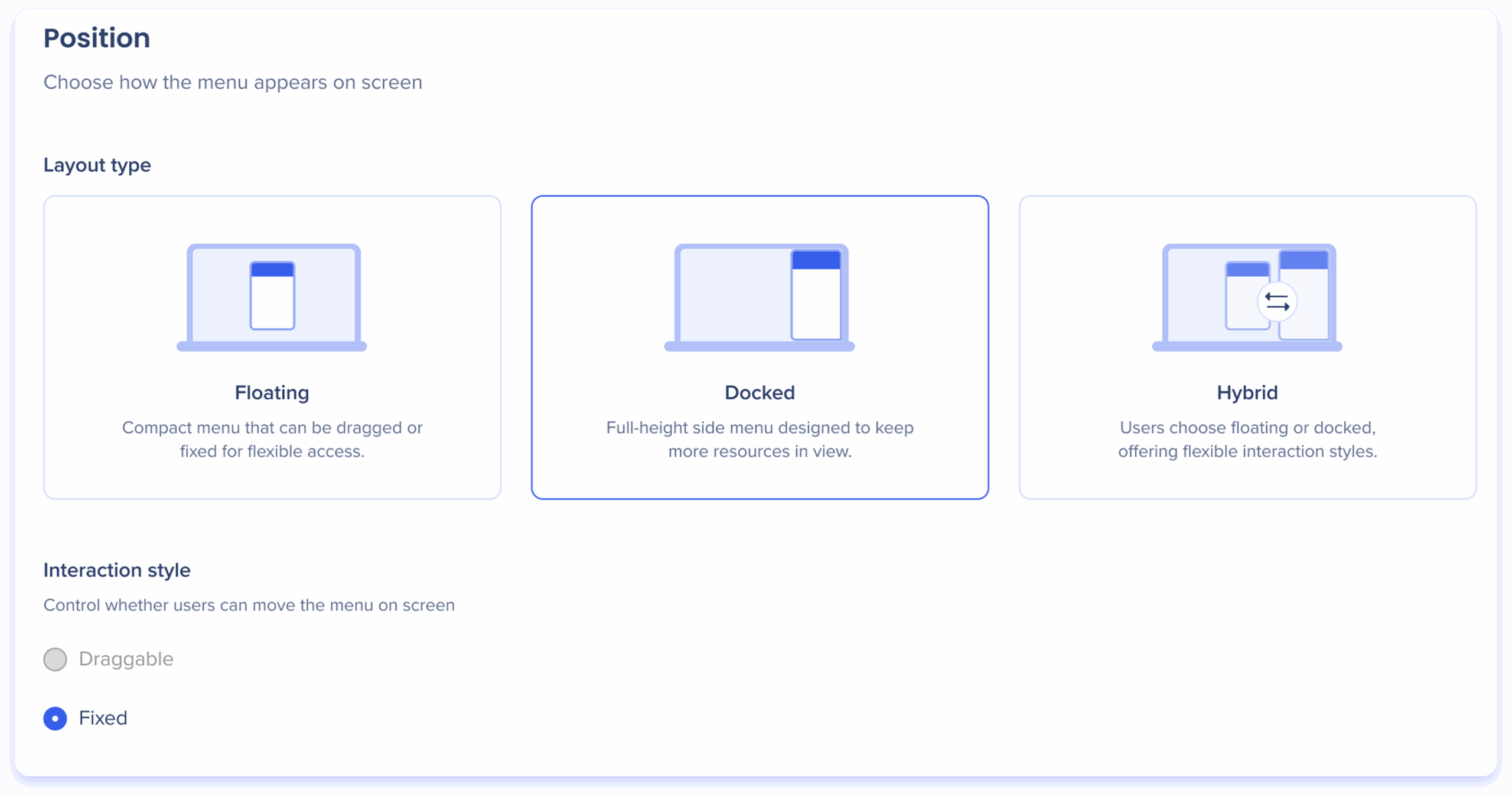
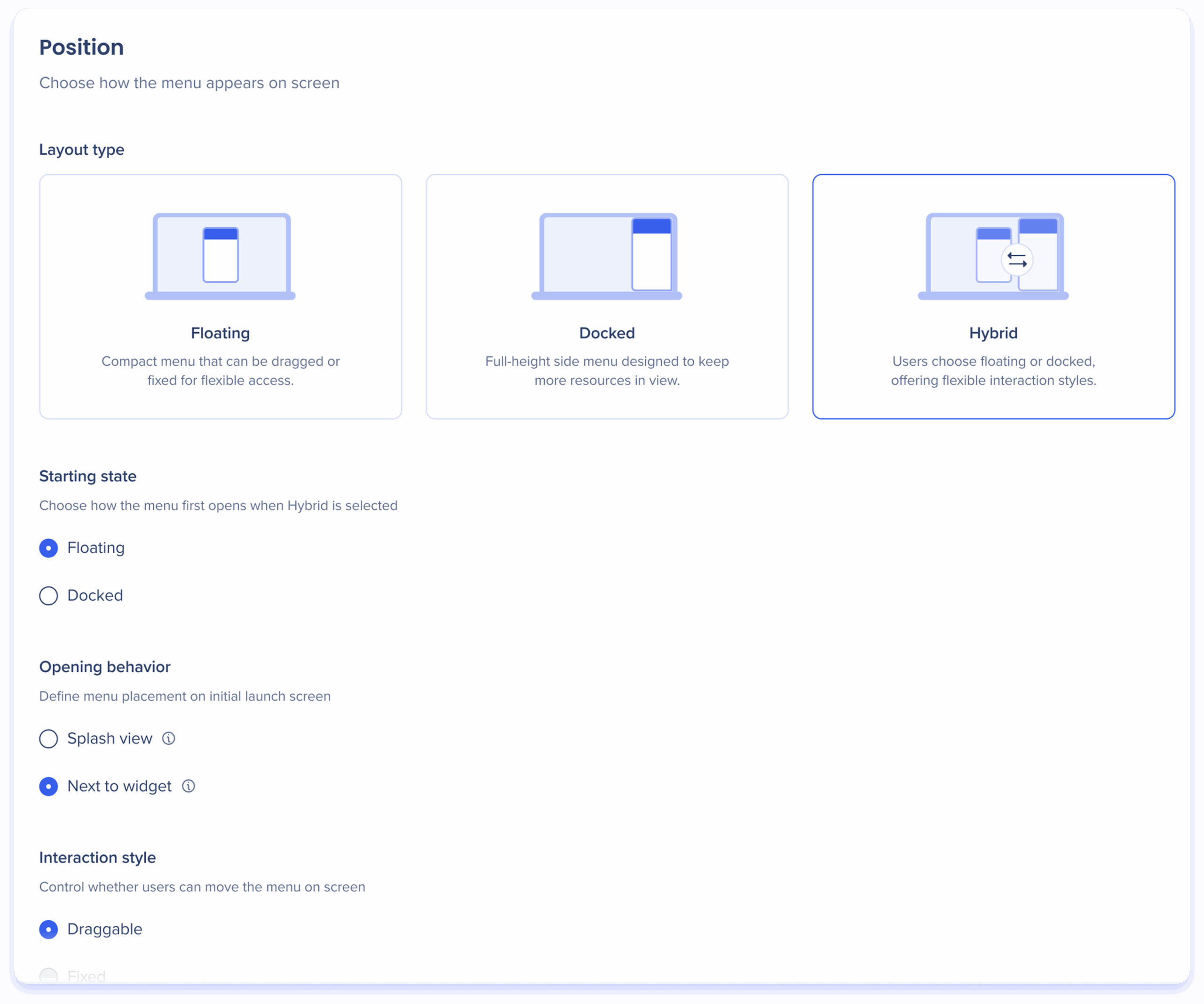
Position
The Position tab defines where and how the menu trigger and panel appear on the screen.
Each mode — Floating, Docked, and Hybrid — offers additional configuration options.
Floating
The floating menu is a compact overlay menu that can be fixed on the screen or made draggable, providing flexible access.
Opening behavior
Choose how the menu opens after the user triggers the menu:
Splash view: Opens the menu in the center of the screen to draw user attention
Next to widget: Opens the menu near the widget that triggers it for easy, contextual access
Interaction style
Control whether users can move the menu on the screen:
Draggable: Allows users to reposition the menu anywhere on the screen
Fixed: Restricts the menu to a set position, preventing movement
Docked
The docked menu is a full-height menu located on the right-side of the screen, designed to keep more resources in view.
Interaction style
Control whether users can move the menu on the screen:
Draggable: Not applicable to the Docked layout type
To enable this feature, select the Hybrid layout type
Fixed: Restricts the menu to a set position, preventing movement (default)
Hybrid
The hybrid menu allows your users to switch between floating and docked.
Starting state
Choose how the menu first opens when triggered in hybrid mode.
Floating
Docked
Opening behavior
Choose how the menu opens after the user triggers the menu:
Splash view: Opens the menu in the center of the screen to draw user attention
Apply dimmed background: Turn on this toggle to dim the screen behind the menu, directing the user's attention during its initial launch
Next to widget: Opens the menu near the widget that triggers it for easy, contextual access
Interaction style
Control whether users can move the menu on the screen:
Draggable: Allows users to reposition the menu anywhere on the screen
Fixed: Restricts the menu to a set position, preventing movement
Menu Structure
Configure the menu pages.
Set a menu homepage
Decide whether the Resources page or the AI Chat page should be the first page users see when they open the menu
By default, the Resources page is set as the homepage
To change the homepage, hover over a page in the list and click the Homepage icon
Reorder pages
If you have Menu Organizer and Learning content enabled, you can rearrange these sections in the Resources page
Simply drag and drop the sections to organize them in your preferred order
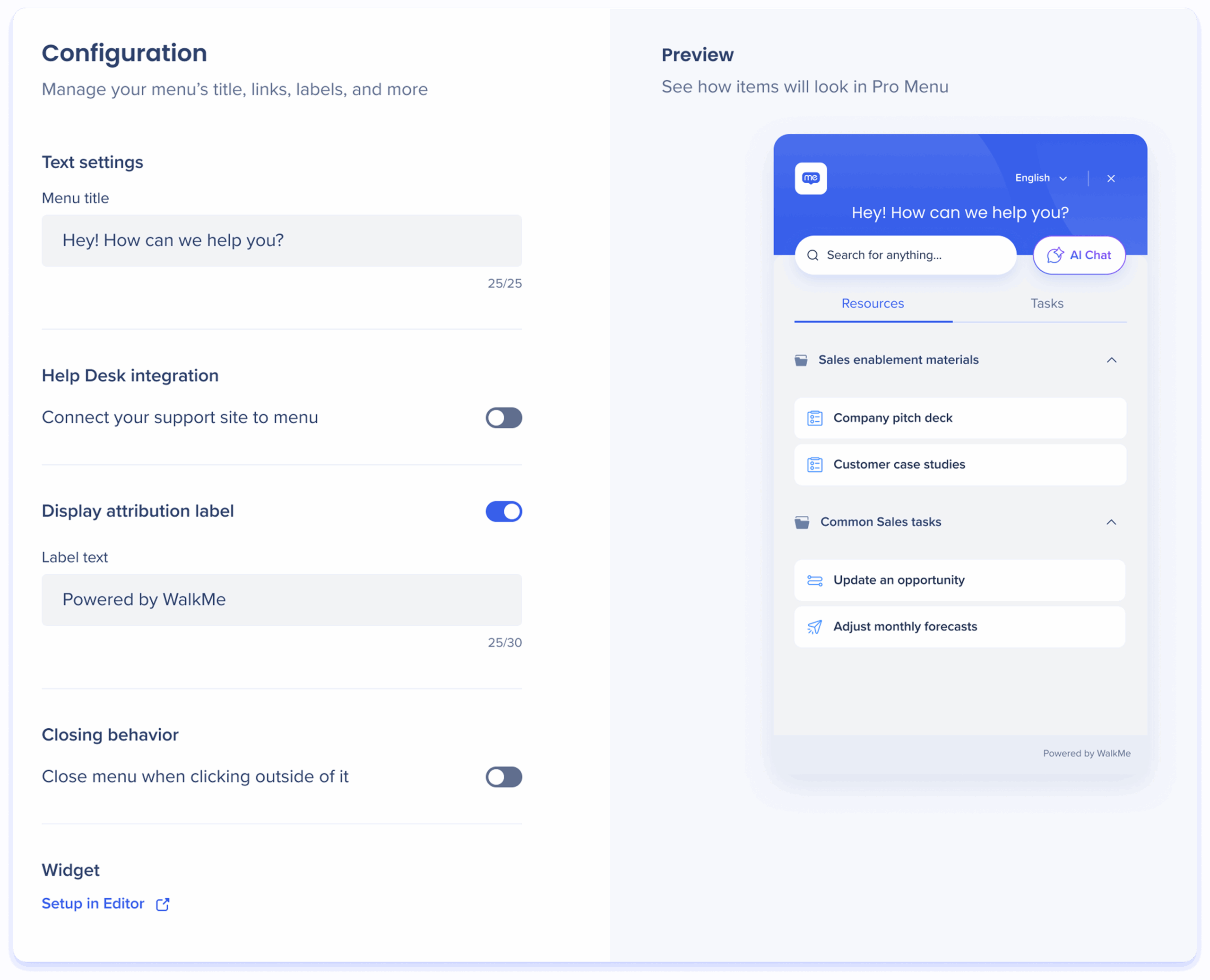
Configuration
The Configuration tab controls your menu's title, links, labels, and more.
Text settings
Menu title: Personalize the title to greet and guide users as they access company resources, tasks, and support
Help Desk integration
Turn on the Connect your support site to menu toggle to provide a direct link to your support site from the menu footer.
Users who click on the link will open the support site in a new tab in their browser.
Label text: Enter a label name to appear at the footer of the menu
URL: Enter the URL of your support site
Display attribution label
Turn on to add a custom label to your menu footer, allowing you to display your company name or any desired text.
Attribution label access
To activate the attribution label feature, please contact your CSM
Closing behavior
Turn on the Close menu when clicking outside of it toggle to automatically close the menu when users click anywhere outside of it.
Widget
Customize the button that triggers the menu to open.
Widget setup is still controlled in the WalkMe Editor.
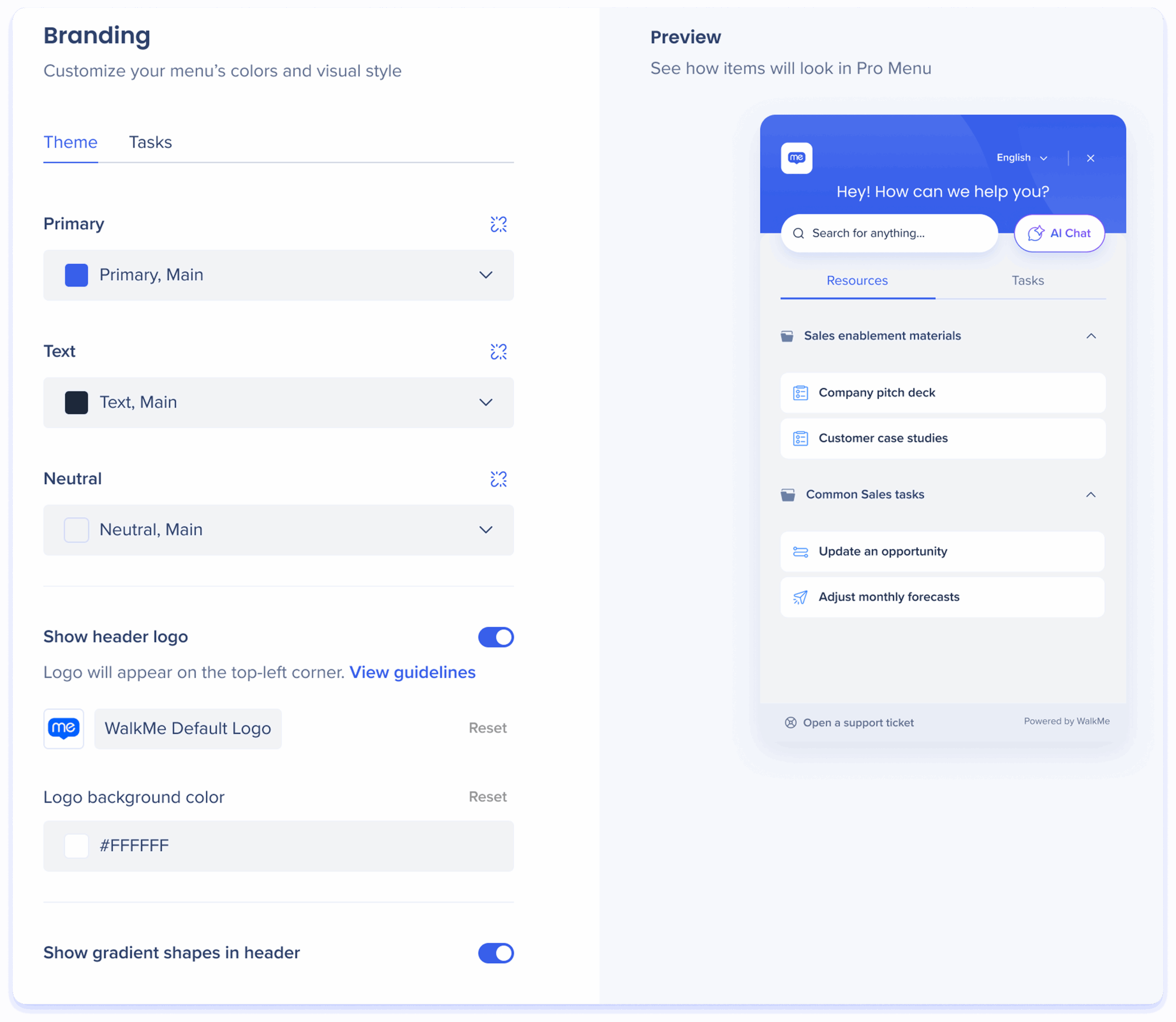
Branding
The Branding tab, featuring Theme and Tasks sub-tabs, allows you to customize your menu's appearance, including theme colors, header logo, and design elements, to align with your company's brand identity.
Theme
Theme colors
Customize your menu's appearance by adjusting these theme colors:
Primary: Sets the color of the menu header
Text: Sets the color of the menu text
Neutral: Sets the background, cards, and footer colors of the menu
Detach from Theming App
By default, the theme colors come from the Theming app. You can click the Detach icon to customize the branding colors for different elements of the WalkMe Menu, overriding the default settings.
Show header logo
Turn on to include your company logo on the top-left corner of the menu.
Header logo: Add your company logo by uploading it
Logo background color: Choose a background color for the logo
Show gradient shapes in the header
Turn on to add subtle design elements to the menu header.
With gradient shapesWithout gradient shapes
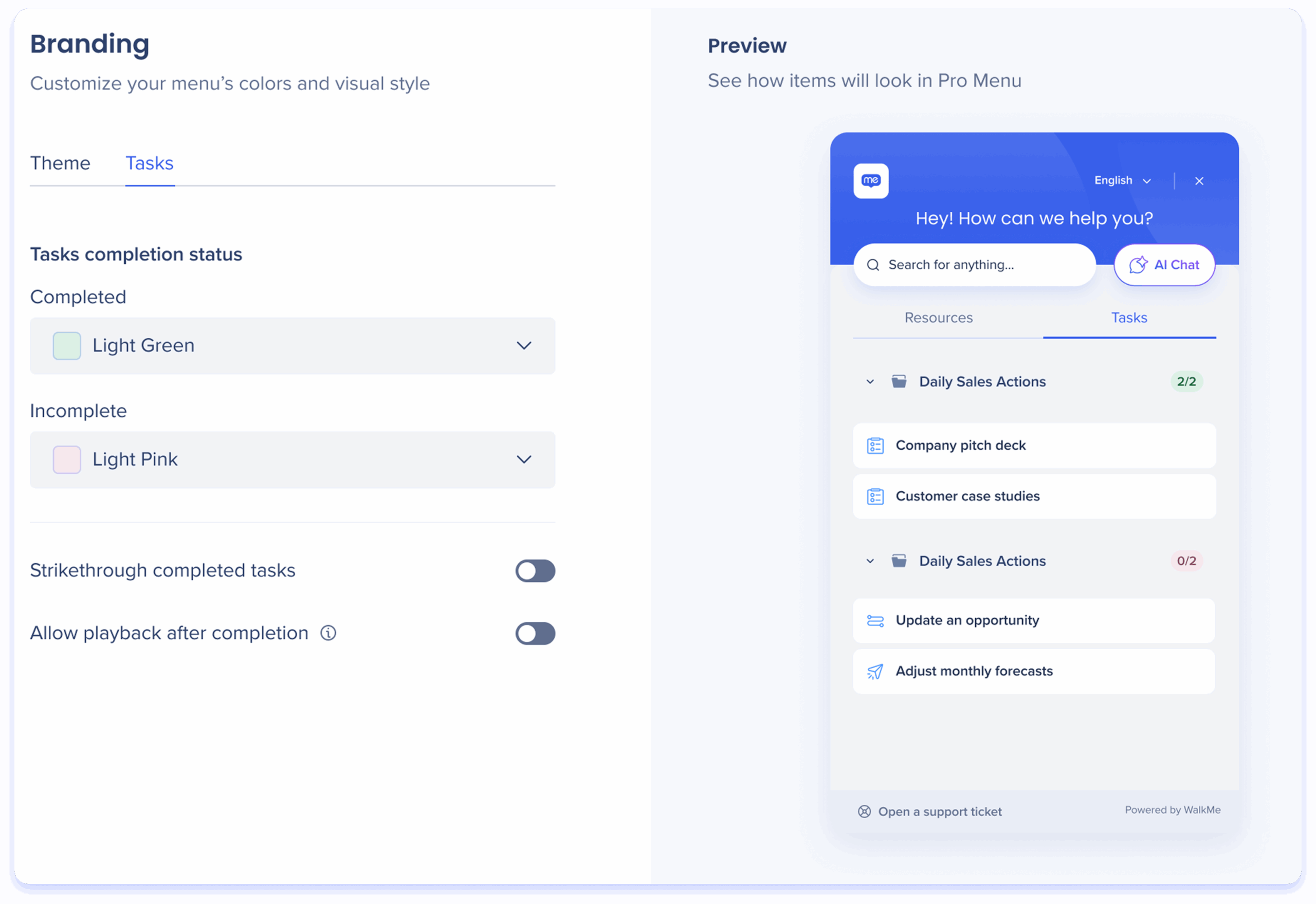
Tasks
Tasks completion status
Choose colors to indicate task completion status:
Use one color for completed tasks and another for incomplete tasks
These status indicators will appear on the right side of task folders
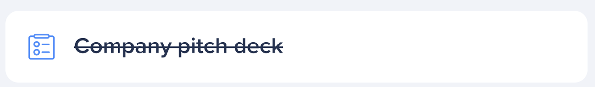
Strikethrough completed tasks
Turn on to apply a strikethrough to completed tasks, making them visually distinct for easy tracking.
Allow playback after completion
Turn on to allow users to complete a task again after they already completed it.
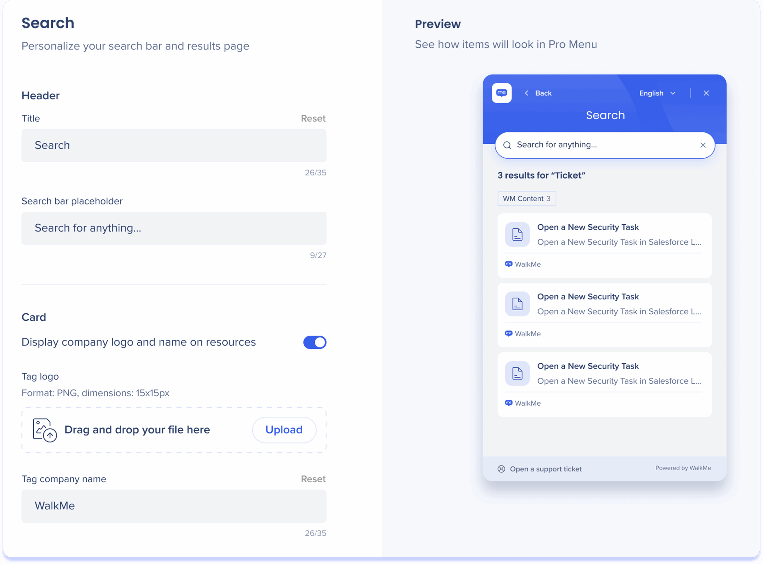
Search
The Search tab allows you to personalize your search bar and search results page by customizing the page title, placeholder text, and displaying your company logo and name in results.
Header
Title: Personalize the title of the search results page
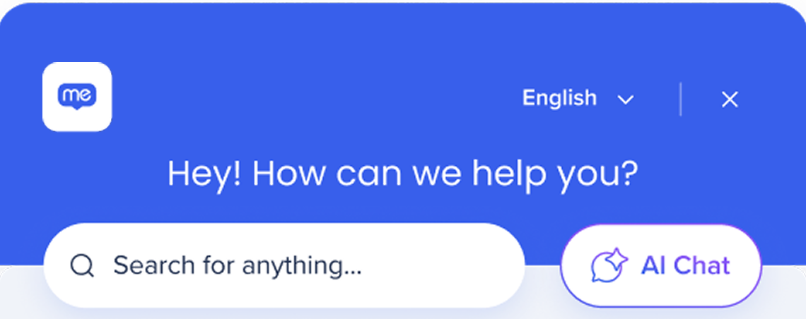
Search bar placeholder: Customize the placeholder text in the search field to guide users. For example: "Search for anything..."
Card
Turn on to show your company logo and name in a company resources results.
Tag logo: Add your company logo by uploading it
Tag company name: Enter a name for the company resource result tag


 To change the homepage, hover over a page in the list and click the Homepage icon
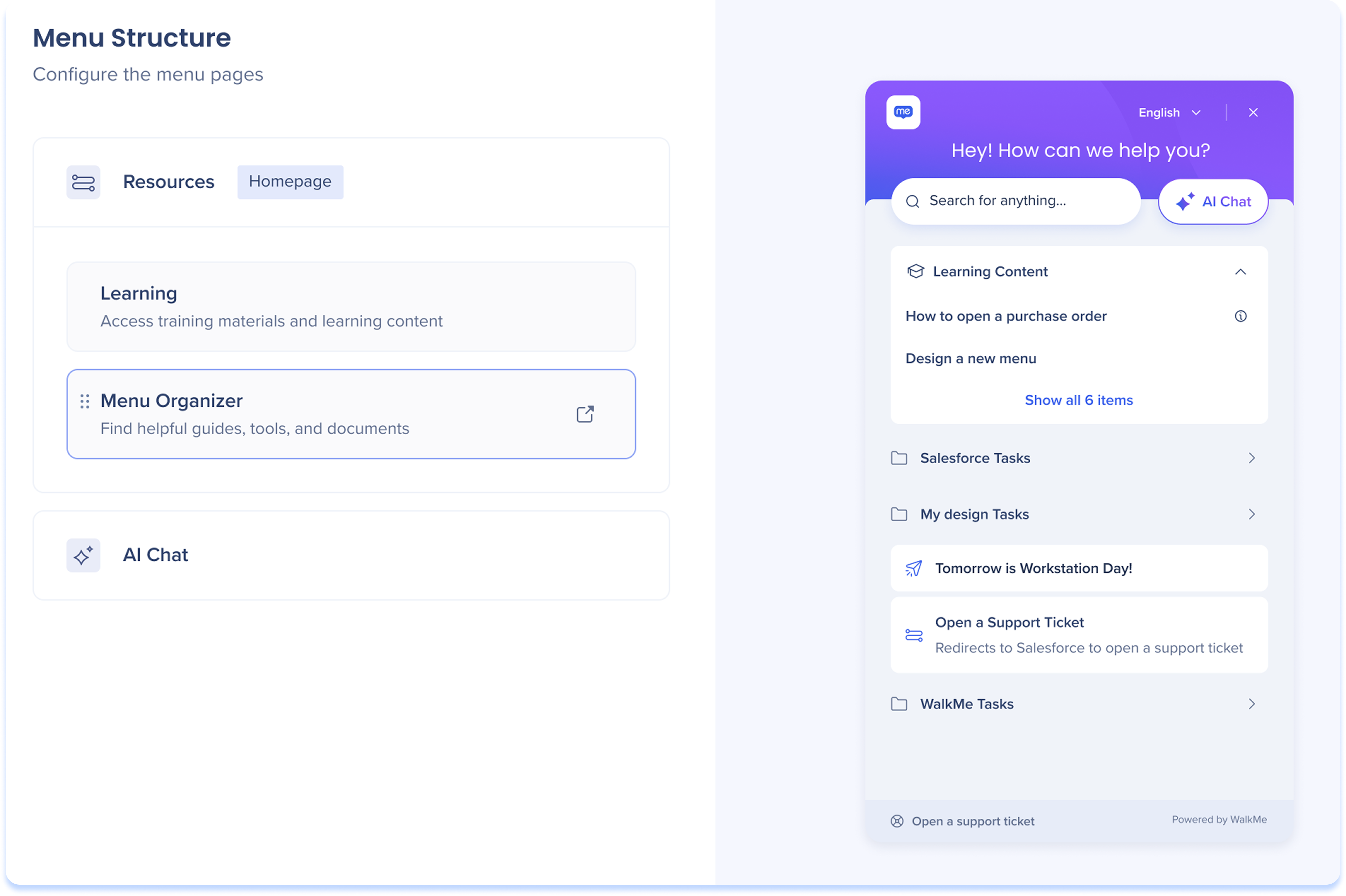
