The WalkMe Editor now has a new design. Our goal was to transform the old interface into a visually appealing, easier to use, and intuitive experience, consistent with other WalkMe applications.
This article covers the key changes in the new design compared to the old.
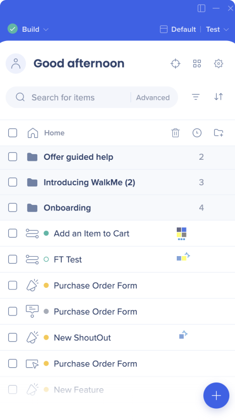
Status icon, Play/Build mode, header and search all got a new design
Switch system was moved and redesigned
To switch to build on mobile web, users now click on their current system name in the upper right corner
Home line minor UI changes
"All items" dropdown removed
New filter option was added - by item type
Editor footer changes
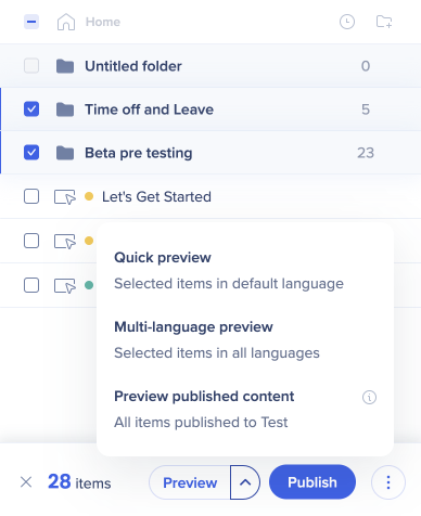
Footer buttons removed:
Preview (now will appear only when items are selected)
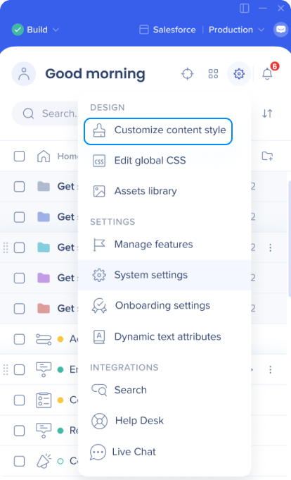
Customize (now available under the Settings icon in the top right corner)
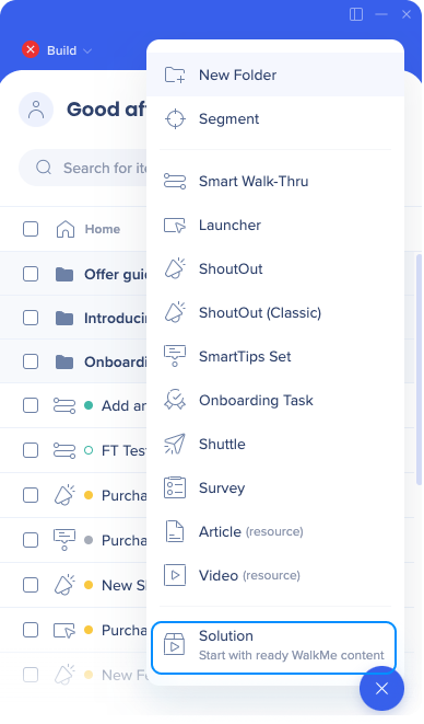
Solutions (relocated to the "Create" menu - under the blue plus icon)
Menu (now available under the Apps menu in the top right corner)
New look and functionality for Create+ button
You can now use it to create folders and segments also
No longer filtered by item type
Exceptions: Shield, Engaged Element, Element Library
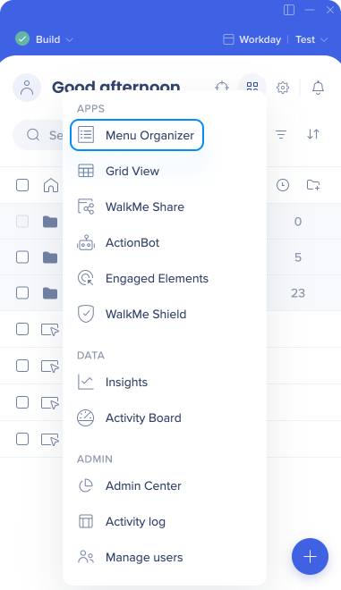
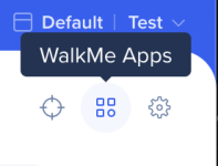
WalkMe Apps menu
The new WalkMe Apps menu offers a central place to access your WalkMe apps, divided into the following categories: Apps, Data, Admin
Create + Button
The revamped Create + button is similar to the old one, with a few key changes:
You can now create any item type using the + button, even when filtering to view specific items types
Two new create options were added: "New Folder" and "Segment"
These additions do not replace existing creation methods from other locations
The list has been simplified and certain names were changed
"Resources" has been replaced with more intuitive options: "Video" and "Article"
"ShoutOuts" has been split into "ShoutOut" and "ShoutOut Classic" for easier access without the need to hover
Anmerkung
Bei der Auswahl von „Shield“, „Engaged Elements“ und „Element Library“ kann im Menü „Create“ nur dieser Elementtyp erstellt werden. Benutzer können in Shield beispielsweise nur neue Tests erstellen.
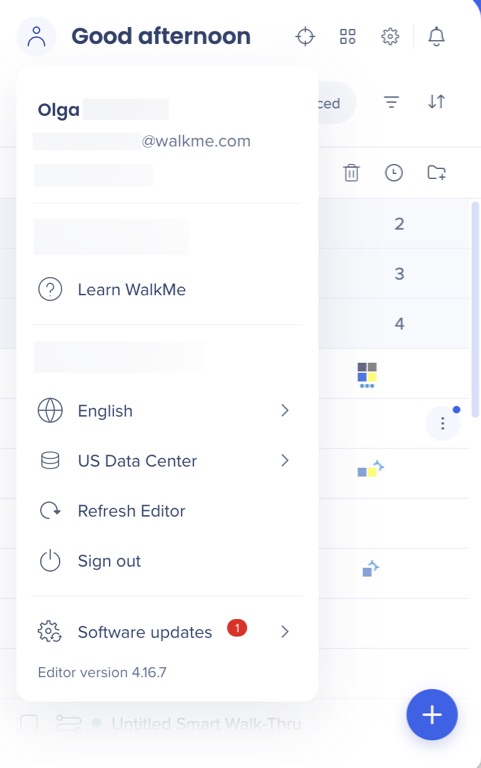
Profile / User Menu
The user menu is a new concept, designed to provide a more personalized experience for the builders.
Within the user menu, users can access actions and information tailored to their specific user profile.
Previously, many of these options were found in the editor options menu.
Settings menu
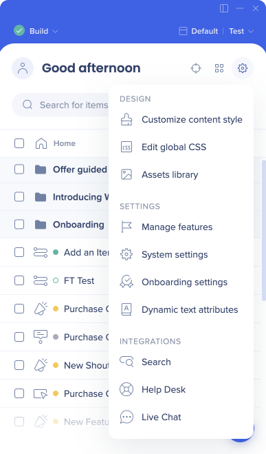
The settings menu serves as a centralized hub for all configurations within the editor, including global system settings.
In the previous design, these settings were found in different locations in the editor, in the footer, header, and within the options menu. We consolidated them all in one location for improved user experience.
Several notable changes:
Integrations moved from the "All items" dropdown menu to the Settings Menu. We consider them as global, system-level settings, which led to this repositioning.
The feature previously known as "Customize" and located in the Editor footer has been relocated to the Settings Menu, now referred to as "Customize content style."
We have removed the direct link to the Snippet screen. Instead, users can access the "System settings" from the Settings Menu and find the new Snippet tab there.
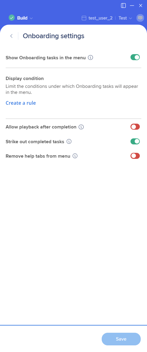
Onboarding settings, previously available only through the "All items" dropdown menu when viewing Onboarding exclusively, have now been placed in the Settings Menu. This change allows users to access this system-level setting regardless of their item list filtering.
All Items Menu
The following apps were previously only, or mainly, available from the “All items” menu:
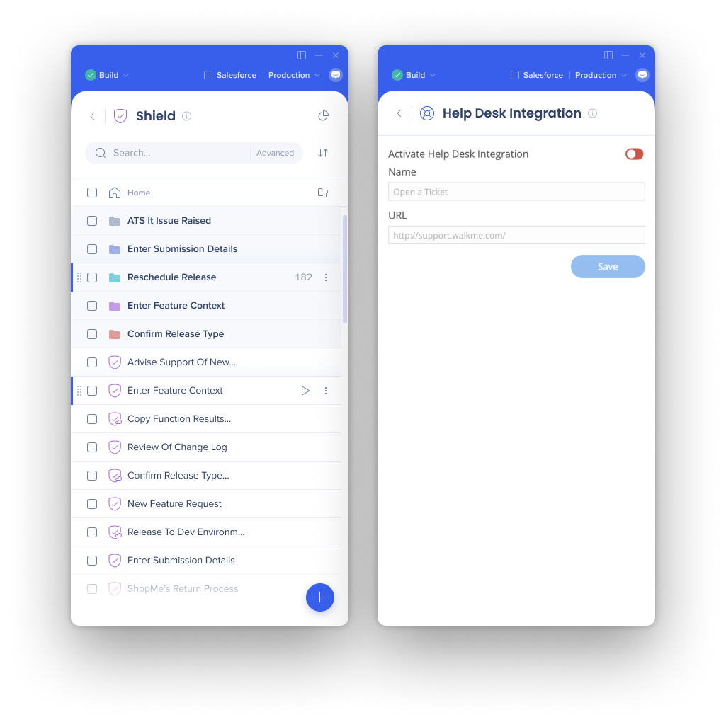
ActionBot
Shield
Engaged Elements
Element Library
Search integration
Live Chat
Help Desk
These apps got a new look and will now be available from either the “WalkMe Apps” menu or the “Settings menu”.
Item Screens
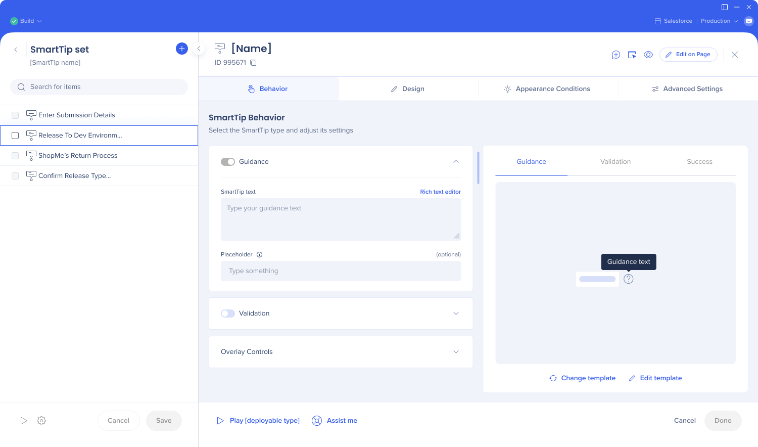
New updated screens are available for SmartTip sets, ShoutOuts, Smart Walk-Thrus, onboarding tasks, shuttles, surveys, articles, and videos.
The settings tabs moved from the left-hand side to the top
Tabs were grouped
The header is now the part of item creation
The footer is dedicated to finalizing and troubleshooting
Notes used to have a tab of their own, it was replaced with the Add+ icon in the upper right corner
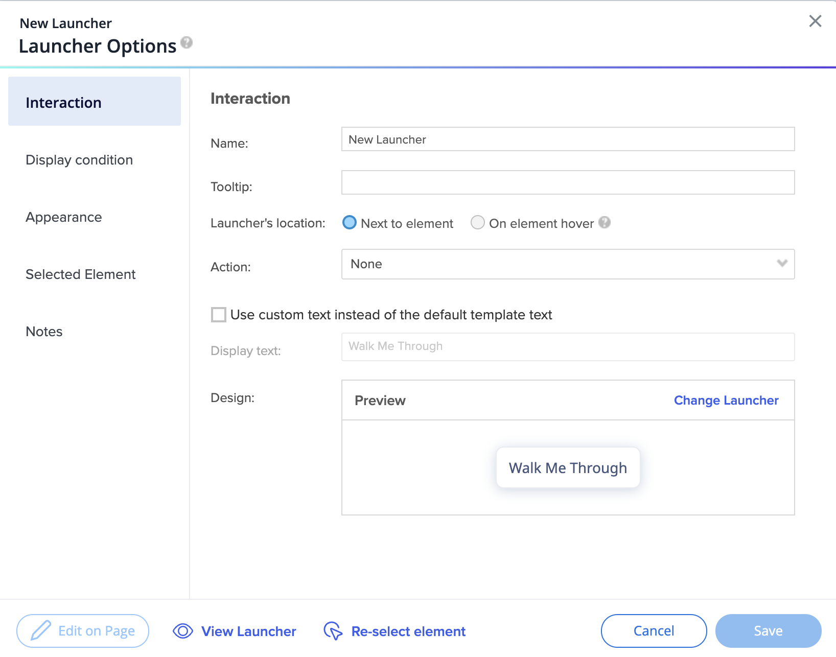
Launcher settings
Before:
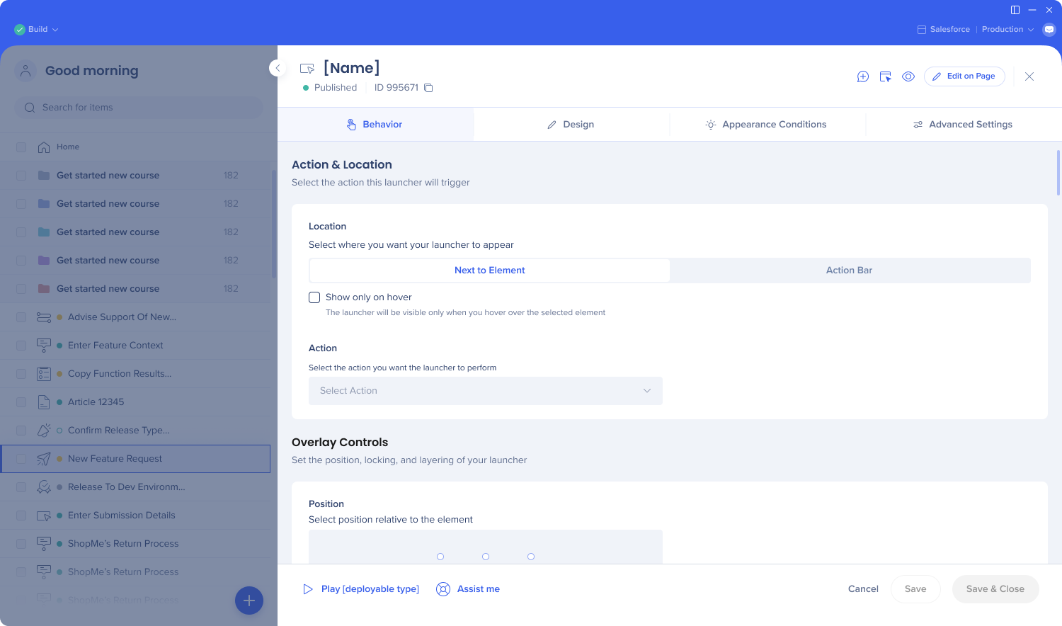
Still available by default, click on the banner to try the new design
After:
Tabs renamed and reorganized to combine similar settings and make the user experience smoother
New Behavior tab contains the Interaction tab settings
Selected Element tab settings partially moved to Advanced Settings, and partially removed
Element loading behavior is now a dropdown with “Automatic” selected by default. This automatic feature is the best technology; no need to select the behavior manually anymore.
“Constantly checks“ option renamed into Removal behavior. New name better explains the functionality of this setting.
Users on DeepUI systems won't see the “Element attributes to ignore” section
Precision level and element grade settings were removed and replaced with a better behind the scenes technology
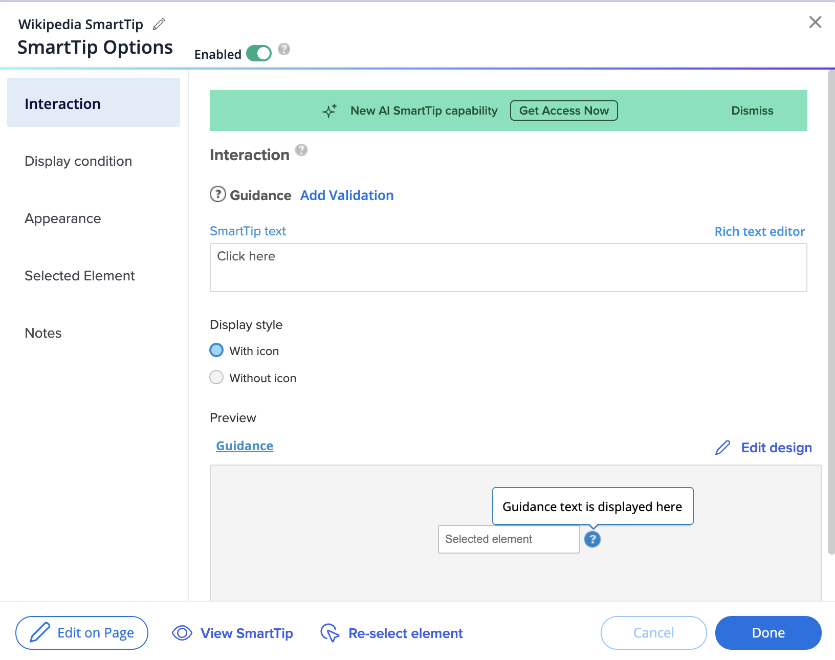
Still available by default, click on the banner to try the new design
After:
Tabs renamed and reorganized to combine similar settings and make the user experience smoother
New Behavior tab contains the Interaction tab settings
Display style (with or without icon) moved to the Design tab
Selected Element tab settings partially moved to Advanced Settings, and partially removed
Element loading behavior is now a dropdown with “Automatic” selected by default. This automatic feature is the best technology; no need to select the behavior manually anymore.
“Constantly checks“ option renamed into Removal behavior. New name better explains the functionality of this setting.
Users on DeepUI systems won't see the “Element attributes to ignore” section
Precision level and element grade settings were removed since it got replaced with a better behind the scenes technology
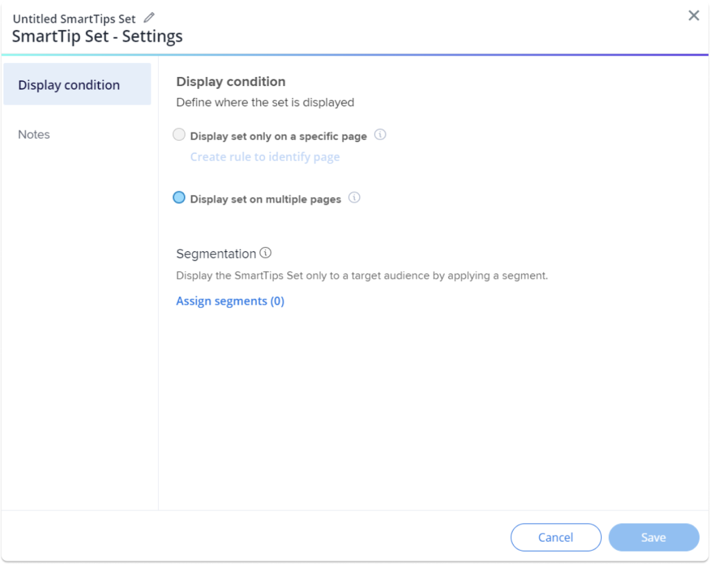
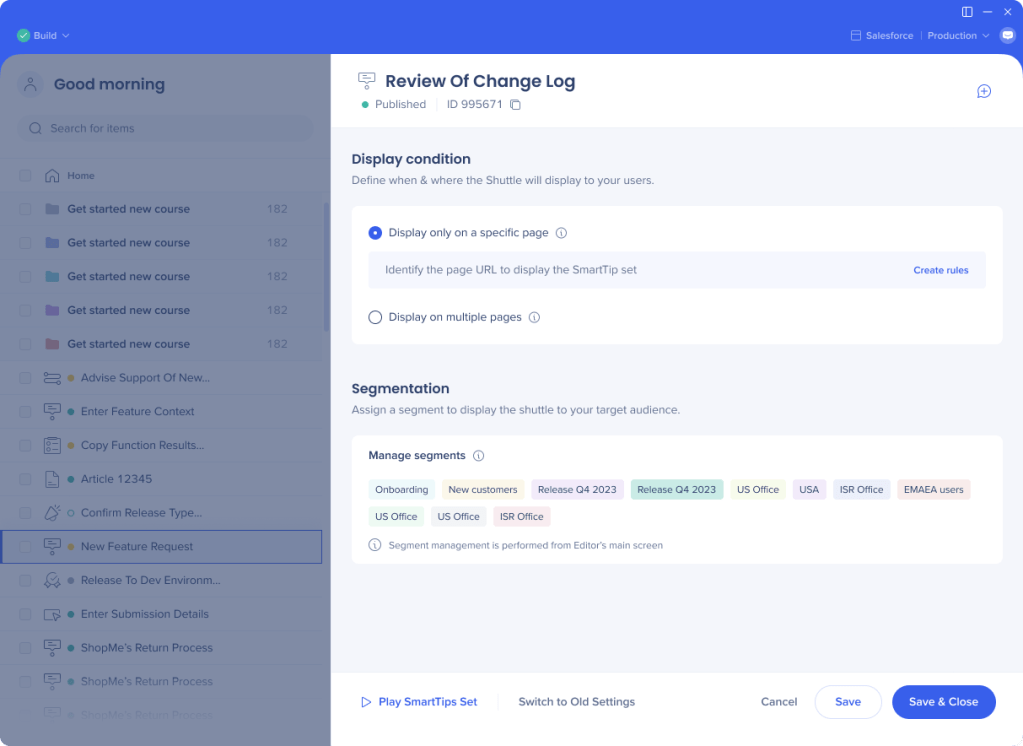
SmartTips Set settings
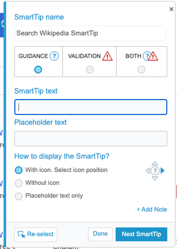
Before:
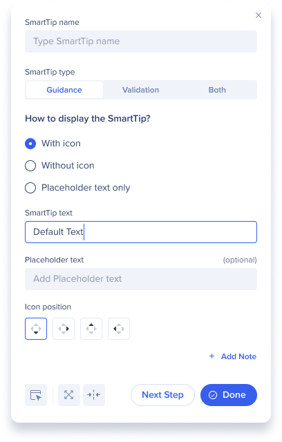
After:
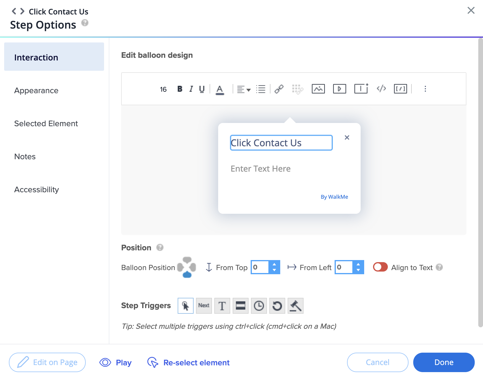
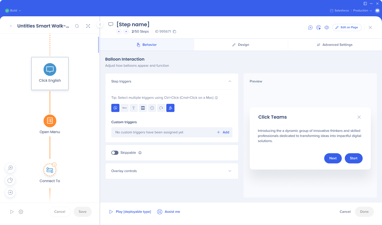
Smart Walk-Thru steps
Before:
Schon gewusst?
Die neuen Smart Walk-Thru-Bildschirme sind sowohl für Web- als auch für mobile Websysteme verfügbar.
After:
Header:
See the step number and navigate between step screens
See and copy the step ID
Add notes
Reselect the element
View screenshot
Open the Edit on Page tool
Behavior tab:
Easily change the text from the Quick edit screen
Select multiple custom triggers, and see an indication of which triggers work well together
Set the step duration
Overlay controls
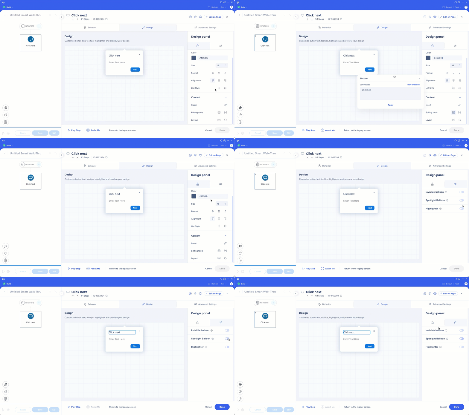
Design tab
See preview of spotlight and highlighter
Easily drag the setting windows such as BBcode's
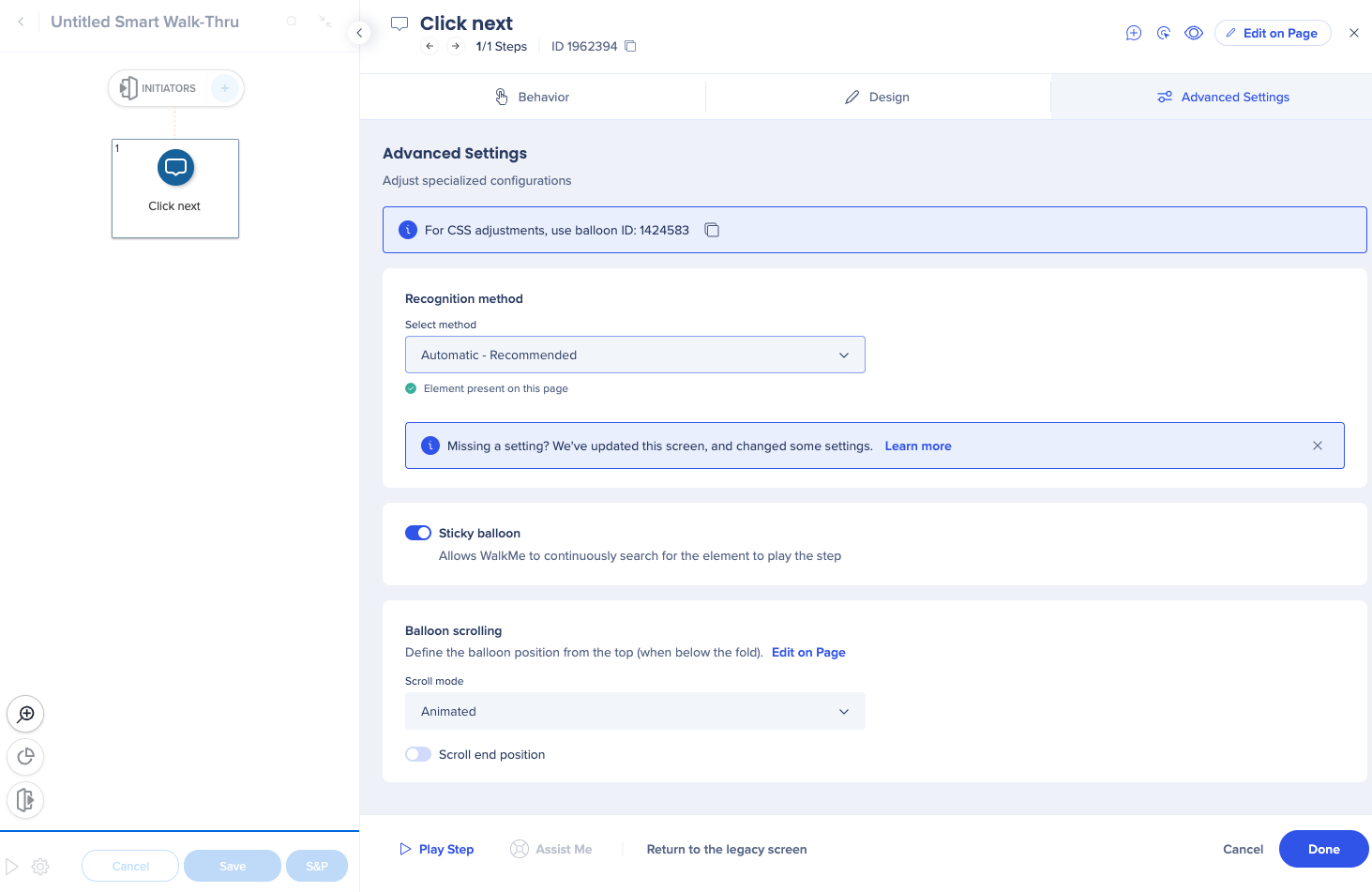
Advanced Settings tab
Selected Element tab settings were partially moved here, and partially removed
Element loading behavior is now a dropdown with “Automatic” selected by default. This automatic feature is the best technology; no need to select the behavior manually anymore.
Precision level and element grade settings were replaced with a better behind the scenes technology
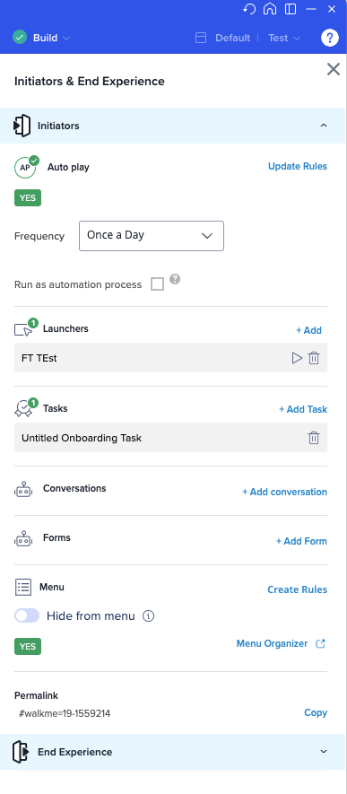
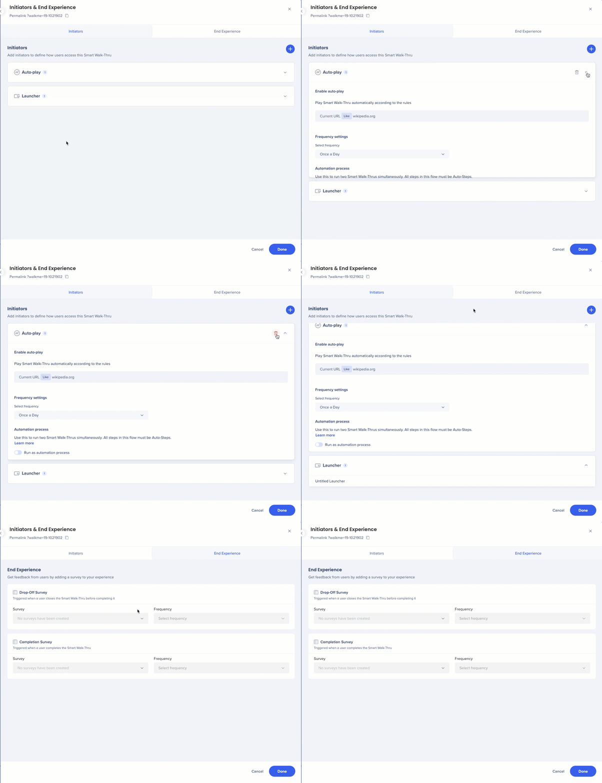
Initiators and end experience
Before
After
Full screen view
Click Expand to see the details of each initiator
Survey naming change to better reflect the use cases
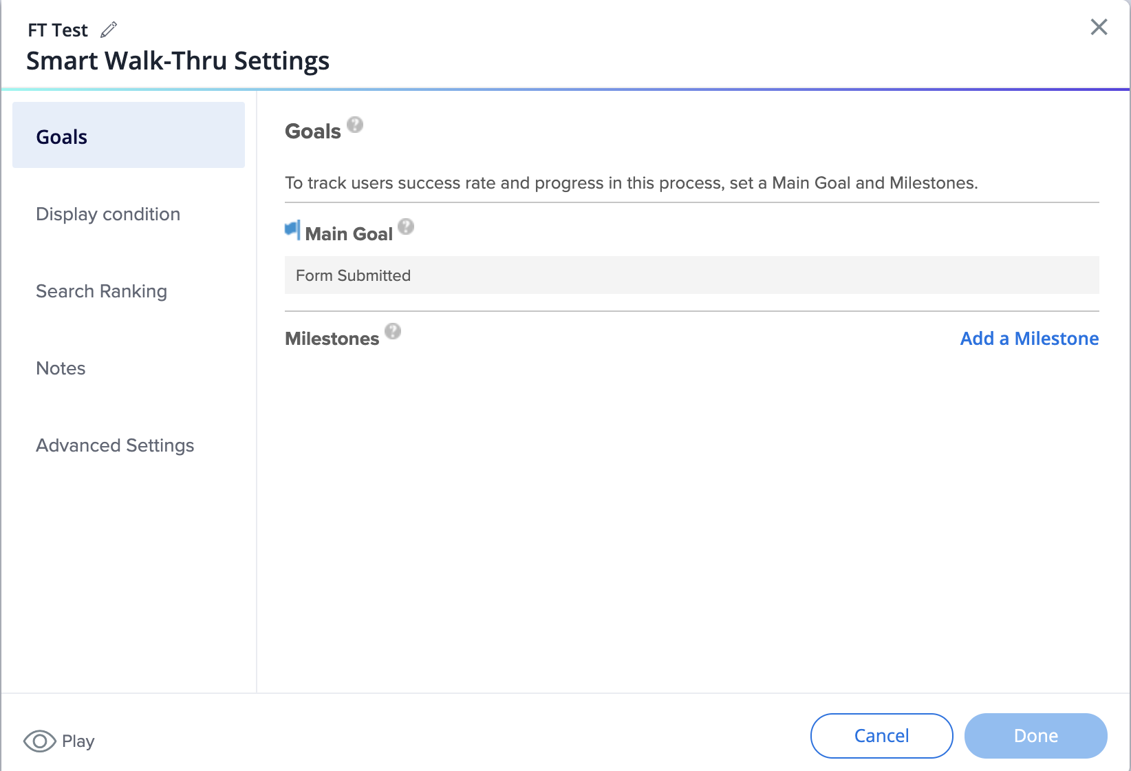
Smart Walk-Thrus settings
Before
Goals have their own tab
Display conditions tab includes segmentation and the ability to create the menu display conditions from here
Search ranking has its own tab
Advanced Settings only include the field for entering custom data
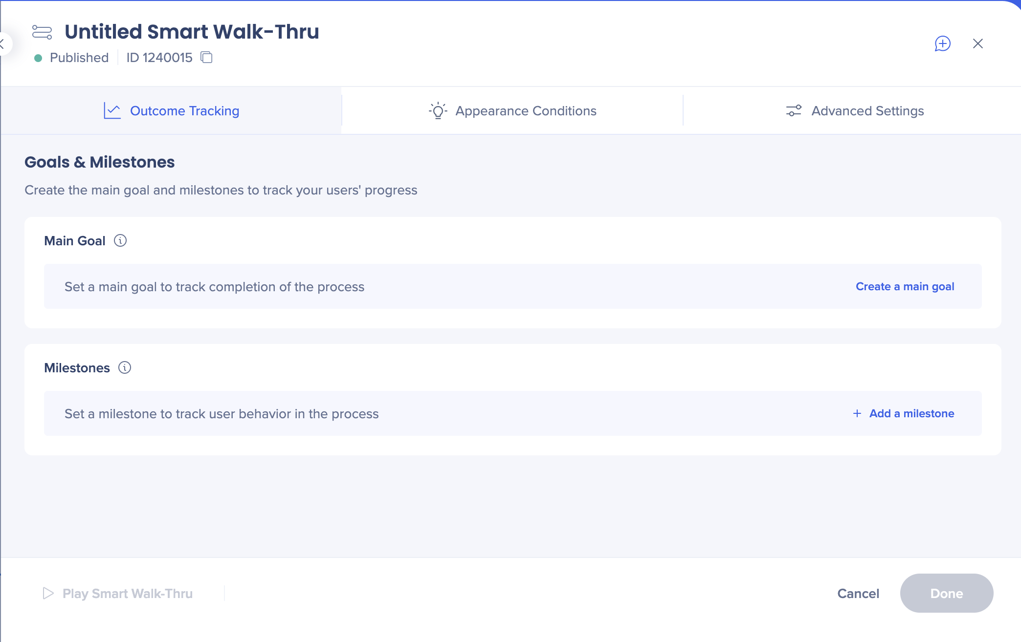
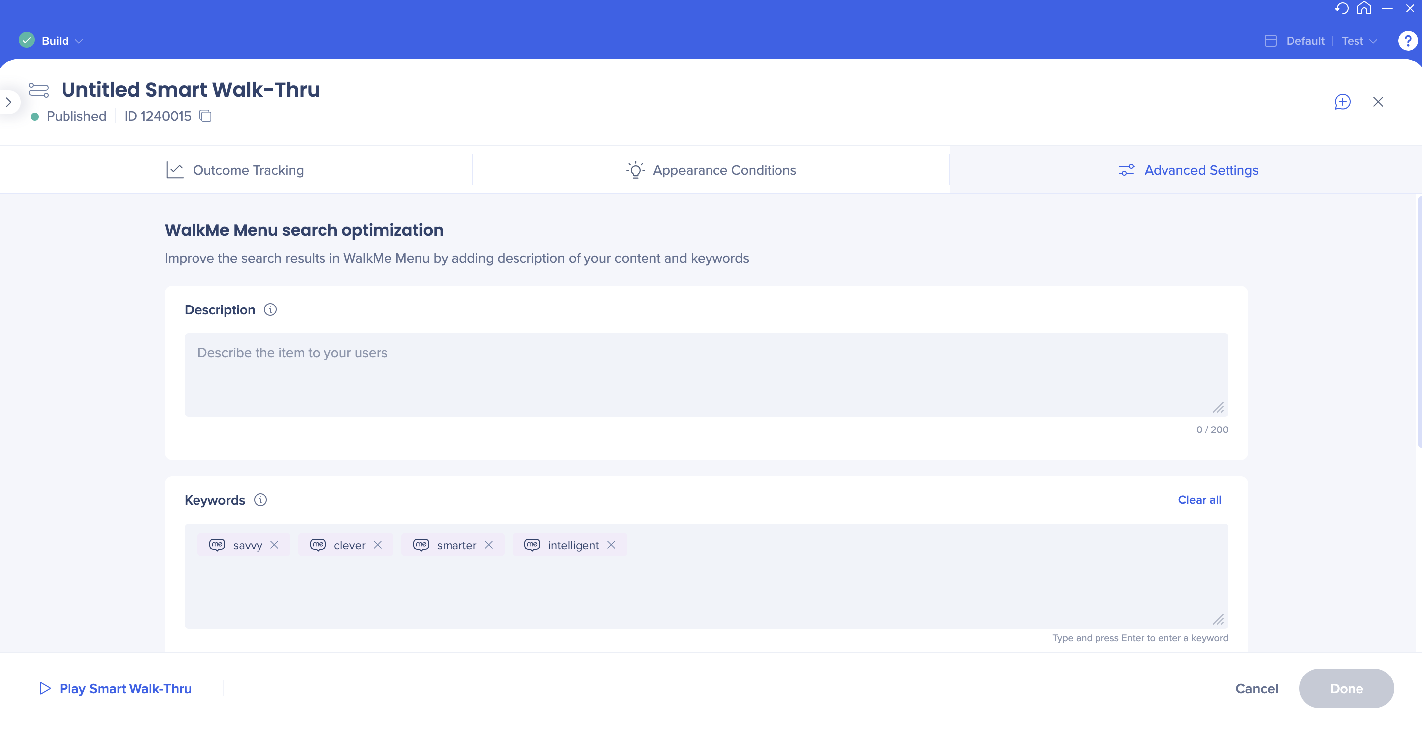
After
Goals and milestones moved under the new Behavior tab
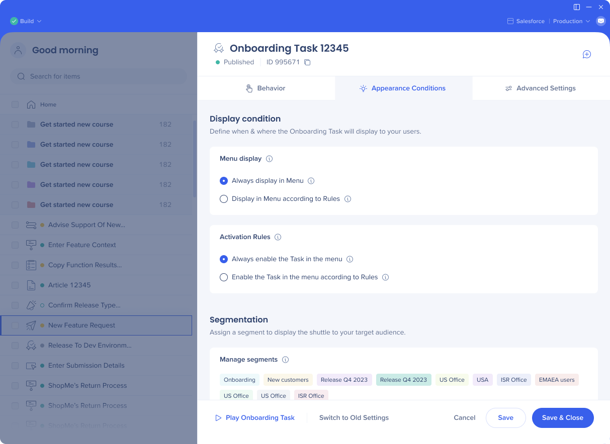
Segmentation is now done from the Appearance Conditions tab
Menu display conditions were moved to the Initiators panel
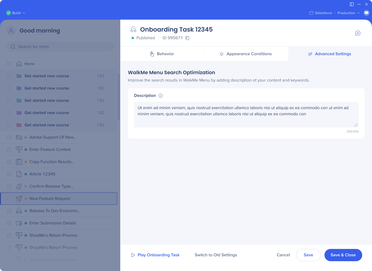
Search ranking/optimization and keywords moved to the Advanced Settings tab
Anmerkung
Das benutzerdefinierte Datenfeld (zuvor - CustomField1) in den erweiterten Einstellungen ist standardmäßig nicht mehr verfügbar. Wenn Sie es aktivieren müssen, wenden Sie sich bitte an den Support.
Onboarding tasks
Before:
All the settings presented as toggles on a single screen
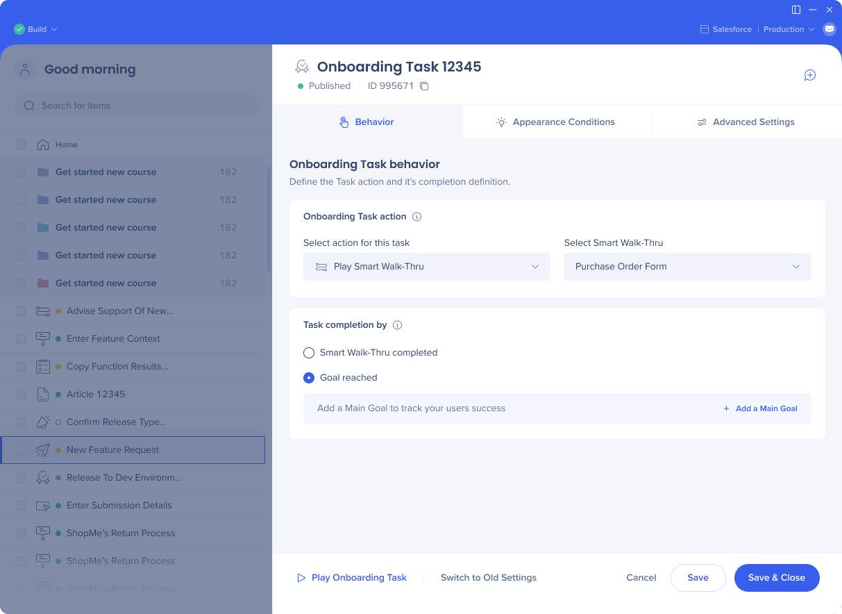
Settings are organized in separate tabs:
Behavior
Appearance Conditions
Advanced Settings
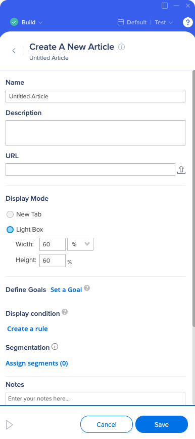
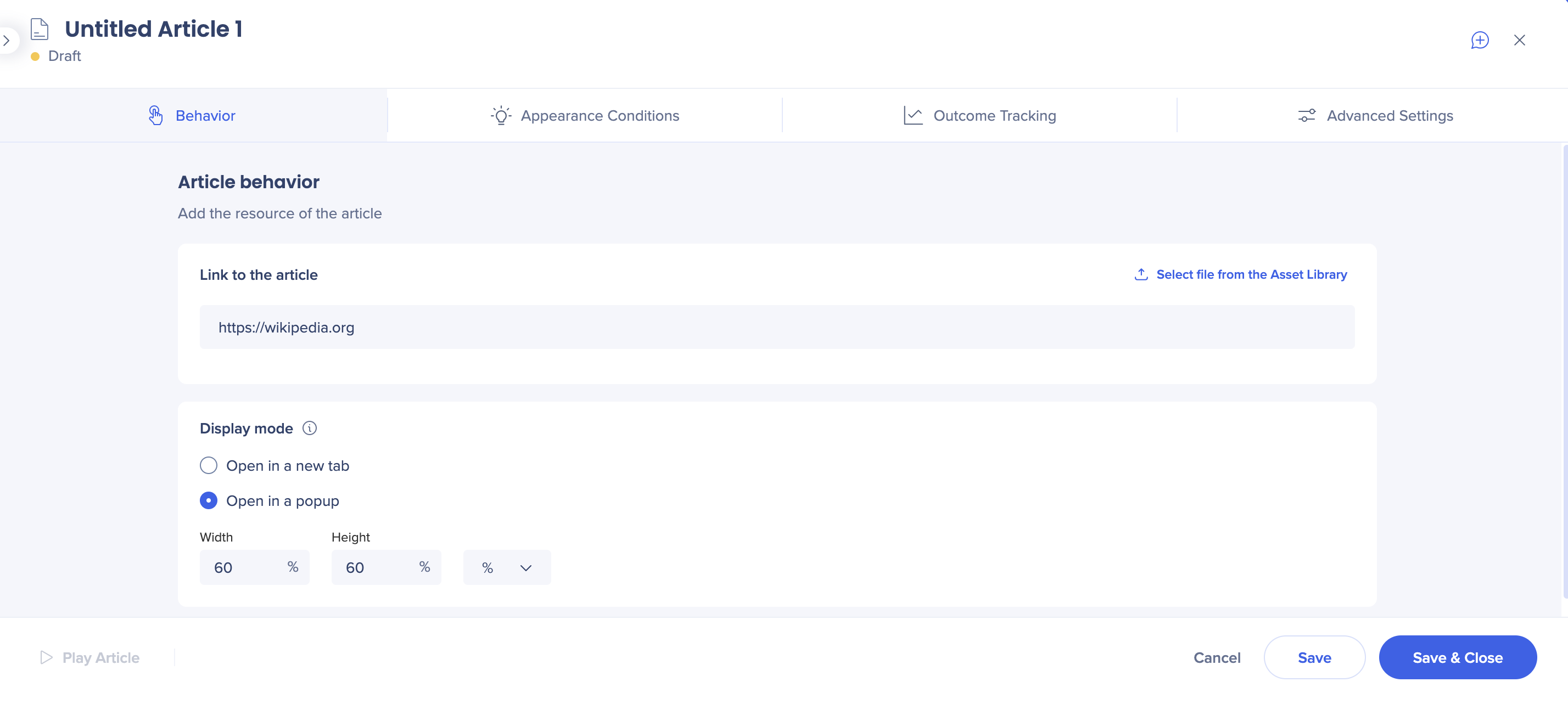
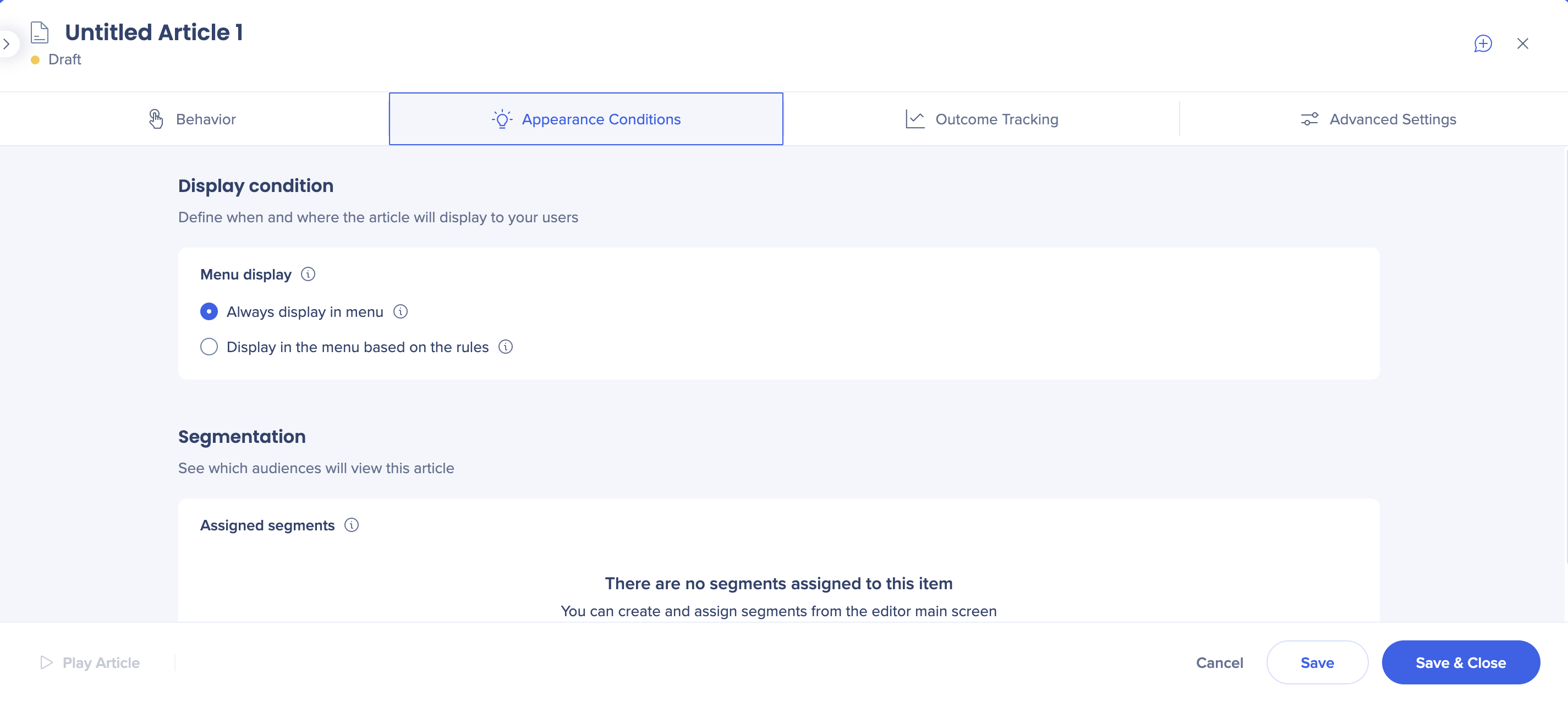
Articles
Before:
All the settings are done from the creation screen
Settings organized in separate tabs:
Behavior
Appearance Conditions
Outcome Tracking (goals and milestones)
Advanced Settings (search and keywords)
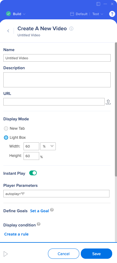
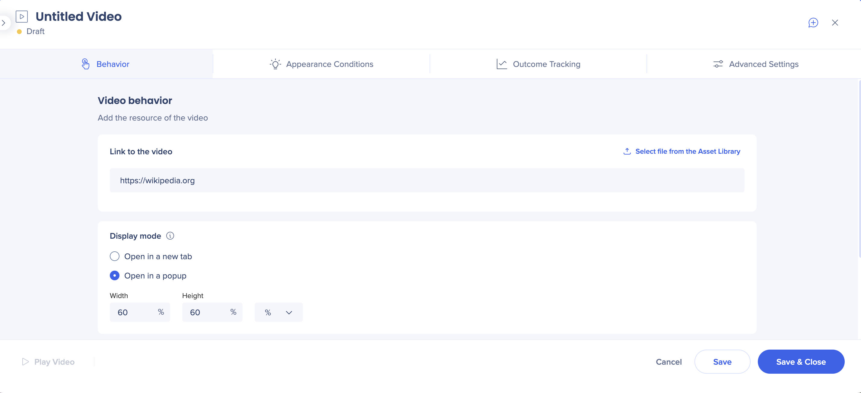
Videos
Before:
All the settings are done from the creation screen
After:
Settings organized in separate tabs:
Behavior
Appearance Conditions
Outcome Tracking (goals and milestones)
Advanced Settings (search and keywords)
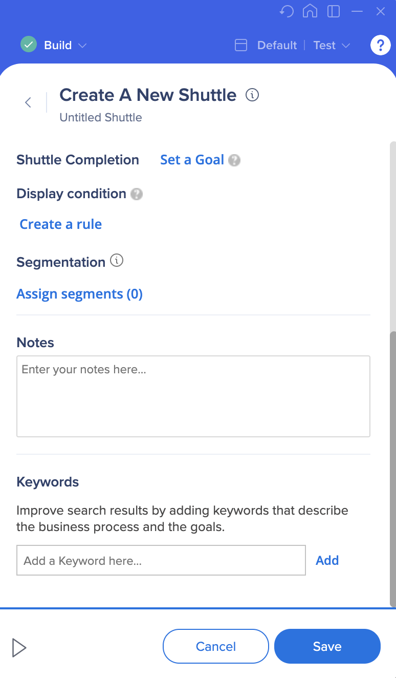
Shuttles
Before:
All the settings are done from the creation screen
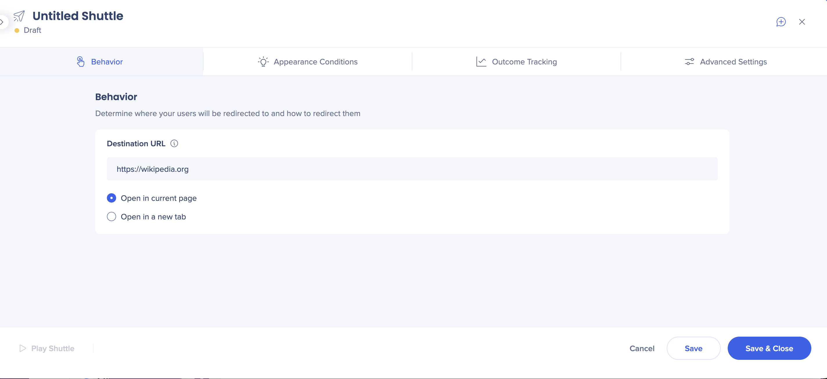
After:
Settings organized in separate tabs:
Behavior
Appearance Conditions
Outcome Tracking (goals and milestones)
Advanced Settings (search and keywords)
ShoutOut Settings
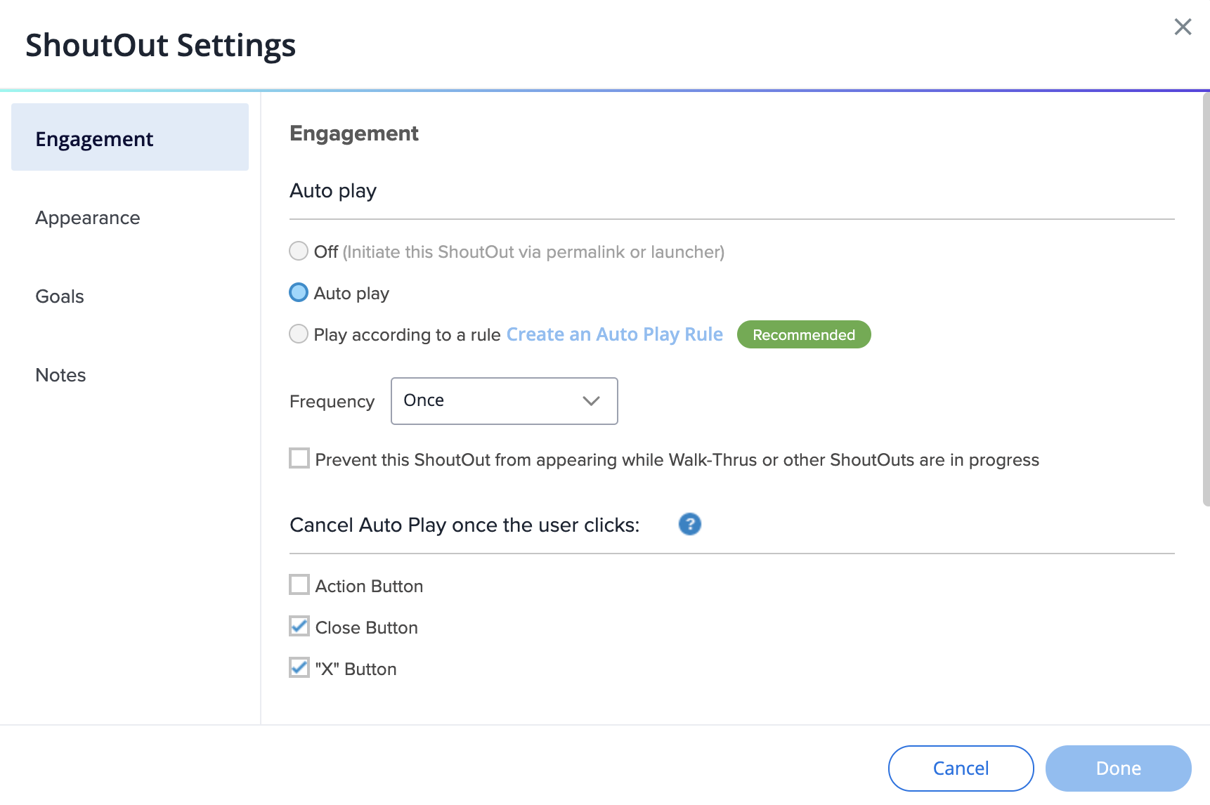
Before:
The size of the screen cannot be changed
Auto-play settings are located in the Engagement tab
Appearance tab holds the z-index and delay settings
Notes have their own tab
After:
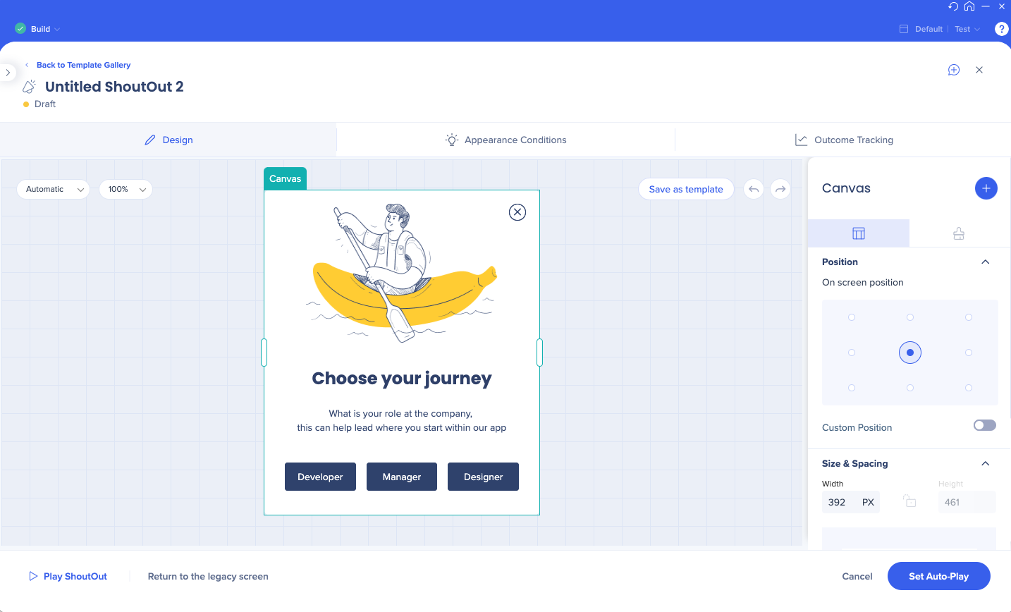
In the header, you can edit the name, see the item status (draft/published), and the Notes icon
In the footer, you can choose to return to legacy screen and play the ShoutOut (Play option is disabled if you're not connected to the page)
Click on the Expand icon to use the entire editor screen
In the Design tab, you can change the design of your ShoutOut and select the actions its buttons will perform
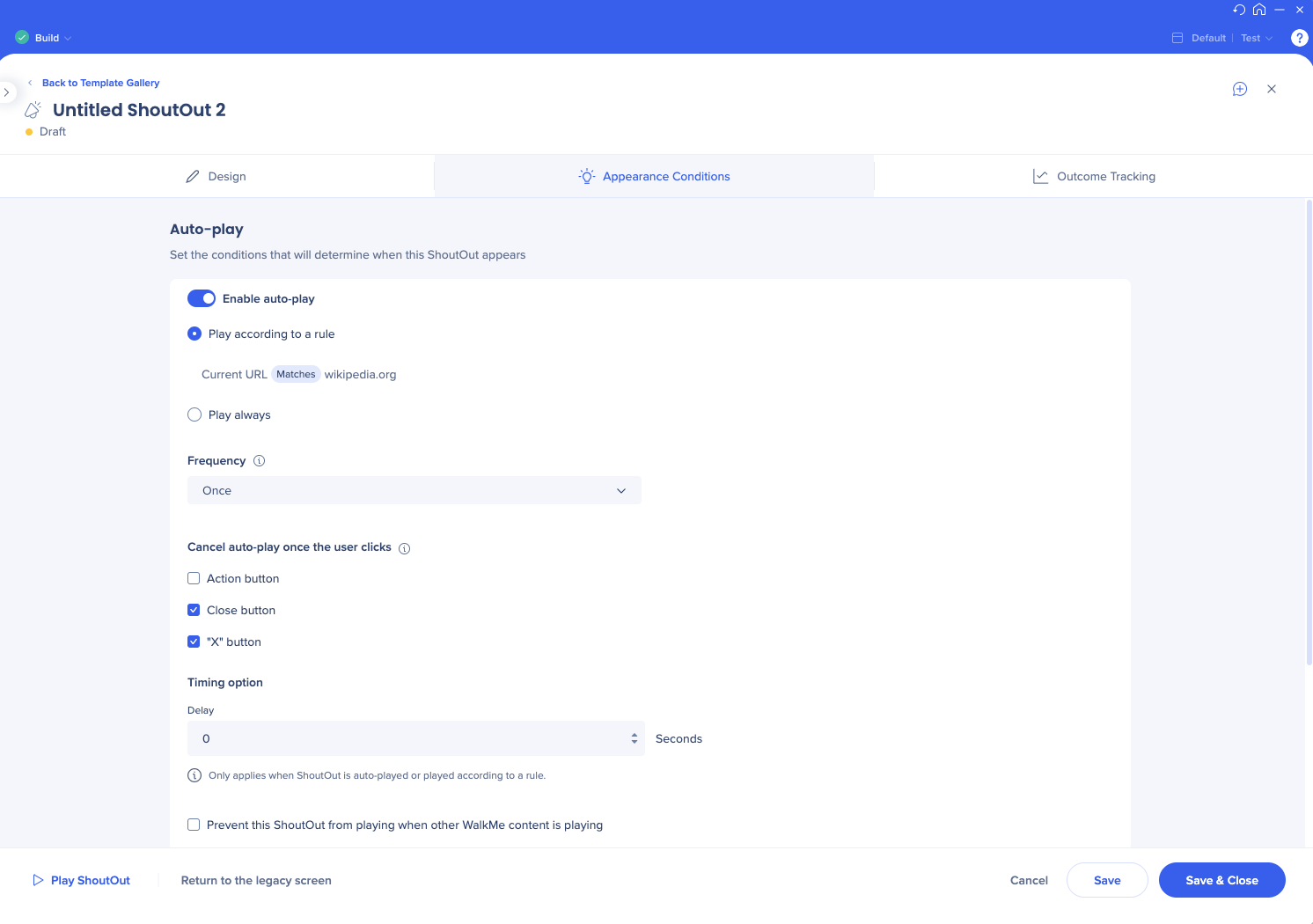
In the Appearance conditions tab, set when this item will appear for the users
All the auto-play settings only become visible when auto-play is enabled
If you choose custom frequency, you can now set a unified time zone for all the users to see your content at exactly the same time
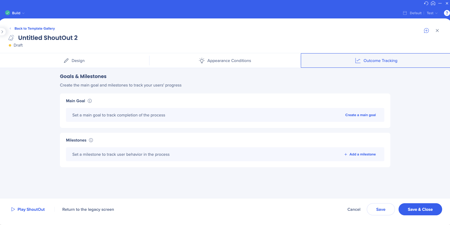
Set your ShoutOut goals and milestones in the Outcome Tracking tab
Survey Settings
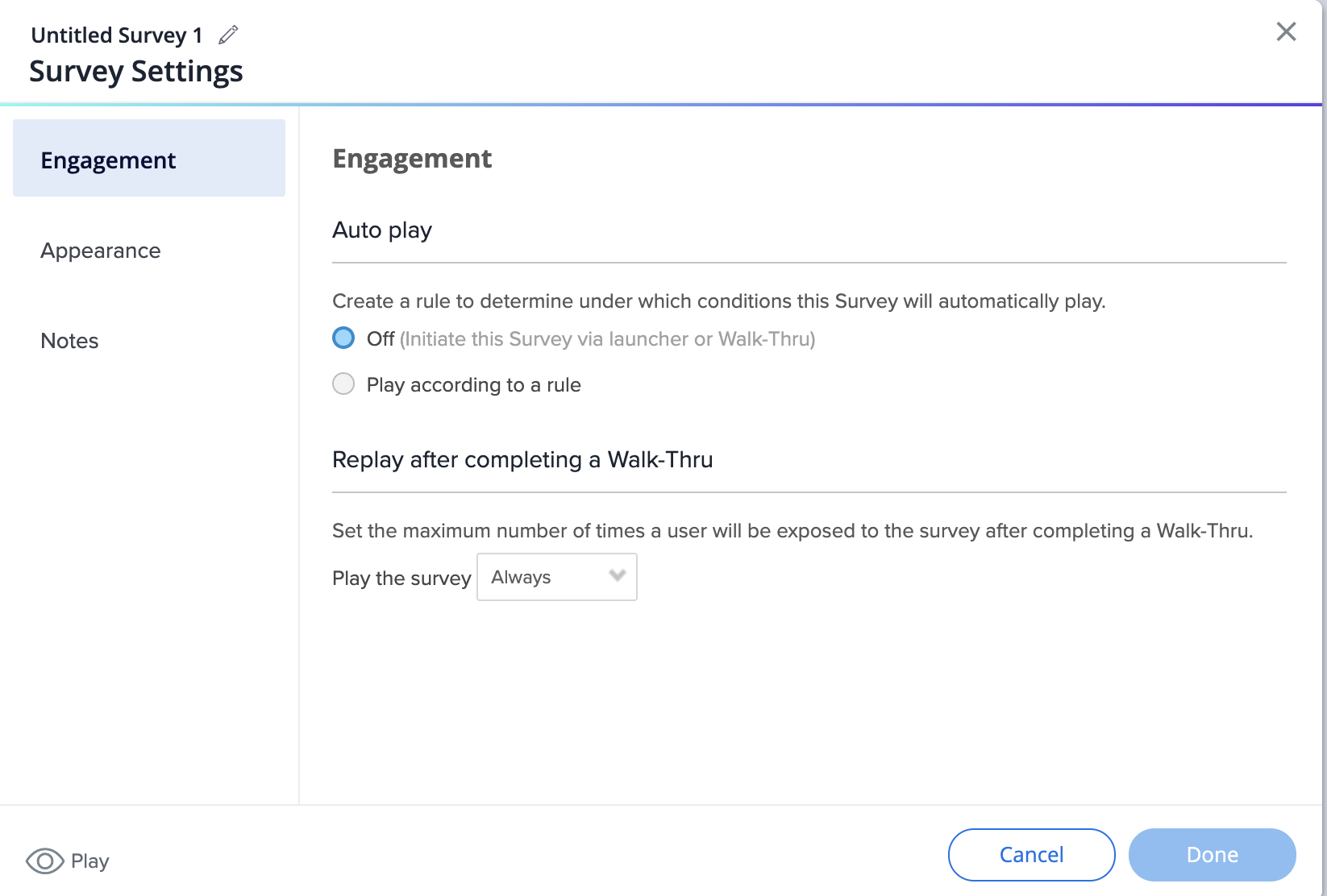
Before:
Auto-play settings are located in the Engagement tab
Appearance tab holds the survey name display options
Notes have their own tab
After:
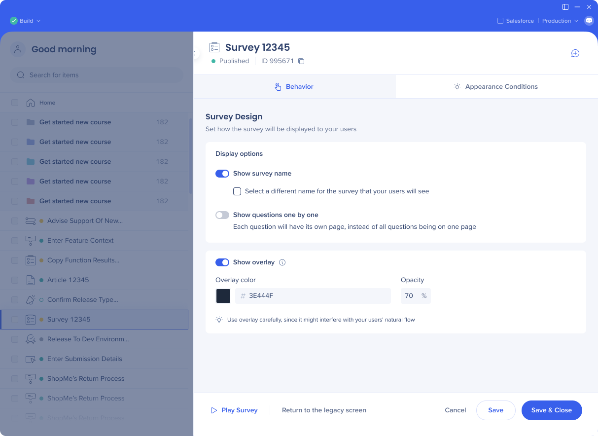
In the Behavior tab, set how you want the survey to be displayed to your users
You can choose to show the overlay
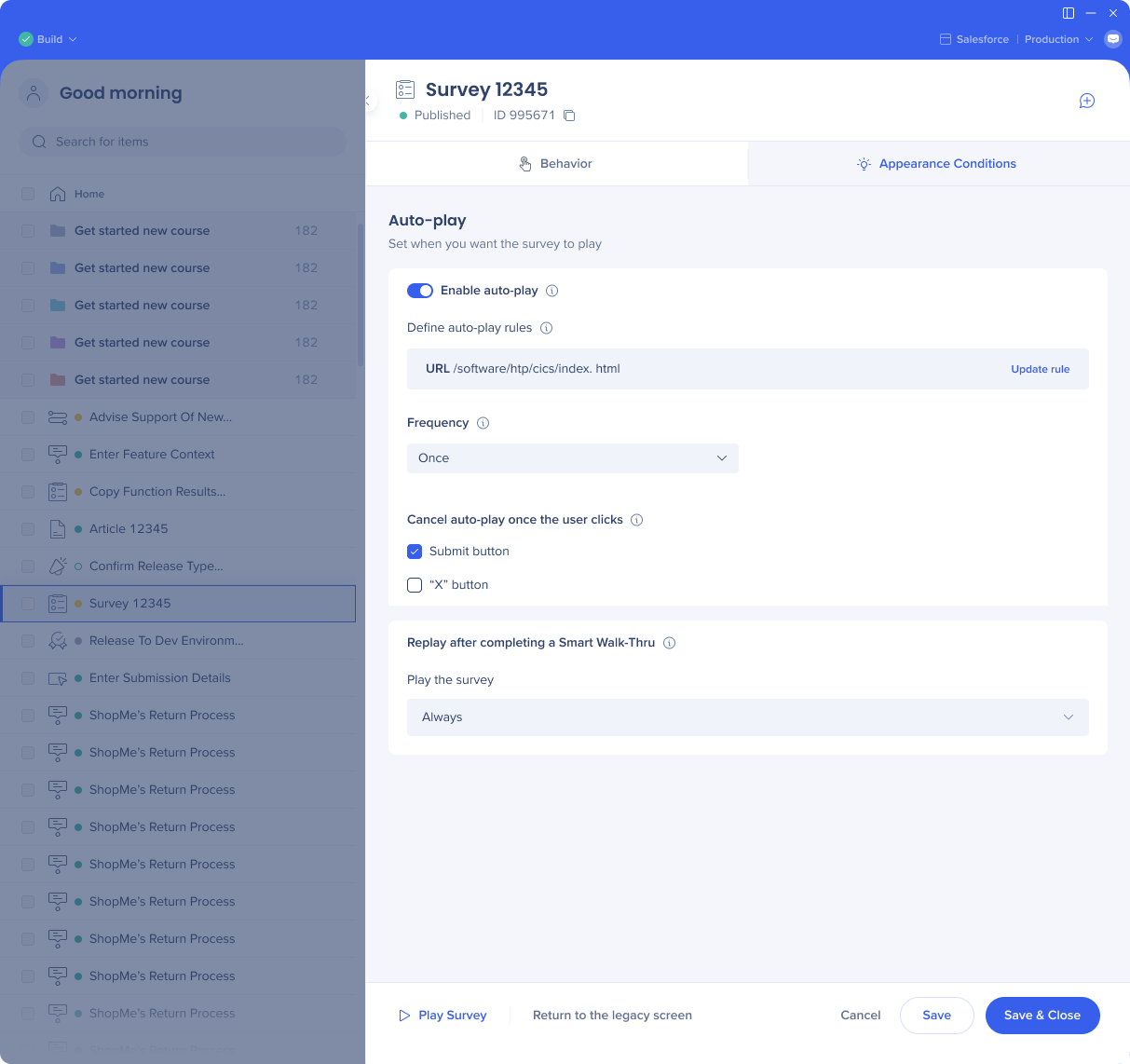
In the Appearance conditions tab, set when this item will appear for the users
All the auto-play settings only become visible when auto-play is enabled
If you choose custom frequency, you can now set a unified time zone for all the users to see your content at exactly the same time
Capture element screens
Before
After
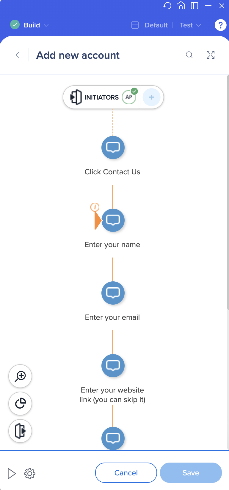
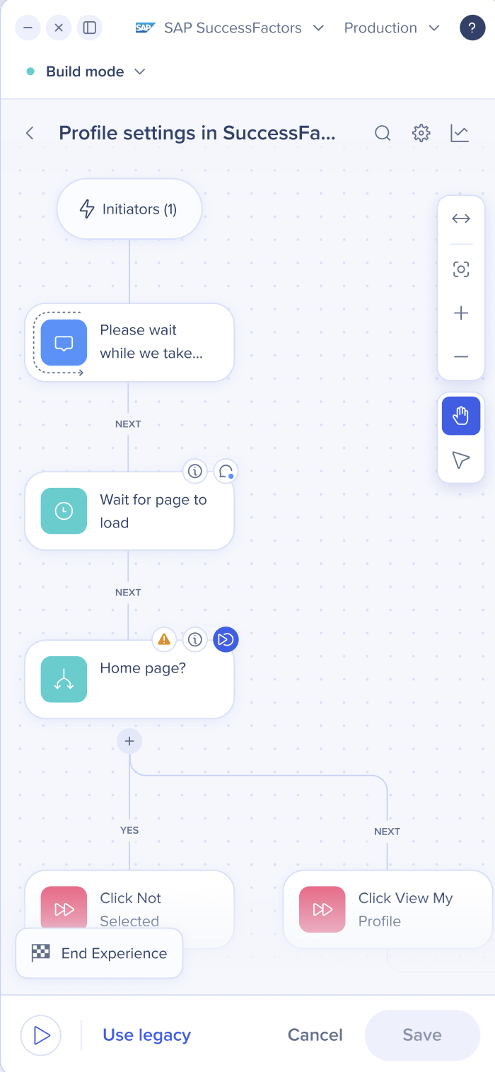
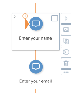
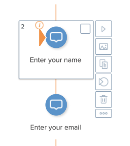
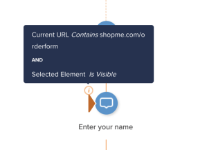
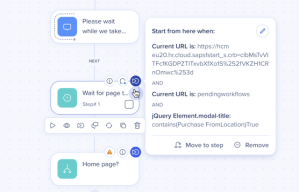
Smart Walk-Thru map
Before
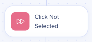
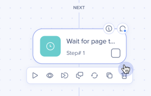
After
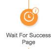
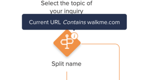
Icons for the flow steps are orange
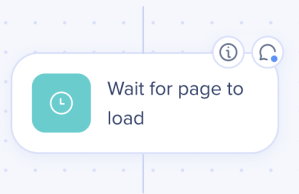
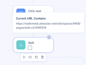
Icons for the flow steps are green
The auto-step icon is orange
The auto-step icon is pink
The step options menu shows on the side of the step
The step options menu shows on the bottom of the step and the icons are improved
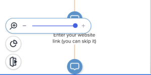
The zoom in/zoom out icon is in the bottom left corner
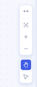
The navigation panel is on the right with additional options