Brief Overview
The canvas defines the overall structure and appearance of a Dynamic Layout ShoutOut. It serves as the container for frames and widgets, controlling how the ShoutOut is sized, positioned, and displayed on screen.
This article explains how to style and configure the canvas, including layout behavior, spacing, positioning, close button settings, and element navigation.
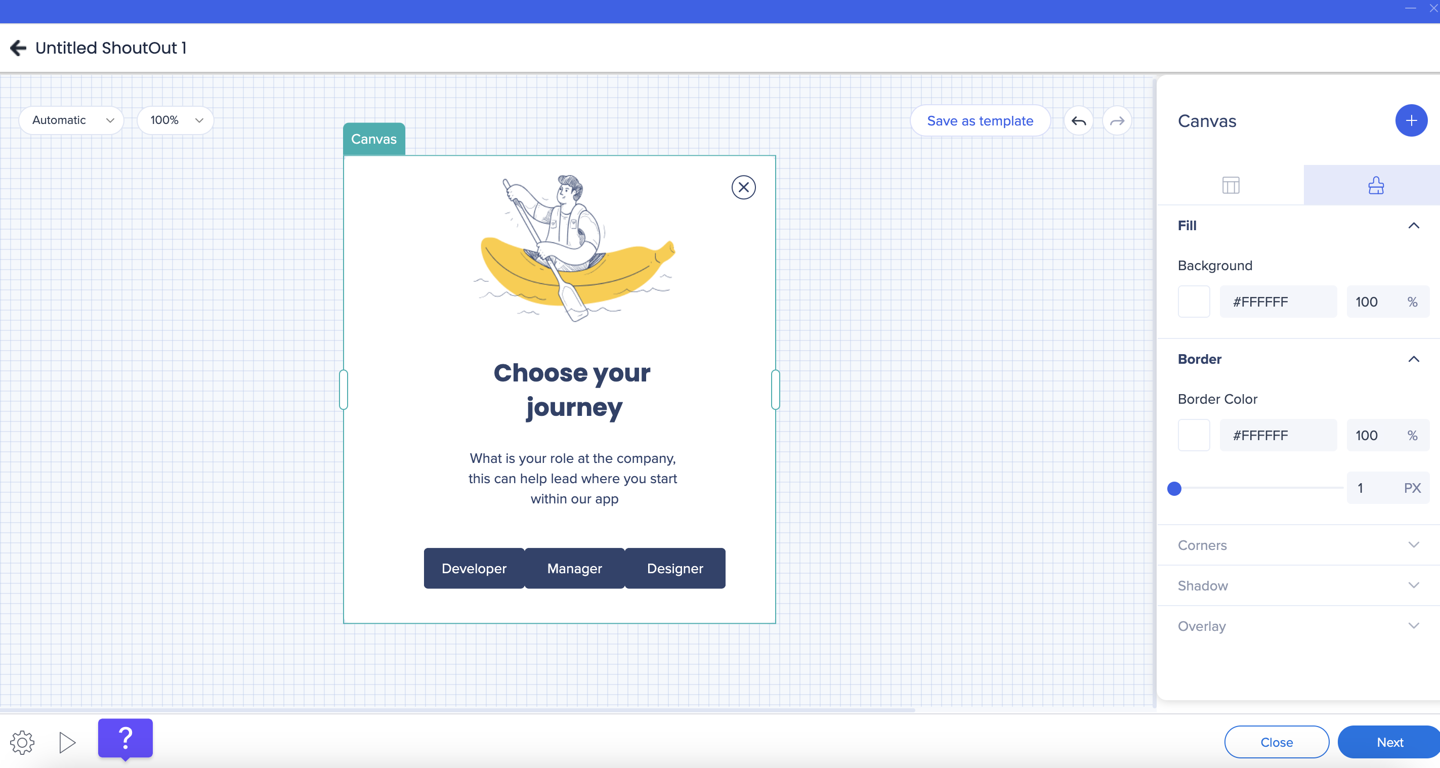
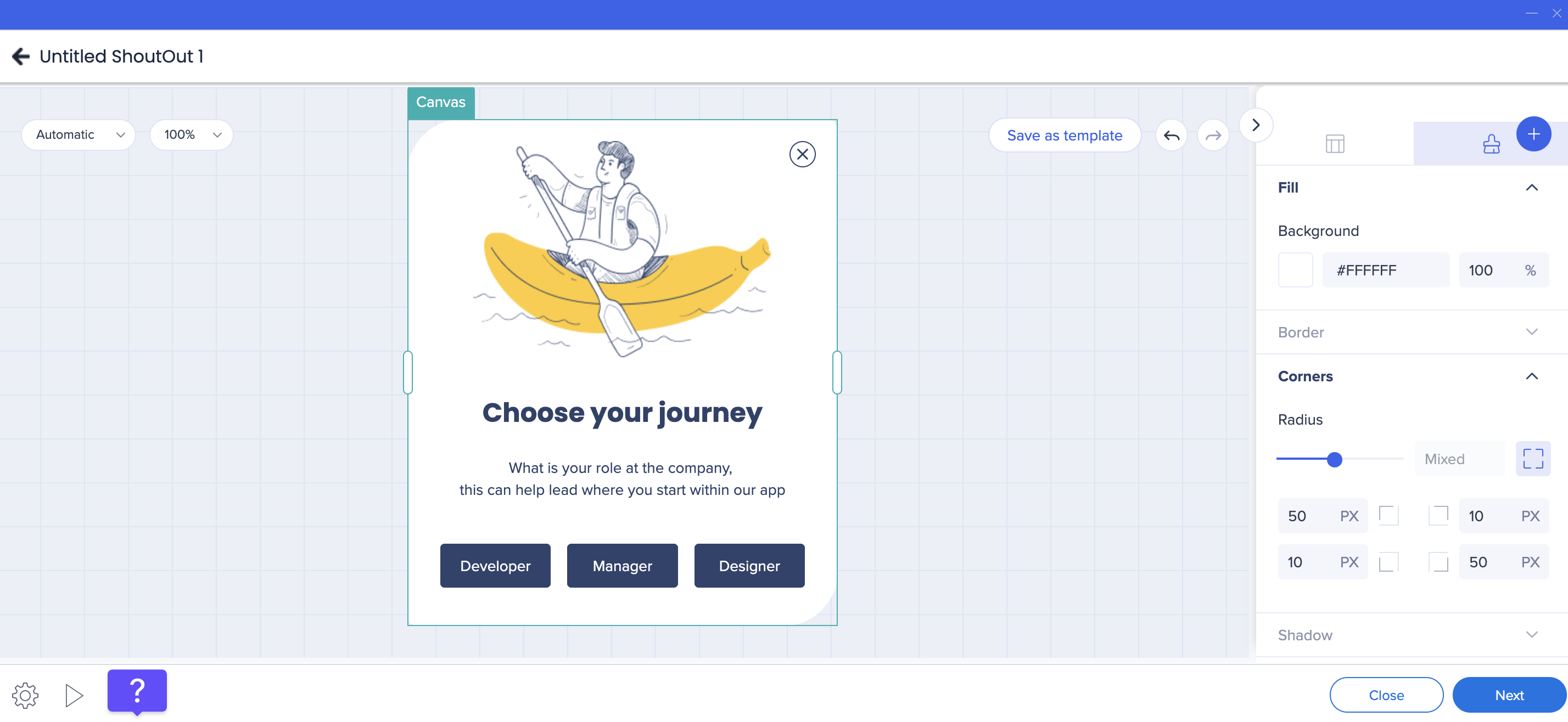
Canvas Styling
You can customize the visual appearance of the canvas from the Styling tab in the property bag.
You can configure:
- Corner radius
- Border width and border color
- Fill color
Canvas Shadow
You can add a shadow to the canvas to create visual separation from the background. The following predefined options are available:
Corner radius values can be applied uniformly or configured individually for each corner.
Layout and Sizing
The canvas layout determines how the ShoutOut adapts to its content.
Sizing behavior
- The canvas width can be resized by dragging it directly on the canvas or by entering values in the property bag
- Canvas height adjusts automatically based on the amount of content
- Only the width of the canvas can be resized manually
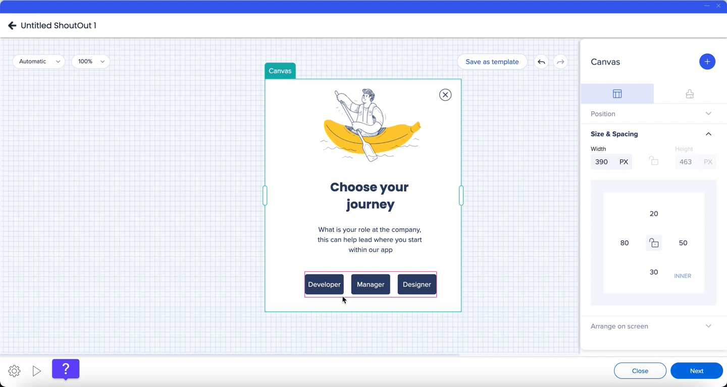
Inner spacing
Inner spacing controls the distance between the canvas edges and the frames inside it.
To adjust inner spacing:
- Select the canvas
- Update the spacing values in the property bag
By default, the same spacing value is applied to all sides. To set different values per side:
- Select the borders icon
- Adjust individual side values
Spacing indicators appear directly on the canvas as you make changes.
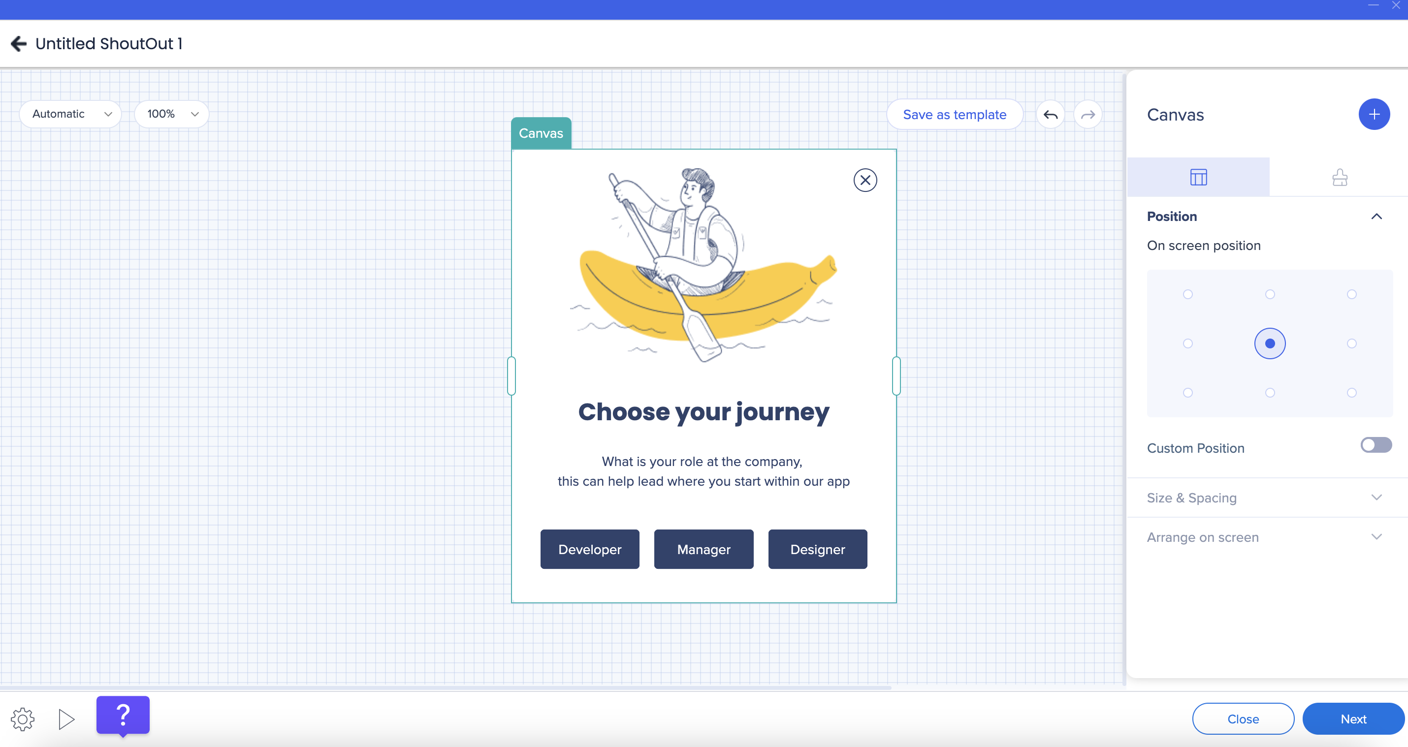
Canvas position
The canvas position on screen is configured from the property bag.
You can:
- Select one of the default on-screen positions
- Turn on the Custom position toggle to define exact placement values
Canvas position cannot be adjusted directly from the canvas.
The Close button lets users dismiss the ShoutOut and can be fully customized.
Show or hide
- Turning off the Show Close Button toggle hides the Close button from the canvas
- To show it again, hover over the Close button location, select it, and turn the toggle back on
Styling
You can customize the Close button from the Styling tab, including:
- Icon size and color
- Button radius and fill color
- Border width and border color
Size and position
- Resize the Close button directly on the canvas
- Change the button position to the top-right or top-left corner from the Layout tab
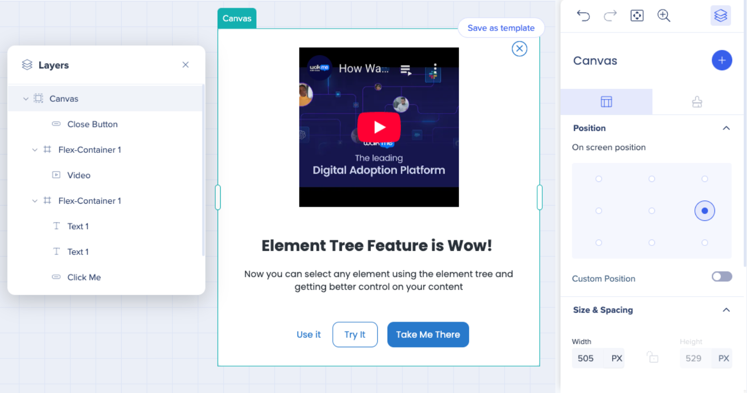
Element Tree
The Element Tree provides a hierarchical view of all components and layers in the Visual Designer.
To open the Element Tree:
Using the Element Tree lets you:
- Navigate quickly between elements
- Select and edit nested components more easily
- Manage complex layouts with greater control
Technical Notes
- Canvas height is determined automatically by content
- Canvas width is the only dimension that can be resized manually


