Visual Designer Dynamic Layout
Last Updated May 28, 2024
Brief Overview
Dynamic layout can be used to design ShoutOuts in the Visual Designer. It offers the canvas adaptability of the flex layout, while providing more freedom and flexibility to users.
This article covers the key features and capabilities of the layout.
Key Benefits of Dynamic Layout
- ShoutOuts automatically adapt to the size and orientation of the screen they're viewed on
- Reduces the building time – there are content arrangements ready to use in the canvas
- Ability to create dynamic layouts that are easy to read and navigate, regardless of the device being used
- Improves the user experience by making popups easier to use on all devices
- Increases the overall performance of the website by allowing popups to load faster and use fewer resources
- Allows you to create a single design that can be easily adapted to support different languages
- When the size of translated text exceeds the original language, the balloon will adapt accordingly
Key Features of Dynamic Layout
The Dynamic Layout canvas consists of the following layers:
- Canvas: Body of the ShoutOut which shows how it will look on screen for a user
- Frames and widgets can be added to the canvas
- Frame: Designated space on the canvas which can be moved around and designed
- Widgets can be added inside the frame
- Widget: Element inside the frame
- Types of widgets: Text, Image, Button, Line, Webview
General
Color specification
Each level of the design when selected is highlighted with a specific color:
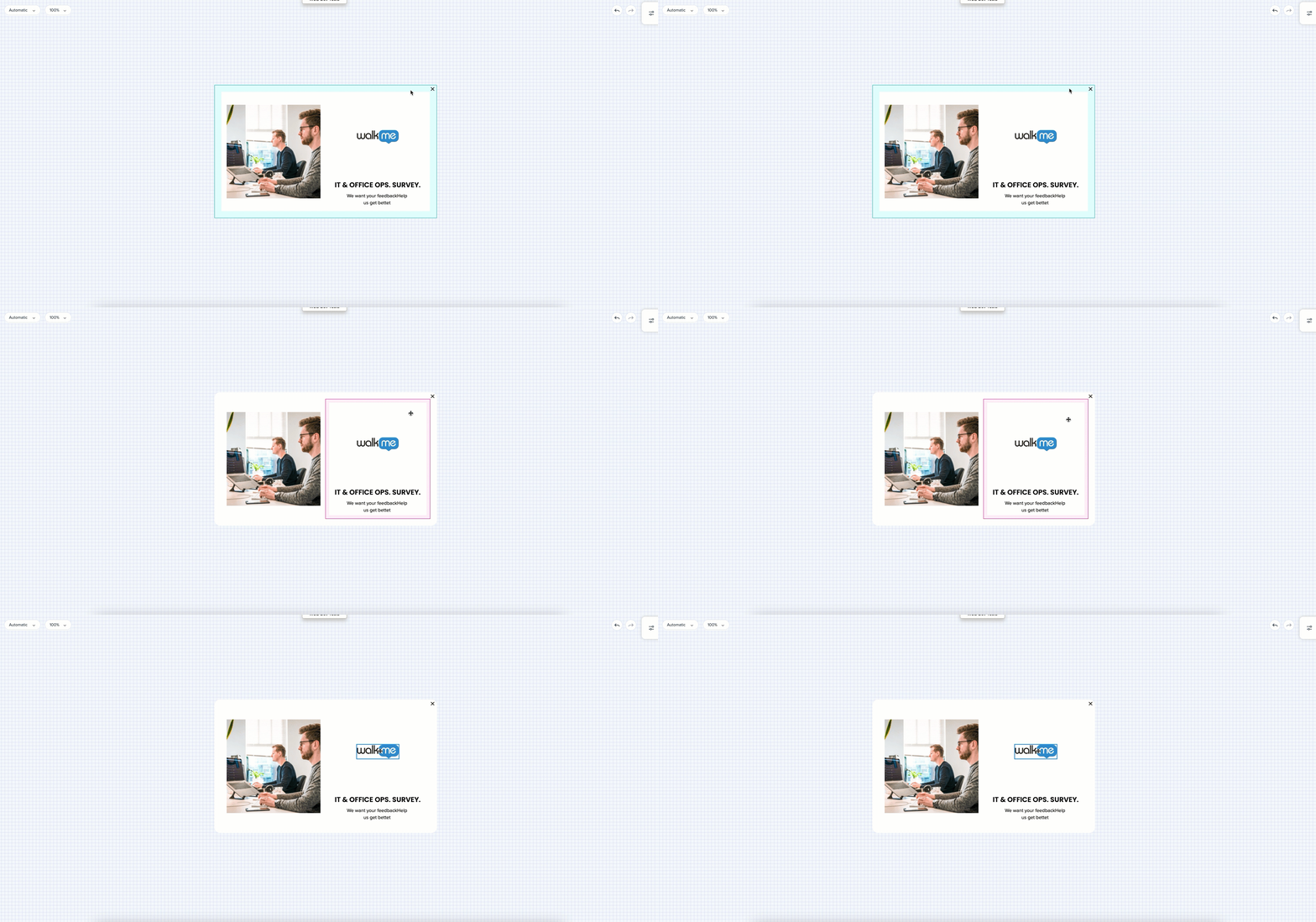
- Canvas: Green
- Frame: Pink
- Widget: Blue
Styling
- For Canvas and Frames, a background color, corner radius, and border width can be set in the Styling tab
Breadcrumbs
- Breadcrumbs are available in the property bag and on the canvas
- For example, when selecting a widget, you will see the frame it belongs to
- Breadcrumbs can be clicked and used to navigate
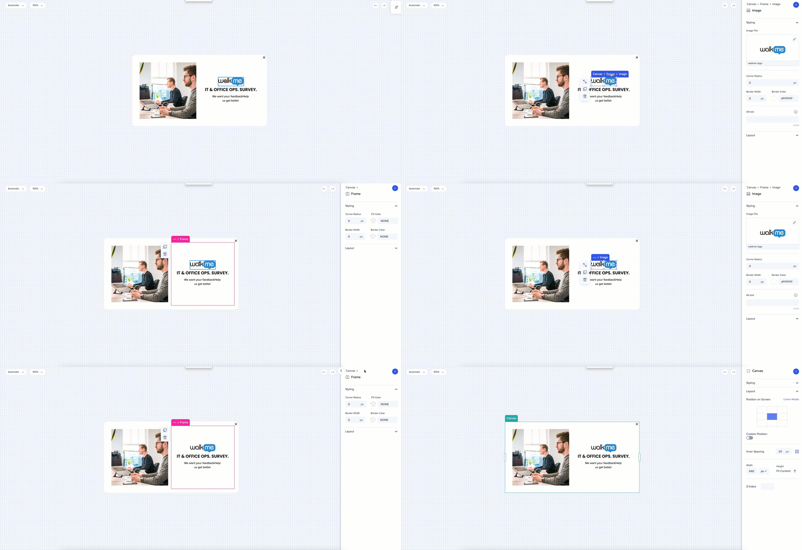
Canvas
Styling
- Corner Radius, Border Width, Fill Color, and Border Color can be changed from the Styling tab
- There is now an ability to add shadow to the canvas of the Shoutout. User can select between None, Soft, Regula, and Retro shadow predefined options.
- Corners can be controlled individually and be different
Layout
Sizing
- The width of the ShoutOut can be changed by stretching it directly from the canvas or applying measurements in the property bag
- The height will adjust automatically based on the amount of content
- Only the width of the canvas can be resized by a user
Inner Spacing
- The distance between the sides of the canvas and the frames can be adjusted in the property bag - the indication will be shown on the canvas
- By default, the same distance is set for all the sides
- To apply a different value to one of the sides, click on the borders icon
Close Button
- Turning off the Show Close Button toggle will hide the Close button from the canvas
- To make it appear again, hover over the Close button location and click on it and then turn on the Show Close Button toggle
- The close button can be customized from the Styling tab - Icon size color, Button radius and fill, Border width and color can be changed
- The size of the button can be changed from the canvas
- The position can be changed (Top Right / Left corner) from the Layout tab
Position
- The position of the canvas on screen can be changed only from the property bag
- Select one of the default options, or turn on the Custom position toggle and enter the preferred settings for more specific changes
Frame
Styling
- Corner radius, border width, fill color, and border color can be changed from the Styling tab
Layout
Resize
- The frame can be resized horizontally in relation to another frame. To do so, drag the frame you want to resize.
- You can resize frames only from the side which is shared with another frame
- The frame size is based on percentage of the canvas size. The frame width is displayed in percentage.
- The frame can't be smaller than the content in the frame
Vertical Alignment
- On the frame level, elements can be aligned horizontally or vertically
- This option is available when the element is inside a frame that's next to another frame which has more content
Widget Spacing
- Adjust default vertical spacing between the widgets in the frame
- It is also possible to set different spacing for a specific widget on a widget level
Adding Frames
- Frames can be added by duplicating existing ones, or clicking on the plus sign which appears in the highlighted area when hovering on the outside area of the canvas
- Up to four frames can be added in one row
- There is no limit for number of vertical frames
- When new frames are created (or deleted), the canvas size will be divided by the number of frames so all frames are the same size
- The minimum size of a frame is 10% of the canvas
Moving Frames
- Frames can be moved by dragging and dropping - horizontally or vertically
Inner Spacing
- The distance from the sides of the frame to the widgets can be adjusted in the property bag
- Select the frame and set the default distance for all the sides, or click on the borders icon - and control each side individually
- If you have an image that's the same size as it's frame and you need to select the frame - use the breadcrumbs to switch between the widget and the frame
Widget
Styling
The style of the widget can be changed from the property bag:
- Image: Upload it and select corner radius, border width and border color
- Select an action for when a user clicks on the image, it'll perform an action, for example they'll be redirected to an external URL or email address
- When an action is selected, the icon indicator will change from neutral to green
- Select an action for when a user clicks on the image, it'll perform an action, for example they'll be redirected to an external URL or email address
- Text: Choose the font, font size and color, alignment of the text
- Line: Change the corner radius, border width, line color, and border color
- Webview: Past the URL and see the preview
- Button: Select the action you want the button to perform
- When the action is selected, the red icon indicator will change to green
- Multi-line text in a button is supported - press Enter to create a new line
- Color picker now has a pipette tool to capture the color already existing in the design
Adding a Widget
- To add a widget, click on the Plus button in the property bag and drag selected widget to the canvas
- You will see a blue indication of where that widget will be added
- Four widgets can be added in a row inside one frame
Layout
Resizing a Widget
- To resize a widget, select it and drag the handle bar
- Button size can be controlled via both the outer (distance from the other widgets) and inner (distance from the text of the button to its borders) spacing
Stretching a Widget
- A widget can be stretched by clicking on the stretch icon
- When aspect ratio is locked, the widget will be stretched up to inserted figures
- When aspect ratio is unlocked, the widget will take the entire horizontal space available inside the frame
- When there are multiple widgets in a row, each of the widgets will dynamically adjust to fill the space inside the frame
- For example, when there are two widgets each will take up 50% of the space, when there are four, each will take up 25%
- The height if the widget can be controlled manually
Outer Spacing
- To create space between multiple widgets, select the widget and adjust the outer spacing in the property bag
- By default the same distance is set for all the sides
- To apply a different value to one of the sides, click on the borders icon
Tip Tuesday Videos
Updates to the Visual Designer
Introduction to the Visual Designer - Dynamic Layout
Building with the Visual Designer
Technical Notes
Limitations
- Visual Designer can not be customized using global or custom CSS
- We are aiming to replace all need to use global/custom CSS with “in Editor” functionality
- Frameset sites are not supported – content cannot be drawn on them
Support
- Web Player: Supports ShoutOuts
- Mobile Player: Supports ShoutOuts, Smart Walk-Thrus (limited), Surveys, and Launchers
- Desktop Player: Supports ShoutOuts and Smart Walk-Thrus (limited)
Was this article helpful?
Yes
No
Thanks for your feedback!