Welcome to the
WalkMe Help Center
Please log in to continue

Please log in to continue

Customizing ShoutOuts has gotten much easier with the help of the Visual Designer. Create beautiful designs without the need for CSS. Giving easy control when creating and designing ShoutOuts, with capabilities like:
For more information on ShoutOuts, see the dedicated ShoutOuts article here!
Below are further details about the options available to further customize your ShoutOut using the different Visual Designer tabs:
Select Screen resolution, Zoom level and Undo / Redo for any editing action (also supported by Keyboard shortcuts).

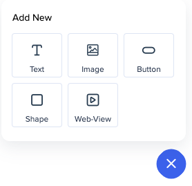
To add new items to your ShoutOut, Click the ADD NEW OBJECT blue plus icon in the right bottom corner, choose an object, and drag it into the desired location. Once in place, you can edit shape, contents, location, and more. Selecting an object in the objects tree will indicate that object within the ShoutOut.
When adding an image or a video, you can preview it on the side panel. For YouTube and Vimeo there's no need to insert embed links, a regular one will be embedded automatically.

To delete an object from your ShoutOut, select the object on the ShoutOut preview display and click on the trash can icon.

Alternatively, select your object and click the same icon in the side menu.

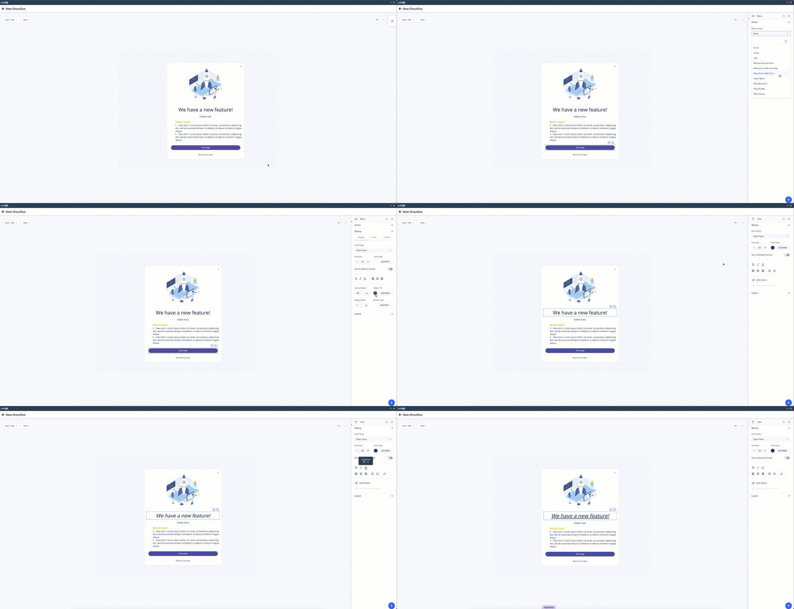
When selecting a specific object within your ShoutOut, (text box, image, etc) the Styling tab provides you with a range of formatting options, specific to that object. Including the following capabilities and more:
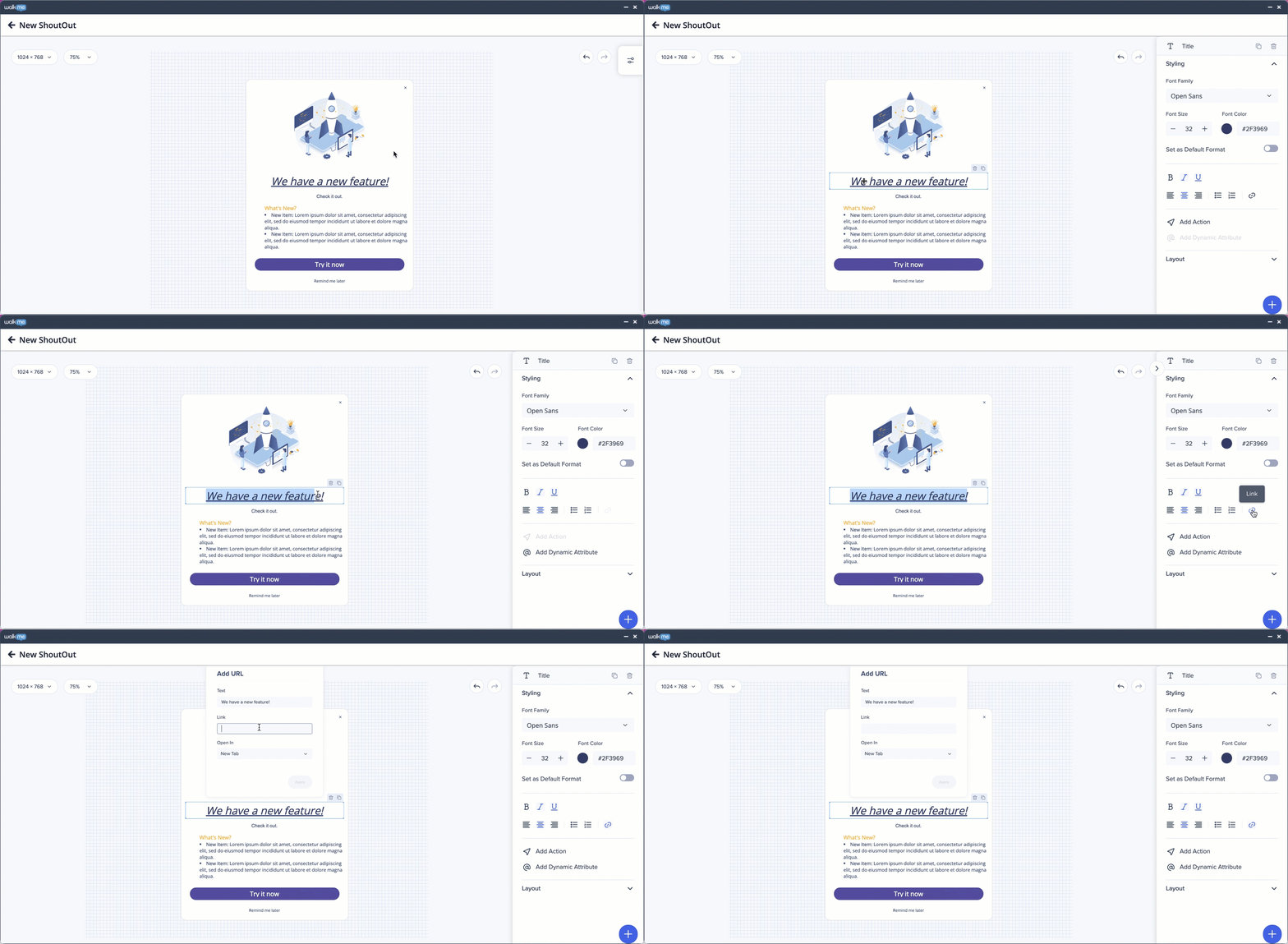
Links: Add a link to the text of your ShoutOut. Select the desired text, press the URL icon in the styling tab, insert the link and choose where you would like it to open (New Window, This Window, New Tab).
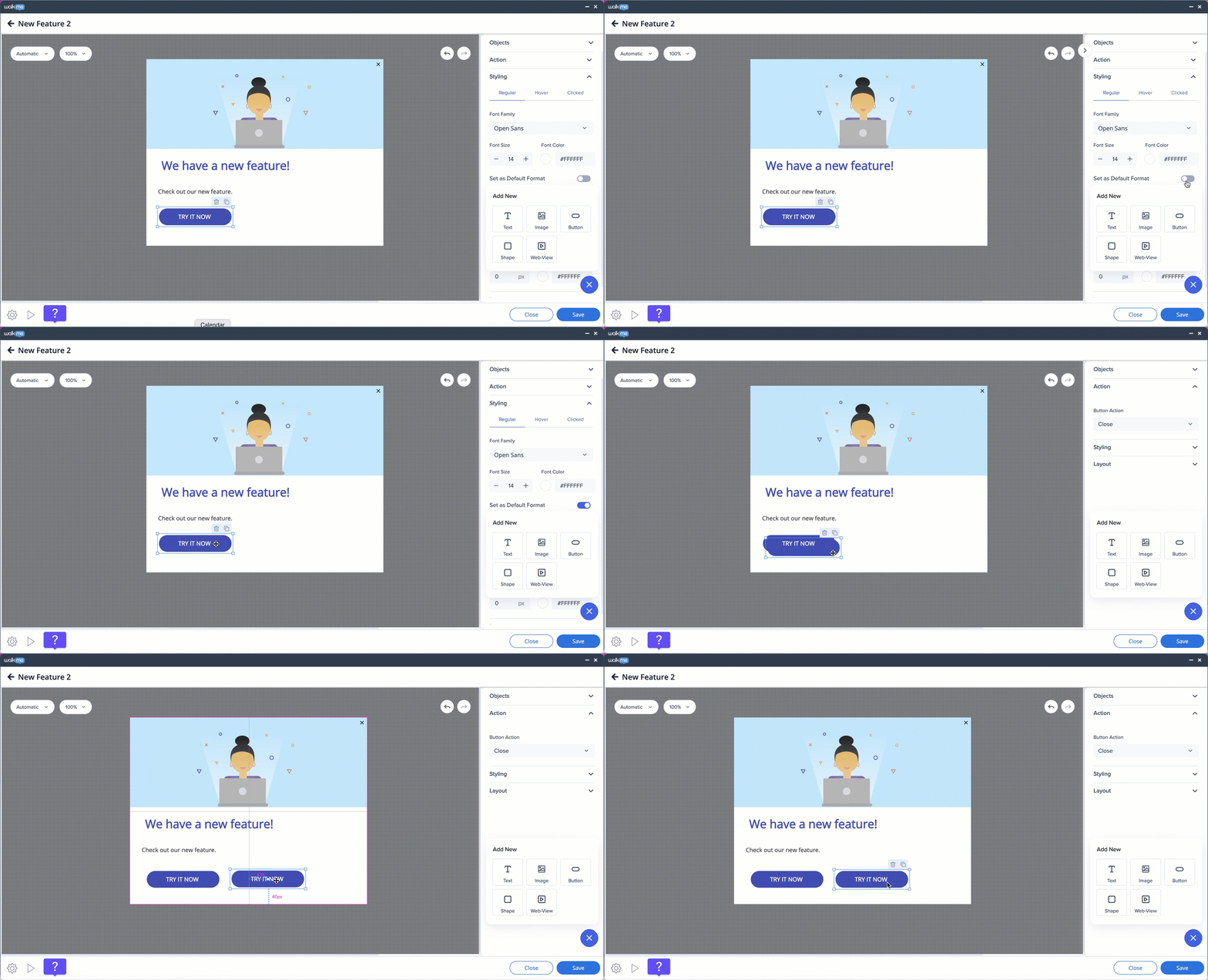
Set as Default Format: If you design a widget – e.g. a button – and toggle this feature to ON, the next buttons you add will be recreated in the same design.
Emoji: You can insert emojis into your WalkMe content. Simply add them to text or button widgets and customize their size, just like you do with fonts.
To open the emoji menu:

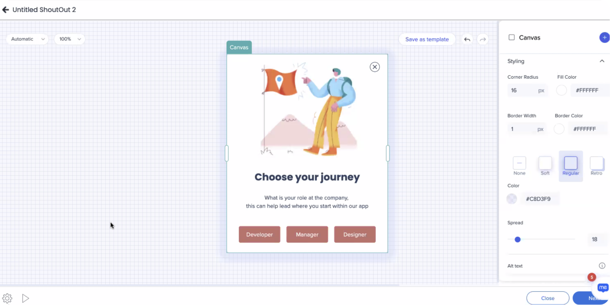
Shadow: Add a shadow to the canvas of the Shoutout.
Select between: None, Soft, Regular & Retro shadow predefined options.
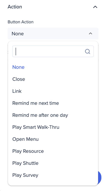
Add an Action that will be triggered when clicking on the ShoutOut object. New actions — Play Shoutout, Play Survey, Play Action Bot, Open a Link — were added.
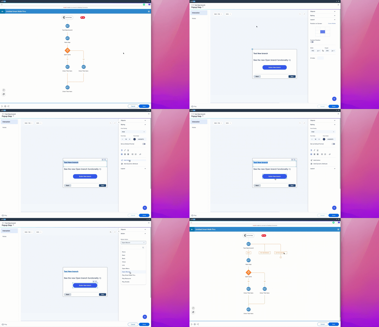
The action opens a new branch on the Smart Walk-Thru map (in the classic balloons it was done via "trg" BBcode). It can be applied to a button or text.
The feature also includes validations – if a branch has a step connected to it, the button/text which opens the branch can't be deleted.

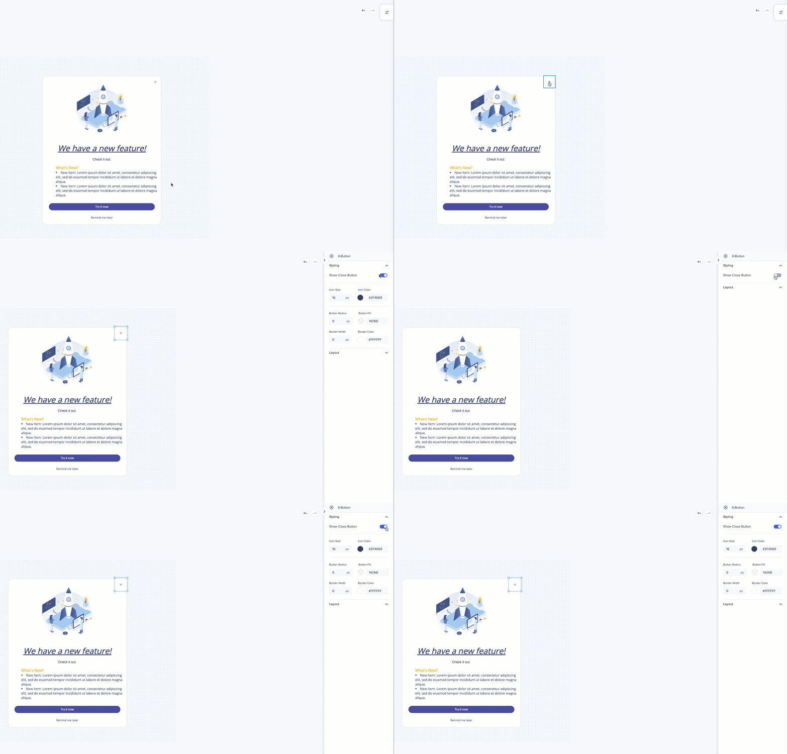
Show or hide the X Button on your ShoutOut.
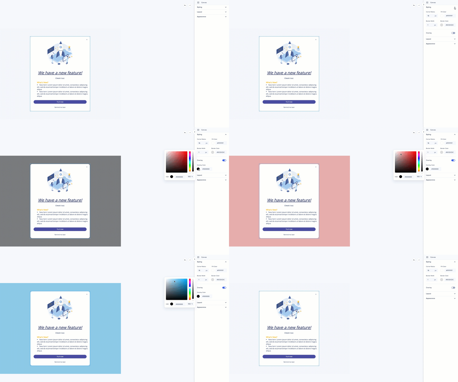
You can decide to have a screen overlay behind your ShoutOut and set the color and opacity of it. Enabling screen overlay will dim or color the screen behind and make your ShoutOut stand out.
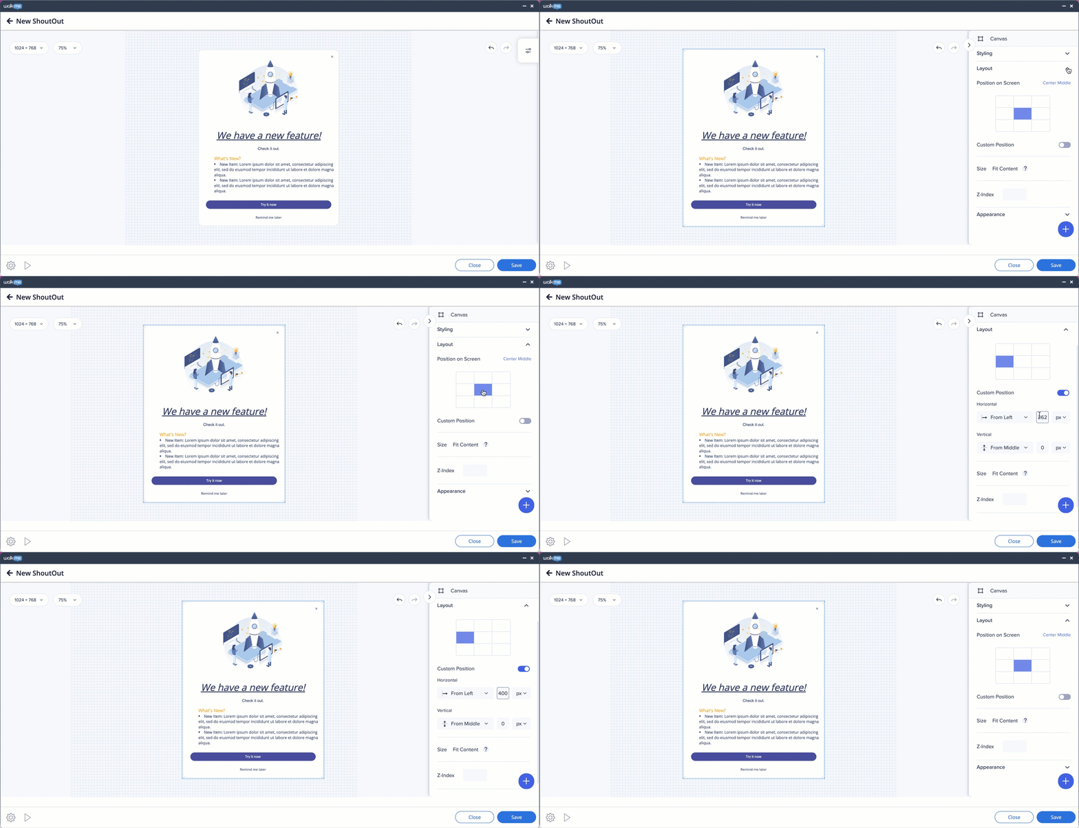
Select where ShoutOut appears on the screen — by dragging it around the preview screen, choosing one of the default position settings in the side menu, or setting a custom position.
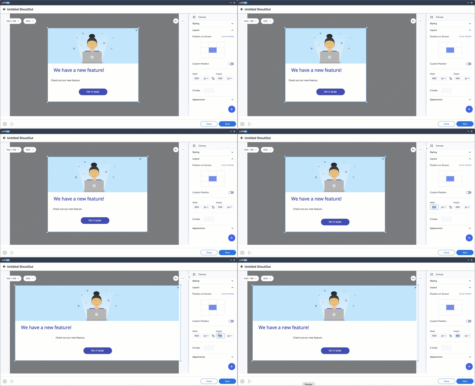
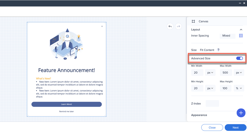
Adjust the size of your ShoutOut either manually (on the Shoutout preview screen) or by selecting the desired width and height properties in the side menu.
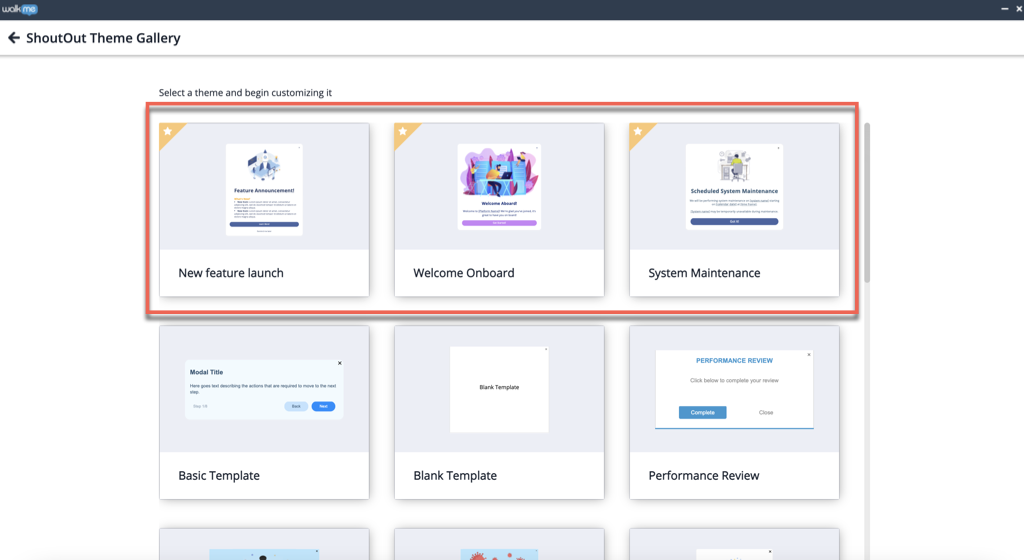
NOTE: Templates marked with a star in the ShoutOut Theme Gallery use the Dynamic Layout and have a different side menu. To change the size of such a ShoutOut, turn the Advanced Size toggle to ON.
Adjust the ShoutOut settings by clicking on the cog icon in the bottom left corner.
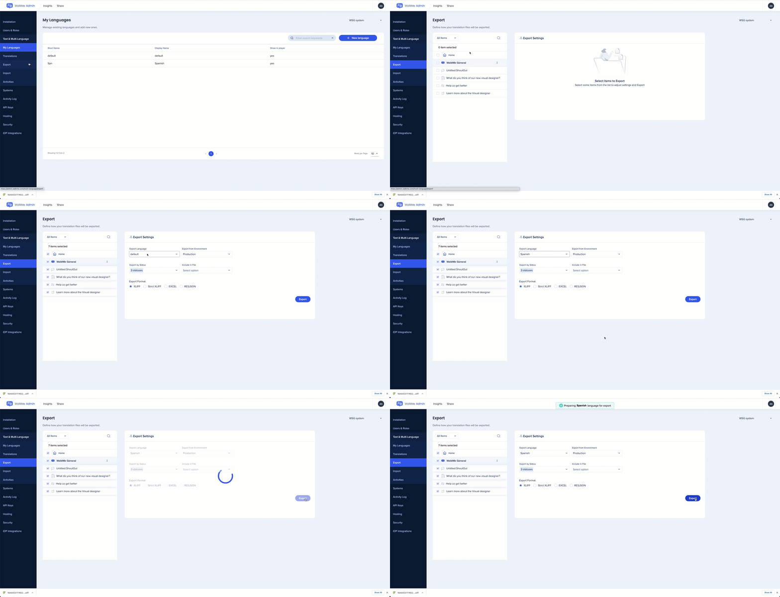
If you would like to translate the rich text in the new Visual Designer for ShoutOuts (not classic ShoutOuts), the process required for this translation slightly varies from what is normally expected. Please see the instructions below for how to translate a portion of this text:
Step 1: Download the associated language .xliff file from your Text & Multi-language export tab:
Step 2: Unlike a normal field where we are expected to introduce a <target> *text* </target> for the translations, the Rich Text fields are constructed slightly differently and as a result, require a specific method:
Step 3: The end result for a whole field containing both it's original text and translated text should resemble the example below:
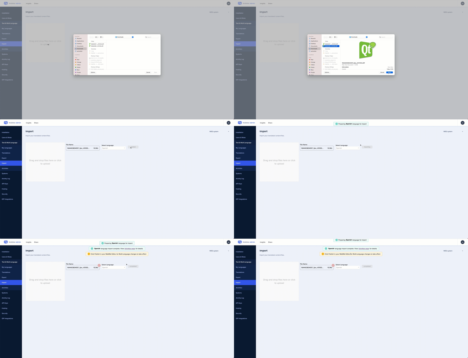
Step 4: Save the updated file in the current folder it is located within, and import it back to the multi-language section onto the relevant language – no error should be experienced if the formatting syntax is identical and only the container was modified.
Use these shortcuts to optimize your time while working with the Visual Designer.
| Description | Mac Shortcut | Windows shortcut |
| Insert link or edit link | Command + K | Control + K |
| Bold | Command + B | Control + B |
| Italic | Command + I | Control + I |
| Underline | Command + U | Control + U |
| Delete an item when selected | Delete | Delete |
| Copy formatting of the selected text or shape | Command + Option + C | Control + Option + C |
| Paste formatting of the selected text or shape | Command + Option + V | Control + Option + V |
| Duplicate | Command + D | Control + D |
| Send backward | Command + Up Arrow | Control + Up Arrow |
| Bring Forward | Command + Up Arrow | Control + Up Arrow |
| Send to Back | Command + Shift + Down Arrow | Control + Shift + Down Arrow |
| Bring to Front | Command + Shift + Up Arrow | Control + Shift + Up Arrow |
| Redo | Command + Y | Control + Y |
| Undo | Command + Z | Control + Z |