Brief Overview
Widgets are the building blocks used in Dynamic Layout ShoutOuts to create structured, flexible content inside a frame. By combining different widget types—such as text, images, buttons, and carousels—you can design responsive layouts that adapt to content and screen size.
This article explains how to add, style, and manage widgets in Dynamic Layout, including layout behavior, spacing, and widget-specific limitations.
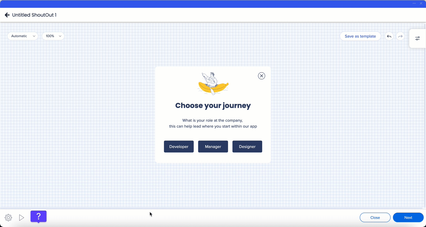
To add a widget to a frame:
- Select the Plus icon in the property bag
- Drag the widget to the canvas
- Use the blue indicator to choose where the widget will be placed
Note
Up to four widgets can be added in a single row inside one frame.
You can customize widget appearance and behavior from the property bag.
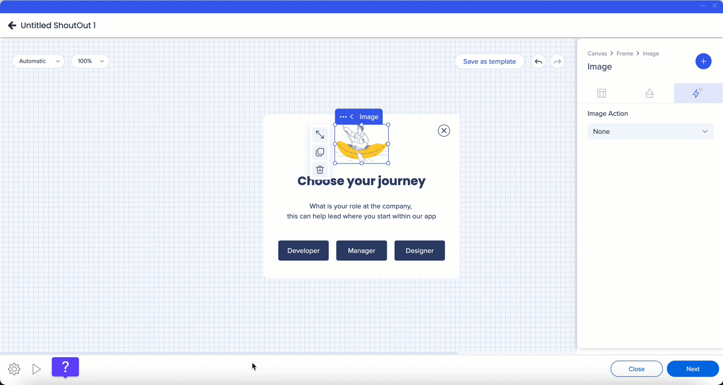
Image
- Upload an image
- Adjust corner radius, border width, and border color
- Assign an action for user interaction with the image, such as:
- Redirecting to an external URL
- Opening an email client
When an action is selected, the action indicator changes from neutral to green.
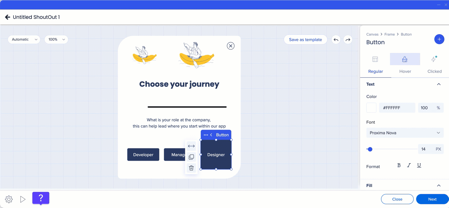
Text
- Select the font, font size, and text color
- Set text alignment
Tip
Use the color picker pipette tool to capture colors already used in the design.
Line
- Adjust corner radius
- Change border width, border color, and line color
Video
- Add a video from
- YouTube
- Vimeo
- Assets library
- Customize the video using the advanced playback controls including:
- Trim video: Custom start and end times
- Play in loop: The video will automatically restart when it ends
- Autoplay: The video will automatically start playing once the ShoutOut appears
- Thumbnail: Select any image as a cover
- Play control: Pause, move forward/back, open YouTube

Note
- When autoplay is on, mute is automatically enabled
- If you trim a Vimeo video and enable autoplay at the same time, autoplay won't work (Vimeo limitation)
Webview
- Paste a URL to display external content
- Preview the content directly in the Visual Designer
- Assign an action for the button to perform
- Create multi-line button text by pressing Enter
When an action is selected, the action indicator changes from red to green.

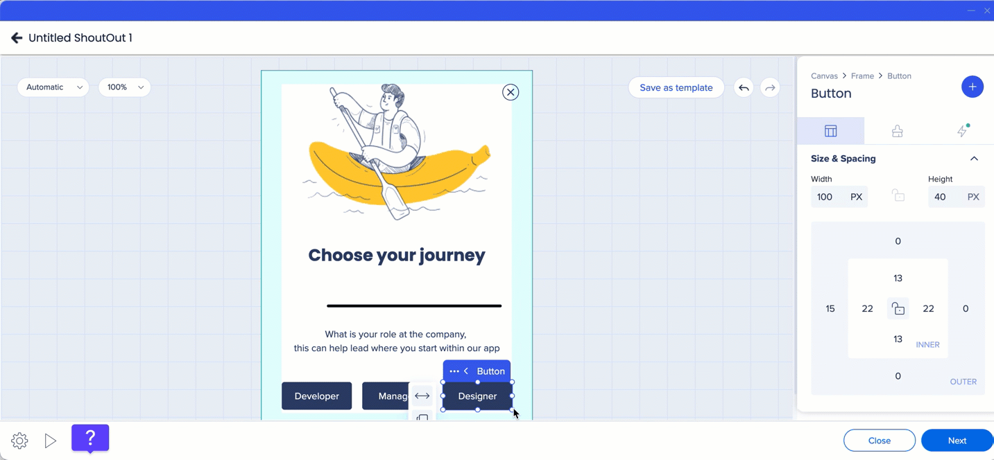
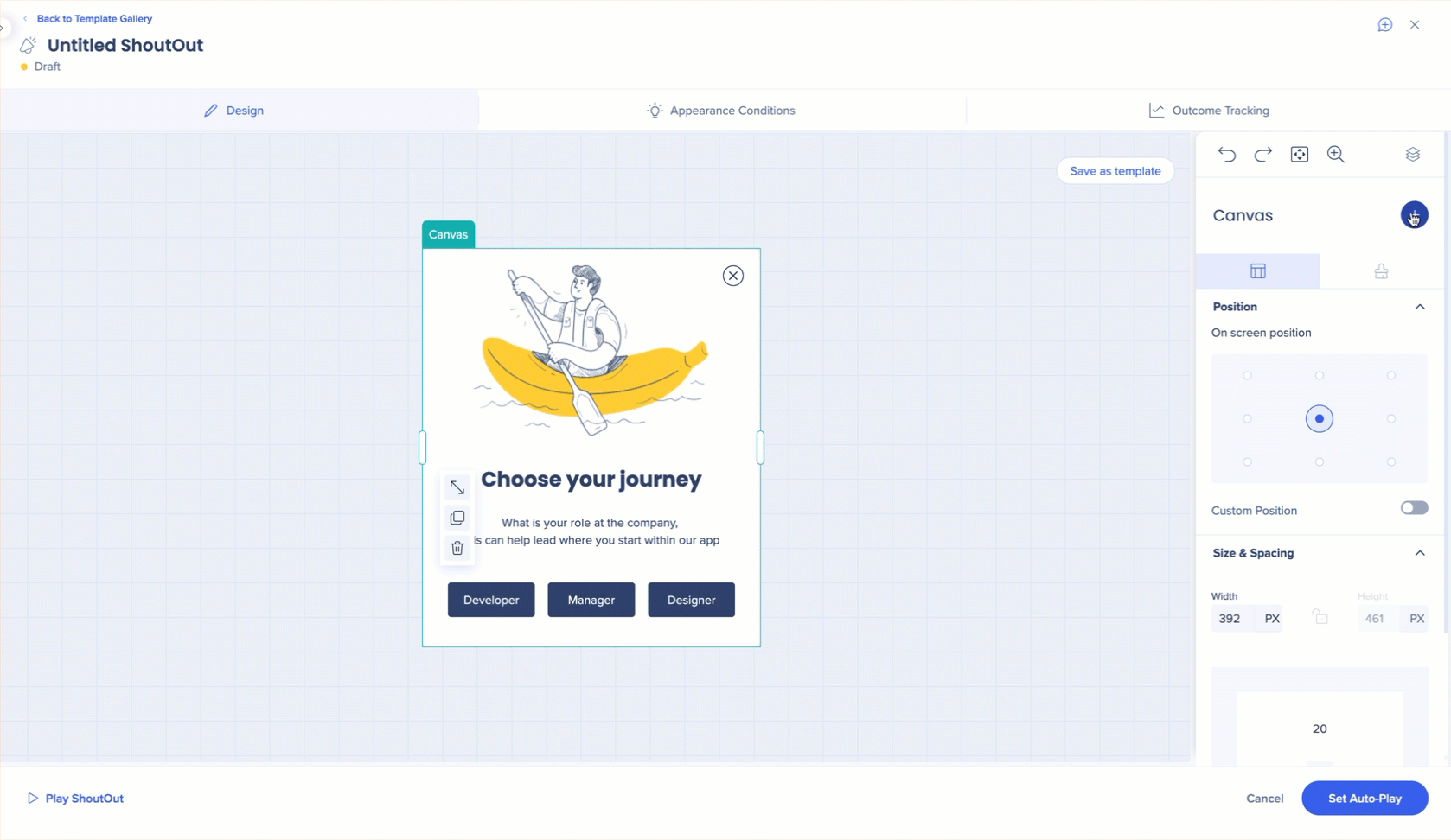
Resize
To resize a widget, do one of the following:
- Select the widget and drag the handle bar
- Use the Size & Spacing controls in the side bar
Button size is controlled by:
- Outer spacing, which defines the distance from other widgets
- Inner spacing, which defines the distance between the button text and its borders
Stretch
You can stretch widgets horizontally by selecting the stretch icon.
- When aspect ratio is locked, the widget stretches proportionally based on its original dimensions
- When aspect ratio is unlocked, the widget fills the entire horizontal space inside the frame
When multiple widgets appear in a row, each widget automatically adjusts its width to evenly fill the available space. For example:
- Two widgets each take up 50% of the row
- Four widgets each take up 25% of the row
Widget height can be controlled manually.
Outer spacing
Outer spacing controls the space between widgets.
To adjust outer spacing:
- Select the widget
- Update the outer spacing values in the property bag
By default, the same value is applied to all sides. To set different values per side:
- Select the borders icon
- Adjust individual side values
When spacing values differ, the indicator displays Mixed.
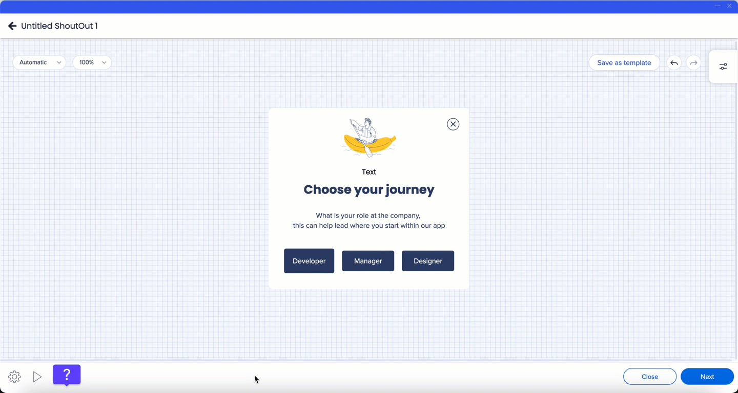
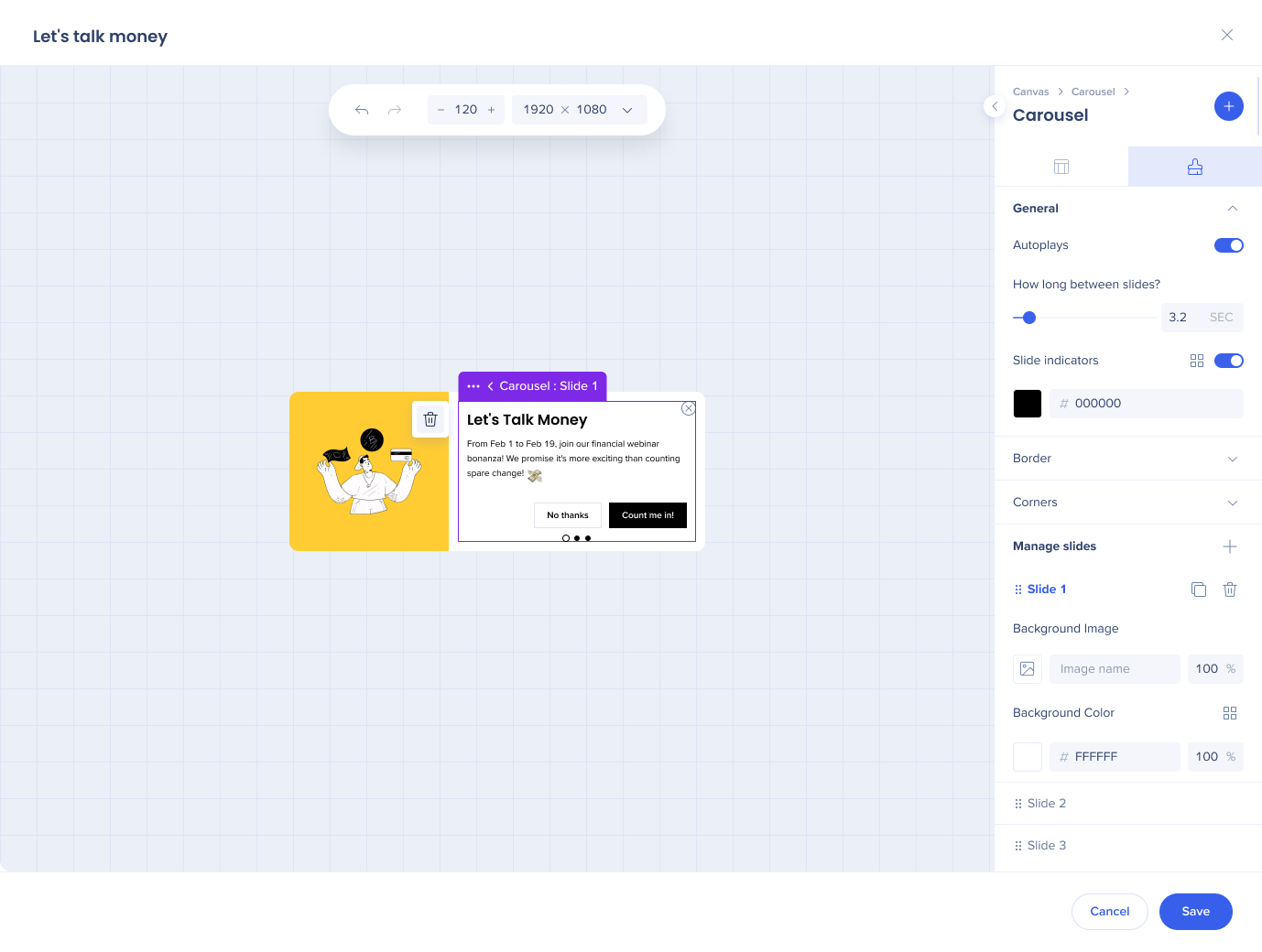
By default, adding a carousel widget creates three slides, each containing an image and text.
With a carousel widget, you can:
- Add other widgets inside each slide, including text, image, button, web view, and line widgets
- Enable auto-play to move between slides automatically
- Navigate slides using the dot indicators at the bottom of the ShoutOut
- Reorder slides by dragging them
Additional behavior and limitations:
- The height of the ShoutOut is based on the tallest slide
- Layout settings such as borders, corners, and structure apply to all slides
- Background color, background image, and content can differ per slide
- A maximum of five slides is supported
- Only one carousel widget can be added per ShoutOut
- Duplicating a slide will add another slide to the carousel
You can also create custom navigation by assigning Next Slide and Previous Slide actions to buttons, text, or images.
The Video widget lets you embed videos from YouTube or Vimeo directly in the Visual Designer.
Playback options include:
- Trimming the video start and end time
- Looping playback
- Autoplay when the ShoutOut appears
Additional controls:
- Select a custom thumbnail image
- Pause or skip forward and backward
- Open the video in YouTube
Note
- When autoplay is enabled, the video is muted automatically
- Autoplay does not work when a trimmed Vimeo video is used due to a Vimeo limitation
Tip Tuesday Video
ShoutOut Background Images, Carousels, and Delays
Technical Notes
- Up to four widgets can be added in a single row inside one frame


