Welcome to the
WalkMe Help Center
Please log in to continue

Please log in to continue

There're three types of templates available in the Visual Designer:
A. Dynamic
B. Free
C. Flex
The Flex Layout is being deprecated - it will no longer be updated with new features and shown in the Template Gallery.
However, existing ShoutOuts that were created with Flex will continue to be supported.
We upgraded and enhanced the Flex capabilities and developed the Dynamic Layout which offers variety of new features and improved building experience.
We recommend it to be used in all ShoutOuts and especially when using Multi-Language: the ShoutOut build with it will adapt its size based on the amount of text.
Free Layout will still stay available with the same capabilities as before.
The Dynamic layout has the relevant tag in the Template Gallery. All the templates without a tag are the Free Layout ones.
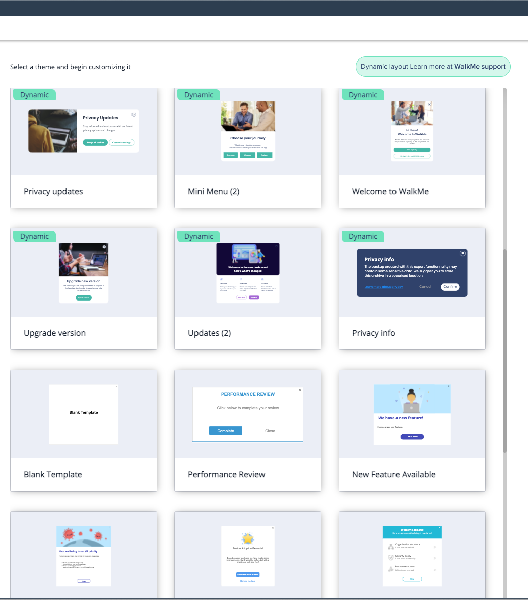
This article explains the differences between the three layouts.
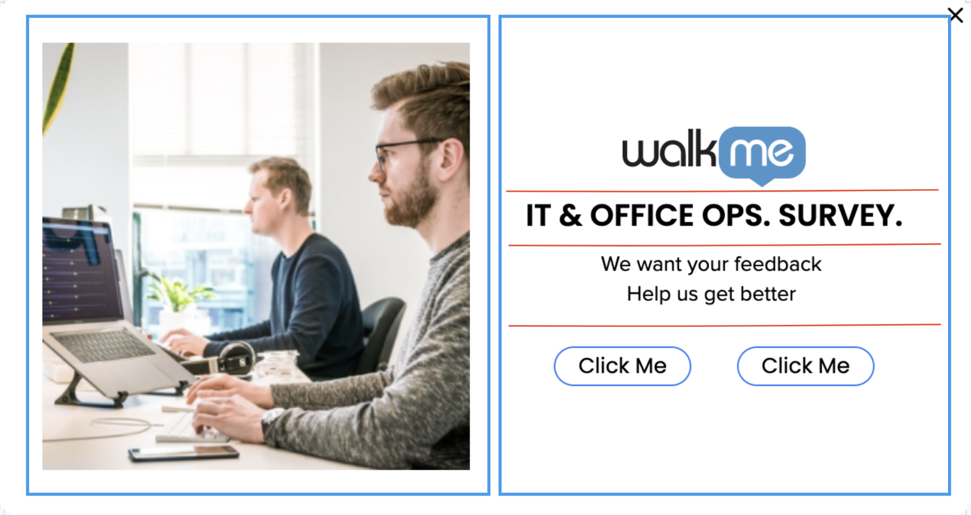
Dynamic layout has three layers - canvas, frame (marked in blue squares), and widget (separated by red lines).
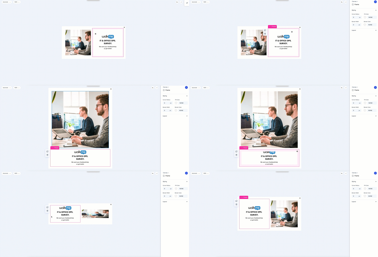
Multiple frames can be added next to each other, below and above each other. Widget rows inside the frames can be arranged horizontally.
Elements can be arranged in any order.
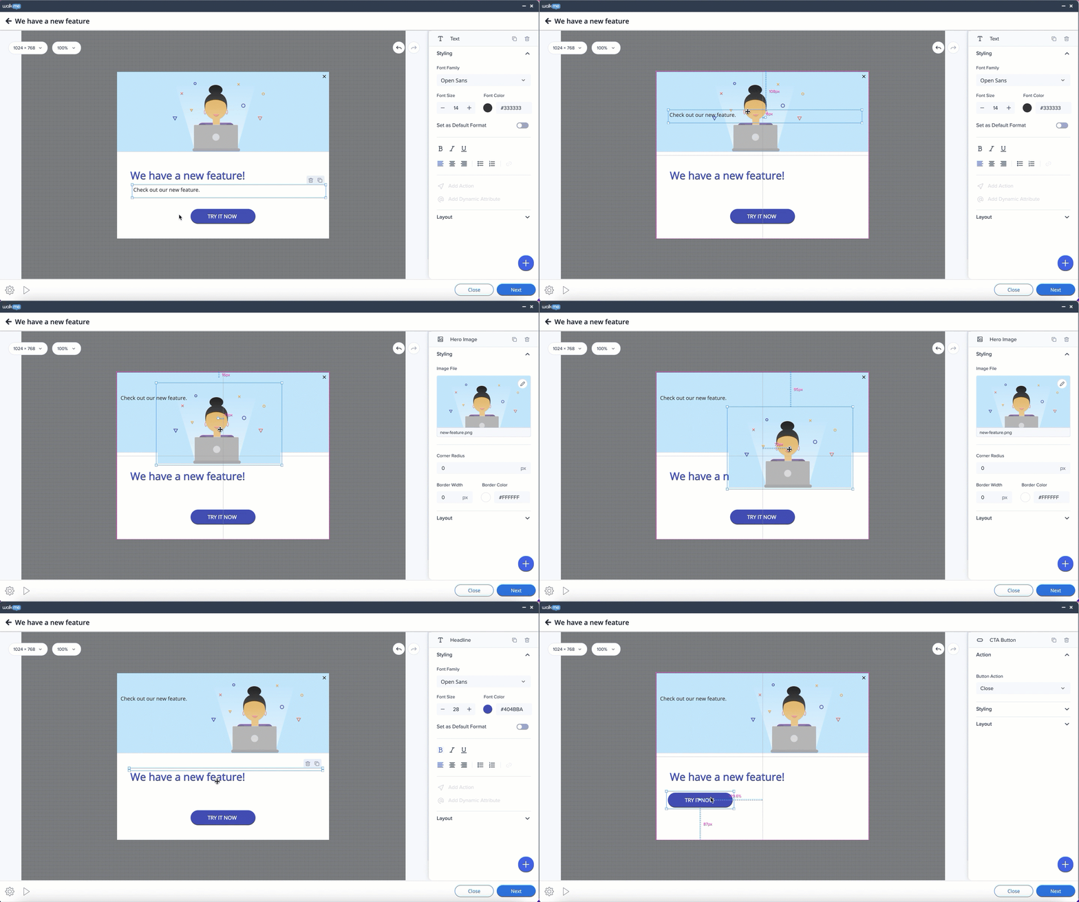
Flex layout has two layers - canvas and widgets.
There can be only one frame in a row (another frame cannot be added next to another). Rows inside the frame can only be arranged horizontally.

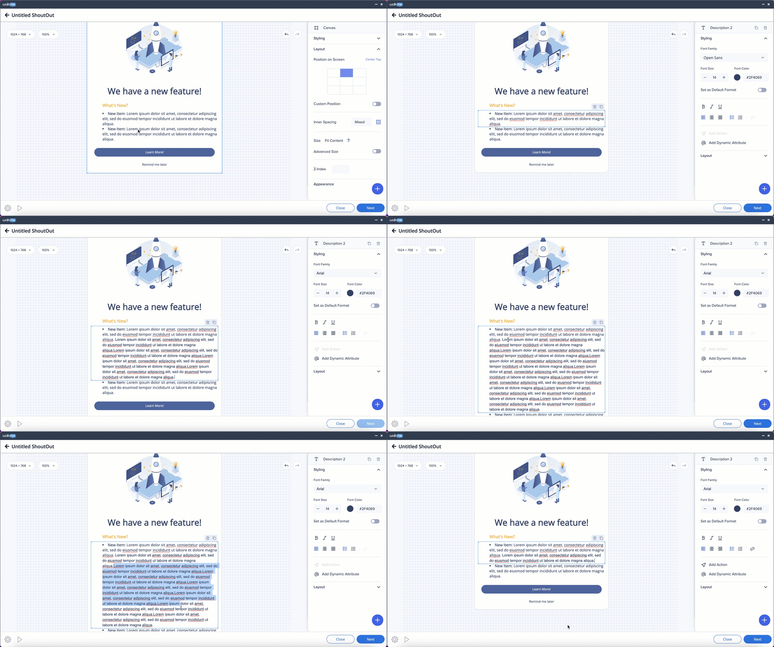
The text frame will expand and shrink automatically.
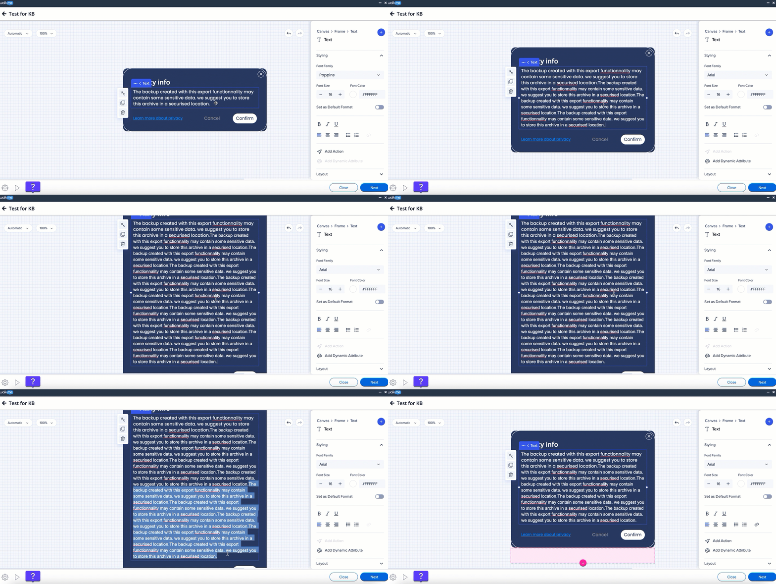
When two frames are put next to each other, adding text to one of them will also expand the second frame.
When there're two frames next to each other and one above/below them - adding text to the single frame won't affect the size of the other two.
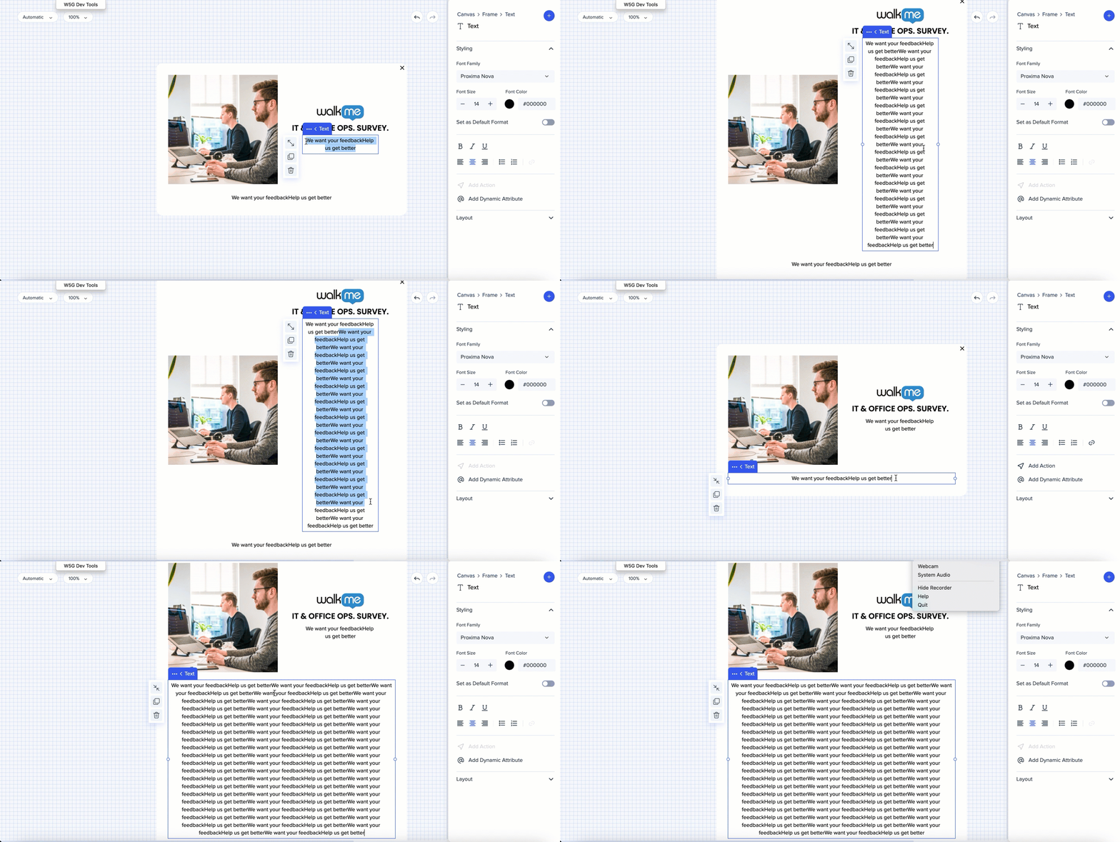
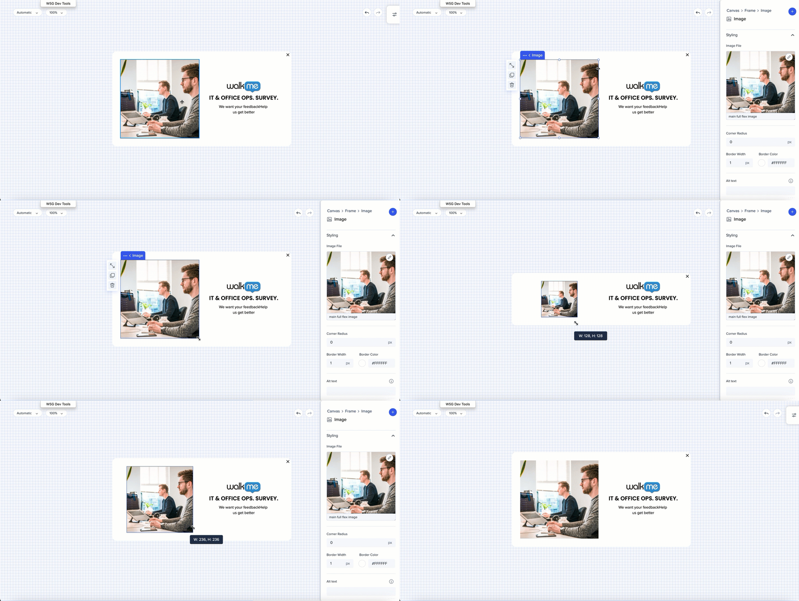
When there's an image in one frame and text in the other next to it, resizing the image will affect the whole canvas.
When adding more text, you have to manually resize the frame and the canvas.
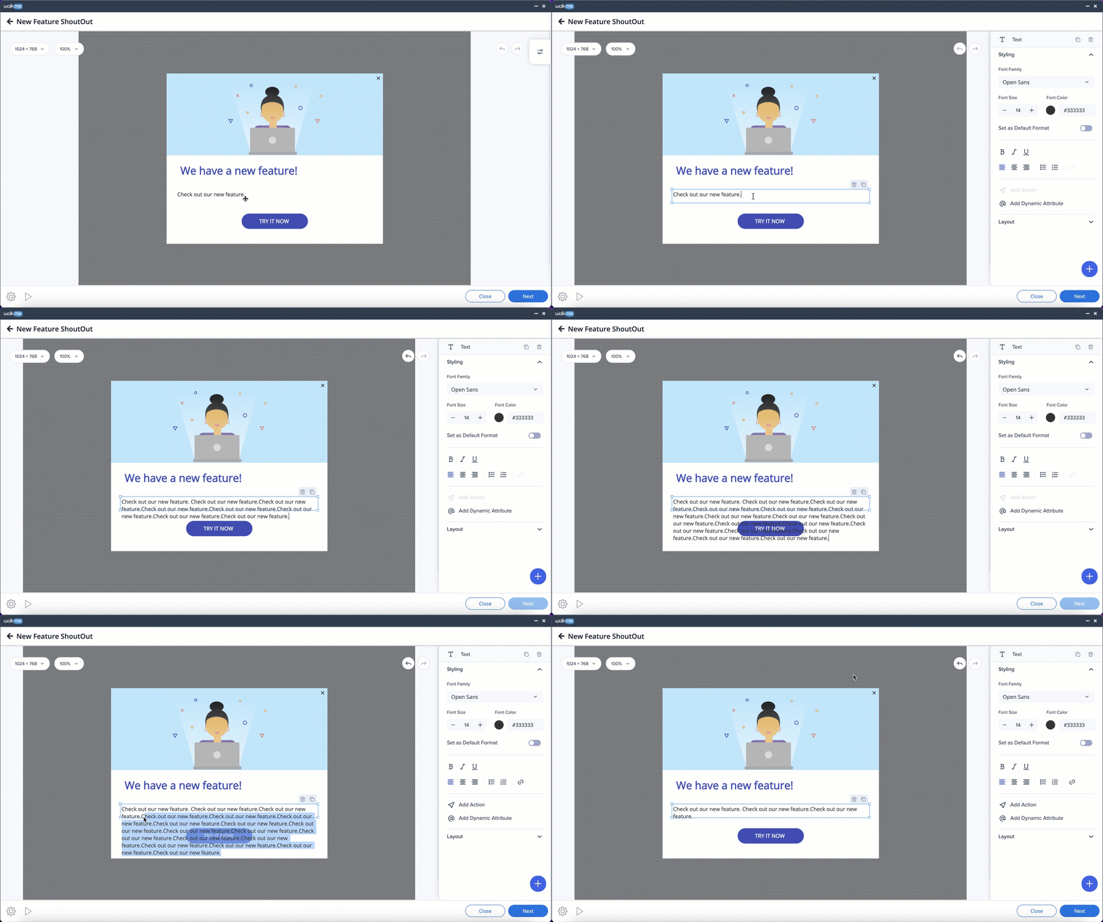
The text frame will expand and shrink automatically.
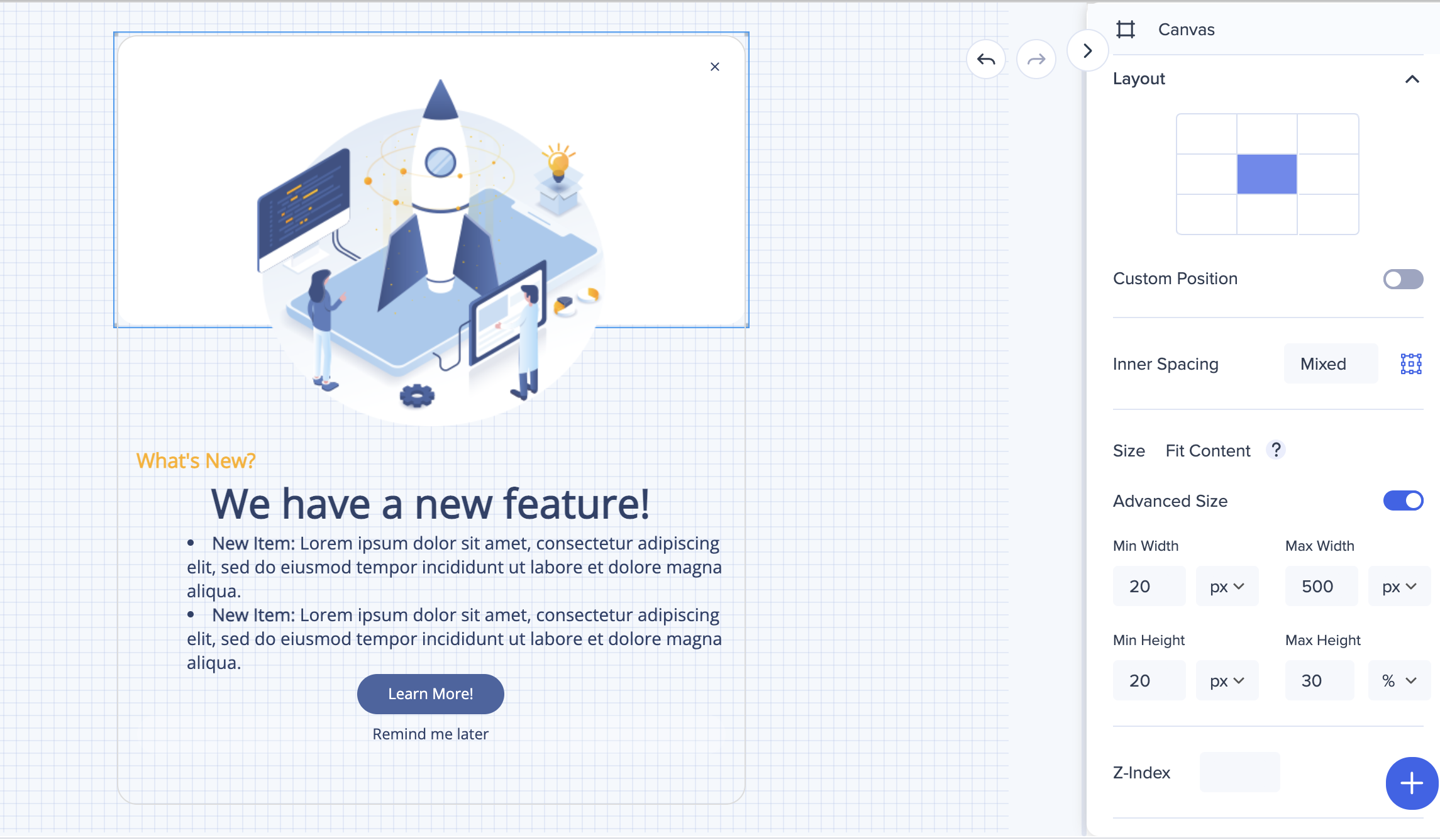
Position of the canvas on screen can be changed only from the property bag. Select one of the default options, or toggle "Custom position" to on - and enter the preferred settings in pixels or percentage for more specific changes.
Position of the canvas can either be changed from the screen (select it and freely drag it around) or from the property bag (you can either select one of the preset positions, or set the custom one).
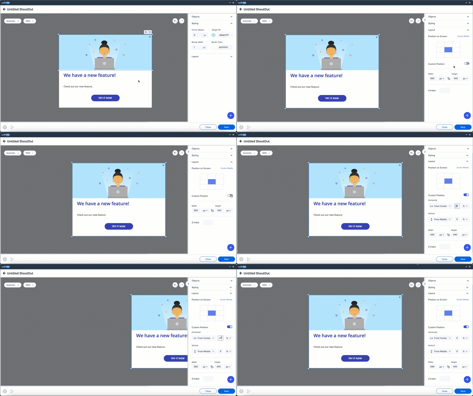
Position of the canvas can either be changed from the screen (select it and freely drag it around) or from the property bag (you can either select one of the preset positions, or set the custom one).

Width of the ShoutOut can be changed by stretching the side handles of the canvas or applying measurements in the property bag. Height will adjust automatically based on the amount of content.
Only the width of the canvas can be resized by a user.
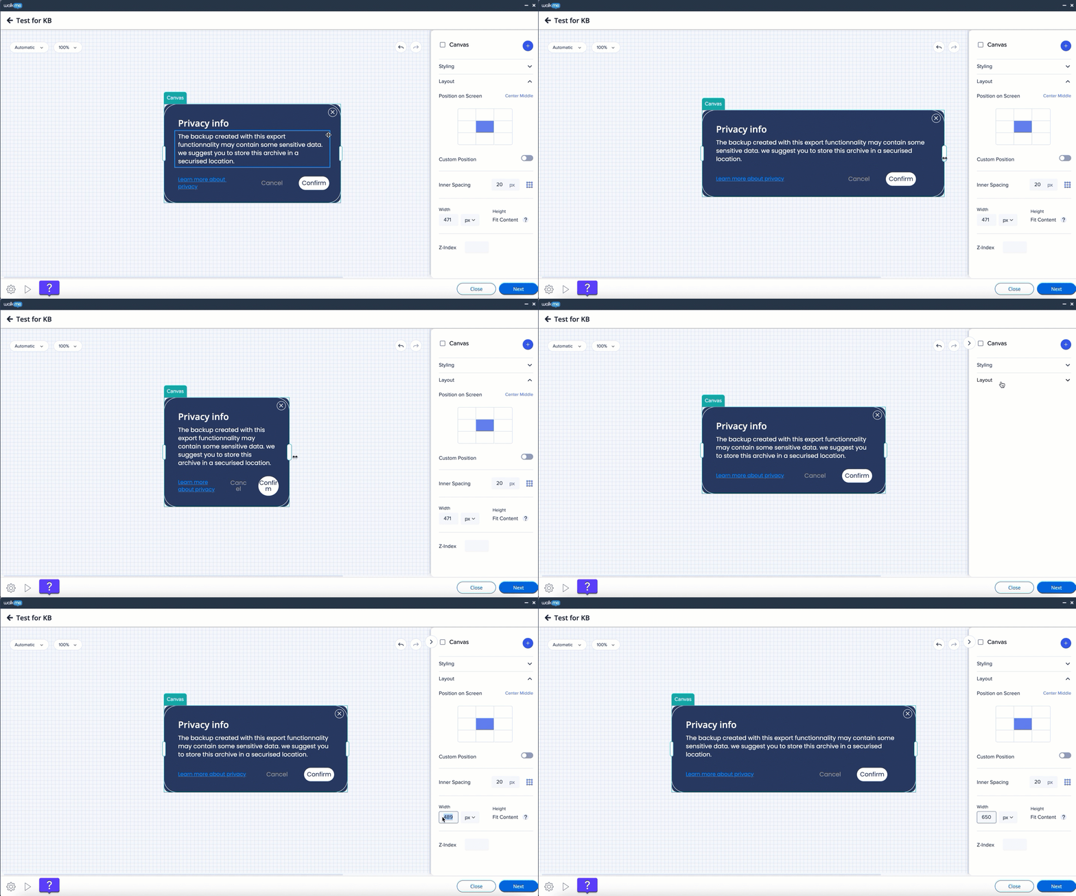
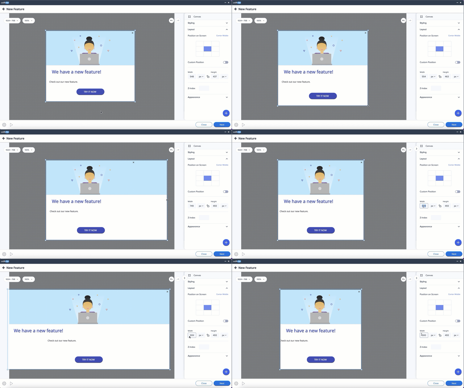
The canvas can be resized using the Width and Height settings on the side panel or by manually stretching the borders of it.
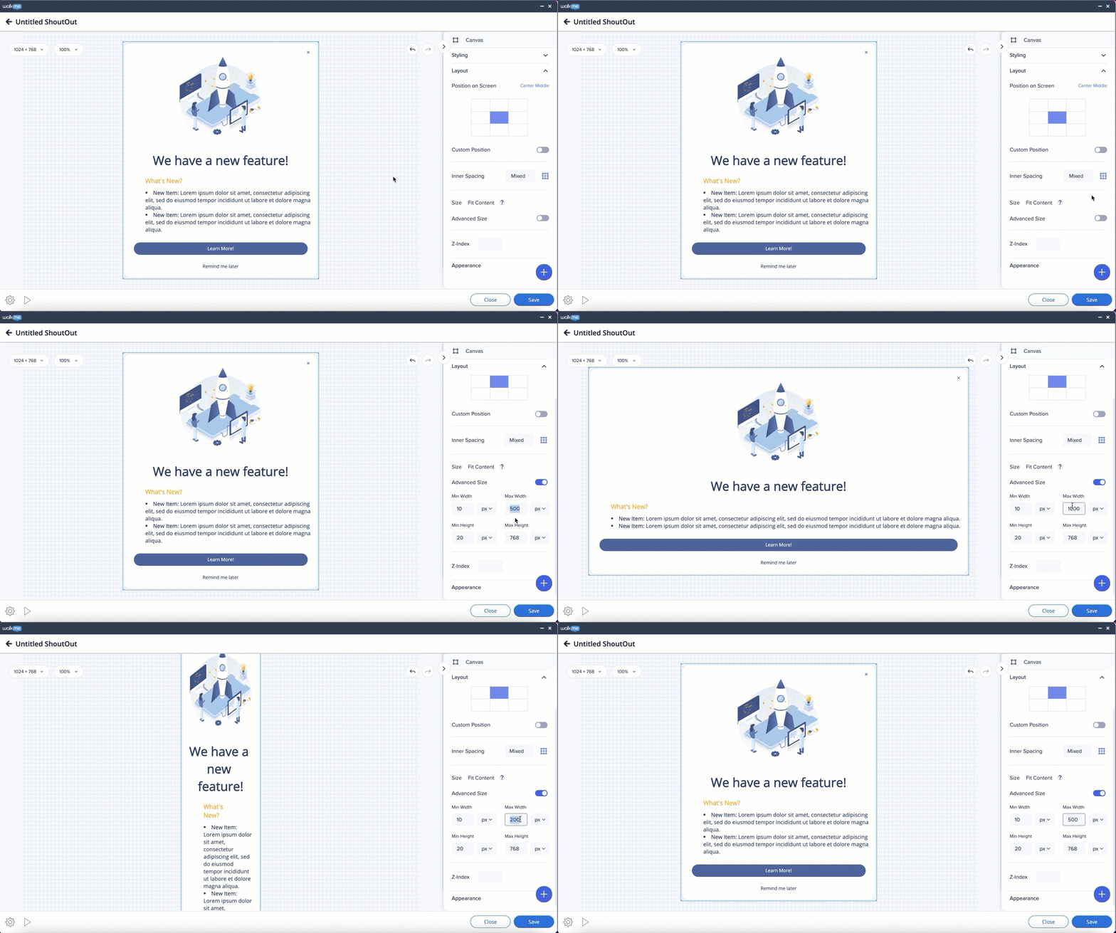
The size of the canvas can be changed from the side panel. In order to do so, switch the toggle to ON in Advanced size box in the Layout tab. The max width and height can be set in pixels or percentages (from the size of the browser screen).
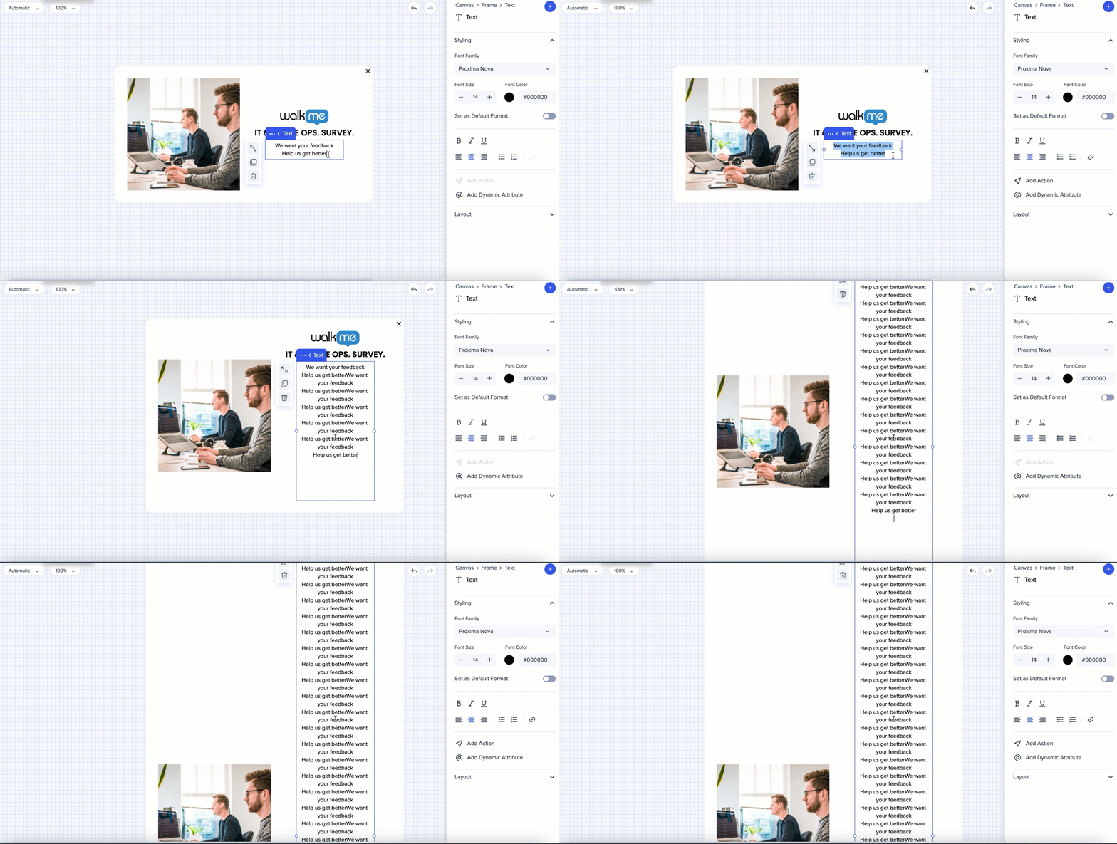
The canvas will expand automatically adapting to the content inside it or to the size of the screen, but it will not exceed the set width/height max limit.
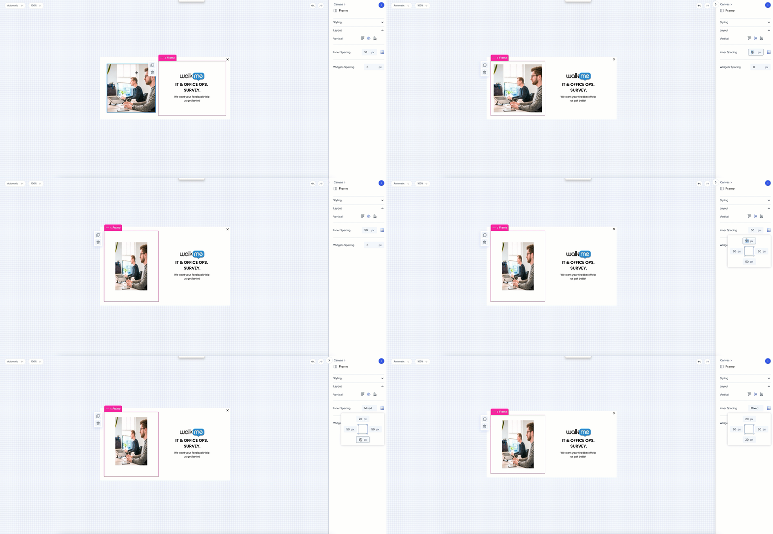
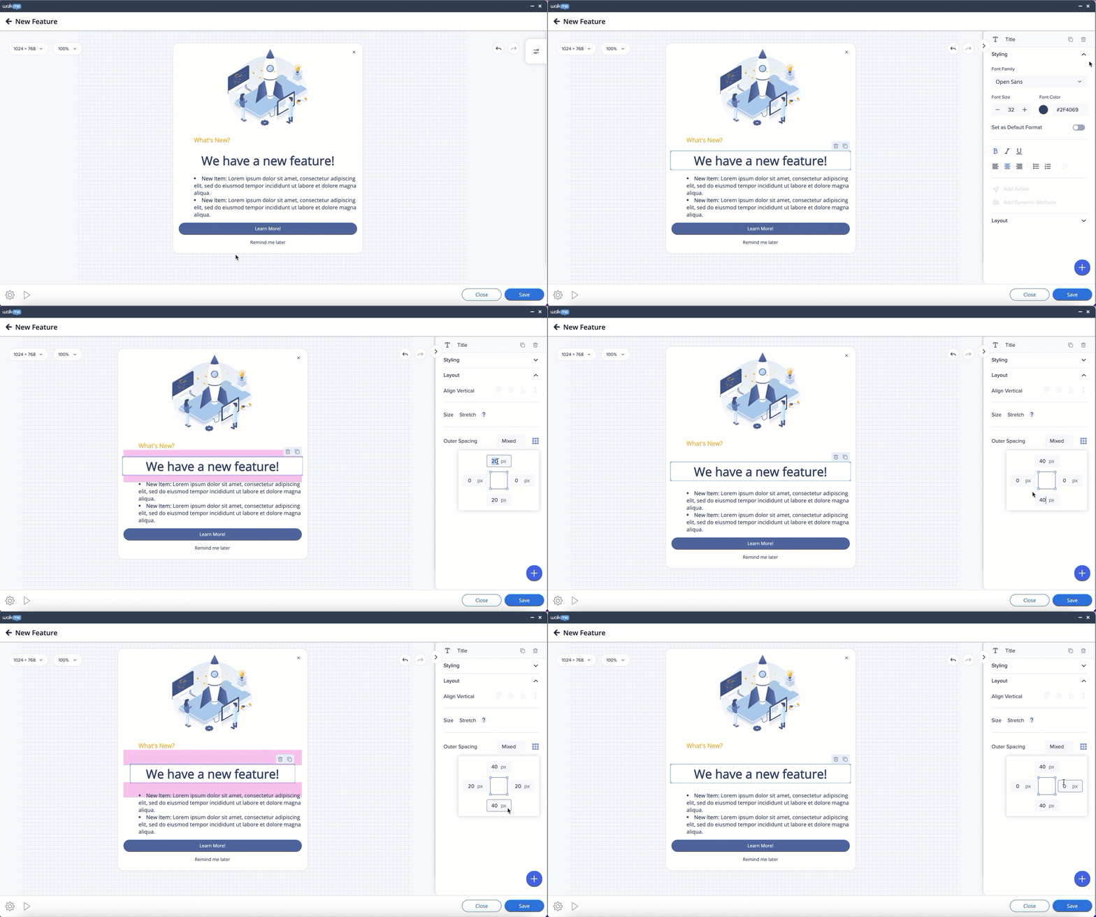
Distance from the sides of the frame to the widgets can be adjusted in the property bag. Select the frame and set the default distance for all the sides, or click on the borders icon - and control each side individually.
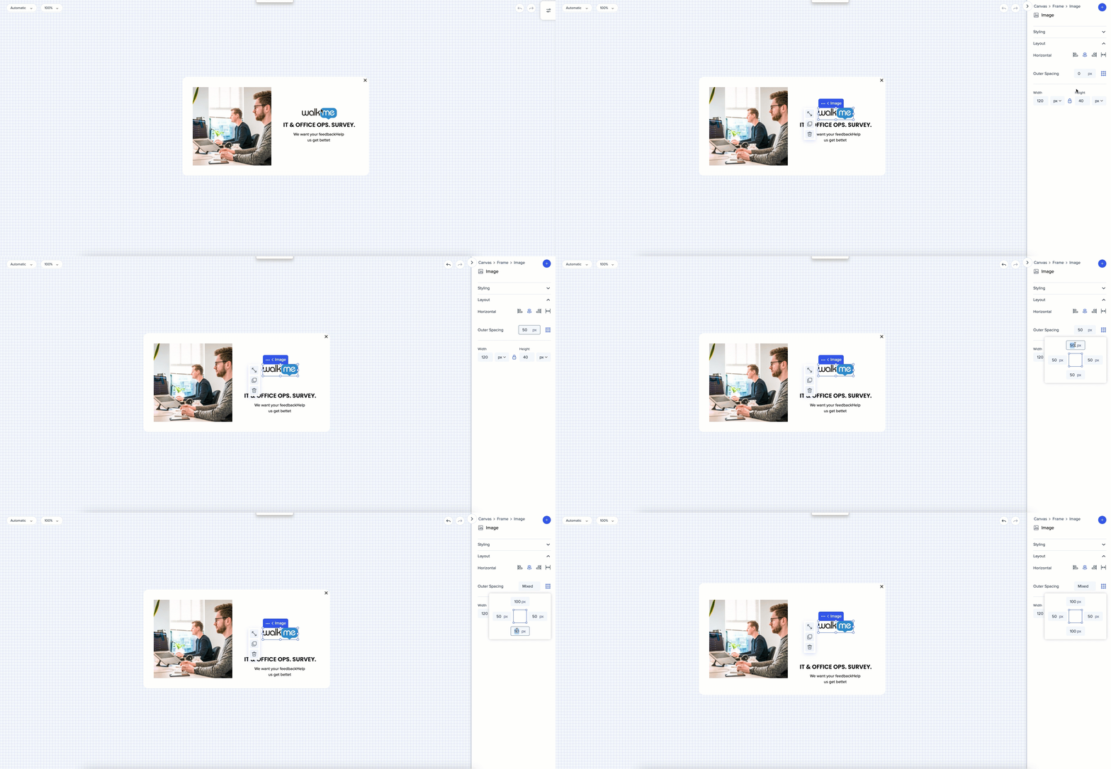
To create space between two widgets - select the widget and adjust outer spacing in the property bag. Use the outer spacing to get more precise position results.
By default same distance is set for all the sides. To apply a different value to one of the sides, click on the borders icon. Indication "Mixed" will appear.
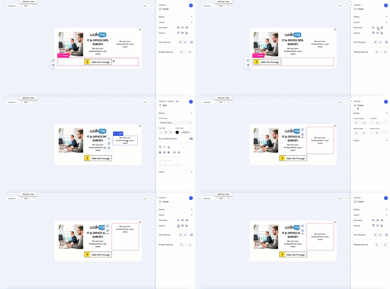
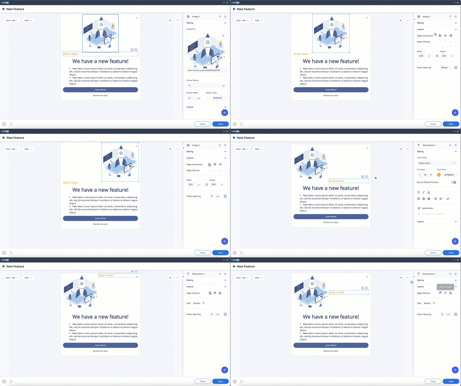
On the frame level, elements can be aligned horizontally or vertically. The option is available when the element is inside a frame that's next to another frame which has more content.
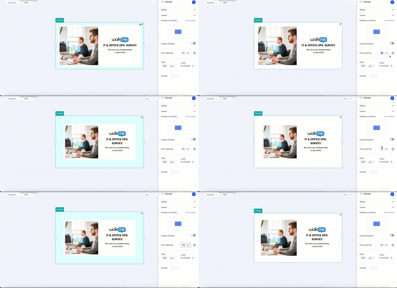
Use the outer spacing on the canvas level to expand the space between the borders and the elements.
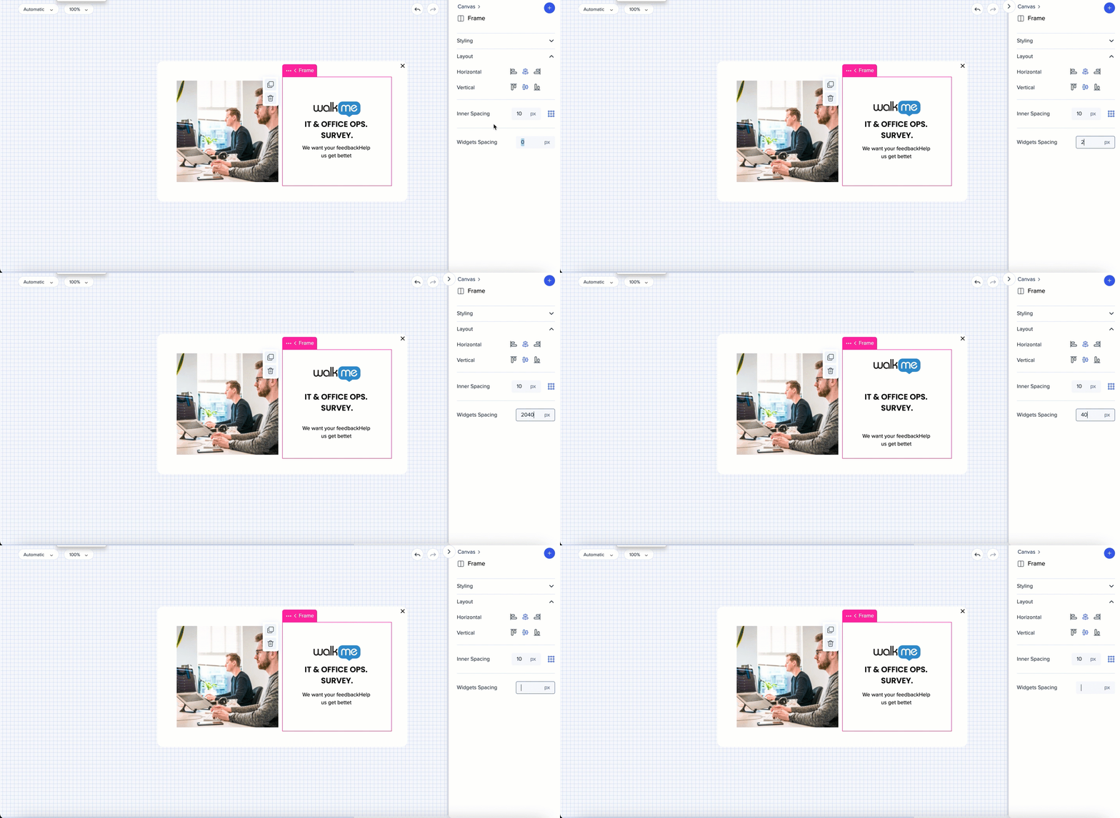
Use the widget spacing to change the amount of vertical space between the widgets.
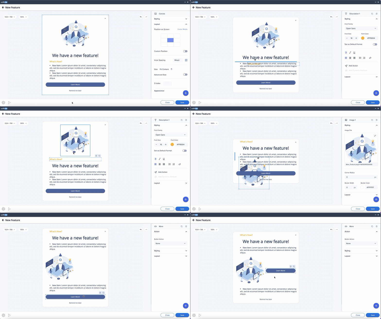
Elements can be freely moved around inside the canvas.

Elements can only be arranged in preset positions that are automatically suggested to users when they drag an element (potential positions are indicated by blue lines).
Frames can be moved by dragging and dropping - horizontally or vertically.
For more precise results - use the inner spacing for frames and outer spacing for widgets.
Distance from the sides of the frame to the widgets can be adjusted in the property bag. Select the frame and set the default distance for all the sides, or click on the borders icon - and control each side individually.
The element's position can be adjusted – inside the canvas and in relation to other elements – in the Layout tab on the side panel by choosing the alignment of the element and setting the outer spacing.
Note: vertical alignment is only available when the object is next to another one of a greater height.
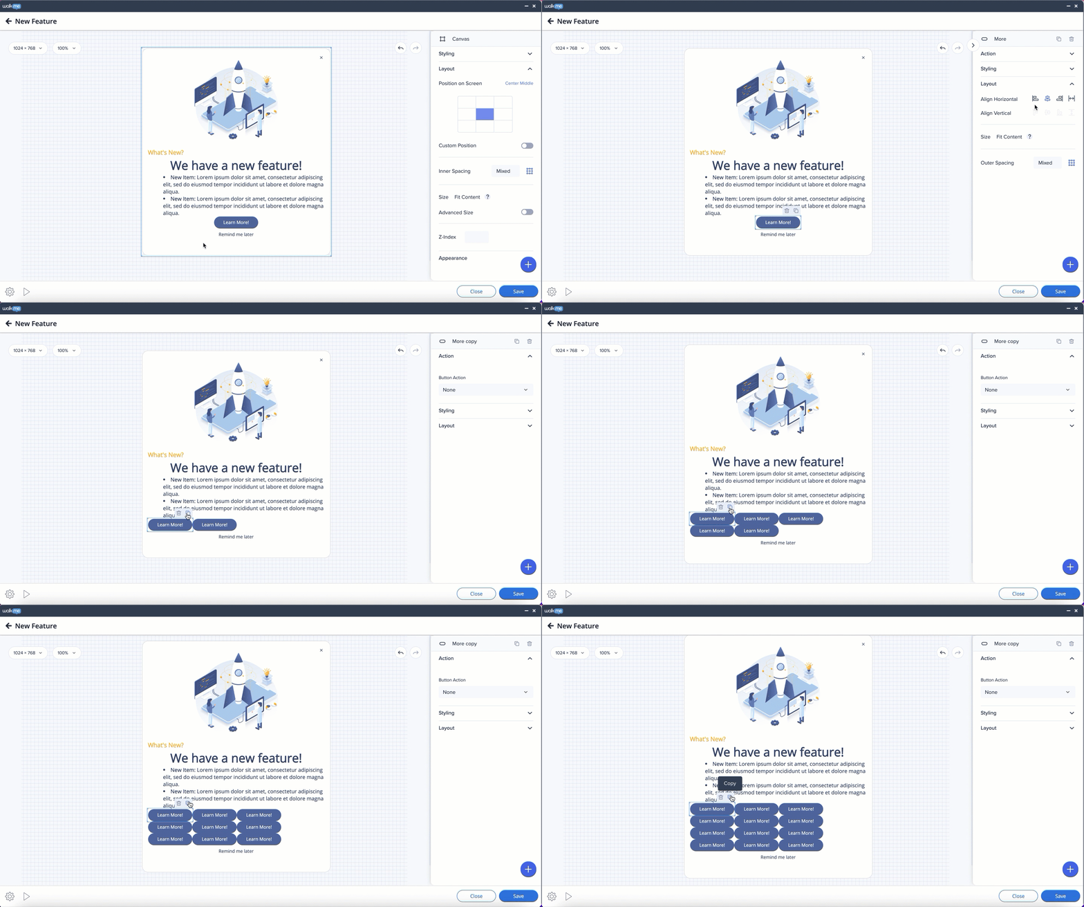
Widgets can be added to the same row as long as there is enough space for them. When the space is over, the widget will be created in a separate row.
To resize a widget, select it and drag the handle bar.
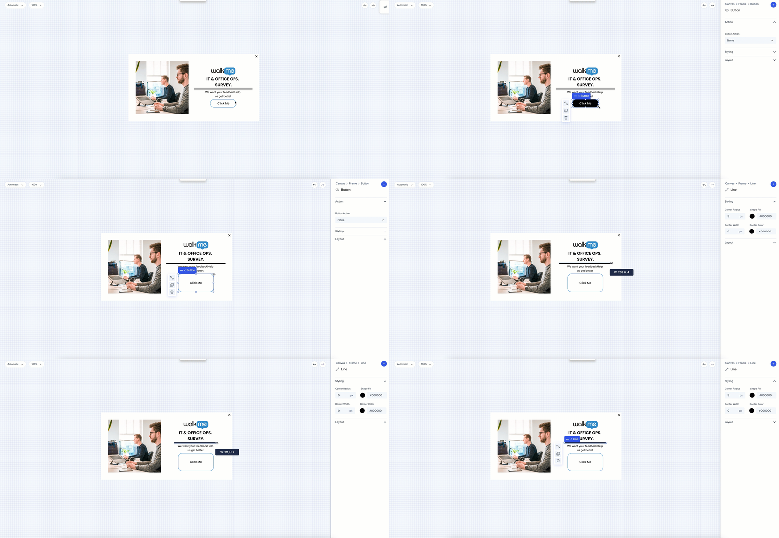
Widget can be stretched by clicking on the stretch icon.
When aspect ratio is locked, the widget will be stretched up to inserted figures. When aspect ratio is unlocked, the widget will take the entire horizontal space available inside the frame.
When there're two widgets in a row - each of the widgets will take 50% of the space inside the frame.
Height of the widget can be controlled manually.
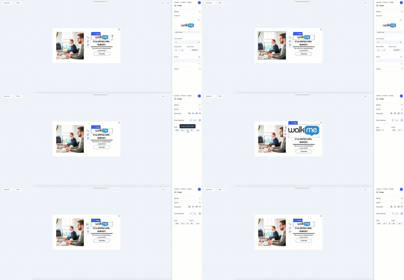
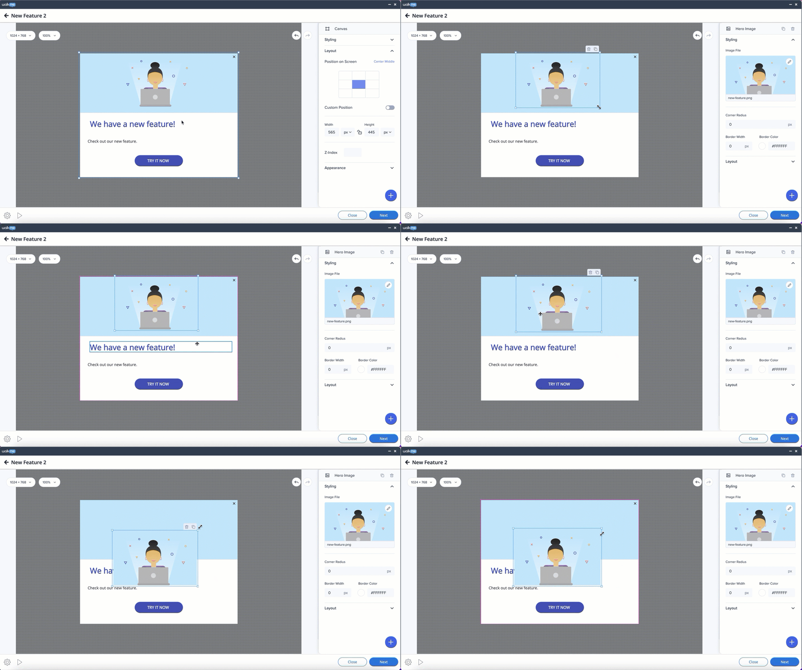
The size of an image, web-view, and shape can easily be changed on the canvas in both templates. In the Flex Layout, the canvas will adapt.
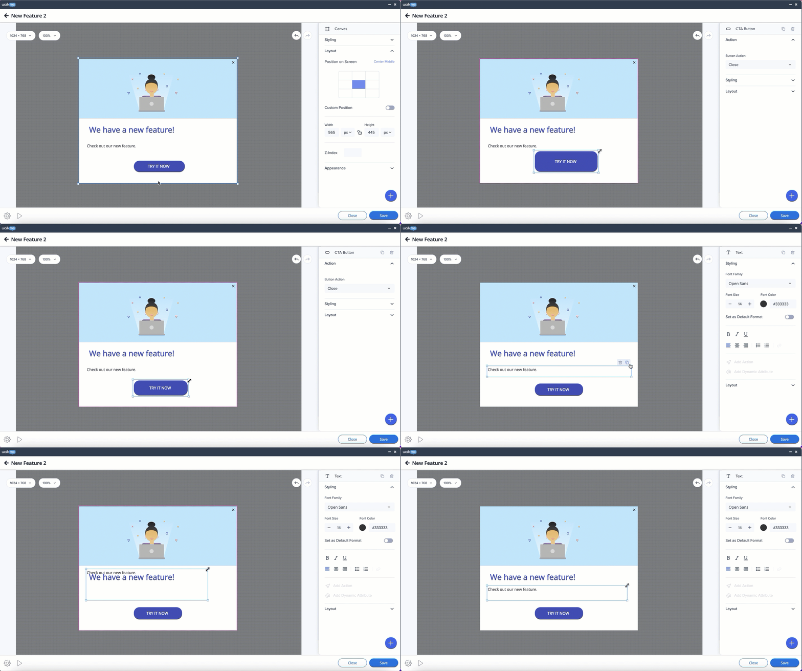
Size of a text box and button can also be changed on the canvas or on the side panel.
The size of an image, web-view, and shape can easily be changed on the canvas in both templates. In the Flex Layout, the canvas will adapt.
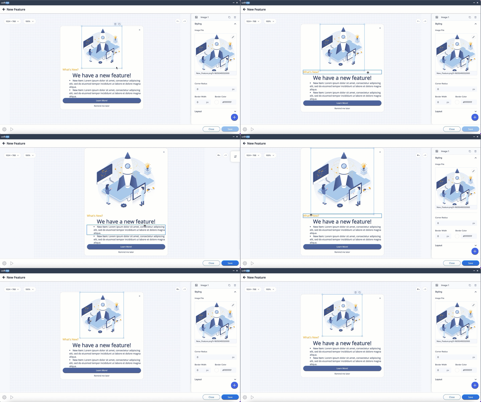
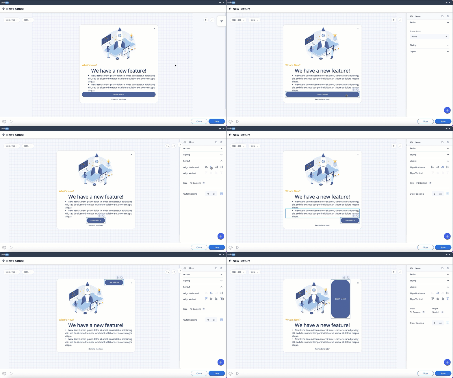
Text box and button size can't be changed. Widget can be stretched by clicking on the stretch icon.
Button can be stretched horizontally or vertically if there is space.
The canvas will expand depending on the amount of content. It will play, but the parts exceeding the screen won't be seen, and the user will not have access to it in the Edit mode as well.
When you added too much content, and it goes beyond the canvas borders.
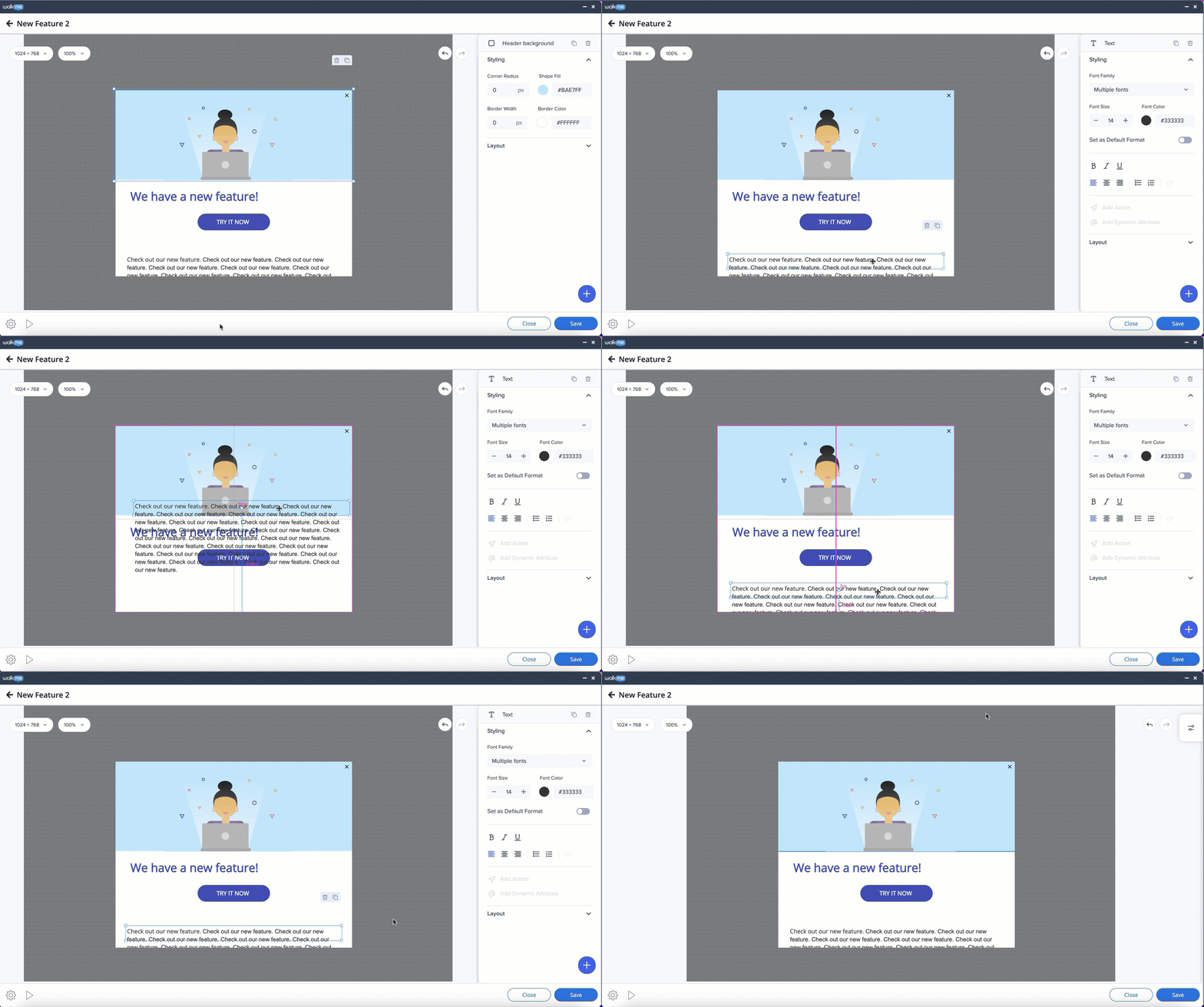
When you added more content than the canvas can fit, and the max height and/or width of the canvas has been reached.
