Legacy WYSIWYG: If a ShoutOut's canvas is set to have a back cover (in the Canvas Element Settings), dismissing the ShoutOut by tapping the back cover will be treated as a CTA of type MAYBE;
New WYSIWYG: In the new WYSIWYG, the back cover is now referred to as "screen overlay." If a ShoutOut's canvas is set to have a screen overlay (in the Canvas object's SCREEN OVERLAY tab), dismissing the ShoutOut by tapping the screen overlay will be treated as an Action of whichever type you choose.
Adding Web-View objects to ShoutOuts
The ShoutOut is the main campaign type in which web-view elements are utilized. Web-views in ShoutOuts can portray web-surveys, videos or other external resources in the host app's UI.
Drag the Web-View icon from the OBJECTS directory to wherever you'd like the web-view to appear on your app screen.
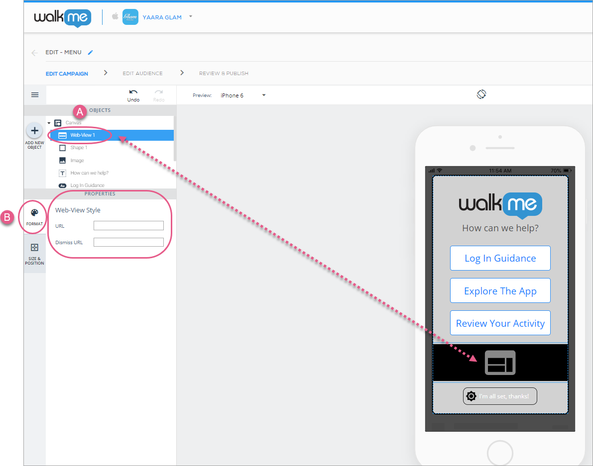
Upon adding or clicking a web-view, the default tab will be the FORMAT tab, where you can do the following:
Enter the URL for the web-view you would like to appear on the campaign; and
Enter a Dismiss URL (the URL that, when reached, will result in the campaign being automatically dismissed/closed without the need for further action from the end-user):
Steps 1 & 2: Click on Web-View and enter your desired URL (REQUIRED) and Dismiss URL (OPTIONAL).
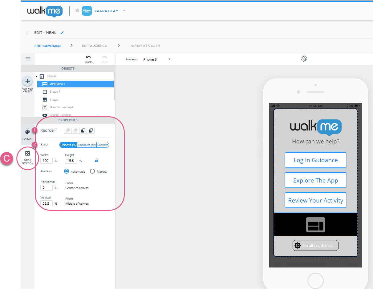
Next, click the SIZE & POSITION tab, where you can configure the web-views layer order (similar to z-index), size and units, and positioning relative to the Canvas object:
Steps 3 & 4: Click SIZE & POSITION and customize your web-view object's layer order (similar to z-index), and size/position to your liking.
Web-view elements support Google Forms-based surveys and streaming videos. Support for inline video can be provided using an S3 script (contact the WalkMe Mobile team to inquire).
Adding Carousel widgets to ShoutOuts
Carousels are widgets or complex objects comprised of other simple objects, each of which can be configured. Carousel widgets are most suitable for use in ShoutOuts, though they may be used elsewhere as well (e.g., in Surveys for a better multi-question UI).
Drag the Carousel icon from the OBJECTS directory to wherever you'd like the carousel to appear on your app screen.
You can only add one Carousel object per canvas.
Main (Carousel) widget configuration
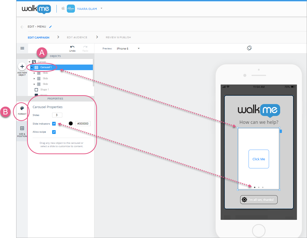
Upon adding or clicking a Carousel icon, the default object will be the main (Carousel) widget, and the default tab will be the FORMAT tab, where you can configure the following global settings:
The number of sub-objects (Slides) that appear in the carousel;
The default number is three and the max number is ten;
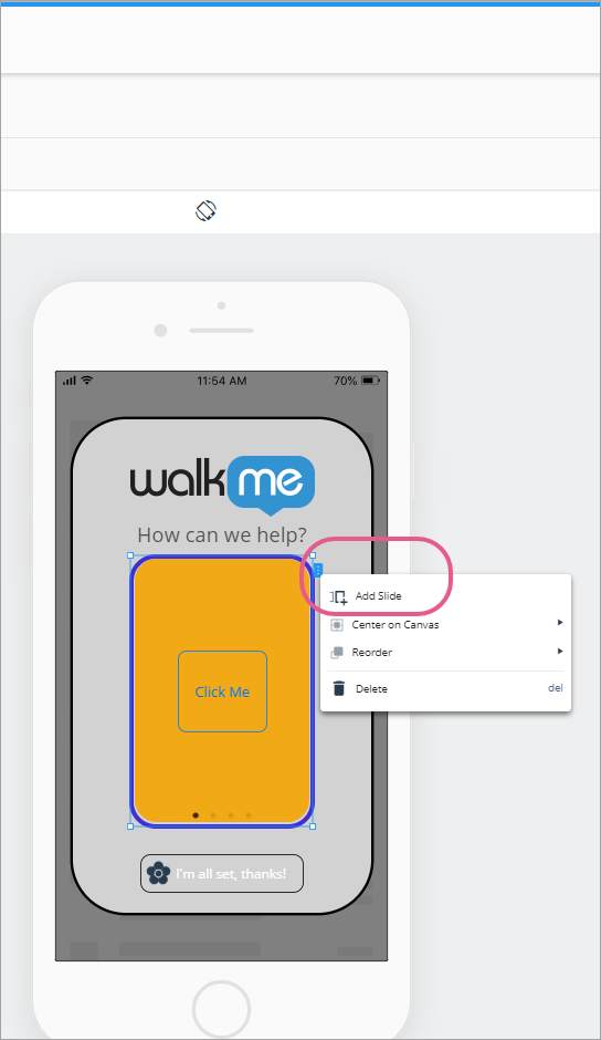
You can also add new slides from the right-click menu or by clicking the blue tab on the object's right side:
Whether or not to show the slide indicators (dots at the bottom of each slide that show you which slide you are currently on and how many slides there are in total);
These indicators are clickable to navigate between slides during the content creation process and for end-users of your app;
You can also navigate between slides by clicking on the blue wings that appear on the right and left sides of a slide when you hover over it in the preview device screen, or by simply clicking a Slide object in the OBJECTS tree.
Whether or not to allow navigation between slides using a swiping action on the app screen:
Steps 1 & 2: Click on Carousel 1 and configure your global Carousel Properties.
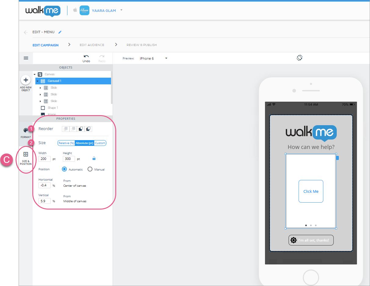
Next, click the SIZE & POSITION tab, where you can configure the carousel's layer order (similar to z-index), size and units, and positioning relative to the Canvas object:
Steps 3 & 4: Click SIZE & POSITION and customize your carousel's layer order (similar to z-index), and size/position to your liking.
Sub-object (Slide) configuration
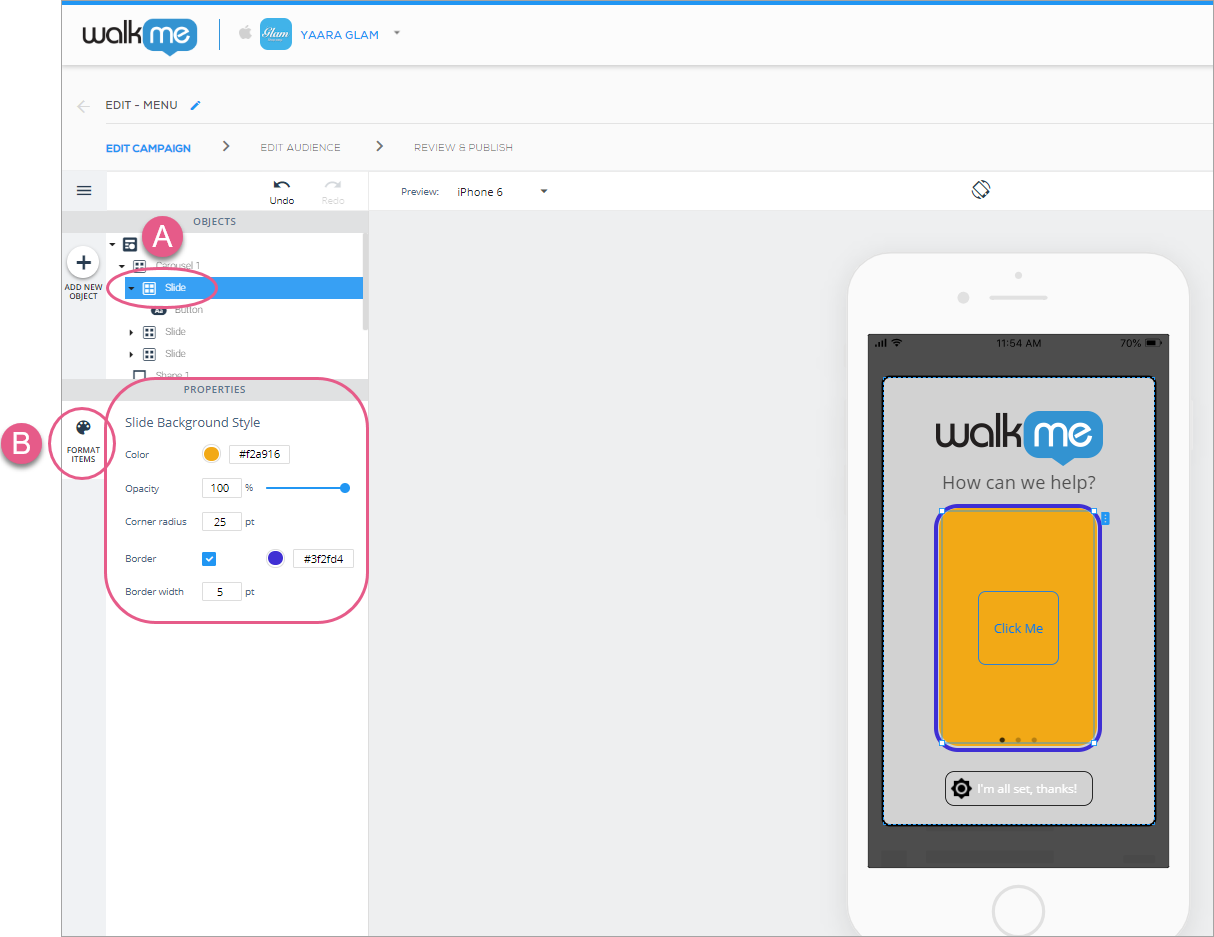
Once you're done configuring your global carousel settings, click on one of the sub-objects (Slide icons) to configure your individual sub-object.
Because the slides' size and position settings are configured in the Carousel object, there is only one tab, the FORMAT tab, with one section called Slide Background Style, where you can configure the following:
Individual slide's background color;
Individual slide's opacity (visibility) level;
Individual slide's corner radius (the higher the corner radius, the more rounded the slide's corners are); and
Whether the individual slide has a border around it, and, if so, the border color and radius:
Steps 1 & 2: Click on a Slide icon and configure your individual slide properties.
You can add any other object from the OBJECTS directory into a slide. Try it out!
Adding lists to your ShoutOuts
List widgets may only be used in ShoutOut-type campaigns.
Drag the List icon from the OBJECTS directory to wherever you'd like the list to appear on your app screen.
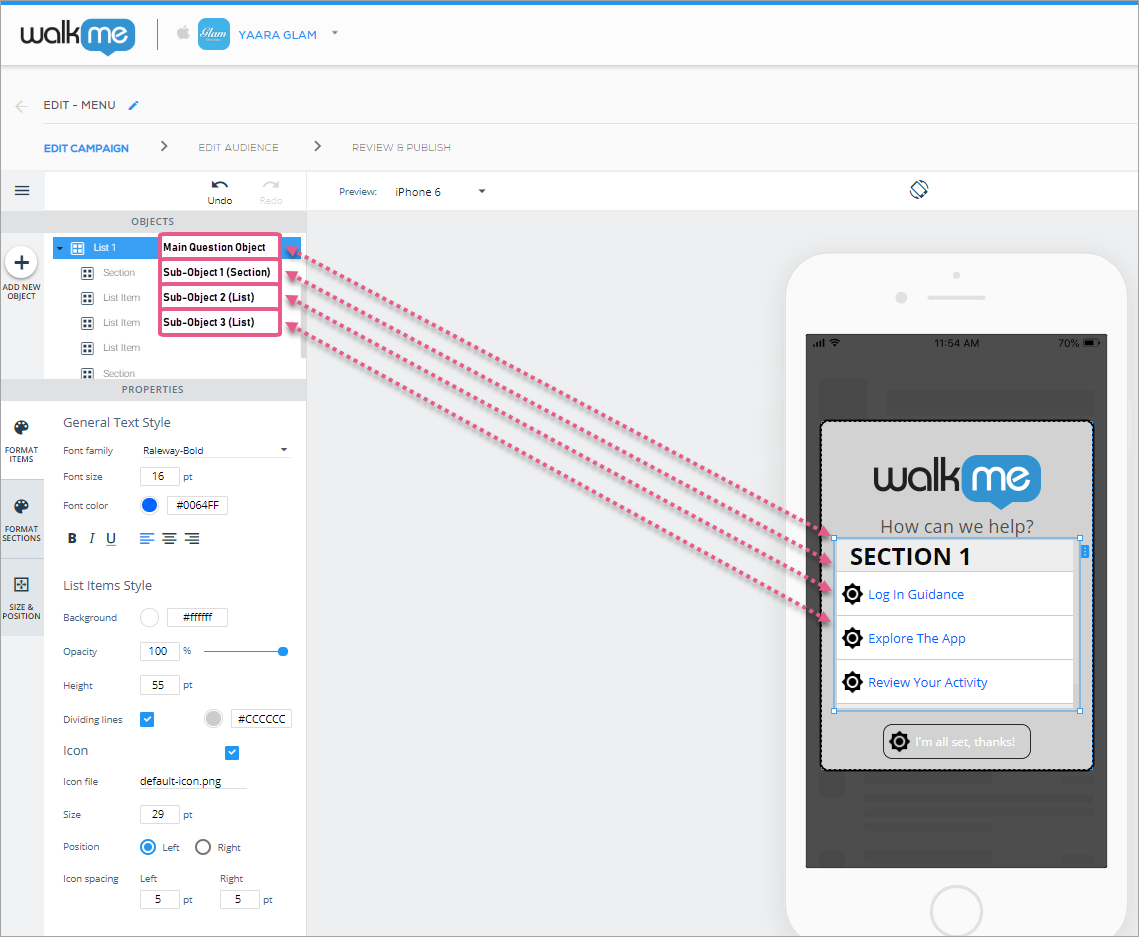
Lists, like carousels, are widgets, or complex objects comprised of other simple objects, each of which can be configured:
Main object (List) configuration
Upon adding or clicking a list, the default object will be the main object, and the default tab will be the FORMAT tab, where you can configure the following global settings:
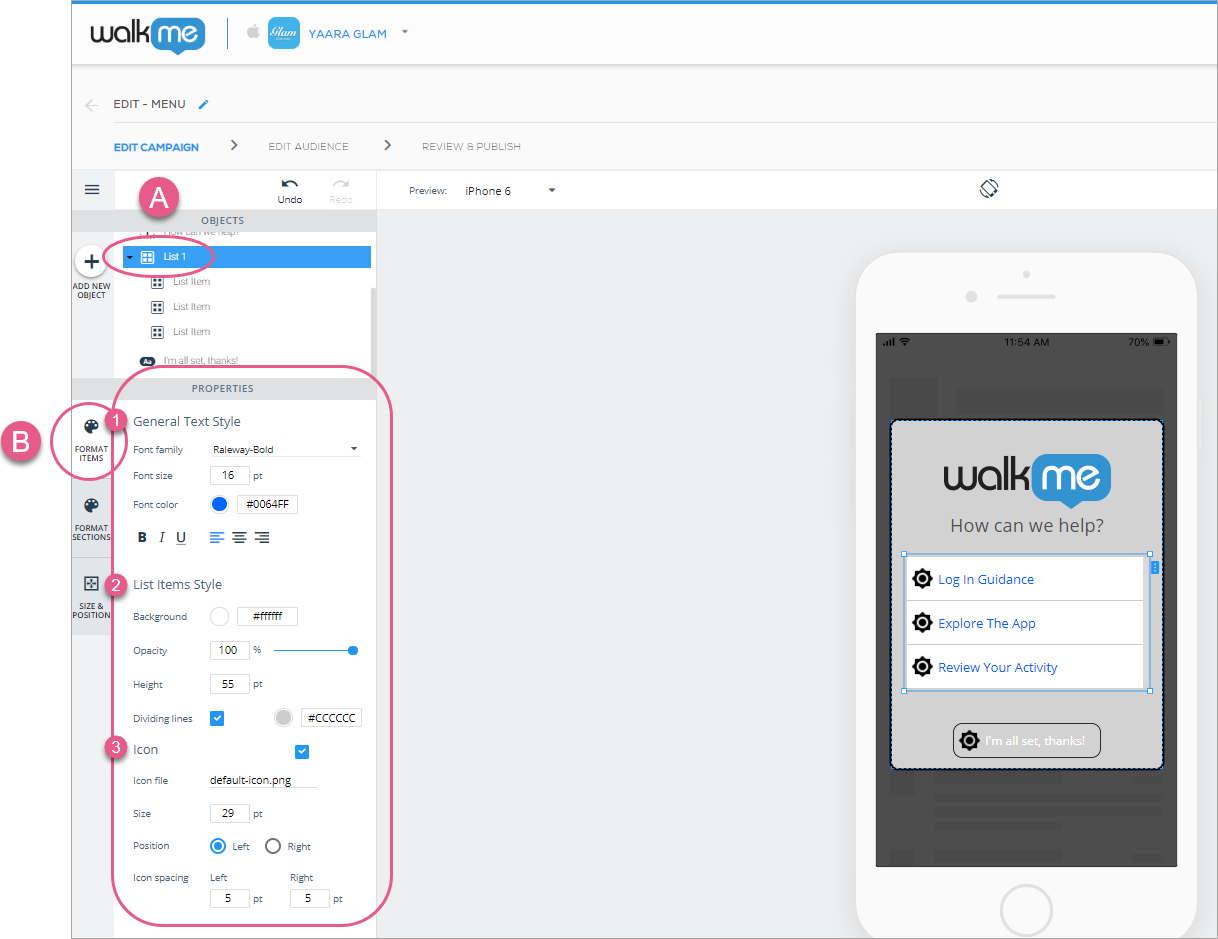
In the General Text Style section, set the following:
Global general text font;
Global text font size;
Global text font color;
Global text alignment; and
Style.
In the List Items Style section, set the following:
Global background color;
Opacity (visibility);
List-item height (the height of each rectangle enclosing list text; this is important for when you add additional items to your list and want them visible without scrolling); and
Whether there are dividing lines between the sub-objects.
In the Icon section set the following:
Decide whether you want an icon to appear next to each list item, and, if so, which icon:
Steps 1-4: Click your list, choose your desired Text Style, List Items Style, and Icon settings. These are global settings that will apply to each of your sub-objects, unless you configure your sub-objects separately.
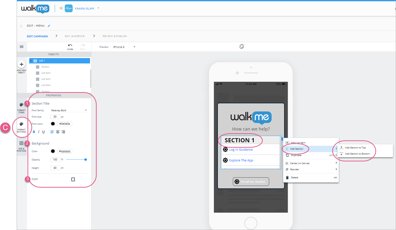
Next, click the FORMAT SECTIONS tab, which applies to sections you add to your list. Here, you can configure the following global settings:
In the Section Title section, set the entire list's global section text font, section text font size, section text font color, section text alignment, and style;
In the Background section, set the section's background color, opacity (visibility) level and height:
Steps 5-7: Click FORMAT SECTIONS, and configure your sections' title, background, and icon settings to your preference. These settings are global (will apply to all of your list sections).
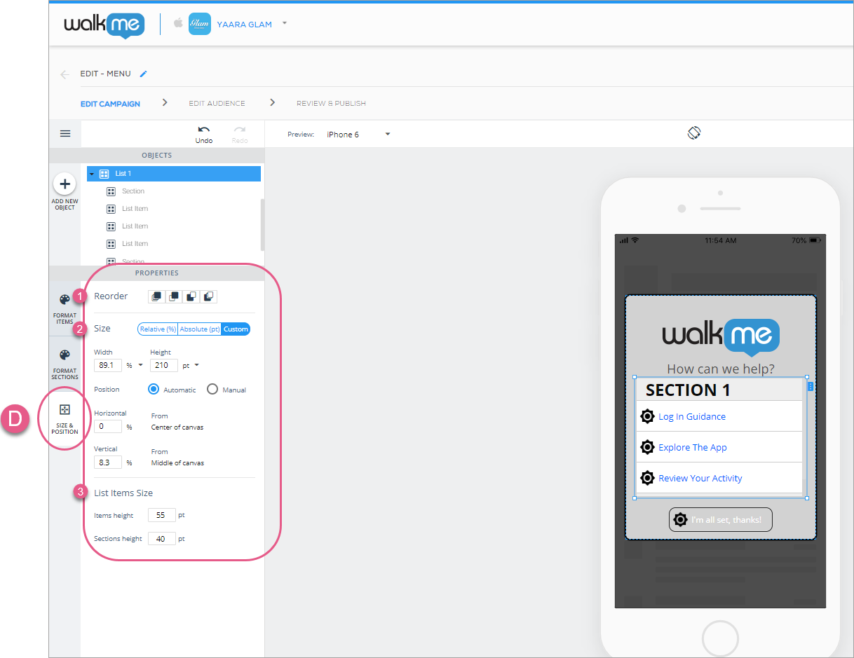
Finally, click the SIZE & POSITION tab, where you can configure the list's (as a unit) layer order (similar to z-index), size and units, positioning relative to the Canvas object, and list items size:
Steps 8-10: Configure your list's global layer order, list size, and list item size.
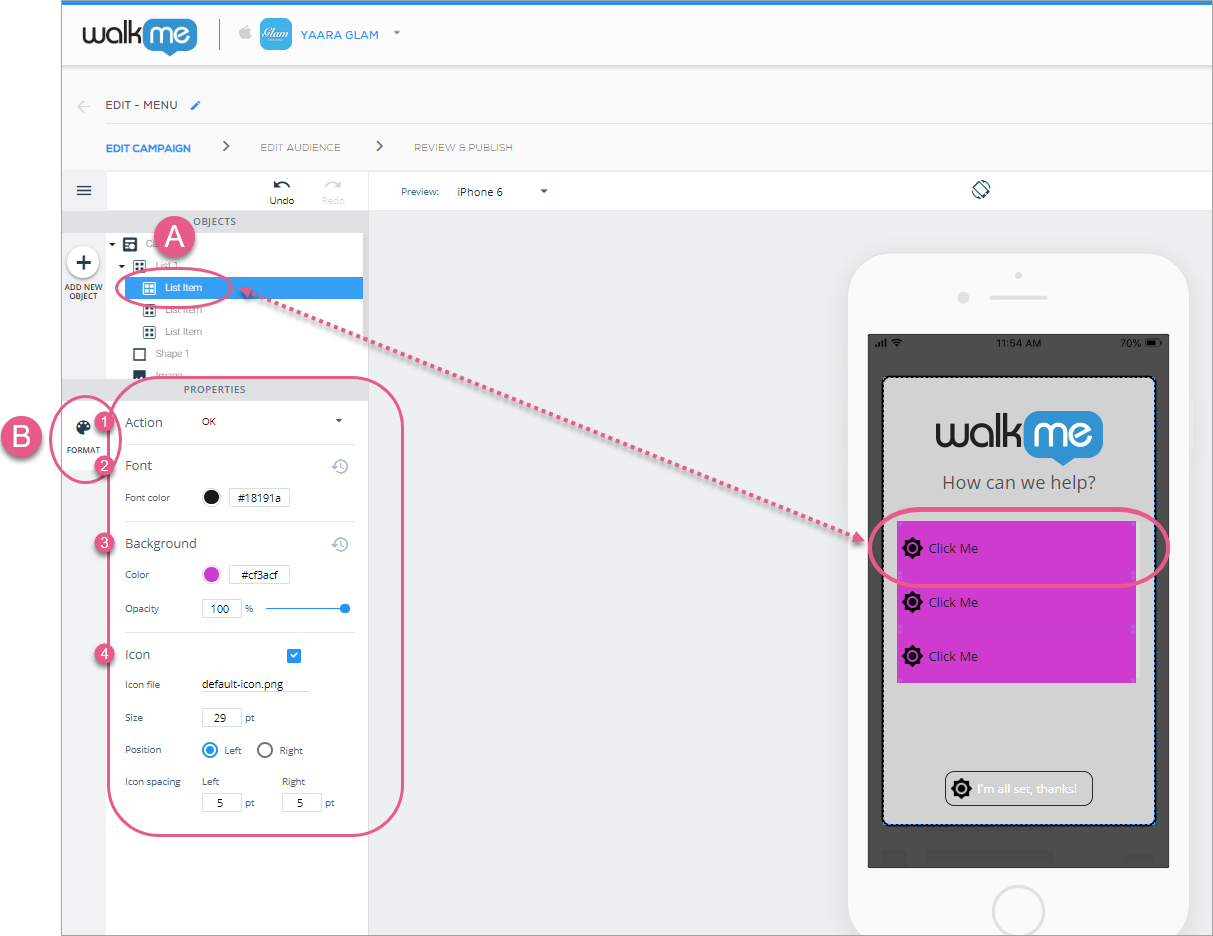
Sub-object (List Item) configuration
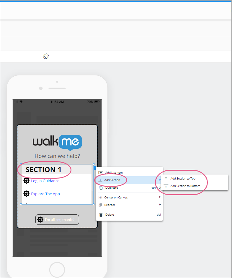
While three list-items and zero sections are the default for lists, you can add additional list items and sections with the right-click menu or clicking on the blue tab to the right of the list:
Once you're done configuring your global list settings, click on one of the sub-objects (List Item icons) to configure your individual sub-objects.
There is only one tab, the FORMAT tab, from where you can configure the following:
In the Action section, set an Action that will occur when an end-user clicks this individual sub-object;
See the Available Actions for buttons, shapes, lists, and overlays section in the new WYSIWYG article.
In the Font section, configure the individual sub-object's font color;
In the Background section, configure the individual sub-object's background color and opacity (visibility);
In the Icon section, decide whether you want an icon to appear next to each sub-object, and, if so, which icon, its size, and positioning:
Steps 1-5: Click your list item, choose your desired Action, font color, background color and opacity, and icon settings. These are individual settings that will override the global settings you set on this list, but only for this individual list item.
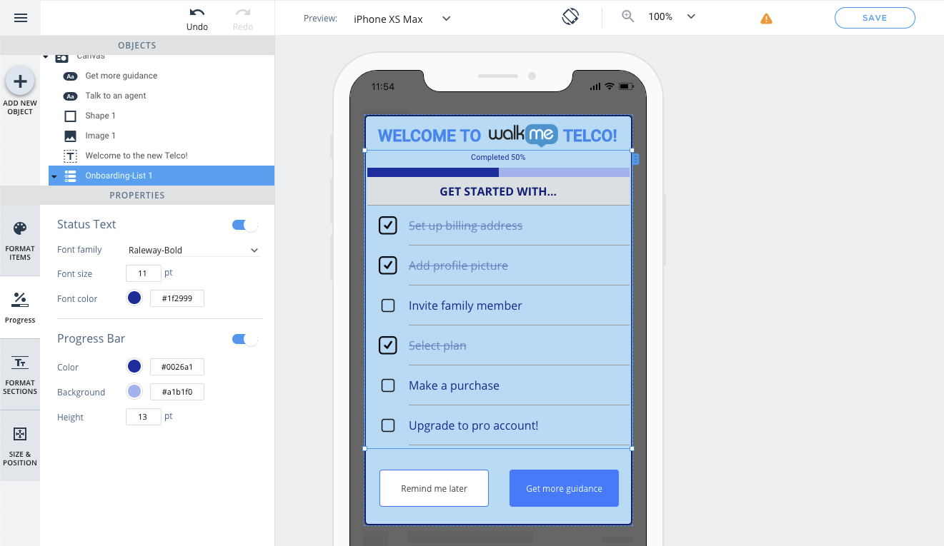
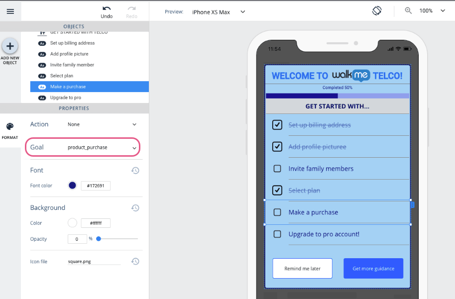
Onboarding Lists
Starting from SDK version 1.17.0 and above, you can add Onboarding Lists to your ShoutOuts to show your users their progress when they complete different goals within the app!
This new widget type, which is only available in ShoutOut campaigns, opens the door to new use cases you can create with WalkMe Mobile including:
Gamification for onboarding - encourage users to reach 100% completion of their onboarding.
Structured training - let your users track what processes they already reviewed and completed.
Progress measurement for users actions in the app - help users track their progress in complex processes.
To do list - check items off your users list as they complete them.
The onboarding list widget is available for ShoutOut campaigns, and is pretty similar to the standard "List" widget, but what makes it different is its ability to track completion for items in the list, by checking whether or not users reached the goal related to each item in the list. Once a goal related to an item is reached (regardless of the user's interaction with the onboarding list campaign), this item will be marked "Done", and the list's progress bar will progress accordingly.
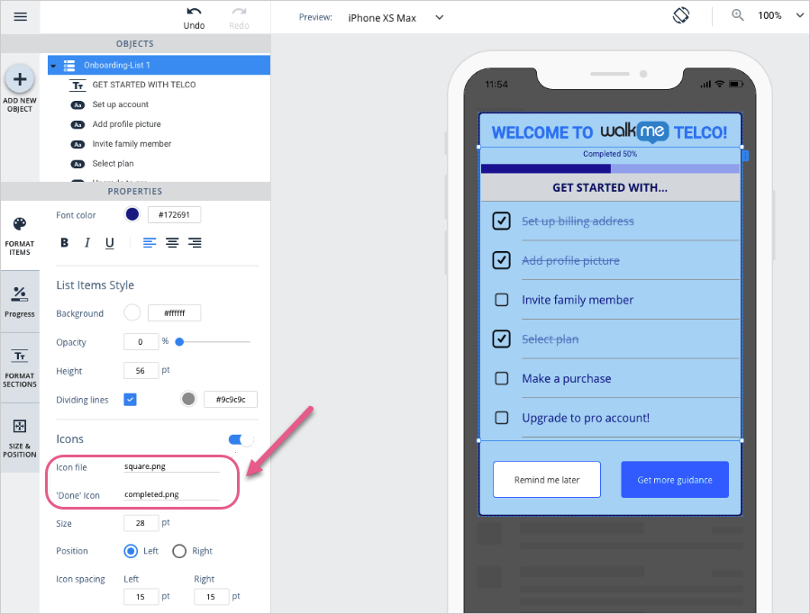
The Onboarding List widget in the WYSIWYG has a few unique properties to it (comparing to the standard "List" widget). Use these properties to customize and control the Onboarding List for your needs:
Done icon:
If your onboarding list is set to display icons for list items (Format Items tab in the list object), you will be able to set a different icon for items in their 'Done' state:
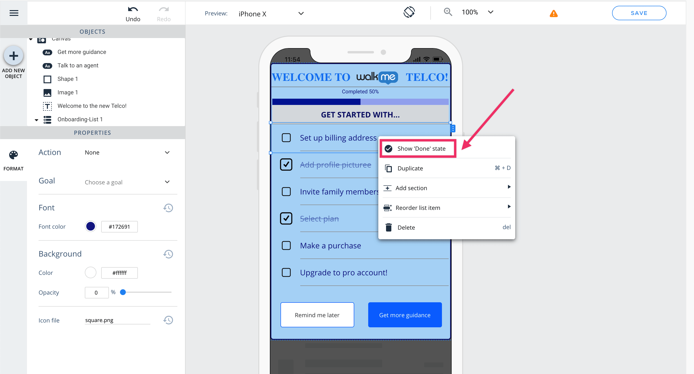
To view each item's 'Done' state - you can right click on the item and select the "Show 'Done' state" option
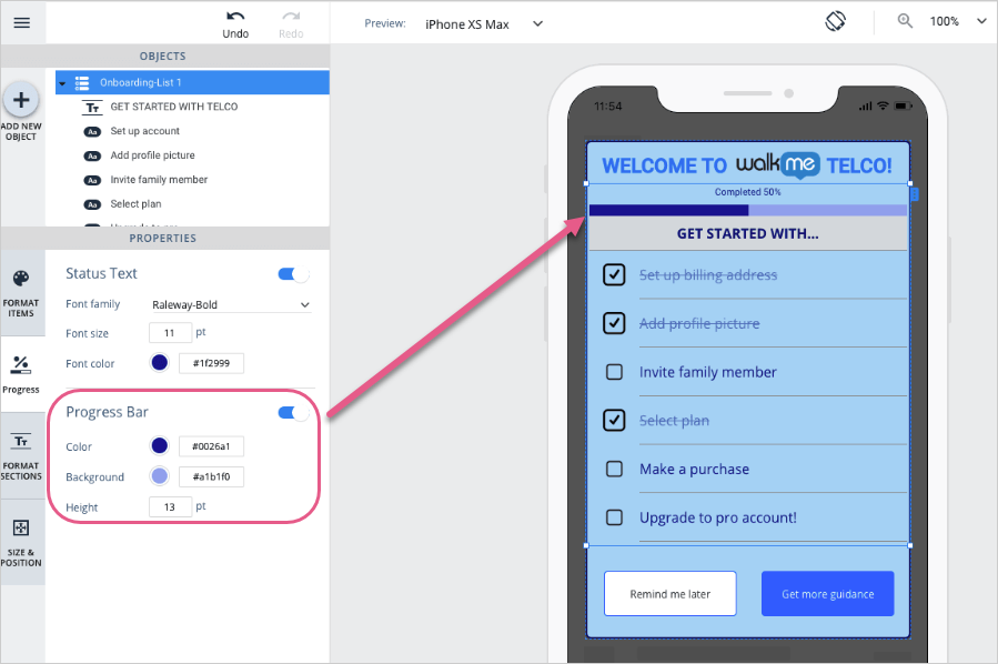
Progress tab:
Here you customize the progress indicators for the list - the progress text formatting and the progress bar design.
Note:
Progress status text ("Completed x%") cannot be edited, only its design properties can be customized from the "Progress" tab.
The progress bar shown in the WYSIWYG will always show 50% completion by default, regardless of the list content.
Goal property:
Each list item has a Goal property that when reached, will make the item be marked as "done"
In addition to the progress-related properties - you can select to display specific items from the Onboarding List in their "Done" state in the WYSIWYG, by right-clicking the item or clicking on the context menu button next to the item:
In the "Done" state, you can preview the item's "Done" icon and the what the item looks like when it's crossed off from the list.
Note:
As Goals are not evaluated on Preview Mode, to see the onboarding list completion use Simulate Mode.


