Welcome to the
WalkMe Help Center
Please log in to continue

Please log in to continue

The Menu Dashboard is the analytics platform for the desktop and mobile menu. It provides value and visibility, requiring no action from the user.
Features include the "Invite Co-Workers" button, which can be used to invite other users to manually download the desktop and mobile menu.
In addition, the dashboard shows analytics data about user engagement with the desktop and mobile menu.
1. Environment
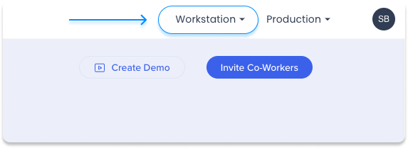
Change the environment dropdown on the top right of the console to display data for the selected environment
2. Audience
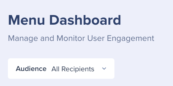
Filter the dashboard to display data according to audiences so that you can see how different user groups are engaging with the desktop and mobile menu
3. Deployment status
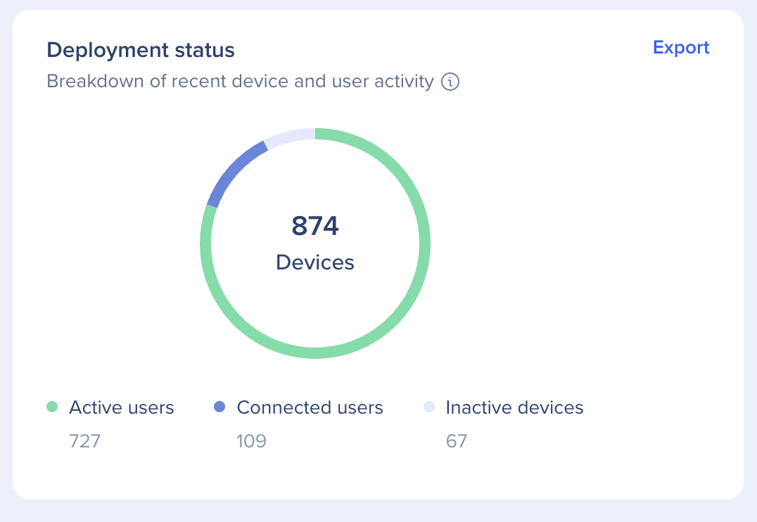
Breakdown of recent device and user activity that includes only users and devices that have version 2.0 and higher, and does not include mobile devices.
This pie chart is broken into three metrics:
Deployment status CSV file
Click Export to download a CSV (file name: Menu Deployment status ), that includes a list of all users and the number of devices they have active, connected or inactive. The User identifier Column containing list of emails or ID (for hashed accounts) For inactive devices in this column will include machine ID
See a video explaining the Deployment status tile:
4. Menu adoption
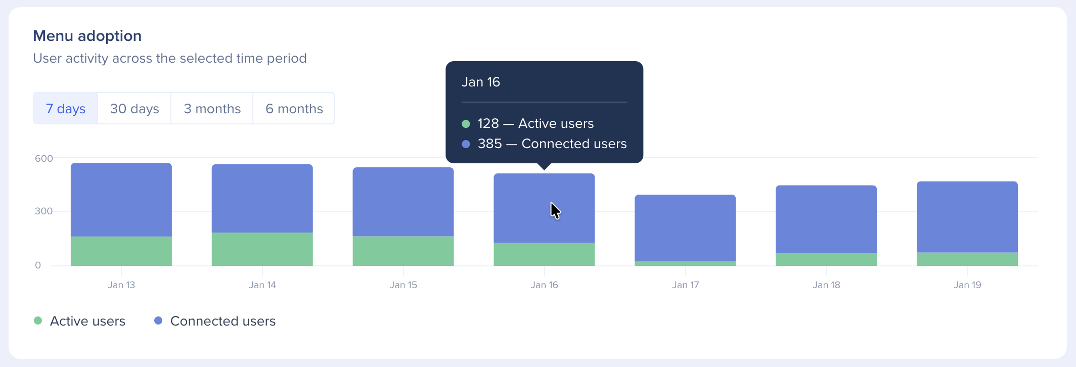
Device and user activity across the selected time period
Available time periods: Today, Last 7 days, last 30 days, last 3 months, or last 6 months
This stacked bar graph visualizes activity across the available devices. The metrics are the same as the deployment status widget: Active users and connected users.
5. Users activity
Provides you with insights on how your users are using the desktop and mobile menu and the value they are getting from it
Each color cube describes a specific action that was done by a user:
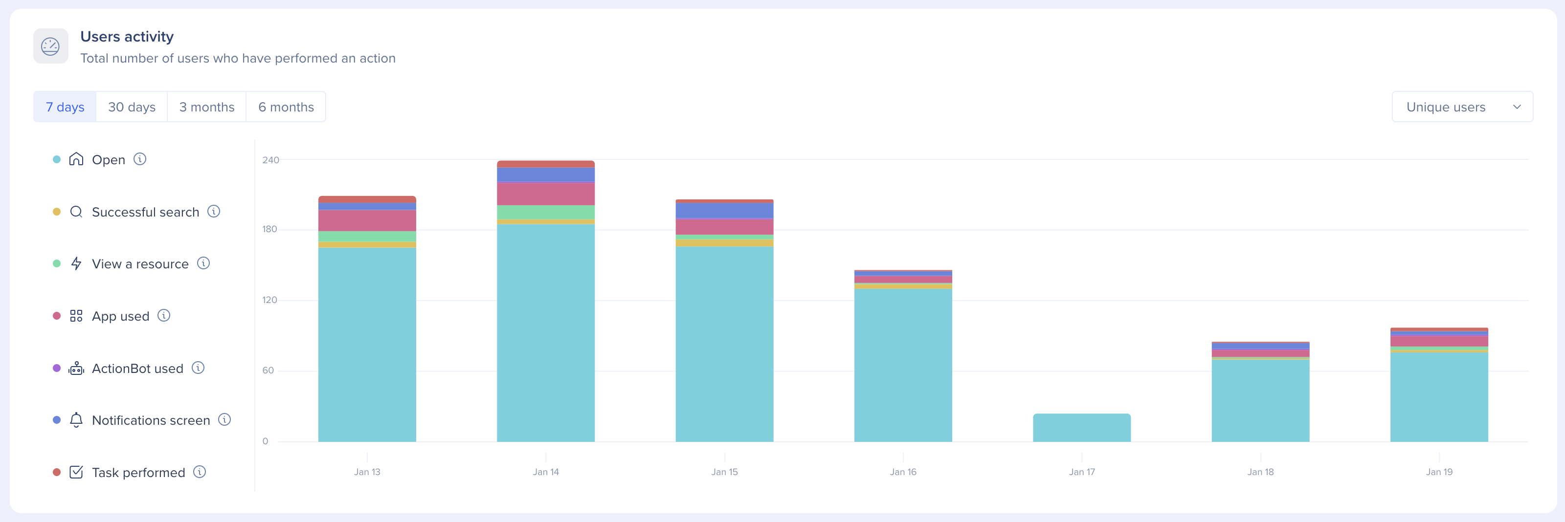
See a video explaining the User Activity cubes:
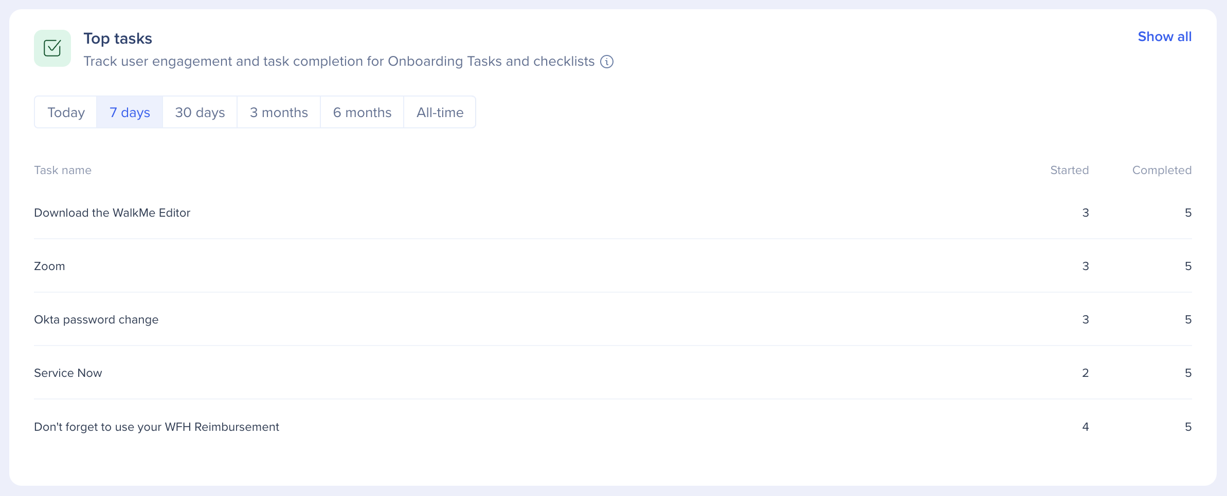
6. Top tasks
Track user engagement and task completion for Onboarding Tasks and checklists
This table displays the most popular tasks that are currently published across the selected time period (Today, Last 7 days, last 30 days, last 3 months, or last 6 months). Each row is a WalkMe Onboarding Task and the columns are:
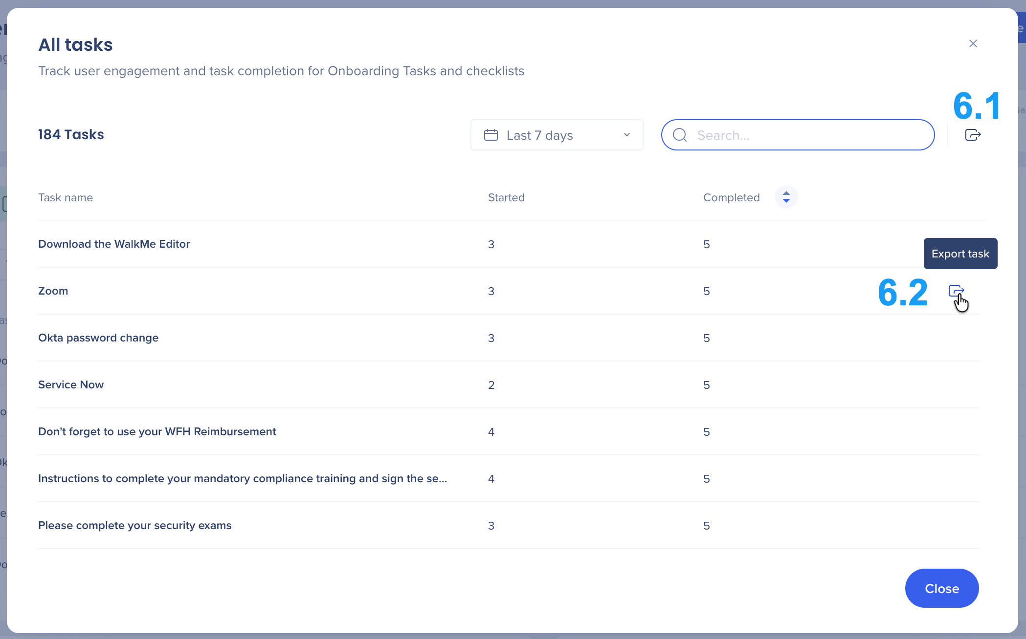
Click Show all to see a list of all of the available Tasks. You can also search for a specific task and download multiple CSV's that contain additional information about the tasks and users who completed them.
(6.1) Tasks engagement CSV file & Tasks completion by user CSV file Click the top Export to download 2 CSV files. Tasks engagement CSV includes a list of all tasks as shown in the "show more" pop up. it contains: Tasks completion by user CSV includes user data on all tasks This is the most extensive report that can be exported it contains: (6.2) Specific Task engagement by user report CSV file includes the following data on the specific task clicked:
User ID
Total assigned
Total Started tasks
Total completed tasks
Completion rate (out of tasks assigned)
Task 1 <name>
Task 2 <name>
Task x <name>
danielk@walkme.com
5
3
2
40%
10/06/2023
25/07/2023
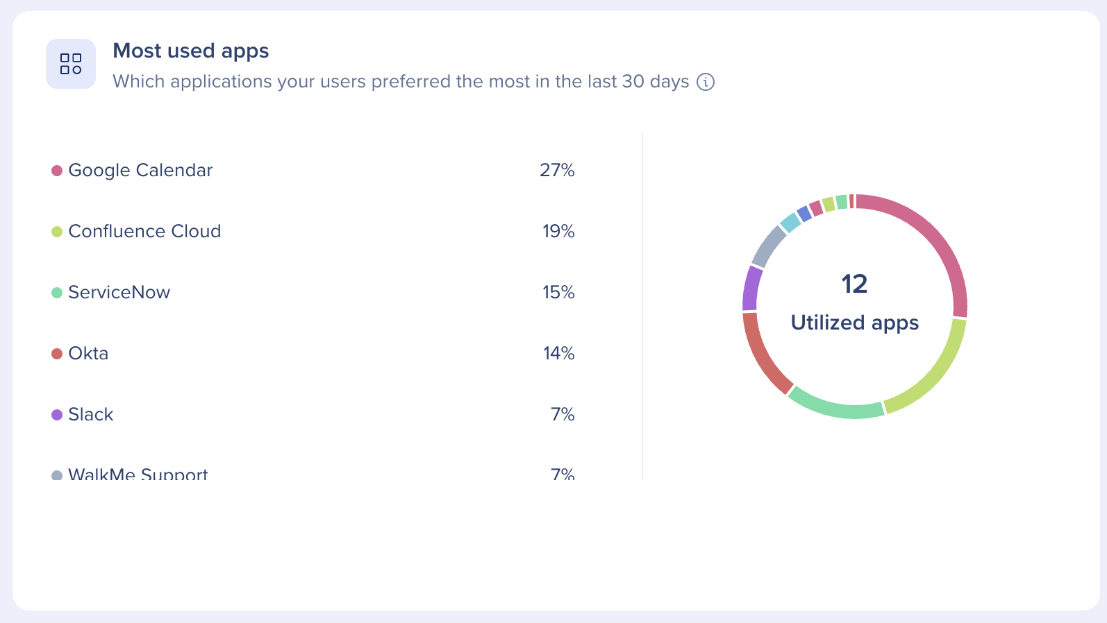
7. Most used apps
Which applications your users preferred the most in the last 30 days
Which integrations are being used most by users in the last 30 days. Counting both engagement with specific widgets and clicking on search results that originated from a specific integration.
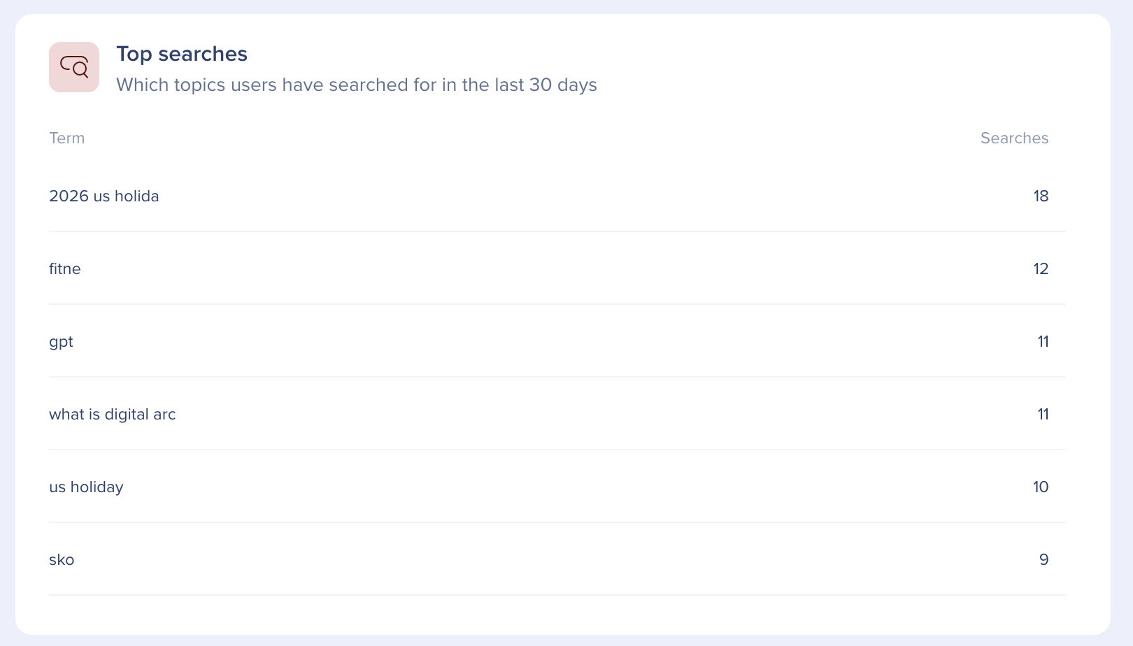
8. Top searches
Showcases which topics users have searched for in the last 30 days
The top most common search terms from users in the last 30 days.
9. Top content
Which WalkMe items users engaged with the most (excluding Tasks)
The top 5 most played WalkMe items (Smart Walk-Thrus, articles, videos & shuttles) by users. The Top content tile includes only items that are currently published and displays the item name, number of total plays, and unique user plays.
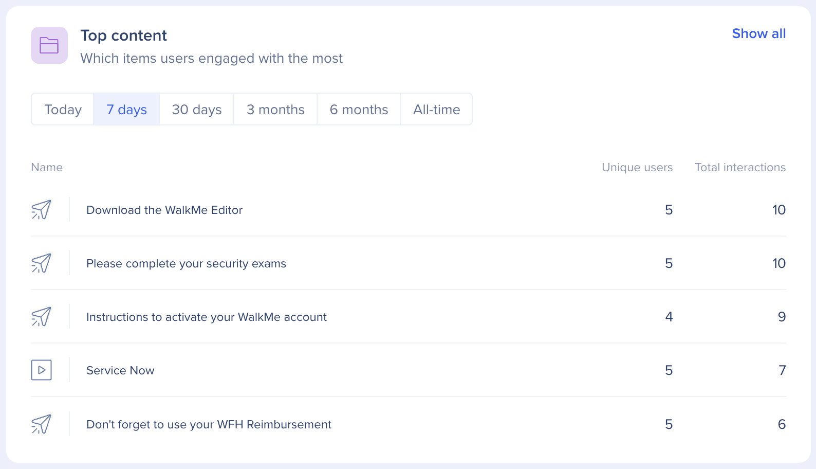
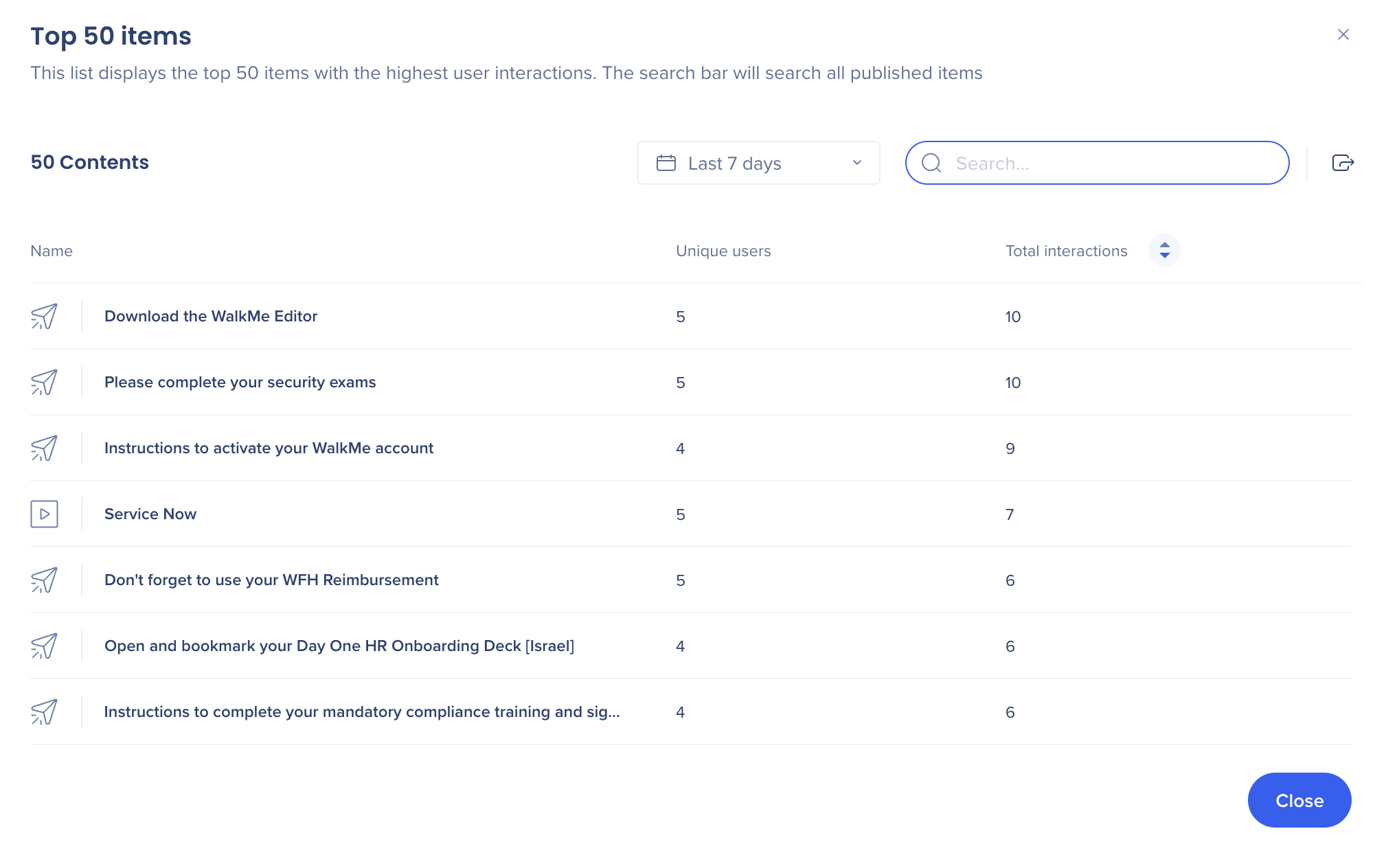
To see an expanded item list, click Show all in the top right corner of the page. This will open the All content page with a full list of items. The top 50 items are shown but all items can be searched for.
Users can download a report from the All content page by clicking the export icon in the top right corner of the page.
Two reports can be downloaded:
See a video explaining the Top Content tile:
10. Operating systems
How users access the desktop and mobile menu
What Operating System end users have been using in the last 30 days

11. Application version
What version users have
What Electron version is being used by end users in the last 30 days

12. User retention
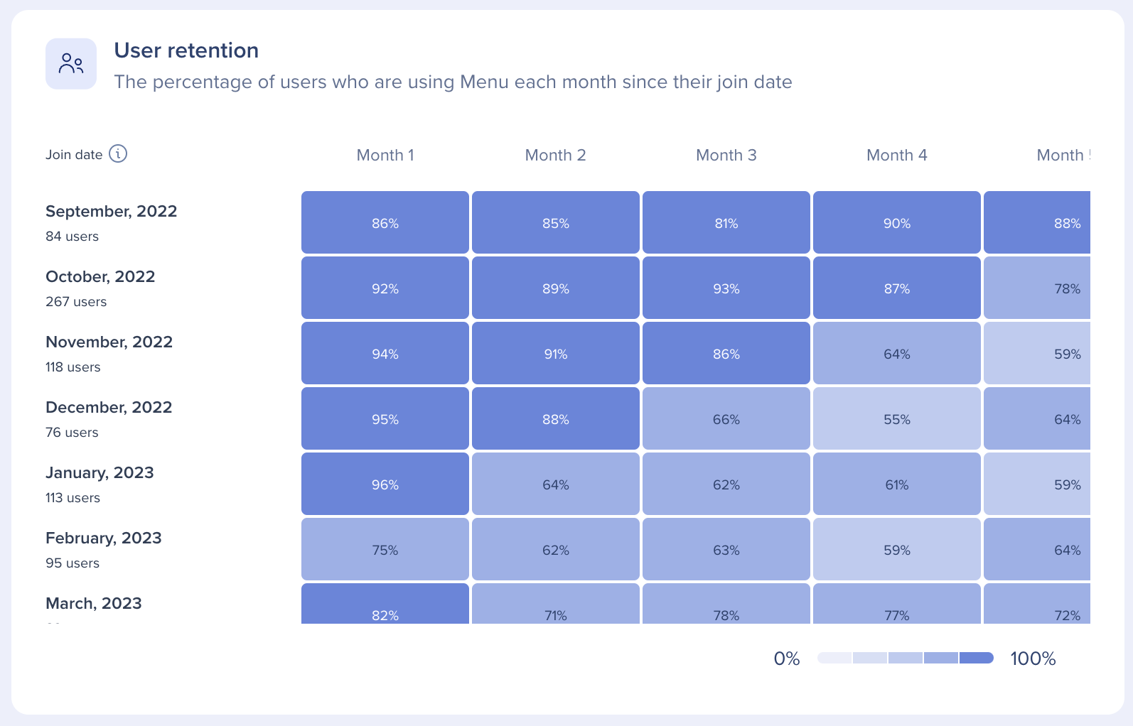
Provides insights on how many users are continuing to use the desktop and mobile menu since their join date
The chart displays cohorts of users that all started on the same join date and tracks month to month the percentage of users that have continued to use Workstation.
How cohort data is calculated and displayed:
See a video explaining the User Retention tile:
Q. I don't see any data on the dashboard, what can be the reason?
A. Possible reasons:
Q. If a customer enables "Allow playback after completion" and a user accidentally checks the Onboarding tasks box, will this have an impact on the completed tasks numbers in the console?
A. If a task was marked as done (even if accidentally) we count it as 'Completed'.
Q. Why is the number of completed tasks higher than the number of started tasks in a given time range?
A. The "Started" count reflects tasks that were initiated within the selected time range, indicated by a 'Started' event. If for example we're looking at a 7-day period and a certain task was started before the specified 7-day period (e.g., 2 weeks ago), it would not be included in the 'Started' count for the last 7 days. However, if this task was completed within the last 7 days, it would be included in the 'Completed' count and that would explain the number of completed tasks being higher than the number of started tasks in a given time range.
There may be minor discrepancies between the data in this file and the corresponding graph. The file is the accurate representation of the data, and any differences between the two is due to performance reasons associated with rendering the graphs on the page
Q. The number of inactive devices in the file is higher than it is pie chart.
A. Active users in the file are counted from the last year and not 30 days. That is in order to give our customers the highest level of clarity on which users/ devices have never logged in to desktop and mobile menu.
Q. I filtered the file to see only Active users, and the total number is higher than in the pie chart.
A. In the Active/Connected columns you see the number of devices. So, in order to count unique users you'll need use "count" on the column
Q. I filtered the file to see only Connected users and the total sum is higher than the pie chart
A. Several possible reasons:
Q. I filtered the file to see only Active users, and the total number is higher than the total unique devices for active users in the pie chart.
A. Imagine 2 users logged in from the same device. When looking in the pie chart, you'll see 2 unique users and 1 unique device. The file is ordered by user and has a count of devices per user. That one device they both used will be counted twice.