Brief Overview
Appearance is a settings category that enables you to modify the way Smart Walk-Thru steps, Launchers, ShoutOuts, individual SmartTips, and Surveys appear. With appearance settings, you can highlight or focus on a particular element or correct the position of your WalkMe items.
The appearance tab holds settings that can move an item to prevent it from obscuring important information. Common appearance tab changes include moving the item around an element and refining its position.
Appearance settings also allow you to emphasize elements that may otherwise get lost. Any time you use the WalkMe Editor to select an element on your site, whether it's for a Smart Walk-Thru step, Launcher, or SmartTip, you can customize the way it appears on the screen.
Use Cases
- Emphasize an element on a busy page
- Modify the layering of items that incorrectly appear above or below a popup
- Lock an item to an element to prevent misidentification if a similar element appears on screen
- Better control the flow of Smart Walk-Thrus
How It Works
Each element's appearance settings are checked immediately before the item appears on screen. Not every app contains the same appearance settings.
To access appearance settings, follow these steps:
- Open the Smart Walk-Thru step, Launcher, ShoutOut, SmartTip, or Survey in the WalkMe Editor
- Click on Settings
- Go to the Appearance tab

Tip
Appearance settings can also be accessed while content is playing using Edit on Page. This allows you to see the effects of the changes you are making in real time.
Appearance Settings
Spotlight
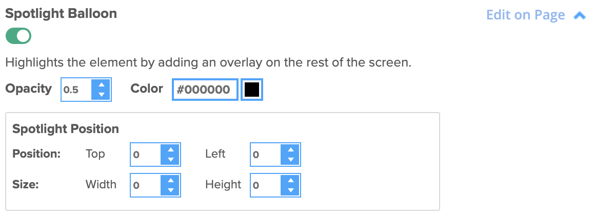
- Turn on Spotlight Balloon for a step to dim the screen, except for your selected element
- Other elements will be unclickable

Highlighter
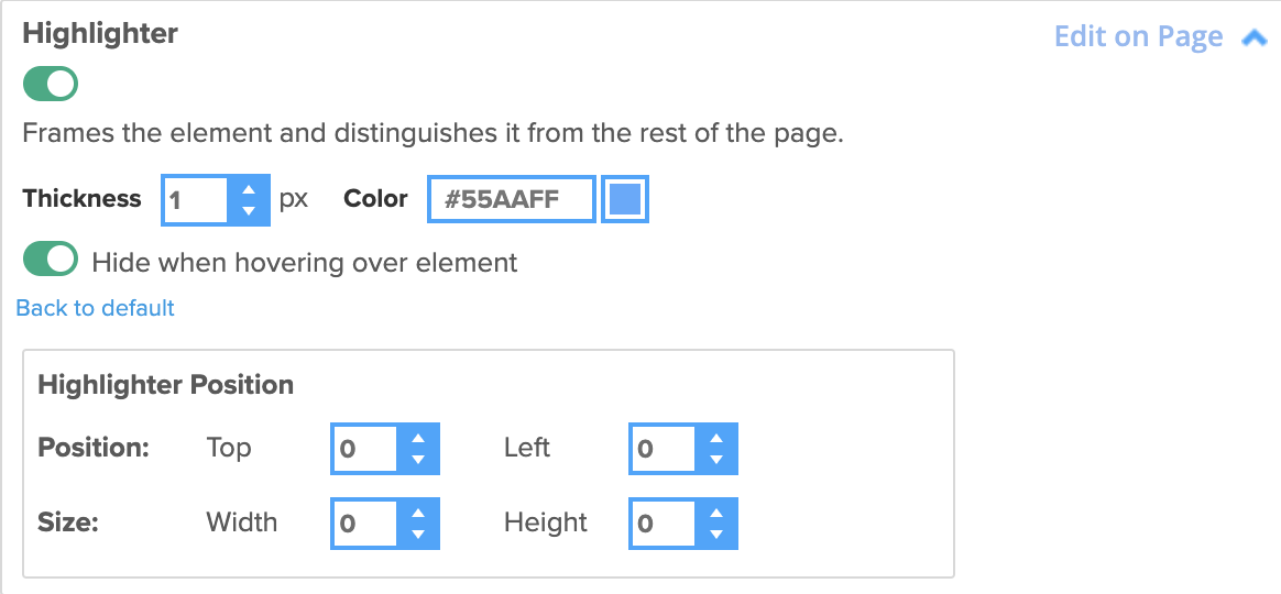
- Turn on Highlighter to present a colored box around the chosen element of a balloon
- Highlighter is used to emphasize the selected element and is customizable in both thickness and color

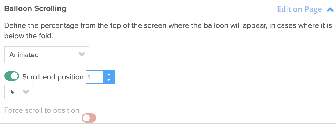
- If the element you selected for a balloon is past the fold or farther down the page than the current screen-scroll position displays, WalkMe will automatically scroll to that location and display the balloon

Animated
- Generates a smooth scrolling experience that feels more polished than a regular scroll
- This will work on the major browsers, but you may have problems on mobile devices
Normal
- Generates a simple "A to B" scrolling experience
- This option works on all browsers
- None: Scroll will be turned off
Z-Index
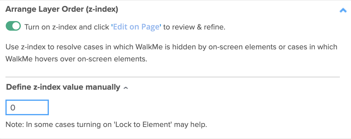
- Z-index specifies the layering of an element compared to other existing elements on the same webpage
WalkMe Items Appearing Above or Below Site Elements? Change the Layer Order (Z-Index)

Position
- Alter the position of the balloon to the left and right by a number of pixels
- This will allow you to make small adjustments and optimize how the balloon appears on screen relative to the element
Invisible Balloon
- Turn on Invisible Balloon to make a balloon invisible and prevent the balloon from showing
- The element, trigger, and appearance changes you made will still appear, but the balloon will not
- This can be useful to create multiple steps simultaneously, for example on a form, where you would not want multiple balloons

Skippable
- Turn on Skippable to enable a Smart Walk-Thru step to be skipped if its anchor element is not found, allowing the flow to continue
- This is particularly useful on dynamic sites where elements in a fixed process can change due to user selections or content that changes based on user role
- Skippable can be applied to any Smart Walk-Thru step that is element-oriented (for example, auto-steps)

- Skippable is turned off by default
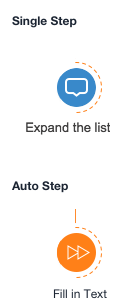
- In the Smart Walk-Thru flow map, skippable steps will be indicated by a dotted semi-circular line

Tip
- If a skippable step has peer steps, you can trigger them to play in the event the main step is skipped using BBcode
- The Flow Tracker will indicate when a step was skipped during a Smart Walk-Thru flow
Timing Options
- Automatically trigger a step with the delay feature
- For example, a Smart Walk-Thru will automatically move on after a specified number of seconds

Lock to Element
- Turn on Lock to Element to prevent a step from moving away from the element when the page is scrolled, or from hiding beneath it
- The Launcher or step balloon will be embedded in the selected element and they will inherit the same z-index as the element, preventing it from jumping around the page or appearing behind content

Sticky
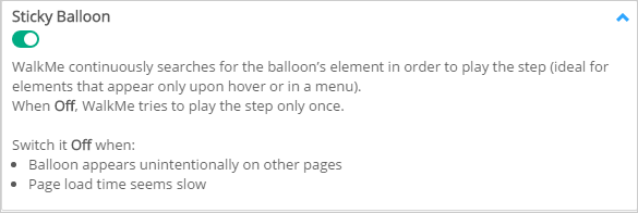
- Turn on Sticky Balloon for a step that is attached to an element that might disappear from the screen
- For example, in hover menus or when the page might be refreshed but the step needs to stay in place
- If Sticky is enabled, WalkMe will keep searching for the element
- This is turned on by default and you can turn this off if you are experiencing issues with a step displaying

Margins
- Offset the location of a ShoutOut when the center position is not selected


