Brief Overview
The carousel widget lets you show several slides inside one ShoutOut in the Visual Designer. Users can move between slides with dots, arrows, buttons, or autoplay.
You can also use the carousel to design menus and tabs, where a button or image opens a specific slide, control the transition between slides, and give your users a clear visual cue for the slide that's currently active.
Dynamic Layout: Widgets
How It Works
Add a carousel
- Open the Editor and create or open a ShoutOut in the Visual Designer
- Click the + Add icon in the property bag to open Add widgets
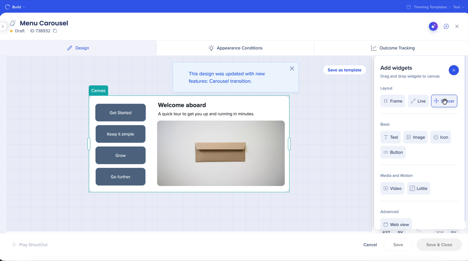
- From the Media and Motion group, drag the Carousel widget to the canvas
- By default, a new carousel has 3 slides, each with an image and text
- You can add other widgets inside the carousel slides – for example text, image, button, web view, and line
- Slide names follow their order (Slide 1, Slide 2, and so on) and show in the Layers panel and in Manage Slides
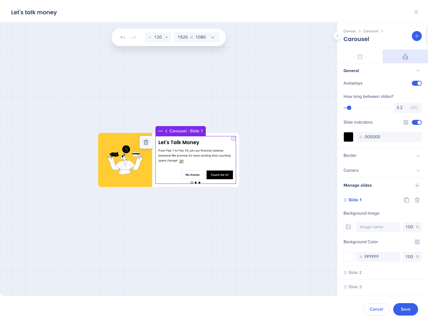
Manage slides
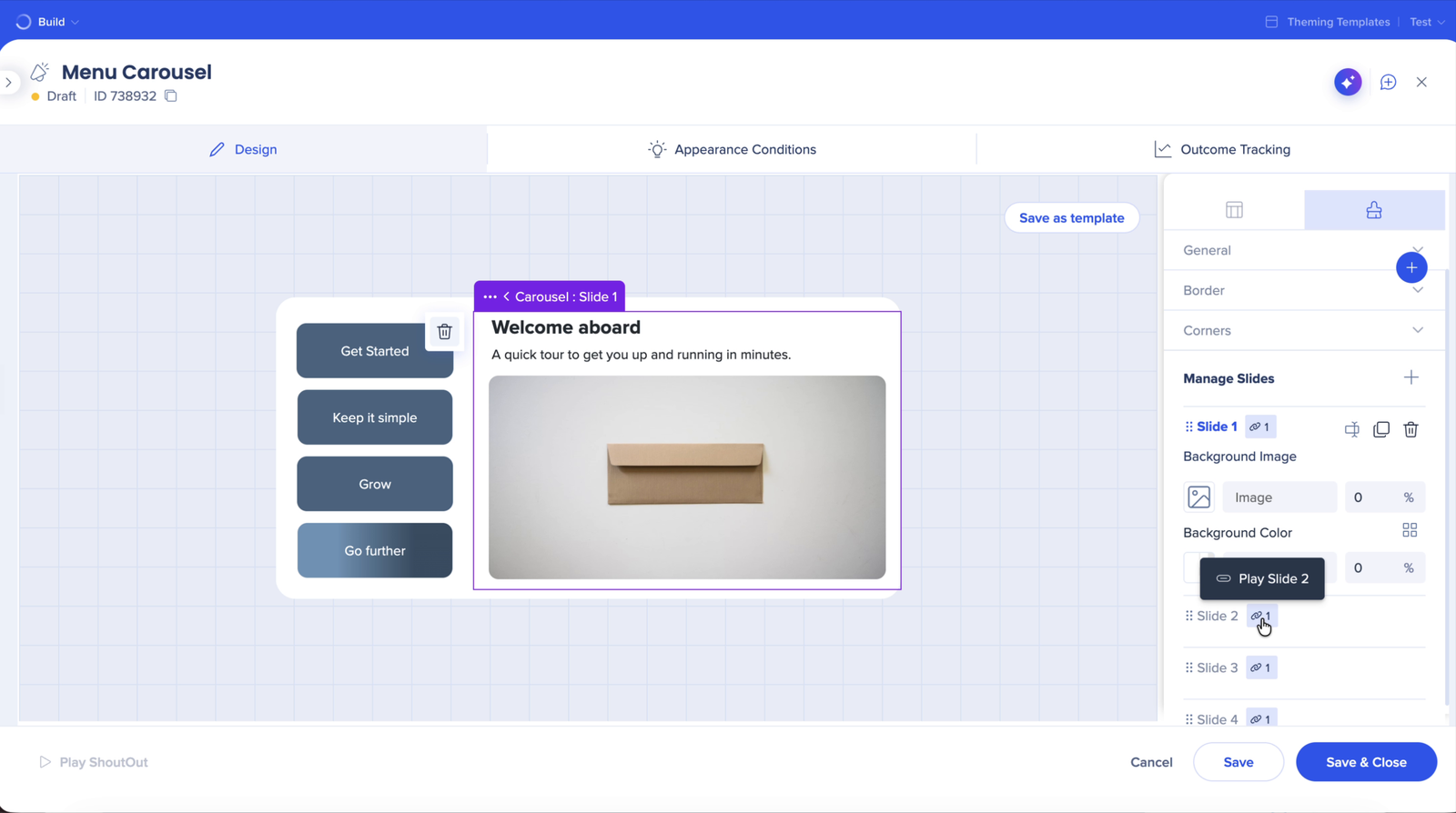
Select the carousel and open the Styling tab to see Manage Slides. For each slide, you can:
- Set a background image and background color
- Duplicate or delete the slide
- See which elements are connected to it – the link indicator next to the slide shows how many elements play this slide. Hover over it to see their names (for example, Play Slide 2).
Navigate between slides
There are a few ways users can move between slides:
- Click the dots at the bottom of the ShoutOut
- Click a button, text, or image with the Next Slide or Previous Slide action
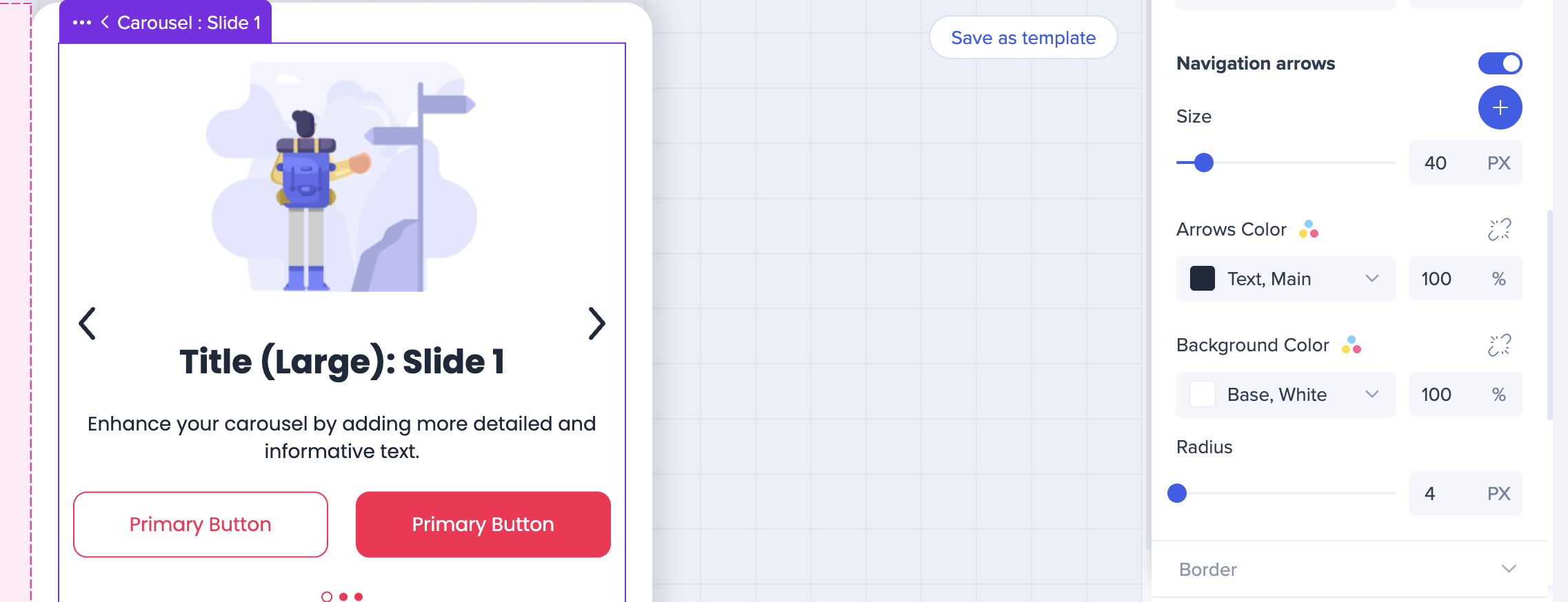
- Click arrows added to the carousel
- Click a button or image with the Play carousel slide action to open a specific slide (see "Menu and tab carousels" below)
- Autoplay: When enabled, slides switch automatically. Autoplay pauses when the user hovers over the carousel.
Menu and tab carousels
Use the carousel to create menu and tab designs. Each slide is connected to its own button or image – users click it to open the slide they want, in any order. The button can sit inside or outside the carousel, for example in a side menu.
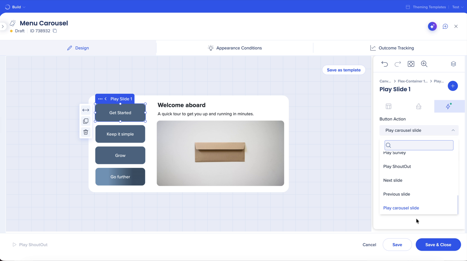
- Select the button or image on the canvas
- Open the Action tab
- From the Button Action dropdown, select Play carousel slide
- From the Slide dropdown, select the slide this button opens
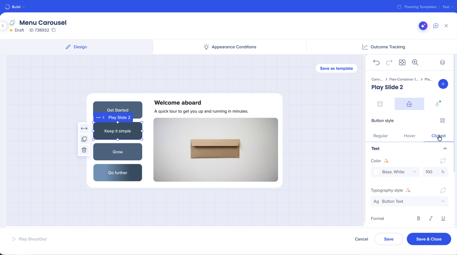
Active slide indication
While a slide is playing, every element connected to it shows its Clicked state. Design this state in the button's Styling tab under Button style → Clicked, next to Regular and Hover.
Tip: Rename your buttons so they're easy to match to their slides – for example, Play Slide 2. You can rename any element in the Layers panel.
Slide transitions
Choose how the carousel moves from one slide to the to the next:
- Transition style: None, Zoom, Fade, or Slide
- Transition speed: How fast the animation runs
- Easing: How the animation speeds up and slows down
- Autoplay and Time between slides