You may wonder how to optimize your campaigns' user interface and user experience. This article will teach you about optimal element placement and campaign style.
New and Improved WYSIWYG (WalkMe Mobile SDK v1.13.1+)
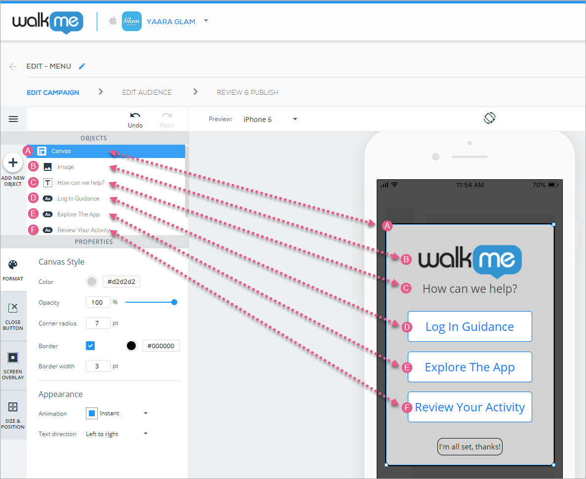
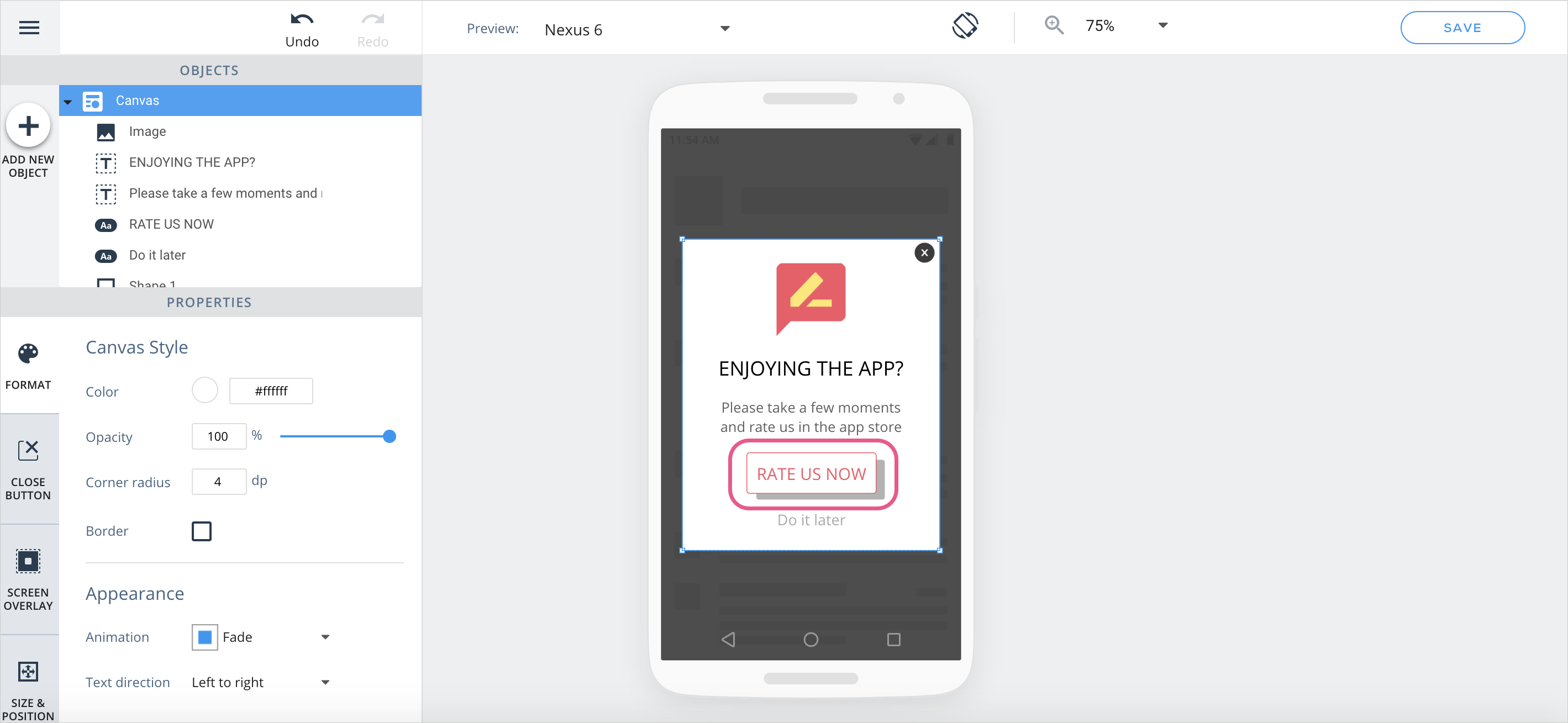
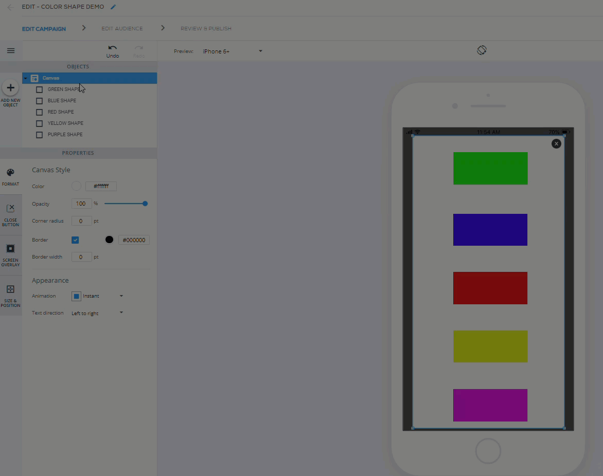
Understanding elements
Every item under OBJECTS in the new WYSIWYG corresponds to an object that currently sits on your preview device screen:
Aside from the Canvas object, the OBJECTS tree objects are ordered by their layer's z-index: The front-most object in the WYSIWYG is the top-most in the OBJECTS tree, etc.
You can select one of these objects for placement and customization either by clicking it in the OBJECTS tree or on the preview device screen itself.
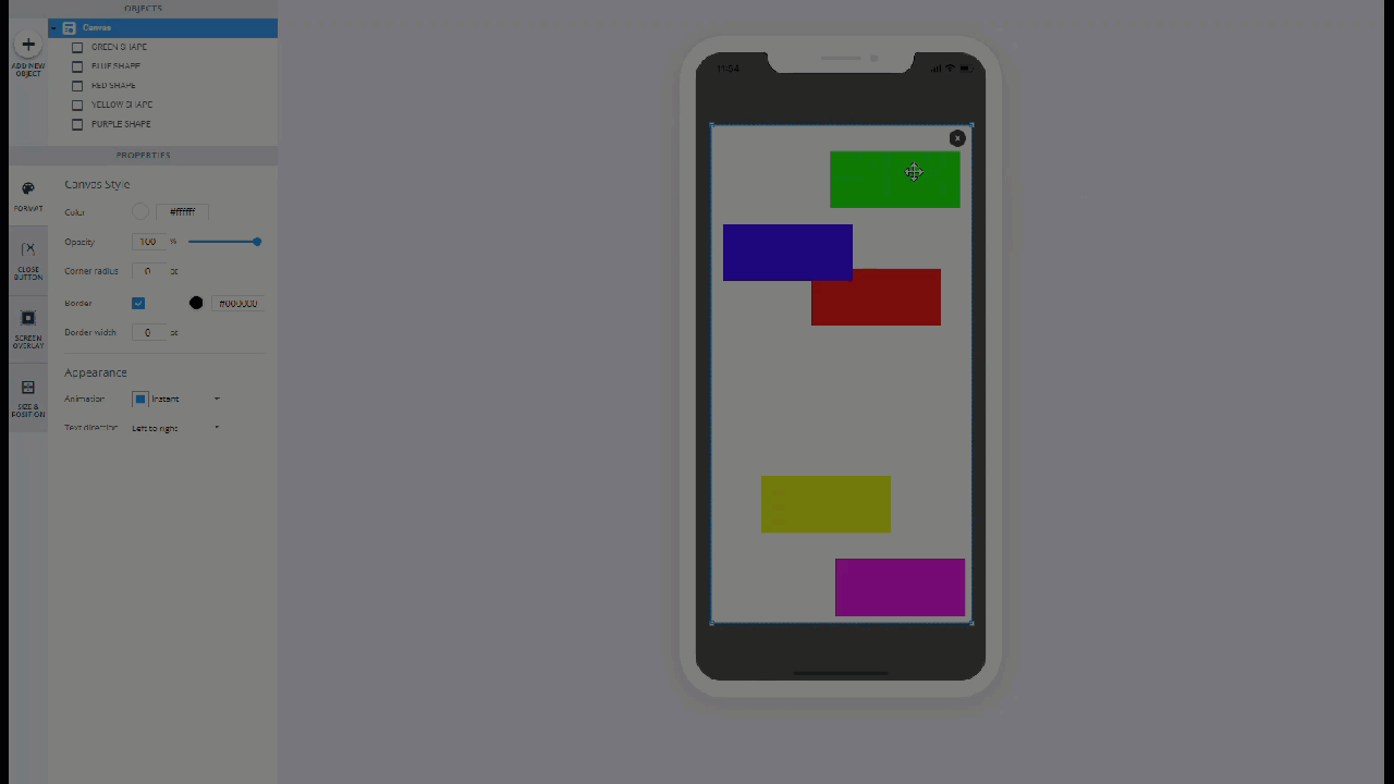
You can move all of the elements on the screen together by clicking Canvas in the OBJECTS tree and dragging the highlighted section around the preview device screen.
Additionally, you can move any object (canvas included) by selecting it in either of the ways mentioned above and using the up/down/left/right arrow keys on your keyboard.
Campaign Design Tips and Tricks
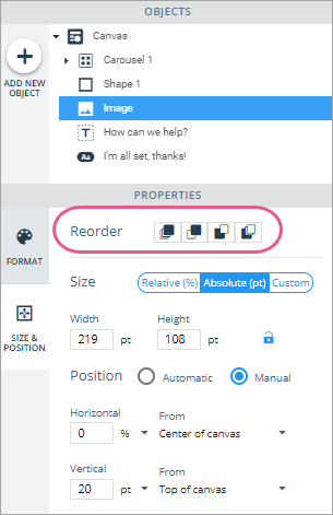
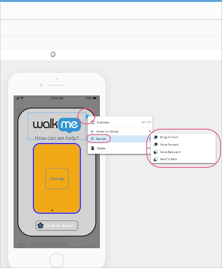
Moving elements forward and backward
Some objects can be moved forward and backward with respect to other elements on the screen (similar to z-index in HTML). You can do this in one of two ways:
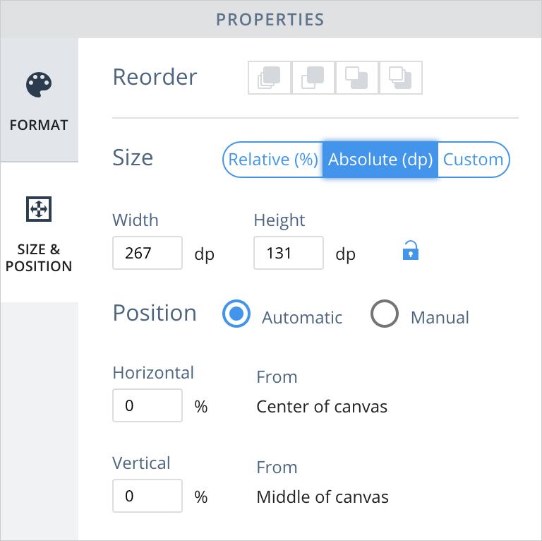
Navigate to the object's SIZE & POSITION tab and click one of the icons to the right of the Reorder section:
In order of appearance, the icons mean 1) move to the front-most layer, 2) move forward one layer, 3) move backward one layer, and 4) move to the back-most layer.
Either right click on the object, or click its blue tab on the preview device screen and select one of the layer ordering options:
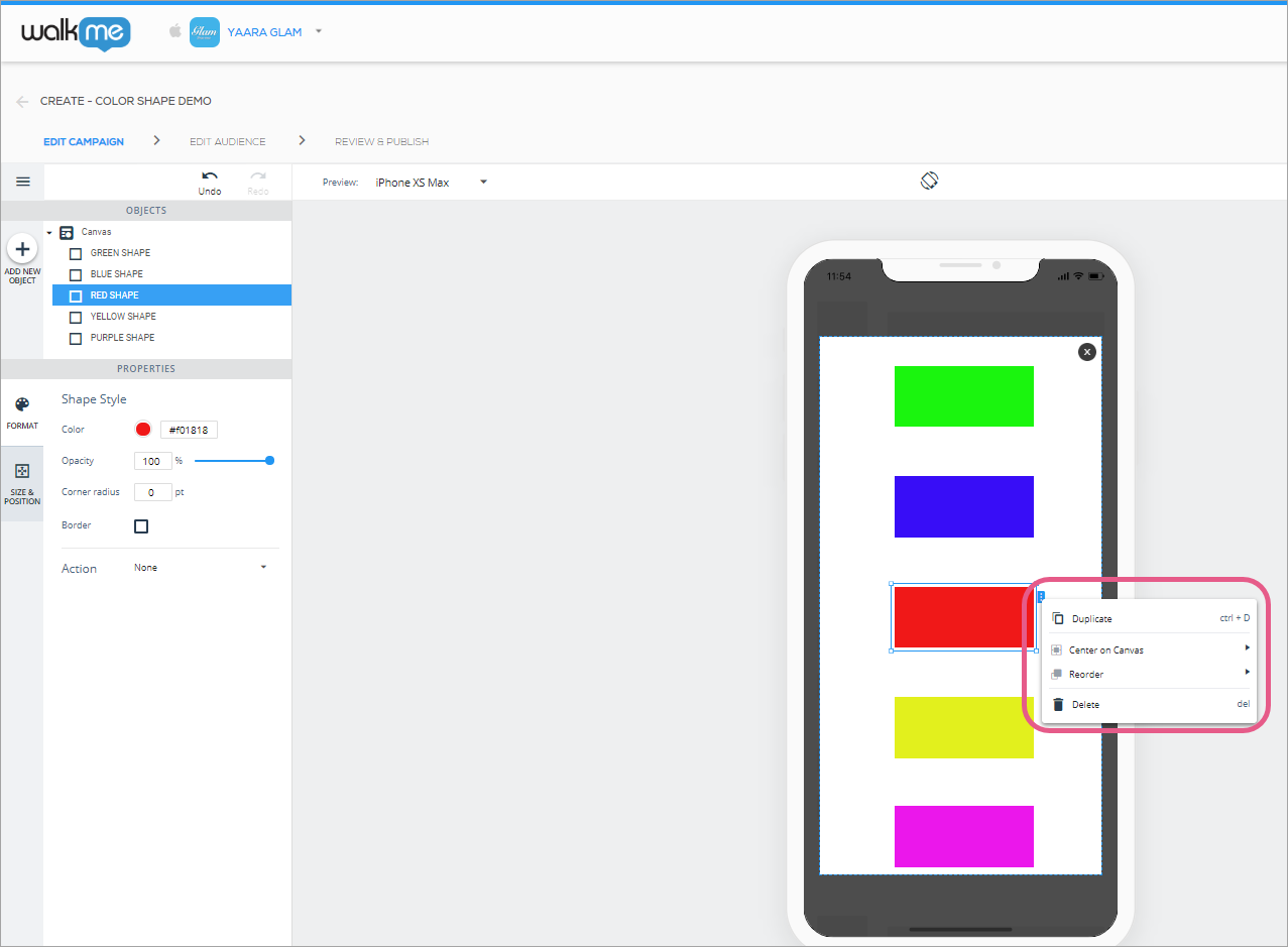
Creating multiple objects with the same design
Simply use the “duplicate” option that appears either to the right of the object in the OBJECTS tree, or when you right-click an object in the device preview screen.
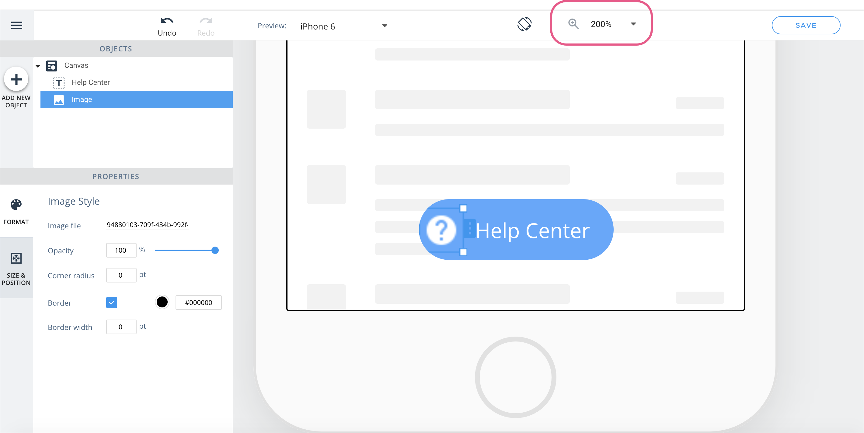
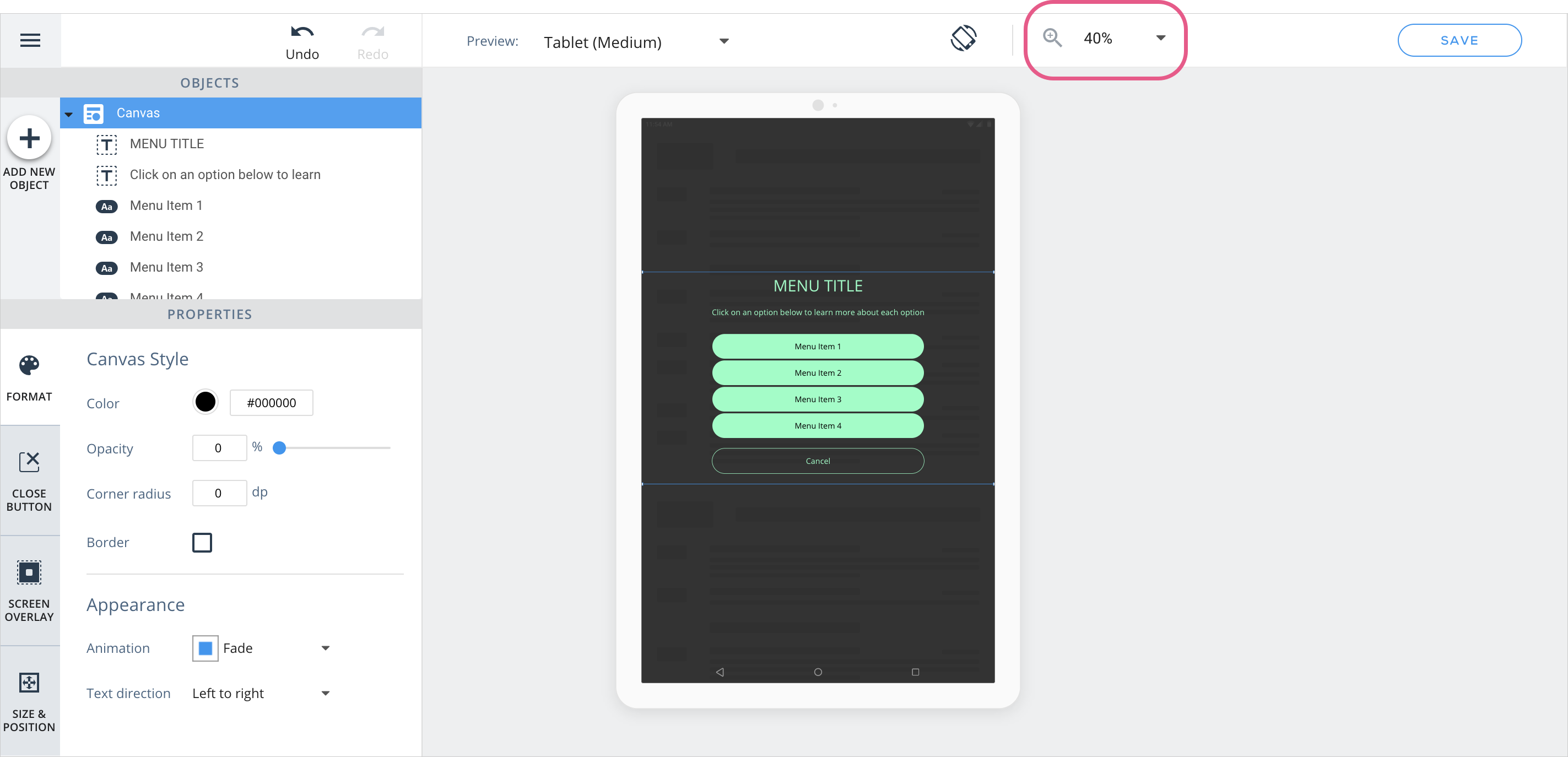
Zoom in for better precision
Zooming in is helpful when working on large or small designs. If you would like to make pixel-perfect additions to your content, zoom in to the canvas:
If you are working on large-screen devices like tablets or iPads, zoom out to get a different perspective:
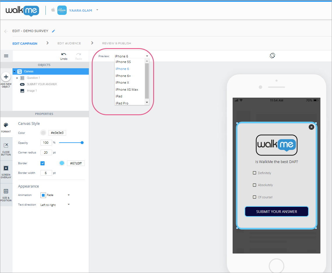
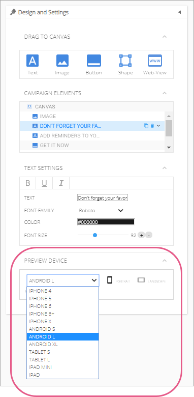
Previewing content on end-user devices
An important part of campaign content-building is ensuring your campaign will provide a pleasant UI regardless of device OS and size.
Preview, located in the new WYSIWYG, enables you to simulate the campaign's appearance on small, medium and large Android and iOS devices, in both portrait and landscape orientations:
To toggle between portrait and landscape orientations, click the toggle button located over the preview device screen:
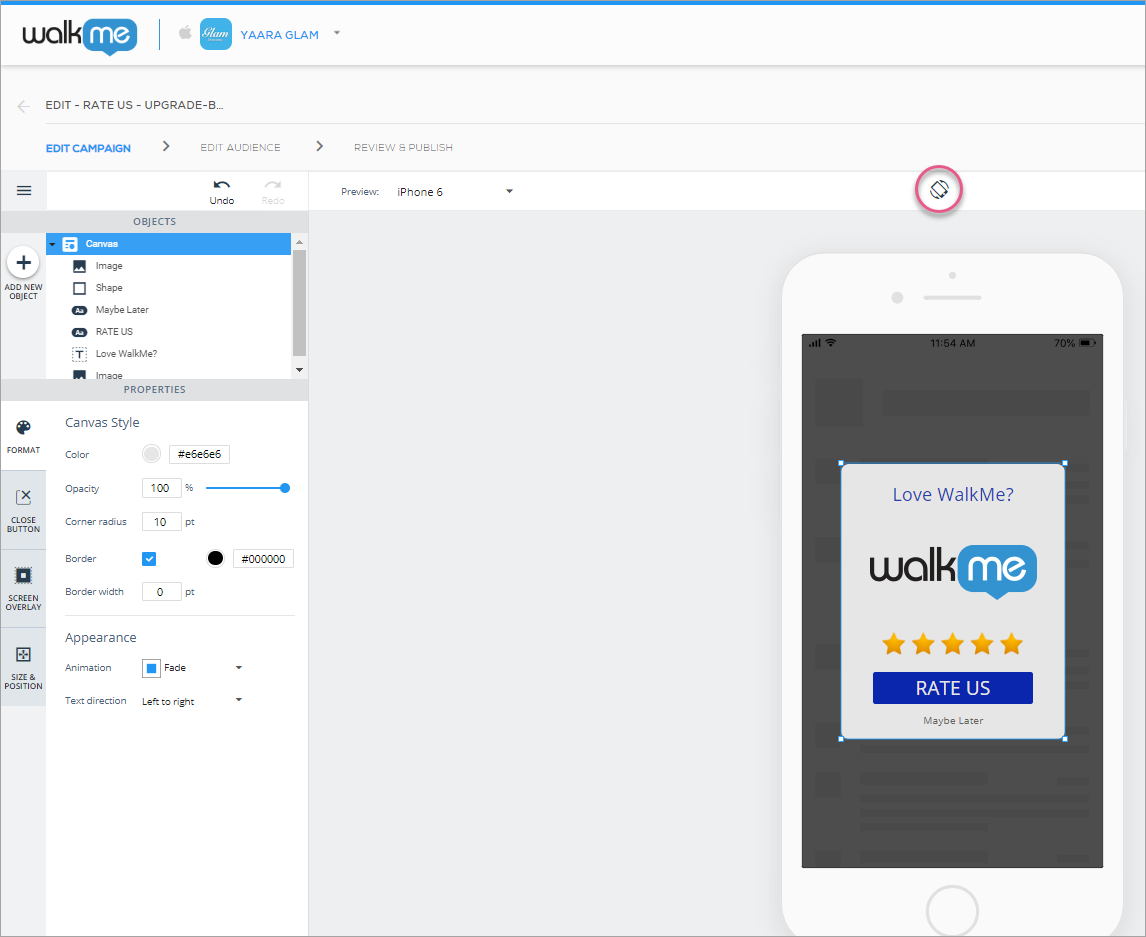
Context menu
Quick and common actions are available by right clicking on an object or clicking on its blue border tag:
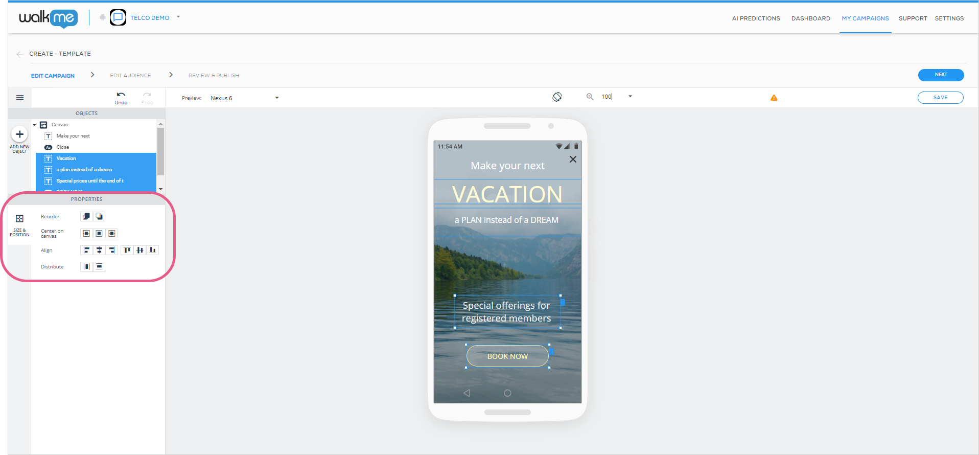
Object arrangement in the canvas
Creating beautiful campaigns with precise design is easier than ever using the two object arrangement features:
Object alignment: Align multiple objects with each other horizontally or vertically; and
Object distribution: Create equal spacing between objects by distributing them horizontally or vertically.
To select the objects you want to align or distribute with each other, hold the Command (Mac) or Ctrl (PC) key down and click on the object(s) with your mouse:
Additionally, when you highlight two or more objects, you will see buttons in the WYSIWYG's PROPERTIES section enabling you to arrange the objects:
Undo and redo
No need to hesitate before making changes to your campaigns' designs! Any change you make while editing can be undone by either clicking on the Undo button or typing Command + Z (Mac) or Ctrl + Z (PC).
If you regret undoing something, you can re-do it by clicking Redo or typing Shift + Command + Z (Mac) or Shift + Ctrl + Z (PC).
Keyboard shortcuts and actions
You can now use your keyboard's arrow keys to move the canvas and the objects inside it with more sensitivity than when you use your mouse.
In addition, you can use all of these keyboard shortcuts to save time:
Action
Mac
PC
Duplicate object
Command + D
Ctrl + D
Delete object
Del
Delete
Undo
Command + Z
Ctrl + Z
Redo
Shift + Command + Z
Shift + Ctrl + Z
Bold text
Command + B
Ctrl + B
Italic text
Command + I
Ctrl + I
Underline text
Command + U
Ctrl + U
Saved preferences for preview device
Your selection of on which device to preview your campaign in the WYSIWYG will now be preserved for the next time you open the same campaign. This only works if you open the campaign on the same computer.
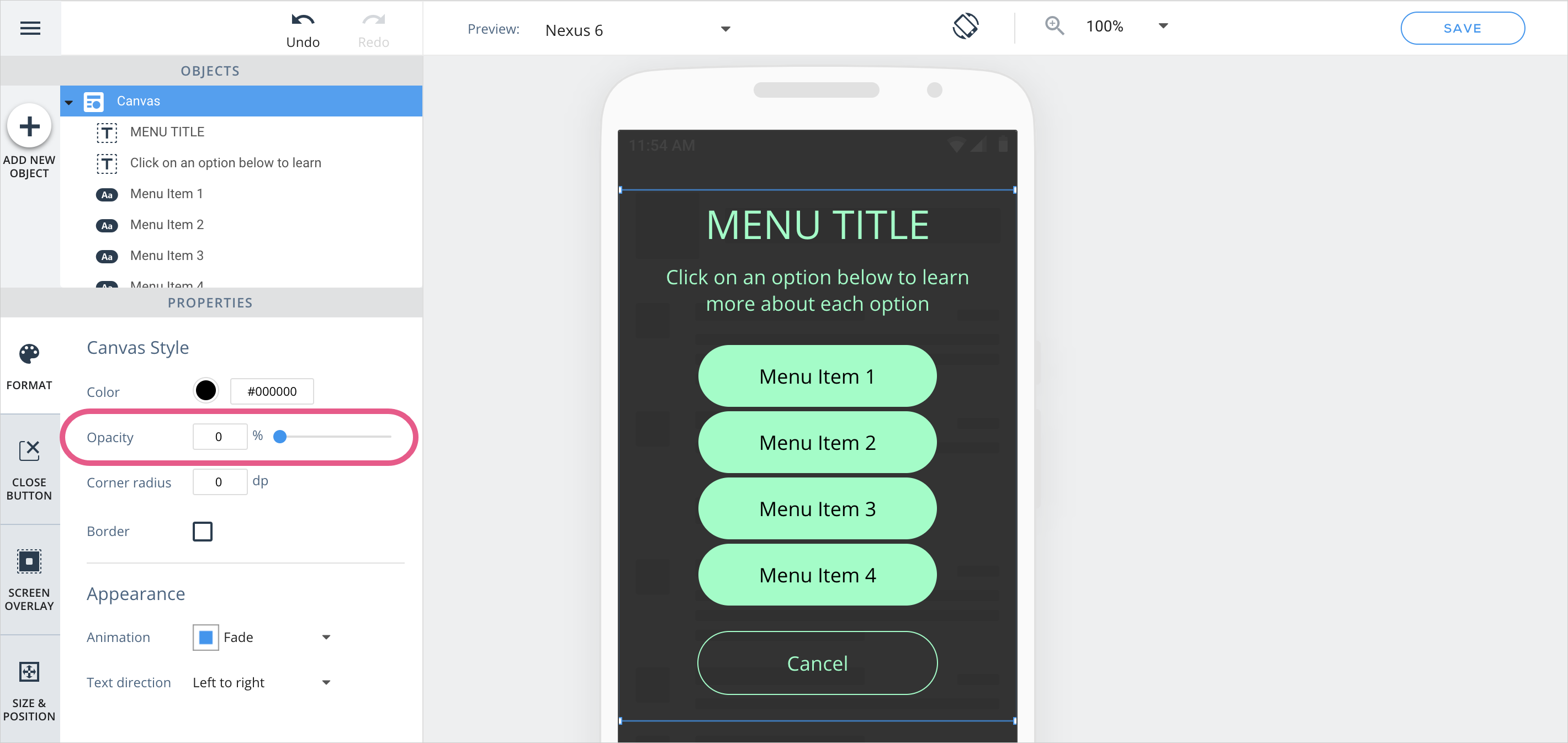
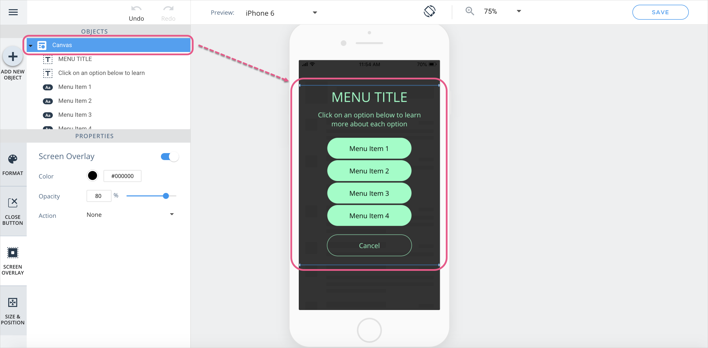
Creating campaigns with a canvas of 0% opacity
If you want to create a transparent campaign that prevents users from interacting with certain UI elements while stillallowing users to see the app behind it, set the opacity of the canvas to 0%:
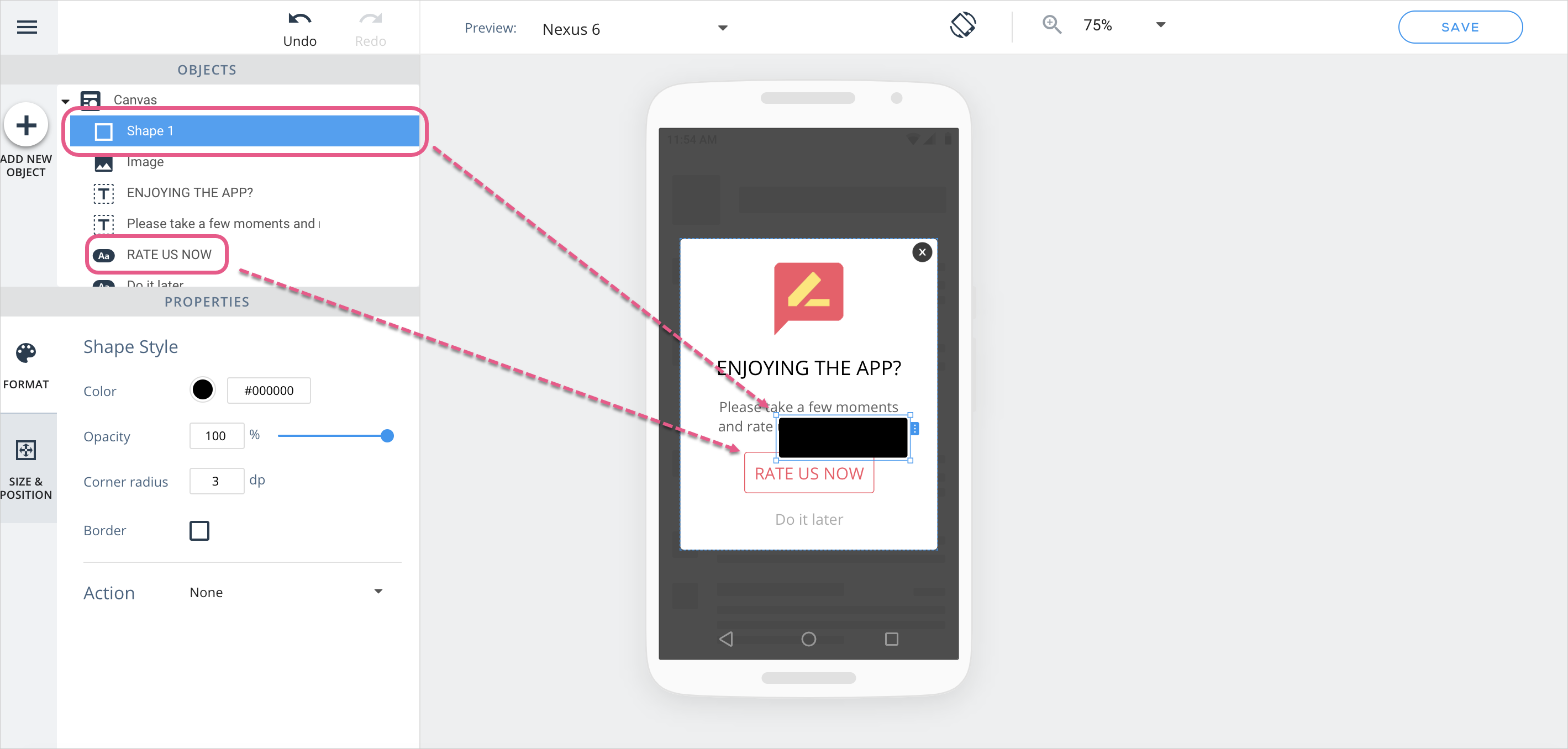
Creating shadow
If you'd like to simulate a shadow effect on one of your campaign objects, follow these steps:
Create a black shape with the same size and position properties as the object:
Arrange the black shape to sit behind the object;
Move the black shape slightly in the direction where you want the shadow to appear;
Change the opacity of the black shape according to the shadow coloryou'd like to create.
And here is the final product!
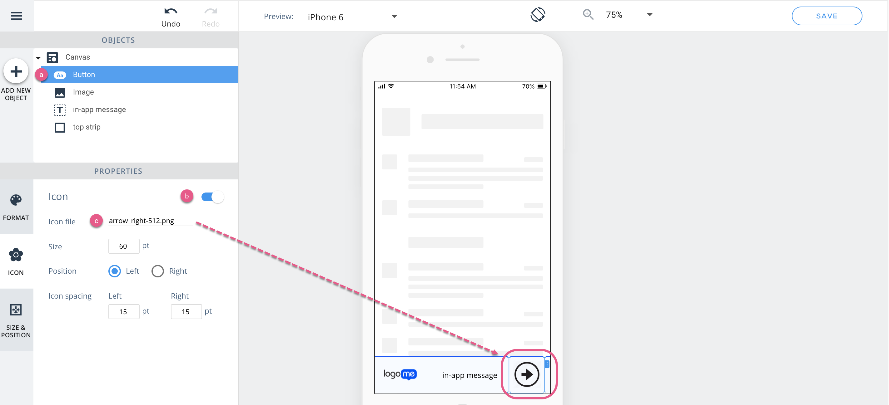
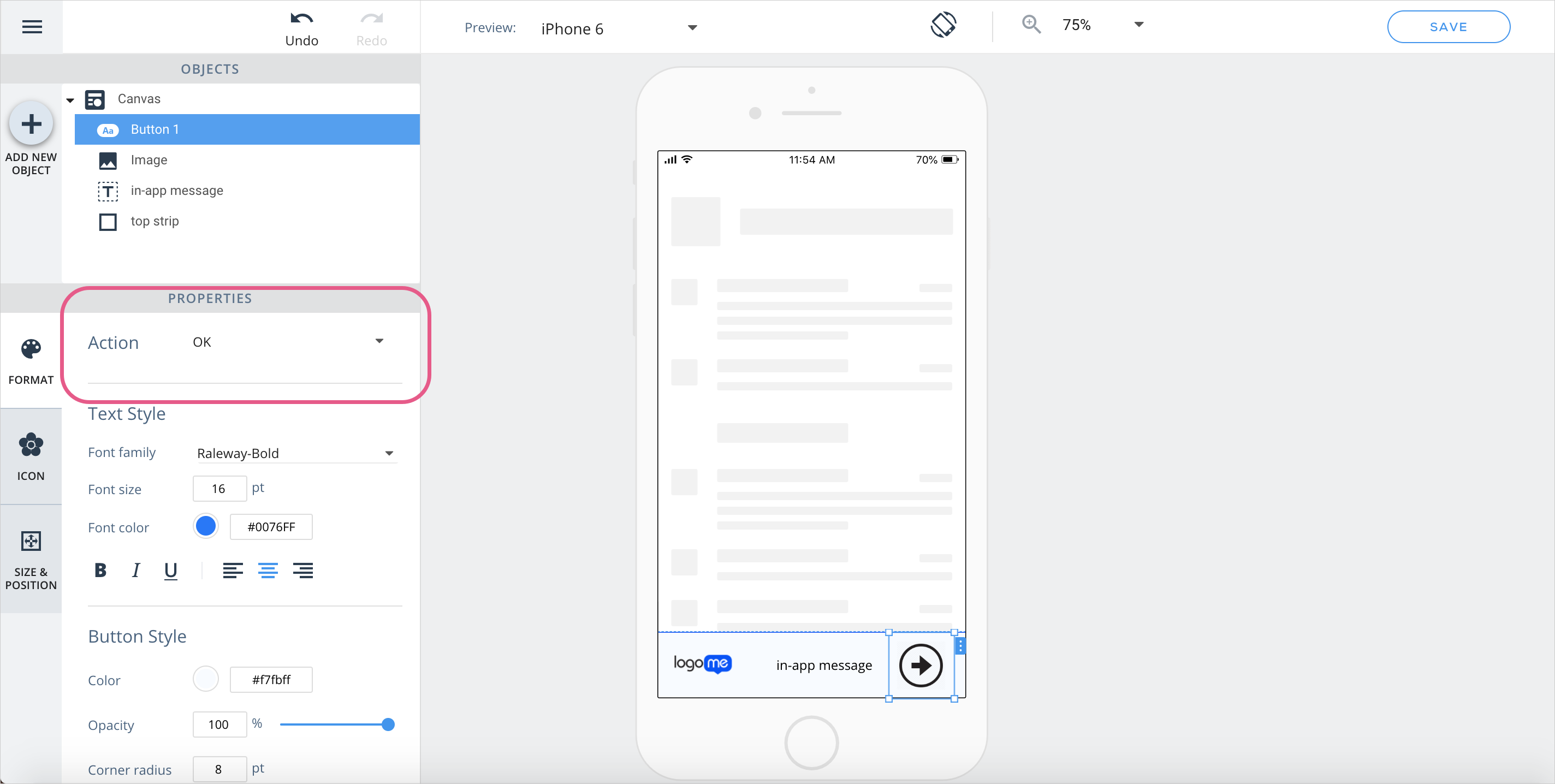
Creating a clickable image
If you'd like to add an image to your campaign that performs an action when clicked, follow these steps:
Drag a button object to the canvas, or click on a button object that already sits there;
Enable an icon for the button;
Assign an image to the icon:
In the FORMAT section, select the suitable action and resize the button so the image covers its entire area:
Creating an "x" button with a non-default design
Follow the steps in the Creating a clickable image section above, and use as your image the “x” you want to appear in the campaign.
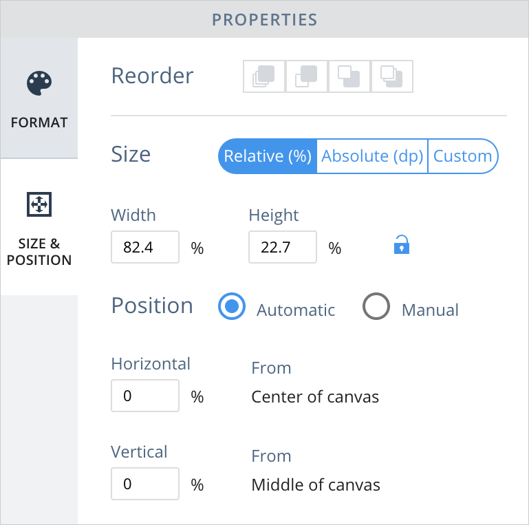
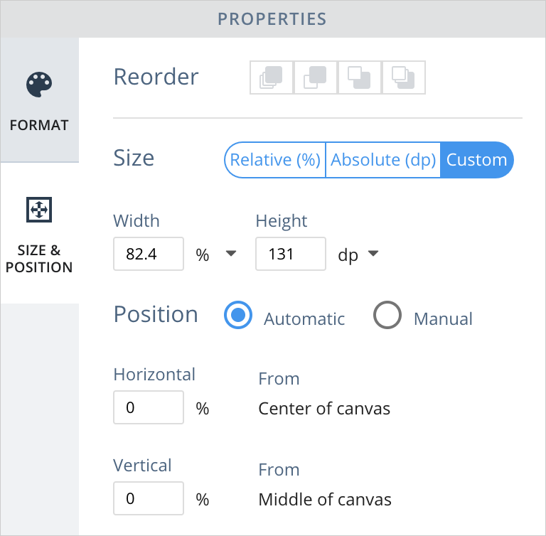
Absolute, relative and custom size/position
Use cases for absolute sizing include the following:
Creating a button that will remain in the same size in every device (e.g., an “x” button);
Adding an image to your campaign that is otherwise displaced in landscape mode or on larger device-screens;
When adding text (generally always Absolute);
For list objects, since the text within the list object is Absolute as well.
Use cases for relative sizing include the following:
Enabling your campaign's canvas and objects to change size depending on device orientation and/or the size of the device screen;
Creating a better UX when using the Carousel widget in a campaign;
Sizing campaign objects in ratio to your app's native objects.
Use cases for custom sizing include the following:
Custom sizing is ideal when combining relative and absolute sizing, since this enables you to choose between these modes on each axis. For example, if you want a button you want to stay the same height but change in width (e.g., for landscape mode) choose Relative for width butAbsolute for height.
Pro tip: Moving between the Absolute, Relative and Custom position options changes the way the object is located on the screen. Use the Preview and Landscape options in concert to see how positional changes will be reflected in any given device.
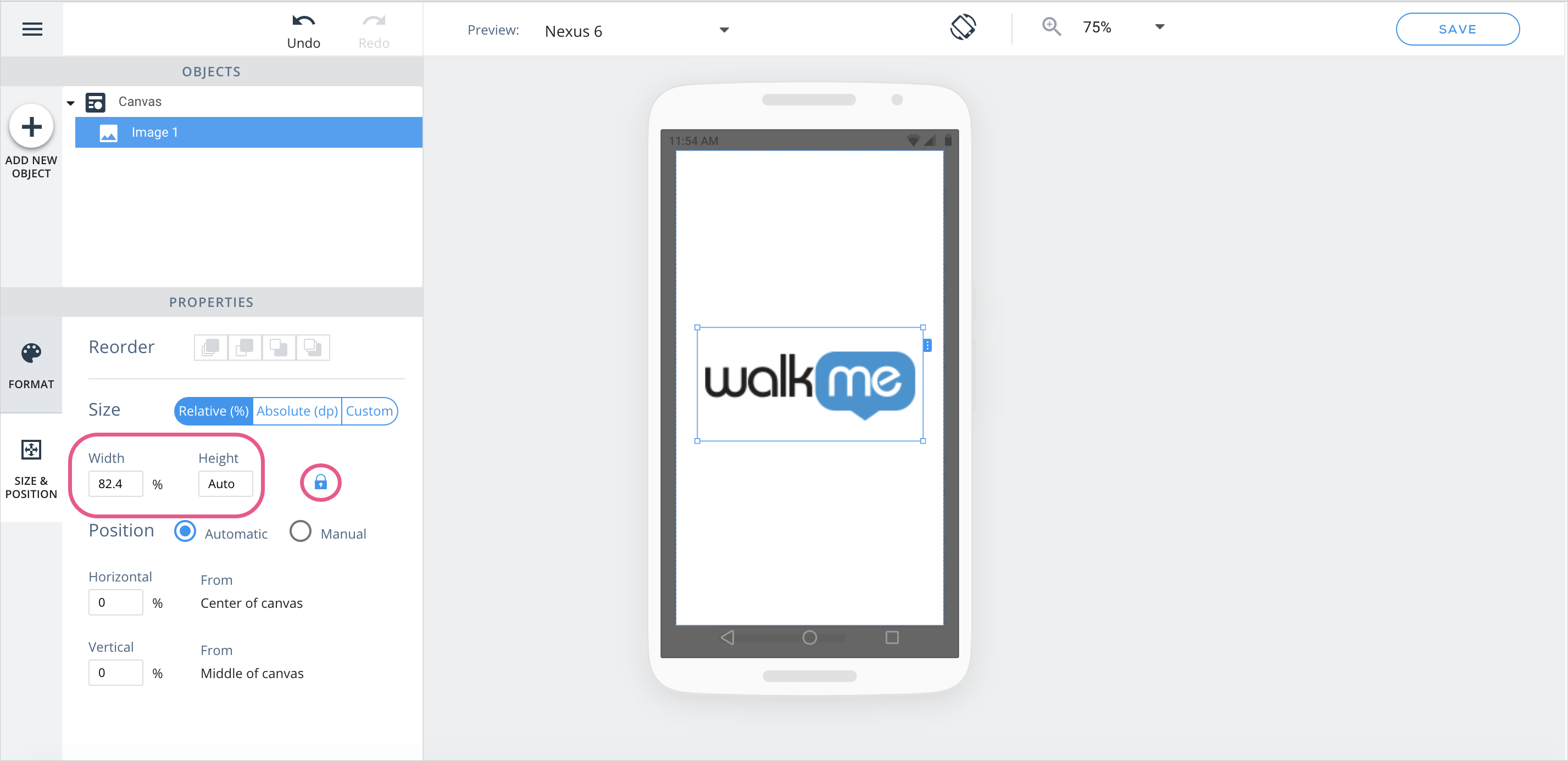
Understanding object aspect ratio
When an image's aspect ratio is locked, this means the affected image's aspect ratio will remain the same regardless of how small/large it becomes in response to changes in screen size. To achieve this, one of the image's axes is locked into Absolute or Relative mode (per your preference), and the size of the image along the other axis adjusts automatically to preserve the axis ratio.
To choose which axis is locked, click on the word “Auto” in the input-field of the desired axis.
Here, the width is a fixed percentage, while the height is set to auto, enabling it to adjust to maintain the same aspect ratio.
When adding a new image to the canvas, its aspect ratio will automatically be “locked”.
Working with the OBJECTS tree
Rename objects
You can now rename objects in the OBJECTS tree to give them meaningful names that will make it easier to identify them:
Hover on objects in tree
Hovering on objects in the objects tree will now highlight them in the WYSIWYG so it's easier to find each object:
Campaign Design Best Practices (Both Legacy and New WYSIWYG)
When building campaigns in the Campaign Wizard, follow these best practices where applicable:
Model your campaign with the smallest device(s) the end-users will use in mind;
If there is insufficient space on an end-user's device, WalkMe content may not be fully visible;
Consider segmenting your campaigns' end-users by their device-sizes.
The most intuitive, and least error-prone, placement for campaigns on end-user device screens is either aligned center or docked to one side;
if you'd like a campaign to span the entire width or height of an end-user device screen, stretch it in the WYSIWYG editor until the size of the Canvas Element reads 100% along the axis you're stretching it on.
If you must support landscape mode (in addition to portrait mode), perform QA frequently as you design and size and place your elements creatively with this goal in mind.
Remember to assign an action to your campaign's Overlay object:
Some common use cases for assigning actions to overlays and to to achieve them include the following:
If you want your end-user to only dismiss a campaign by clicking on a campaign object, choose the “None” action, which changes the screen overlay to be unclickable;
If you are using a menu template or other ShoutOut, and you want to allow users to tap on the screen overlay to close the ShoutOut to increase usability, set the screen overlay action to “Close;”
If you want to present a feedback survey to all users who dismiss a ShoutOut message, set the screen overlay action to “Campaign” and select the desired survey;
When adding images to campaigns, upload images with the smallest file sizes possible to hasten the campaign download process.
Legacy WYSIWYG (WalkMe Mobile SDK v1.13.0 and lower)
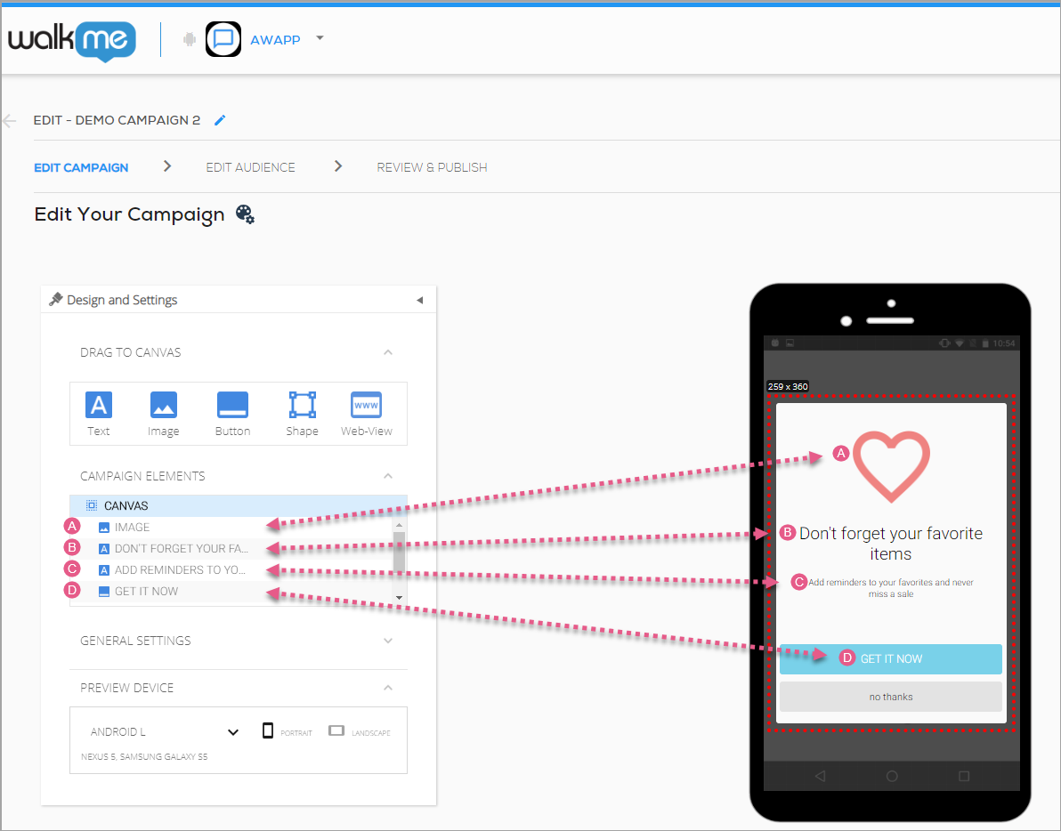
Understanding elements
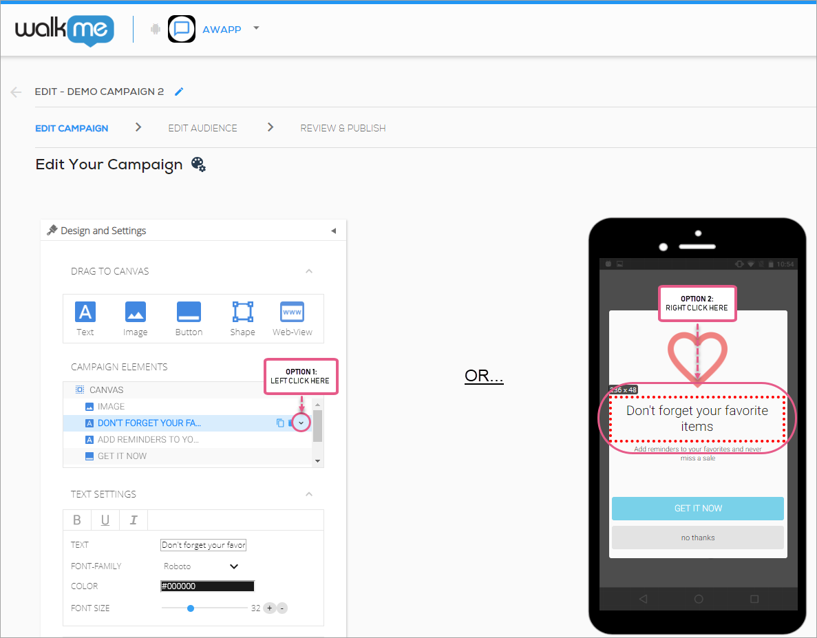
Every item under CAMPAIGN ELEMENTS in the WYSIWYG corresponds to an element that currently sits on your app screen:
You can select one of these elements for placement and customization either by clicking it in the CAMPAIGN ELEMENTS section or on the app screen itself.
You can move all of the elements on the screen together by clicking CANVAS under CAMPAIGN ELEMENTS and dragging the highlighted section around the app screen.
Campaign design tips and tricks
Moving elements forward and backward
Some elements can be moved forward and backward with respect to other elements on the screen (similar to z-index in HTML). You can do this in one of two ways:
Click the dropdown menu to the right of the element and select Move Forward or Move Backward; or
Right click on the image itself on the app screen and select Move Forward or Move Backward:
This is helpful in situations where you assign a CTA trigger to an element that sits at the same location on the app screen as another element (e.g., a shape sitting on top of an image).
Scaling and docking the canvas
You can resize most elements at will, either using their settings-panel's size fields, or by clicking the element's border on the app screen and manually drag-resizing.
When designing for various devices and device-sizes, you must locate and set the size of your elements with this in mind. Use the red guidance lines on the app screen to understand when your elements are centered and/or docked to the sides of the app screen.
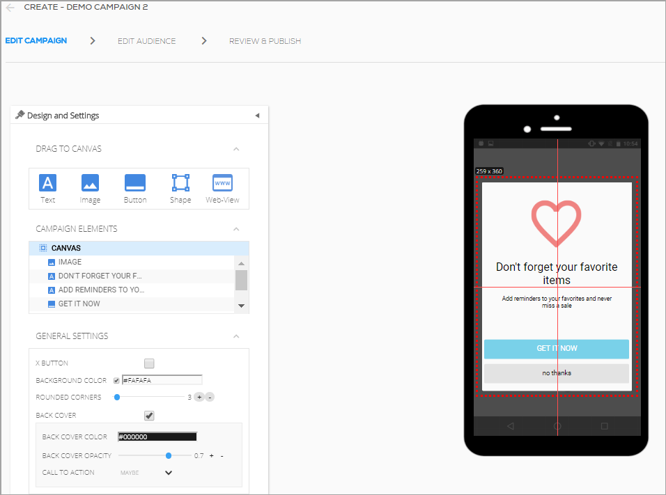
For example, when an element (in the following image, the CANVAS element) is centered vertically and horizontally, you will see two intersecting red guidance lines:
If an element is centered vertically and horizontally, it will appear in the center of the app screen regardless of which device is selected in the PREVIEW DEVICE panel, but it may be cut-off if the size of the content is too large to fit on a given device's screen.
Previewing content on end-user devices
An important part of campaign content-building is ensuring your campaign will provide a pleasant UI regardless of device OS and size.
PREVIEW DEVICE enables you to simulate the campaign's appearance on small, medium and large Android and iOS devices, in both portrait and landscape orientations:
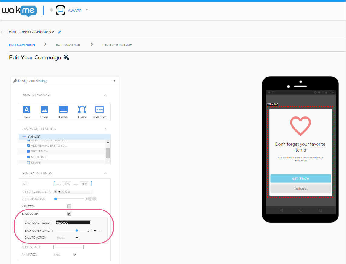
Customizing the campaign's back cover
With Mobile SDK version 1.7.0 and up, you can customize the back cover of your campaign (or the area that sits behind your campaign while the campaign is displayed).
You can designate the back cover's color, opacity, and associated CTA (this last one only for ShoutOuts):