Brief Overview
Theming lets you control the look and feel of all WalkMe items from one place.
Achieve stunning and consistent designs across your DAP program, ensuring your content stays engaging and on-brand everywhere. Choose from default themes or fully customize with colors, fonts, logos, and more to maximize the impact of your DAP content.
Use themes to define brand colors, typography, and button styles that automatically apply across WalkMe experiences—such as SmartTips, launchers, ShoutOuts, and surveys.
You can create, edit, and manage themes in the console. When a theme is active, all new and existing items using theme-based templates automatically update with your latest design.
Use Cases
- Maintain brand consistency: Apply one design language across every WalkMe item
- Save time: Update multiple elements at once instead of editing each item individually
- Support large teams: Share approved themes across systems for consistent builder output
- Enable flexibility: Override specific styles on individual items when needed
Access
To access, go to the Theming app in the Tools category in the WalkMe Console.
How to Enable
To enable Theming:
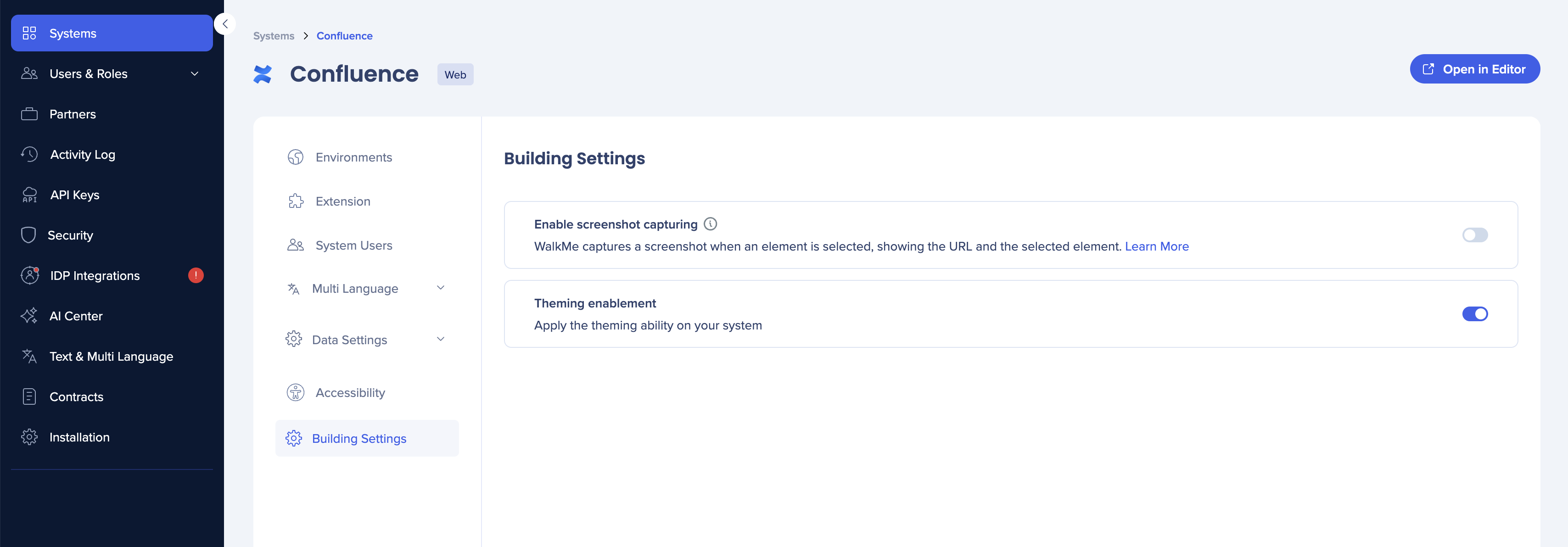
-
In the Admin Center, go to Systems
- Click on the system you'd like to enable Theming for
-
Navigate to the Building Settings
-
Turn on Theming enablement
Theming on all new systems
If you want to have Theming enabled for all newly created systems by default, reach out to your Customer Success Manager or support.
How It Works
Theming applies shared design settings across your WalkMe content, creating a unified visual experience. When Theming is enabled on new systems, your selected theme automatically applies to all WalkMe items by default.
If your system existed before Theming was enabled, you can still use themes—but you'll need to apply them individually to each WalkMe item.
Themes are customized and managed in the console, defining key visual properties like colors, fonts, and buttons. Once set, they become the visual foundation for your DAP program.
Theming: Getting Started Guide
FAQs
Q: Can only those with “Admin” permissions access themes? Are system managers included in the access or only overall admins?
A: Edit Theme permission is enabled by default for Publisher, Content Manager, System Manager, and Admin. You can create custom roles and manage this permission as needed.
Q: Does Theming overlap any existing CSS? What's the hierarchy for companies with heavy branding edits?
A: The hierarchy prioritizes Theming first, followed by custom CSS—CSS has the stronger influence.
Q: Will CSS built as a global rule override Theme settings?
A: Correct.
Q: Is there a way to adjust the widget image with Theming?
A: Not currently, but it is planned for a future update.
Q: Will there be more options for customizing Surveys, such as changing width and height?
A: A new Survey app is coming soon with more design options. The current Survey is connected to Theming.
Q: Can users disconnect from Theming if they have none?
A: They can disconnect their content from Theming. However, if they enabled Theming on their existing systems, they can't disable it completely.
Q: If Theming is activated on a system, will it update existing content retroactively?
A: No, we intentionally avoid altering any of your content. You can decide and manually connect your content yourself.
Q: Can existing content be updated with Theming?
A: Existing content will remain unchanged until you actively update it.
Q: Is there an option to have different themes based on system?
A: Yes, the theme is system-based.
Q: If you edit the theme, will it change published builds?
A: No, you need to publish the updated theme.
Q: Can multiple themes be active at the same time?
A: Only one theme can be active at a time.
Q: Does each theme have its own unique CSS ID for global CSS across different themes?
A: The goal is not to require CSS knowledge to use themes, but sharing themes between systems will be available in a future release.
Q: Can Theming setup be applied to multiple systems or is it system-specific?
A: Currently, Theming is on a system level, but we will introduce a feature to share themes in one of the next releases.
Q: Will Theming work for TeachMe and ActionBot?
A: It will be supported for TeachMe and ActionBot in future updates.
Q: What happens with content built prior to a template change?
A: It remains the same unless connected to the new template, in which case it inherits the theme variables.
Q: If you opt into Theming, can you later opt out, and will content revert to its original design?
A: Content won't change unless connected to Theming, and opting out isn't possible once enabled.
Q: Will new themes be available in the Canadian Data Center?
A: Yes, they will be available.
Q: Why could multiple active themes be necessary?
A: Different color schemes can be used for various purposes, like training resources in orange, help resources in blue, and errors in red. You can still achieve this within a single theme by connecting different templates to different variables.


