Brief Overview
Accessibility Settings lets you configure WalkMe content to work with assistive technologies like screen readers and keyboard navigation. This article covers how to enable accessibility, configure settings for each content type, and test your implementation.
Accessibility in WalkMe
Access
To access accessibility in the console:
- Open the WalkMe Console:
- Go to the Admin category
- Select Systems management and choose a system
- Select Accessibility Settings
To access accessibility in the Admin Center:
- Open the Systems page in the WalkMe Admin Center:
- Select a system
- Go to the Accessibility Settings
How It Works
Enable accessibility
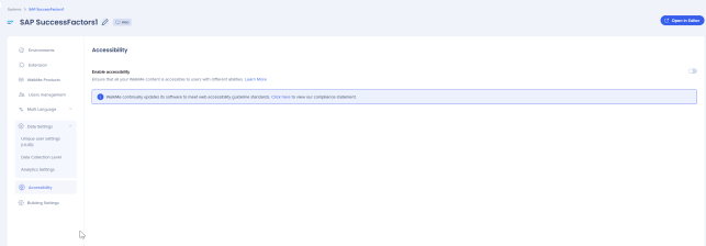
In the Accessibility tab, turn on Enable accessibility. To apply this setting to all future systems on the account, select the checkbox below the toggle.
General navigation
Once accessibility is enabled, users can navigate WalkMe content using their keyboard:
- Tab: Move forward through content
- Tab + Shift: Move backward through content
- Enter: Select or click an element
- Esc: Close a balloon or exit a Smart Walk-Thru. Focus returns to the last focused element on the page.
In menus, use the keyboard arrows to navigate — not Tab.
Before you start building
Explore your site with a screen reader to understand its native accessibility, especially the tab order of elements on the page. WalkMe doesn't fix accessibility issues on your site and depends on your site's structure.
Accessibility Features
Adaptable content
WalkMe elements include ARIA tags and semantic HTML markup to help assistive technologies identify their structure, roles, and functionality.

Keyword accessibility
All WalkMe components are fully operable using a keyboard. For example:
- Use Tab to navigate through launchers, menu items, and buttons
- Use Enter to select action buttons
- Use Esc to close balloons, ShoutOuts, and the WalkMe Menu
Focus order and focus visible
WalkMe sets a predefined focus order for its elements and shows a visible border around elements that receive focus, keeping the experience consistent and predictable.
Screen reader availability
WalkMe supports the following screen readers and browser combinations:
- VoiceOver (Safari)
- JAWS (Edge, Chrome, Firefox)
- NVDA (Edge, Chrome, Firefox)
Accessible text tips
When writing WalkMe content, keep these accessibility best practices in mind:
- Avoid acronyms and idioms — they can be confusing when read aloud by a screen reader
- Use active voice
- Avoid incomplete sentences
- Be consistent in your phrasing
Accessibility for Smart Walk-Thrus
Enabling the accessibility options
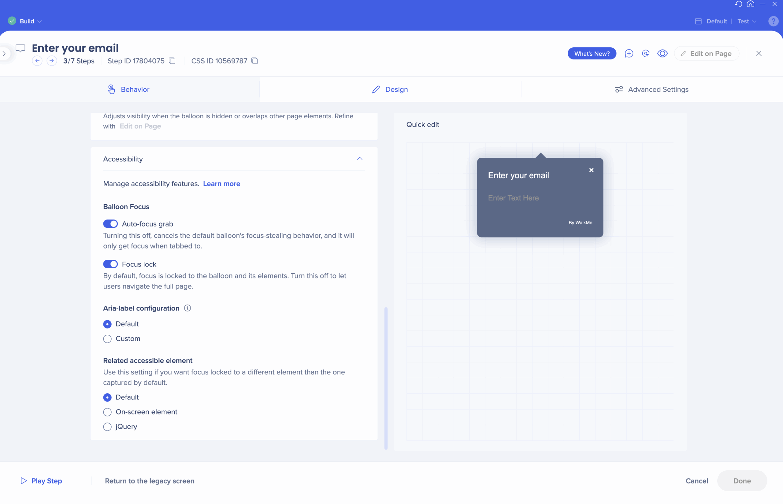
Once accessibility is turned on, an Accessibility dropdown appears in the Behavior tab of each step.
Balloon Focus toggles
WalkMe announces and focuses the screen reader on balloons when they appear on screen, and locks keyboard focus to the balloon and its captured element. This gives keyboard users a similar experience to visual users.
You can modify this behavior per balloon using the following toggles:
- Auto-focus grab: Turn off to stop the balloon from automatically grabbing focus when it appears. The balloon will only receive focus when the user tabs to it.
- Focus lock: Turn off to allow keyboard users to navigate freely across the whole page instead of being locked to the balloon and its captured elements.
Note
Both toggles are on by default to keep keyboard users in the context of the Smart Walk-Thru. Turning them off is not recommended unless you need to adjust specific behavior. Spotlight is not supported when using the Balloon Focus toggles.
ARIA configuration
ARIA labels describe the purpose, role, and functionality of UI elements for assistive technologies. WalkMe lets you set custom aria-labels for balloons from the configuration panel.
- Default: The balloon's aria-label is set to its title. When no title is available, it falls back to "Guidance Balloon" or another default label of your choosing.
- Custom: Use this option to set a different aria-label. This may be needed when the balloon title relies on visual context that screen reader users can't access.
Note
Aria-labels don't appear in the Multi-language panel. Custom labels apply across all languages.
Accessible Capture
In some cases, a captured element is selected for visual reasons but isn't the element the user needs to interact with. Accessible Capture lets you change the captured element for keyboard navigation only, without affecting the visual display.
- Default: Uses the element captured by the builder
- On-screen element: Reselect the element using capture mode
- jQuery: Reselect the element using jQuery
Note
On-screen element capture doesn't have the element precision or advanced options available in other parts of the system.
Images and text atlternatives
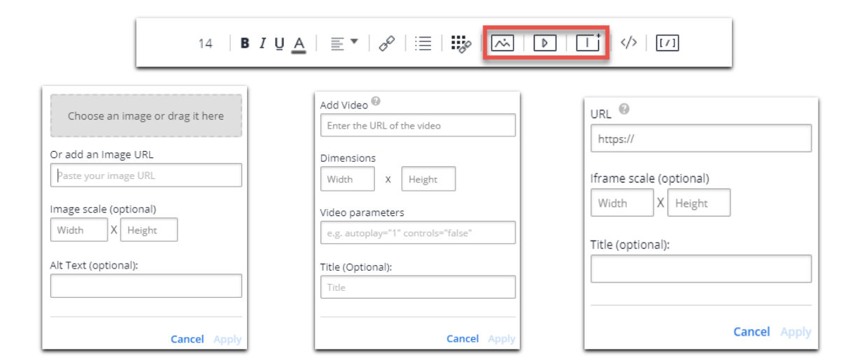
Use the Rich Text Editor to add alt tags for images and title tags for videos and iFrames:
- Default: If no text is added, an empty "" value is added to alt tags and "untitled" to titles, following accessibility best practices
- BBCode: Alt and title tags can also be added manually as part of the BBCode
Accessibility for Launchers
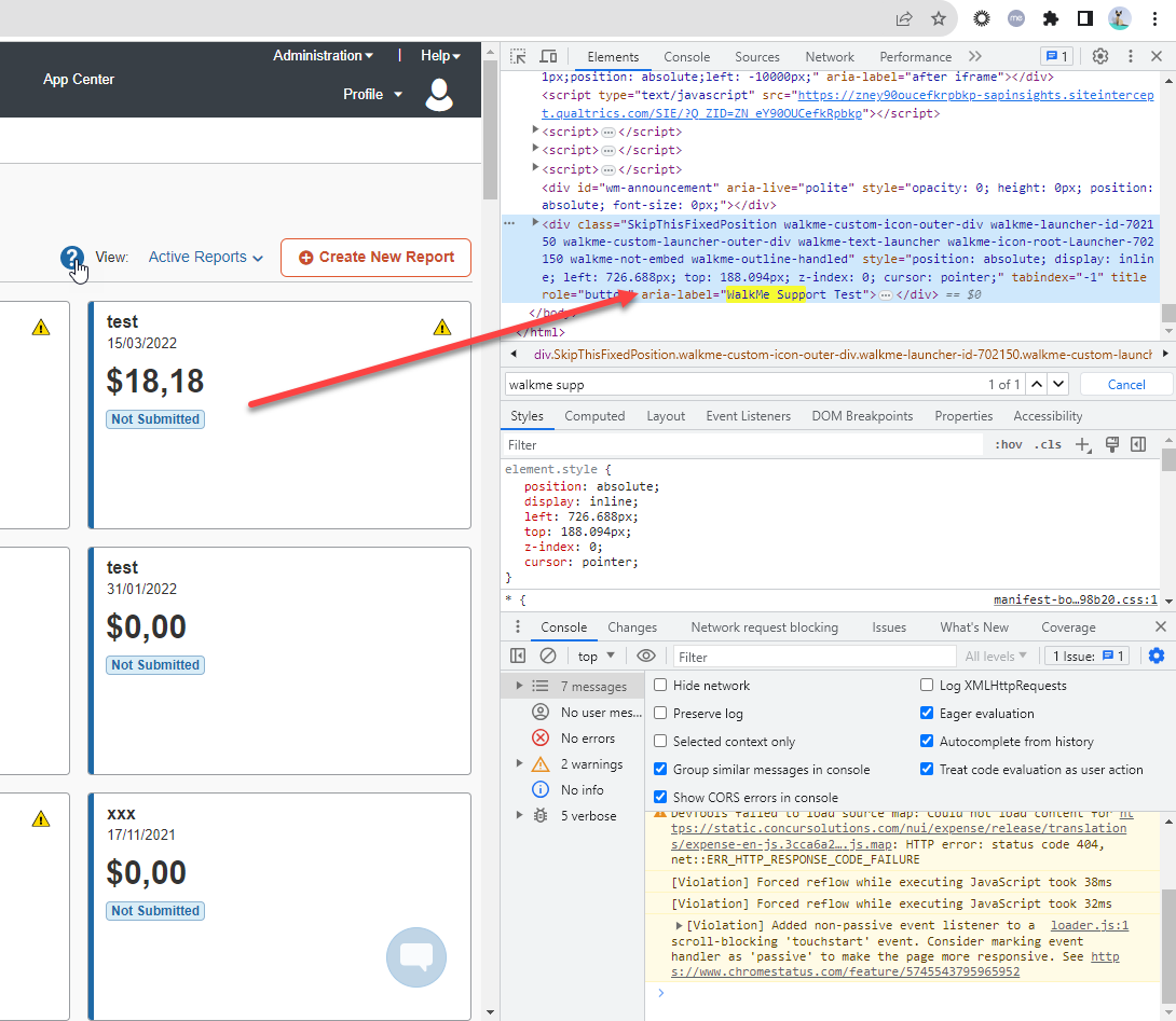
Screen readers read the description of the launcher. To change what is read, update the image description (alt text) in the launcher's image settings.
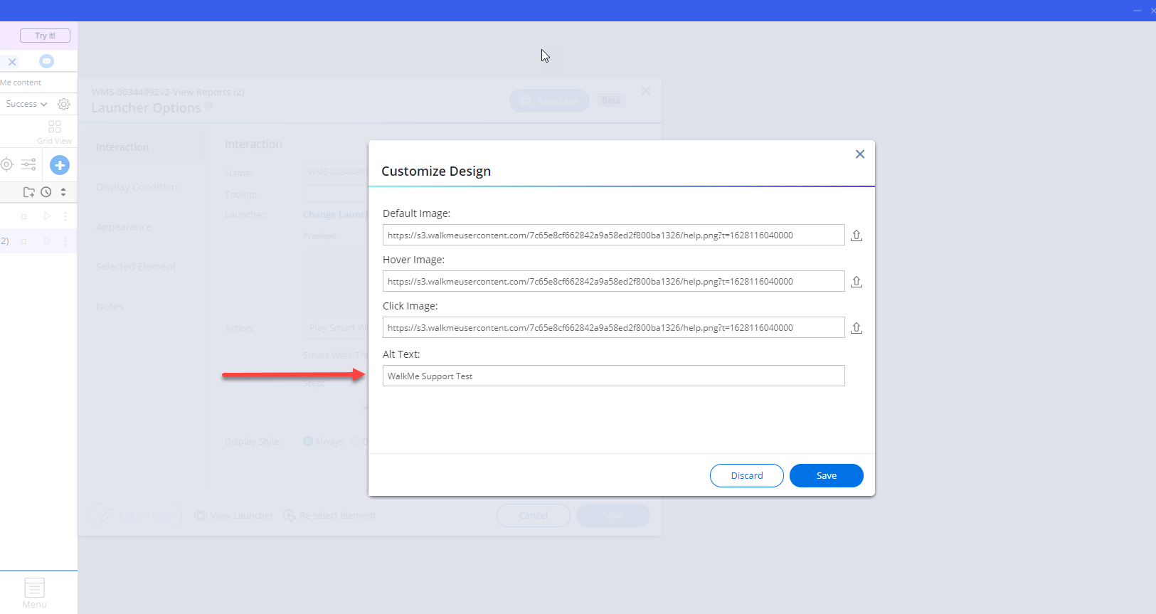
The alt text appears as the aria-label attribute in the HTML.
Accessibility for SmartTips
Screen readers read the tooltip text of the SmartTip. Before building SmartTips, make sure you understand the tab order on the page.
Accessibility for ShoutOuts
ShoutOuts receive keyboard focus regardless of whether the overlay is on or off. Tab moves through focusable elements inside the ShoutOut.
Note
Build your ShoutOut content in the order you want users to tab through it. Rearranging elements after building doesn't update the tab order.
Testing Accessibility
General navigation
Use your keyboard to navigate through the site and WalkMe elements:
- Tab through elements — you'll hear a voice describing the name and purpose of each one
- Use keyboard arrows (not Tab) to navigate inside menus
- Use Enter to select or click elements
Testing SmartTips
Tabbing through SmartTips should behave the same as hovering with a mouse:
- Tab to a field SmartTip: you'll hear an explanation of the field, followed by the tooltip text
- Tab to the SmartTip icon: you'll hear "clickable," followed by the tooltip text
Testing launcher
Tabbing through launchers should behave the same as hovering with a mouse. You'll hear the launcher's call to action text, followed by its tooltip text.