Brief Overview
SmartTips are advanced tooltips that help your users understand your website or product. For example, you can use SmartTips for:
- Adding useful tips to confusing areas
- Verifying users correctly
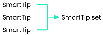
SmartTips are created in the editor. Individual SmartTips are created within a set - a group of SmartTips that appear on the same form or page. SmartTips can be used instead of or in addition to Smart Walk-Thrus.
🎓 Digital Adoption Institute
Use Cases
There are two types of SmartTips:
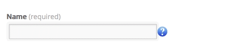
- Guidance SmartTips present users with additional information to what's on the page or an input field. For example, you might place a Guidance SmartTip on a Name field to clarify that the user should enter both his/her first AND last name. The Guidance SmartTip on this field will appear constantly on the page and display the message “Enter your First and Last Name” when the user hovers over it.
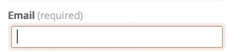
- Validation SmartTips provide real-time feedback on fields before form submission. For example, add a SmartTip on an email field which will display if an incorrect entry is made and will disappear from the screen when the mistake is corrected.
How It Works
SmartTips can display tooltips on either an icon or directly over the selected element. If SmartTips are set to display over the element, the Guidance SmartTip appears when a user focuses on the selected field (hovers, clicks or tabs into). A Validation SmartTip appears when a user focuses out (clicks or tabs out) of the selected field and the field is incorrect (the validation rule evaluates to false).
When using both Guidance and Validation SmartTips the guidance message is placed over an icon and the validation message appears over the selected element (see gifs above).
Learn how to create SmartTips
Sets
A set is a group of related SmartTips. Much like Walk-Thru steps, SmartTips are created as a group within a set. No single SmartTip can be independent of a set just like no single step can exist independent of a Walk-Thru. Your first step when creating SmartTips is to create the set in which the related SmartTips will be grouped.
Settings of a Set
When creating a set, you will first be prompted to determine where this set will play: on a specific page or on multiple pages.
- Display only on a specific page requires using the rule engine to define the page (most commonly used is the URL rule type). Defining a specific page, maximizes performance.
Note
Please refrain from using on-screen element in the set conditions. Those are evaluated on page load and will cause the SmartTip to not appear on an SPA system. Place all on-screen element conditions in the SmartTip display rules.
- Display on multiple pages will play the set on all pages, you will not need to create a rule.
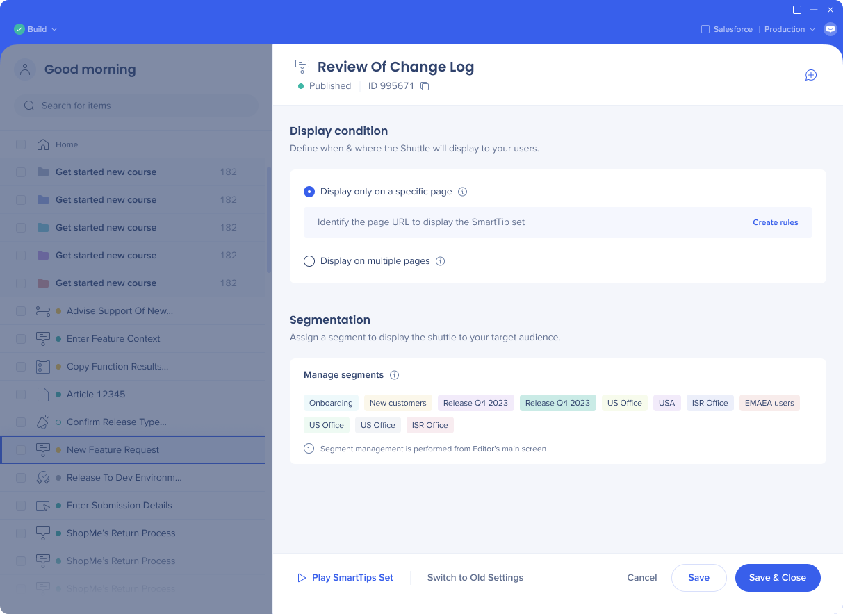
Segmentation Settings
Before displaying SmartTips, WalkMe checks the set's segmentation rules to see if the rule is true. If it is, WalkMe simultaneously runs all the SmartTips within the set.
Add the set to a segment to target a specific audience. For a form that applies to both admins and sales, apply both global segments to the Smart-Tip set.
You can add your segments from the editor.
Segmentation
Notes
Click on the +Add Note icon in the upper right corner to create notes.
Notes can be used to collaborate with team members in the editor and will not appear to your users.
Some examples for notes use cases are:
- Leave yourself a reminder of an action to do later on an item
- Leave a comment for your colleague
- Explain in your own words what you built and why
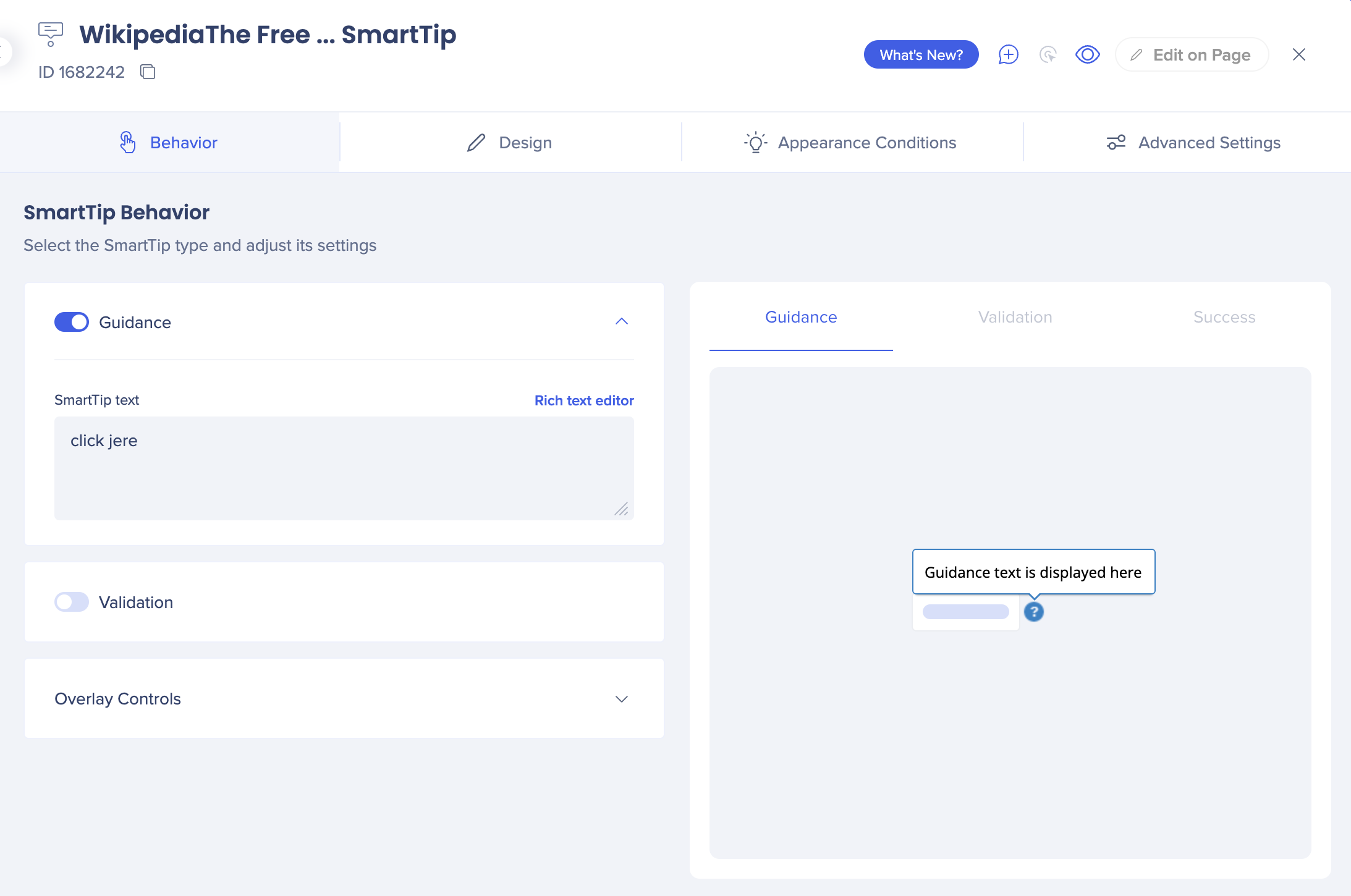
What Are Guidance SmartTips?
A Guidance SmartTip only displays a message to the user. Guidance SmartTip messages appear when you hover over the icon or if you display the message on the element then it appears when you hover or focus on (click or tap into) the element. This message can be displayed either on the anchored element or the SmartTip icon.
Using the Behavior tab you can configure these settings and access the Rich text editor to customize the design of the SmartTip.
New design
Learn about the changes to the SmartTip settings done in the new design.
Tip Tuesday video
What Are Validation SmartTips
Validation SmartTips verify that a user has added valid content into fields. They verify field inputs by checking against validation rules.

Validation rules allow you to set what is considered valid input for a field. If the validation rule evaluates as false (incorrect input into a field) then the SmartTip will display your validation message.
Validation rules are checked when a user focuses out (clicks or tabs out) of a field. The Validation SmartTip icon or element highlight will display if the user completes the field incorrectly (the validation rule evaluates as false ) and disappear when the user has corrected their mistake (the validation rule evaluates as true).
A Validation SmartTip only plays if the rule is false; in other words, if the selected element is not a valid phone number, the validation will display.
The validation can be set to appear either on the SmartTip icon or on the selected field. The message will appear when the user hovers over the icon.
You may configure validation rules and success messages from the Interaction tab.
Select from among the following preset validation rules or create a new, custom rule:
- Mandatory: The Rule will evaluate whether there is text in the attached field. If left empty, the validation Rule will be false.
- Numeric field: Checks that the entry is a numeric value.
- Date format: Checks that the entry is in a valid date format such as dd/mm/yyyy.
Note
When using a date picker, user must interact with an input field and then exit it (click out) for validation to occur.
- Time format: Checks that the entry is in a valid time format such as 14:00 or 2PM.
- US Phone Number: Checks that the entry is a US phone number with 10 digits (area code plus number). This rule cannot check if numbers are real, only that it is written in the correct format.
- Email address format: Checks that the entry is in a valid email format and includes an @ symbol Web address format: Checks that the entry is in a valid web address format.
If you choose one of the presets and click Update Conditions, you will see the way these presets are written in the Rule Engine. For example, the US Phone Number preset uses the following rule:

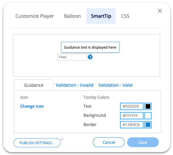
Global Customization
Global customization enables you to change the design for all SmartTips, without the need to customize individual SmartTips as they are being created. Using global customization keeps a consistent look and feel for all SmartTips.
The best practice is to set one style for error tooltips to keep uniformity within the platform. Global customization does not apply retroactively, and will only affect SmartTips created after the design is saved.
You can override global color, text, and icon styling for Guidance SmartTips in the SmartTip Options Menu. This is because there are different use cases for Guidance SmartTips and you may not always want the same style.
Pro-Tip:
Validation SmartTips can only use the global default style and cannot be individually customized.
Publishing
When you are ready to publish your SmartTips, select the set and click publish.
Note
Publishing a Set will publish all the SmartTips within that set
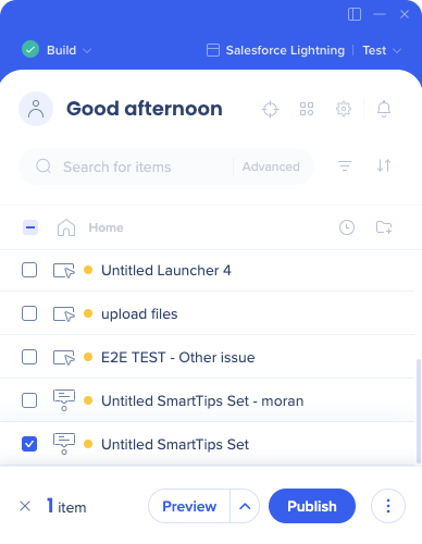
If you would prefer not to publish one or more of the SmartTips in your set, you can disable them by clicking on the Options menu next the the SmartTip and selecting Disable SmartTip.
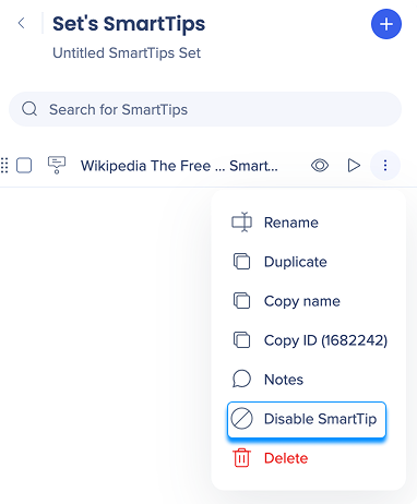
Similarly, individual SmartTips cannot be archived, only whole sets. To retire an individual SmartTip, disable it from the Options menu.
SmartTips Not Showing?
If none of the SmartTips in the set are showing:
- Check the set's page display rules
- Check the set's segmentation rules
If individual SmartTips aren't showing:
- Check the SmartTip's display rule; both the display rule AND the set segmentation must be true for the SmartTip to show.
- Try recapturing your element If a Validation SmartTip is not appearing and check the validation rule. When the rule evaluates as true, the validation message will display.
If your SmartTips still aren't showing, contact Support.


