UX Best Practices for Smart Walk-Thrus
Brief Overview
You know how to build a Smart Walk-Thru, but want to know tricks that the pros use? Keep reading to learn about strategies and methods we have found to be most effective at building Smart Walk-Thrus with great UX.
Build for a Smooth User Experience
It is important to consider the experience of the user when building a Smart Walk-Thru. When using a Smart Walk-Thru to help users navigate, there are two ways to look at it:
- Train: Teach the user how to get to the page / complete the process (standard manual steps);
- Automate: Use automation to help the user complete the desired action.
Choosing the proper perspective has a lot to do with the use case; are we teaching the user how to use the platform? Or we are helping the user perform better and engage with the site quickly and effortlessly.
Think about how frequently a user is performing an action; is it a repeating and variable action he/she should be trained on or a one time action that we can perform for him/her (set it and forget it)?
With that in mind, let's look at some best practices for optimizing UX.
Balloon Color
Pay attention to how the colors used in a Smart Walk-Thru balloon contrast with the background colors of the website/ application.
Also, consider the color of the text in the balloon versus the colors of the balloon itself.
Make sure to use colors that are easy to read. Avoid bright saturated colors. When using black, use the hue from the Editor; it is not a regular black (it's a bit lighter and mixed with brown) and is easier to read.
Text
Keep Balloon Text Short and Simple
Messages in balloons should be direct and actionable. Avoid overloading the user with information. If you need to convey a lot of information at once, use SmartTips or link users to a document that provides more details.
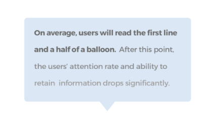
Use Calls to action; immediately tell the users what they need to do. Avoid unnecessary explanations. If you are launching a Walk-Thru and trying to get the user to play it, tell them why they should. For example, “To complete the process faster, click here.”
Smart Walk-Thru Length
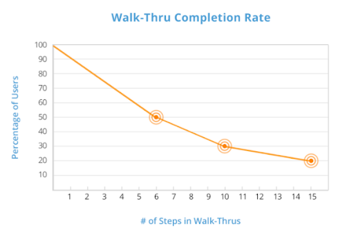
Keep your Smart Walk-Thrus to twelve steps or less
We have seen that Smart Walk-Thrus with more than twelve-step balloons see a significant drop-off. Give your users the information they need when they need it in a concise and efficient manner. Identify the end goal of the Smart Walk-Thru and focus on getting users there in the simplest way possible. Look for opportunities to use fewer balloons. Fewer balloons mean fewer opportunities for your user to click X and exit the Smart Walk-Thru.
To highlight or not to highlight?
You can use highlights to focus the user on an element you are referring to. If the element is far from the balloon or if you have multiple elements relevant or if the element you are pointing to is not clear.
To make a highlighted step noticeable, use a color that contrasts with the site, but avoid colors that are too bright or clashing. Avoid using the color red, as it's associated with an error, unless you are referencing an error.
Create Linear Flows
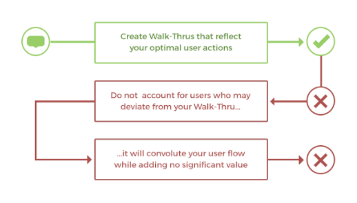
Create Smart Walk-Thrus that reflect your optimal user actions. Do not account for users who may deviate from the Smart Walk-Thru; it will convolute your flow while adding no significant value. If you have multiple desired user actions, break the flow into smaller Smart Walk-Thrus and organize them together in a Folder in the WalkMe Player Menu.
Optimize Titles
Users will find and select the most relevant Smart Walk-Thru from the Player Menu if the title is concise and makes the end goal clear.
Use SmartTips
SmartTips are a great feature to use in addition to or as a replacement to Smart Walk-Thru balloons. Unlike Smart Walk-Thrus, SmartTips always live on the screen. They are minimally invasive, there when the user needs them and easily ignored when not. Read about SmartTips.
Build with Single Balloons on Multi-field Forms
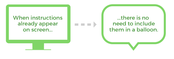
Forms are often self-explanatory and don't require an individual balloon for each field. Instead, consider building with a single balloon on the Save or Submit button that says “Fill out Required Field and Click Submit.” Not enough? Provide additional information or validate field entries with SmartTips.
Use the Next Button Trigger for Optional Steps
When you are not sure whether a user will take an action or wish to make an action optional, use a Next button trigger. You can also use the Next button trigger in conjunction with the Click or Type triggers.
Minimize Required User Clicks with the Custom Trigger
Custom Triggers can be used to replace Next button triggers. Custom Triggers progress the Smart Walk-Thru at the appropriate time under a given circumstance, as opposed to Next button triggers, which are not tailored for a specific circumstance and may require the user to click more times than necessary. Read about Custom Triggers.
Make It Available at the Right Time, in the Right Way
Creating an effective Smart Walk-Thru is half the battle. Make sure it is shown to the right people at the right time.
Add the Smart Walk-Thru to a Segment
Purposeful Segmentation is an important part of your Smart Walk-Thru. Segments allow you to control which user groups will see the Smart Walk-Thru. If Smart Walk-Thrus aren't relevant to certain users or under certain conditions, they can be hidden using the Segmentation Center. This will allow your users to focus on their relevant tasks and reduce clutter on screen and in the Player Menu.
The Best Practice is to use either a URL to segment by page or a variable to segment by user type or role. Read about Segmentation.
Optimize Smart Walk-Thru Initiation Points
How will a user initiate your Smart Walk-Thru? Via a Launcher, the Player Menu, a Permalink, or a ShoutOut? Fully considering the user experience and business objective will make sure that the Smart Walk-Thru is made available to the user at the point of need so that it will provide maximum benefit. Read about initiators.
Auto Play best practices
-
- Use AutoPlay to proactively engage with your end-users. Think critically about the Smart Walk-Thru at hand and when the best time and place is to present it to a user.
- When using an Auto Play it's important to explain the purpose of the balloon first, so a user knows why he/she is seeing the balloon and the value he/she will get from clicking it.
- What not to do:
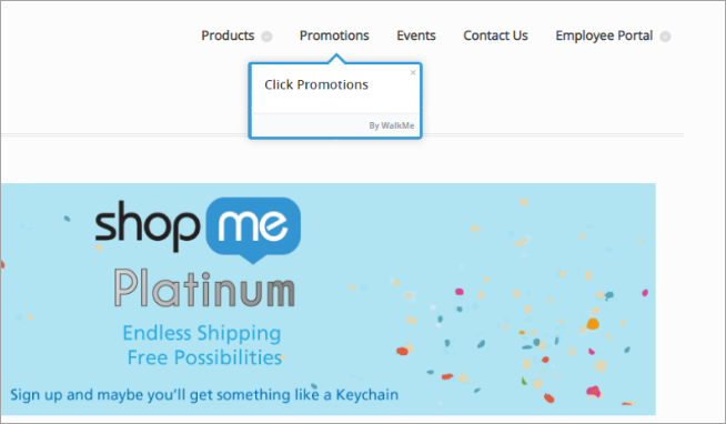 (This balloon is completely non-descriptive and provides no new information…)
- What not to do:
- Always put an Auto Played Smart Walk-Thru's first step in a noticeable section of the site. For example, avoid locating it on the bottom right corner since it might be missed (see the heat maps presented above).
- What not to do:
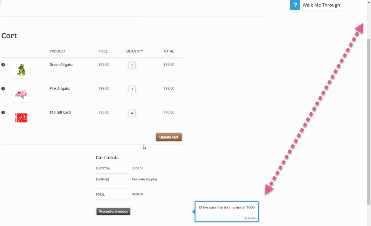 (Here, the user needed to scroll down on the page just to see the balloon at the bottom of the page)
 -
- It is problematic to use a Spotlight Step as a first step! Auto-Playing Spotlight Steps can remind users of advertisements, and might cause a user to close it without reading.
- What not to do:
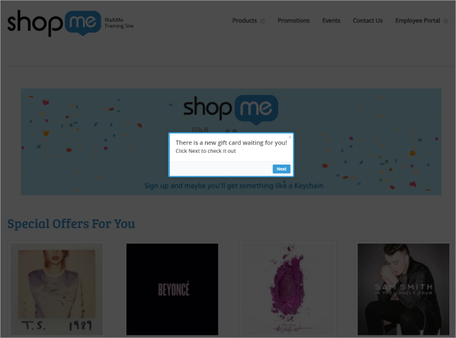
(If this is the first step, it may remind the user of an advertisement and prompt premature closure) - Do not use too many Auto Plays; this might annoy the user. Reserve Auto Play for when you think a user might need the guidance but won't search for it on his/her own.
- We recommend adding a delay before an Auto Play launches so a user can first explore the page and only then interact with WalkMe.
Give Users Multiple Ways to Initiate the Smart Walk-Thru
We recommend making Walk-Thrus available in more than one way such as a contextual Launcher on the page where a user is likely to need help and as an Onboarding Task in the Player Menu.
