Brief Overview
This article goes over the settings supported to make your WalkMe implementations accessible to all of your users, as well as how to activate and use them while building.
For more general information on accessibility in WalkMe and the standards we support, please read the following article:
Accessibility in WalkMe
Settings
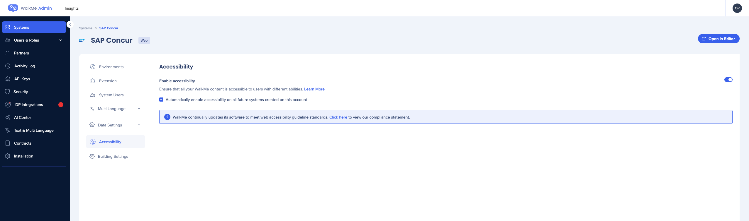
To enable accessibility:
- Go to the Admin Center
- On the Systems page, select the system
- Go to the Accessibility tab
- Enable the Enable accessibility toggle
- Check the box if you want accessibility to be automatically enabled on all future systems created on this account
Before you start building
Explore your own site with a screen reader of choice, understand your site's native accessibility, especially the tab order of elements on the page. WalkMe does not fix accessibility issues on your site and is dependent on the structure of your site.
General navigation
- Tab: To move through content
- Tab+shift: To go backwards
- Enter: To click
Adaptable content
WalkMe elements have ARIA tags and semantic HTML markup to support assistive technology with identifying their structure, roles and functionality.
Keyword accessibility
The complete functionality of all WalkMe components is accessible through a keyboard interface.
For example, use the TAB key to navigate through clickable elements like launchers, menu items, and buttons, use the Enter key to click on action buttons, and use the ESC key to close dialogs like balloons, ShoutOuts, and the WalkMe Menu.
Focus order and Focus visible
WalkMe sets a predefined focus order for its various elements, and displays a visible border around elements that receive focus, making the experience consistent, predictable, and logical.
Screen reader availability
WalkMe focuses on the most popular screen readers in the market, along with their common browser combinations:
- VoiceOver (Safari)
- JAWS (Edge, Chrome, Firefox)
- NVDA (Edge, Chrome, Firefox)
Accessible text
These are some tips for phrasing your content to make it more accessible:
- Avoid acronyms and idioms (can be confusing when read by a screen reader)
- Use active voice where possible
- Try not to use incomplete sentences
- Be consistent
How to Use
Accessibility for Smart Walk-Thrus
Activation
Once you enable accessibility, the Accessibility dropdown will show in the Behavior tab of the step.
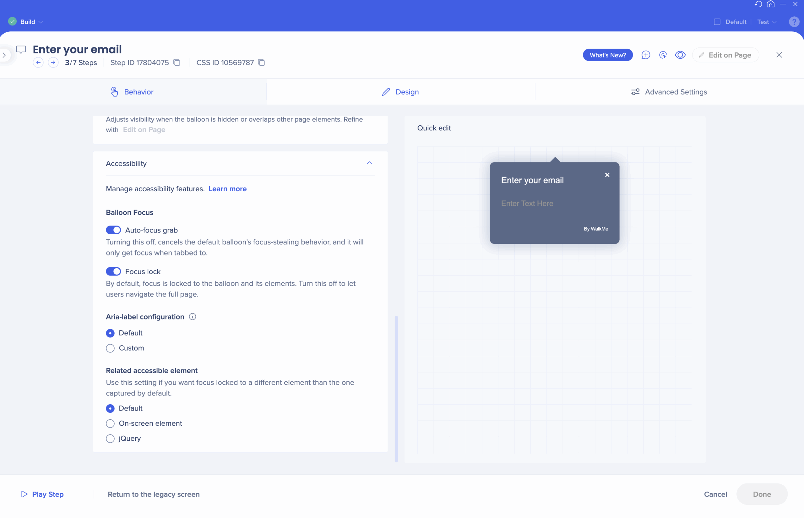
Using the Balloon Focus toggles
Screen readers are able to identify elements in the UI that are in-focus, meaning elements that are selected where the user may decide to interact with them. For example, a screen reader may identify that a specific text field is in-focus, giving the user the option to add input or move to another element. This is visually shown as an outline by most web browsers. To change which element is in focus with a screen reader, users often use their keyboard to navigate the UI.
Based on accessibility best practices, WalkMe announces and focuses the screen reader on balloons when they appear on-screen. The keyboard focus is also locked to the balloon and the specific element selected, making it easy for the user to interact with the on-screen guidance. This gives the end user a similar experience to the visual user. If, however, you wish the screen reader and keyboard navigation to be able to move through all interactive elements and fields and provide the full context of the UI, you may alter the default settings.
Balloon Focus allows you to modify how screen readers focus and navigate UI elements when WalkMe balloons appear on-screen.
- Auto-focus grab: By turning this toggle to OFF, the given balloon's focus-stealing behavior will be canceled, and it will not automatically retain focus upon appearance (only when tabbed to).
- Focus lock: By default, keyboard focus will be locked around the balloon and its captured elements, and keyboard users can't navigate away. Turning this toggle to OFF will disable this behavior for the specific balloon, and the keyboard user will be able to navigate to the rest of the page. Focus lock does not mean the user can't stop a Walk-Thru; this option is always available by clicking ESC.
Note
- These are turned on by default to provide keyboard users with real-time updates of balloon appearances, and help them stay in the context of the Smart Walk-Thru. Disabling these is NOT recommended unless it is specifically required to adjust the desired behavior.
- Spotlight is not supported when using the Balloon Focus toggles.
Use the escape button to exit a Smart Walk-Thru or close a balloon (If the balloon is closed, the focus will go back to the last focused element on the page).
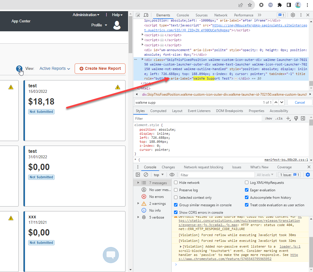
Using ARIA configuration (currently only aria-label)
Aria-labels provide an alternate piece of text that describes the purpose, structure, role, and functionality of UI elements for assistive technologies. For example, there might be an "X" that closes a popup window. This element does not have a proper label for a screen reader so an aria-label may be added to it in the HTML code so a screen reader can identify it as “close”.
In accordance with the SAP accessibility standards, WalkMe elements have ARIA tags and semantic HTML markup to support assistive technology. From the configuration panel, you may create a custom aria-labels for balloons.
- Default: Balloon aria-label will be set to the balloon's title by default. When the title is unavailable, aria-label will fall-back to "Guidance Balloon" or another default label of your choosing.
- Custom: Use this option if there is a need to set a different aria-label than the default. It might be necessary if, for example, the balloon's title relies on another visual representation on the page to be understood, the label may not be clear enough for screen reader users.
Multi-language support
Aria labels are not represented in the Multi-language panel, so custom labels will be unified across all languages.
Using Accessible Capture
In some cases, captured elements are selected for aesthetic reasons, but they are not necessarily the elements that the user needs to interact with. In these cases, the focus will be locked around the incorrect element. Accessible capture will change the captured elements only for keyboard navigation, even though visually the element will stay in the same place.
- Default: Use the element that was initially captured by the Walk-Thru builder
- On-screen element: Use this option to reselect elements using capture mode
- Note: This functionality does not have element precision and other advanced options present in other parts of the system.
- jQuery: Use this option to reselect elements using jQuery
Images and Text Alternatives
WalkMe offers a convenient UI in the Rich Text Editor for adding “alt” tags for images and “title” tags for videos and iFrames:
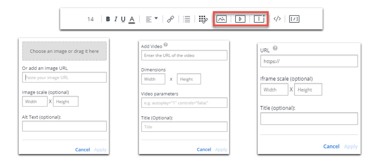
- Default: If any text is added, a default empty “” value will be added to the alt tags and “untitled” to titles, following the accessibility best practices
- BBCode: “alt” or “title” tags can also be added manually as part of the BBcode
Accessibility for launchers
- Description: Screen readers will read the description of the Launcher
- There is an option to change the text of a Launcher by changing it's image description.
- For example, if we add a new image in "My Gallery", we have the option of changing the "Alt Text" field
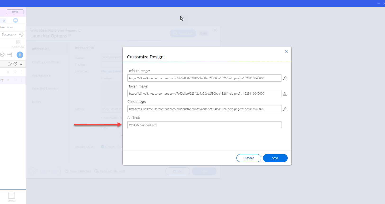
- This will show up in the aria-label attribute
Accessibility for SmartTips
- Screen readers will read the tooltip of the SmartTip
- Pay attention to the Tab order, make sure you understand how the page tabs before building SmartTips
Accessibility for ShoutOuts
- ShoutOut will get keyboard focus no matter if it has the overlay turned on or off
- Tabbing in the ShoutOut moves through focusable elements
- Build your shoutout in the order you want it tabbed. If you build 3 buttons and rearrange them later, they'll retain the original tab order.
Testing Accessibility
General navigations
- To navigate through the site and WalkMe elements, use the Tab key on your keyboard.
-
In menu items navigate using the keyboard arrows, not Tab
- To click site or WalkMe elements, use the Enter key on your keyboard
- While navigating through elements, you will hear a voice describing the name and the purpose of that element
Testing SmartTips
Tabbing through SmartTips should behave as if you were hovering over them with a mouse.
- Hover over field SmartTip: You will hear an explanation about the field, followed by the tooltip's text
- Hover over the SmartTip icon: You will hear the word “clickable”, followed by the tooltip's text
Testing launchers
- Tabbing through launchers should behave as if you were hovering over them with a mouse
- You will hear the launcher's call to action text, followed by the launcher's tooltip text


